i don’t know why some are so picky about some new art/design directions but i respect it since my pickyness about myth creature designs which are in my opinion more or less flawed in the original game gets respected too.
but if you argue with the memory factor it in fact is nostalgia, you see some out of a persective you remember and contact something superior positive with that memory. thats nostalgia in my honest opinion.
i understand the argument about the “too much decorative” design and that this is often too much. this bothers me too in my games. but not this one cause i REALLY don’t see any design which is overdone and overdecorated. in fact i think everything has a clear purpose and is simple yet very effective designed so far.some more details of course, but in a wise placed and immersive way.
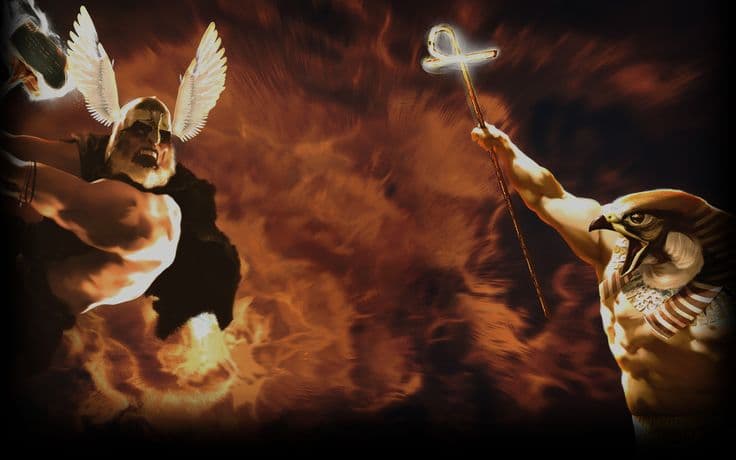
gaia (seth and argus) seem to be the biggest topics regarding new designs.i understand that gaia is a drastic change and drastic changes are often not very welcome from ppl who like to be in their good old memories.
but seth? he never really was in any main promotion art for AoM and his head seems to in fact resemble the head of at least one of the creatues he is portrayed with. of course doesn’t look badass as the original one (which looked more like a horse-head or something?) and the new head looks more cute due to the fact the connected animal looks also adorbale appereance wise. but the splashart/wallpaper and its design is a topic of its own. (partly agree it looks too mobile-ish)
and argus…? really? i see everything alien is connected to starcraft now… you can’t invent the wheel new gentlemen. also you really can’t argue it looks too alien if the orginial was so alien and goofy looking it could have been right out of either a pixar, ghostbuster or marsattack movie. if we want to argue about argus then if a unit like this should in general even be a myth unit and not how its design “should be”.
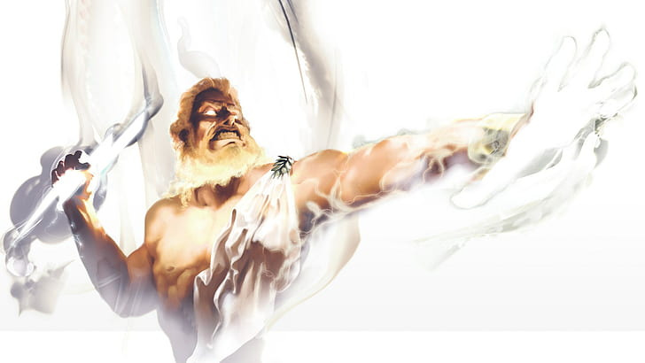
about gaia i am torn apart personally. my 12 year old me really liked the old gaia titan design for obvious reasons. but it was always a quite generic design, something ppl argue about the new desings (which is a bit of a contradiction) her old design wasn’t even consistent with her god portray and her temple statue… also why should a “mother” be portayed more human? why does it have to have a nose to be a mother-figure? there are beings without a prominent nose who give birth. also now she looks way more connected to nature and like an ancient being connected to all living and not like a ######## i can see why some say "why does she have to have bark as her skin? and yeah that could be an argument but i think they wanted to show her ancient, primordial thematic with a bark skin which looks long living, aged and also a bit alien for an ordinary human being. you could still say “away with the bork” but what instead then? skin out of earth/dirt? out of rocks like they did in god of war? i think bark looks at least somewhat elegant.
i also REALLY like the idea that titans across the board should look less human and more primordial and “alien”. to separate them from the gods which are all portrayed human and to make them more ancient looking than the gods.
i think whoever had this design deicision and whoever give the new changes a “go” did the right thing. you can’t always stay in the past. i enjoyed played WC3 campaign and WC3 mods on lan-parties with friends but when i look now at the graphics they aged badly and only their nostagic-charm keeps the design tolerable. otherwise i would call it ugly and it doesn’t really catch me anymore. (since some use WC3 and similar games as an example)
ppl who try new things should be welcomed cause otherwise we would get stuck and we should support brave devs and don’t scare them away cause we see how way too many games get stuck in doing always the same to not take any risks scared about the earnings… thats why i think we should give them positive feedback in that regard and give them confidence that other devs/publishers of other games see this and show more courage to innovate.
also now gaia looks more connected to dryads design and i didn’t see anyone ranting about the dryad design even i think the old game did dryads really no favour in their design…
i think this guy points it out straight to the point regarding certain design decisions. also about gaia:
(2) Age of Mythology: Retold - Reveal Screenshots Trivia and Speculation - YouTube
but what i agree with here is that:
- seth even looking accurate to his description he looks too adorable and should look more menacing.
- the wallpaper/splashart looks overall too clean and mobile like
minotaurs finally looks badass and menacing. really hope this design-direction gets over to trolls aswell.