I agree. In general, a lot of the biomes suffer from lack development. The two new biomes are definitely a step up from the past ones, which mostly consist of slightly different grassland.
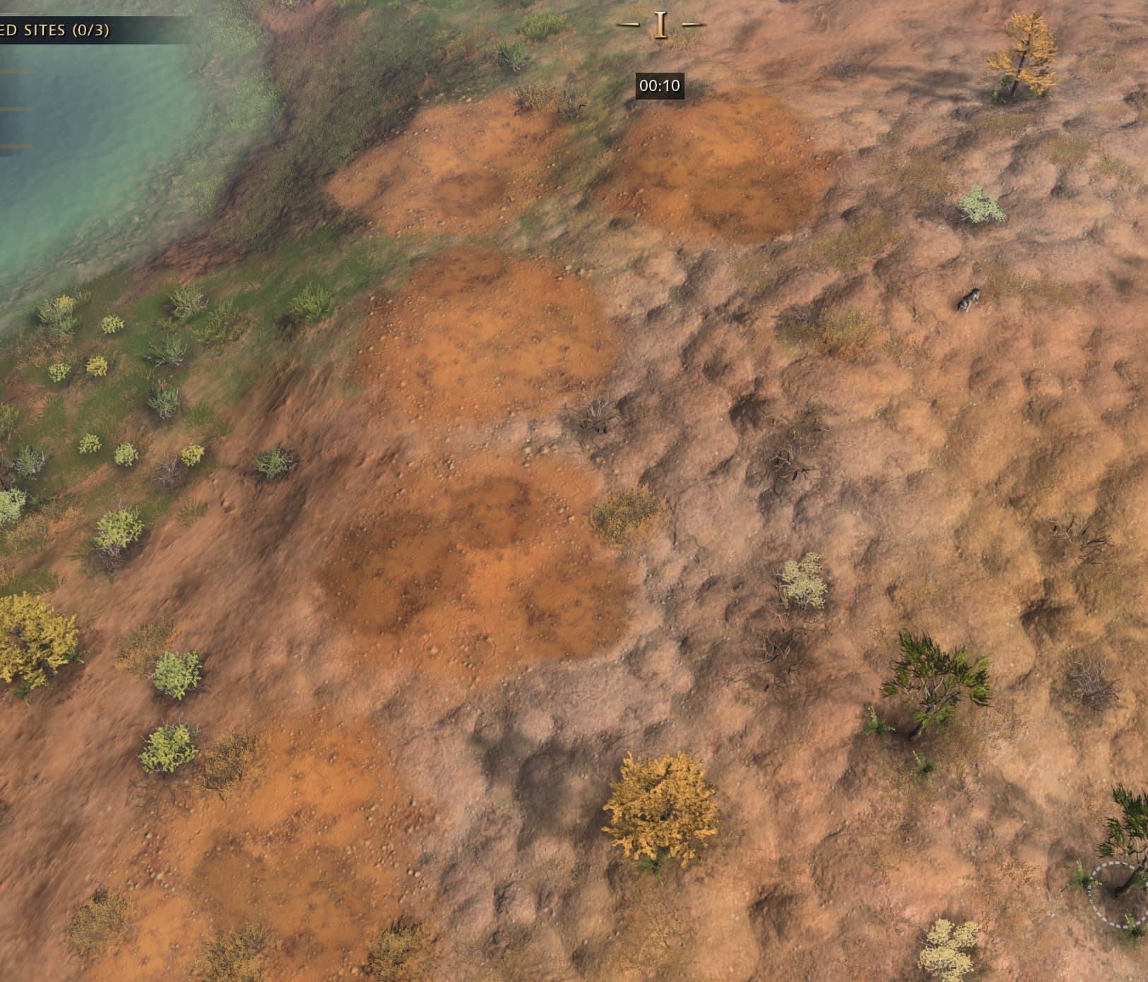
The frequency at which these “patches” keep appearing really hurts the appeal. They also don’t blend in well, and more important, aren’t NEEDED for the appearance of desert–which is what this biome is. Of course desert tends to have bits sticking out like that, but the vast majority should really just be flat, plain desert. Again, the frequency of these really hurts that. Here is an image of what I speak of;
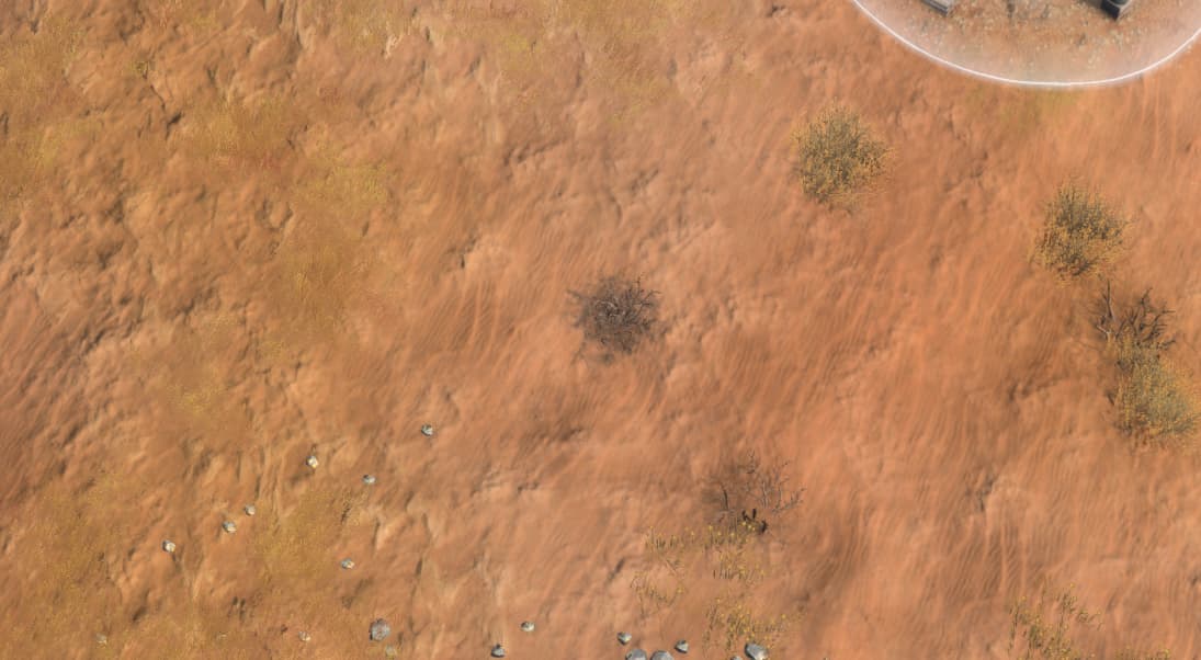
There are other offenders though. For example, Gobi desert have these ridiculous orange orbs that do not blend in with the environment AT ALL, and appear at random intervals like so; here are five of them.
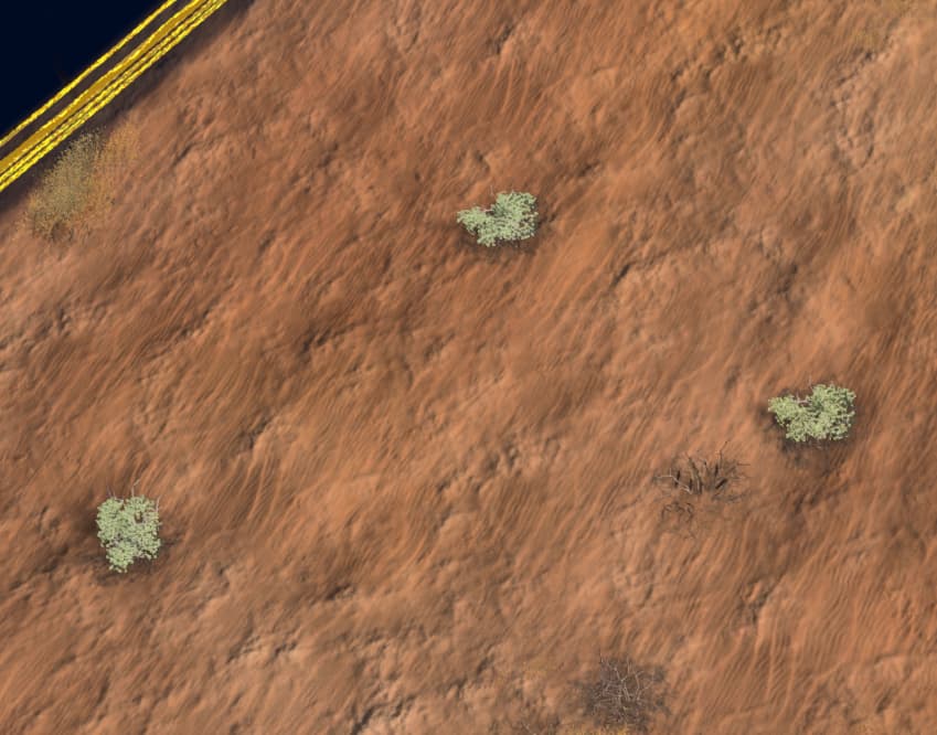
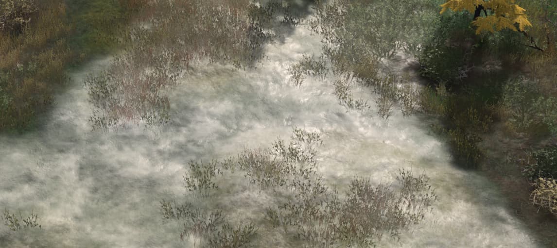
Gobi Desert also has this “semi” dune desert texture. Like, you can see sand dunes, but they are mostly covered up by this completely unnecessary bumpy texture that ruins the entire appeal. Here are some examples of that.
You can see from right to left, how it varies. Right is where it has more of that rocky bumpy texture, and left, less. Here is an image that represents most of Gobi Desert, where both are combined and look awful together.
Ideally the duny parts should be separated and exist in between the bumpy parts; not one on top of the other. It defeats the purpose of each texture and just looks visually and aesthetically confusing.
Taiga Winter is also a problematic biome. The snow does not really look like it, although ironically, from a different angle and so, different lighting, it will reveal the snow to be bumpy and reflective instead of the flat grayish white that covers the ground.
Here is snow. Doesn’t look much like it. Yet this is how the default lighting and camera positon shows.
Here is that same snow from a different angle, one that the default position cannot see.
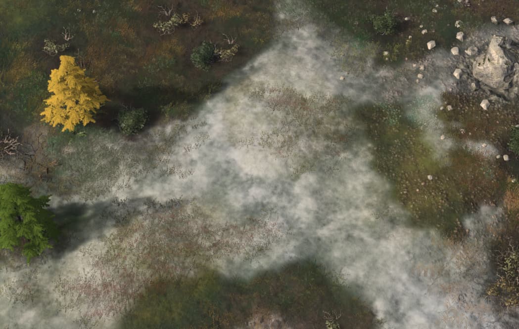
Taiga Winter also has these bits of marshy mud, that from the default angle looks flat and dull.
Yet from another angle, the lighting reveals key details about it, making it look far more visually stimulating.
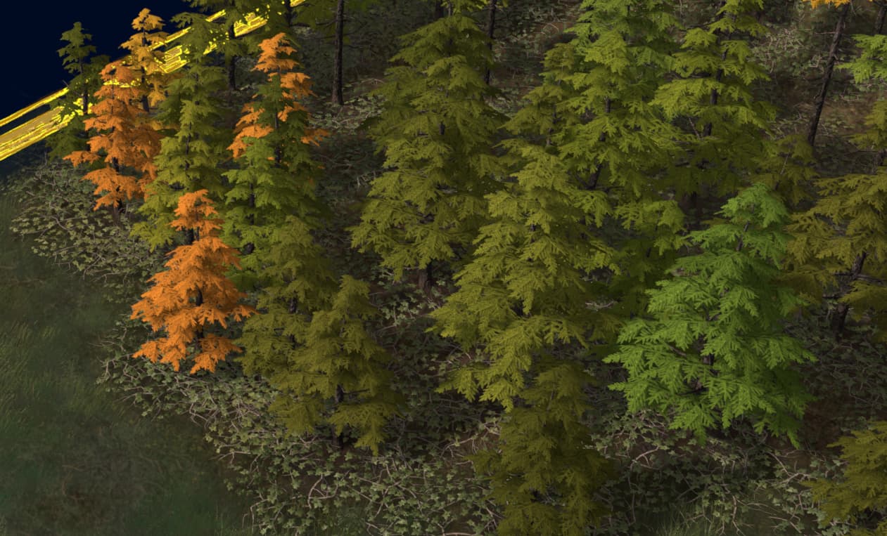
Mind you, this issue is present with Taiga Summer as well.
And I know this is a post about the biome textures, but I’ll throw in two culprits that ruin a lot of the visual appeal for me;
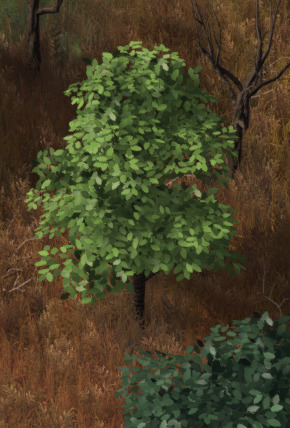
Specimen A.
These trees leaves are so jarring in contrast to everything else in the game. They are far too stylized in comparison to other foliage, ground textures, buildings and units. The blades are too big and fat, making the entire object look like a sappling that throws out the proportions of everything.
Specimen B.
This texture is unfortunately utilized in many areas, but these perfectly shaped lenses that are entirely too big and float randomly off thin air are just a detriment to the game. They appear in the new Mediterranean biome as well, which hurts that biome’s appeal. They just look jarring next to these other new trees, which actually look like a specific type of tree you could name.
Here is hoping the rumours about a graphics DLC is true!