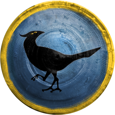
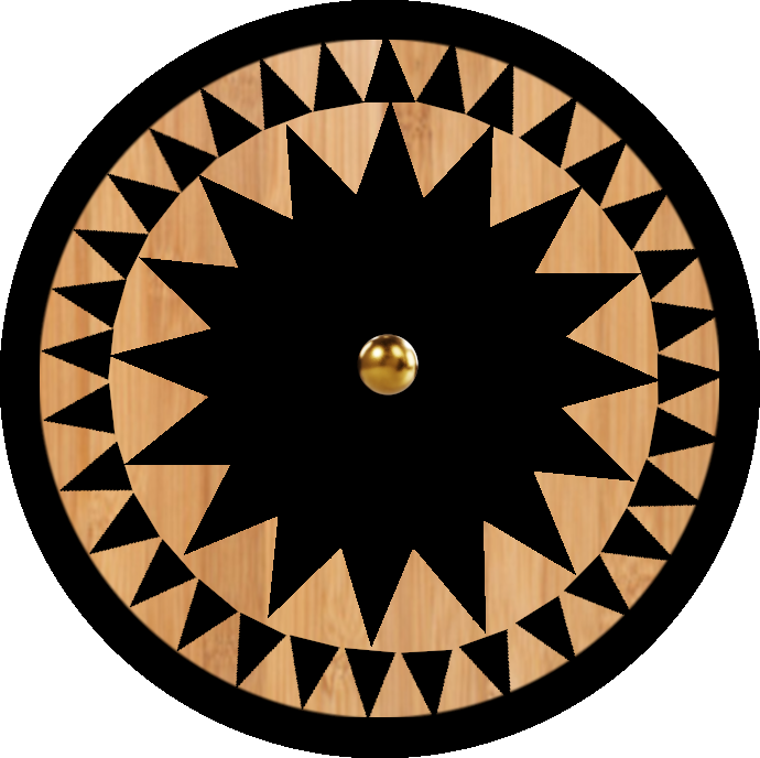
I borrowed a three-legged bird design (with permission) from one of my friends of Wúyuè (name Phiau,  respect), added eyes and rattan shield texture [1], coloured it and made a icon so we from AoE forum at least did some work and don’t look like a whiner who never lifts a finger
[1] The texture of the ratten shield is from Wikimedia - Rattan_Shield_from_Zheng_Chenggong
edit: brightness lowered for better readability
edit 20/04: rotated so that the light direction is consistent with other icons in game
3 Likes
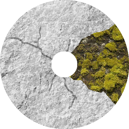
This is miles better than the coats of arms I make. What program did you use?
GIMP at least 20 characters
I use GIMP too, but they never look nearly as good. How do you get the texture to look so professional?
I just always had a hobby of creating images.
Specifically, the texture + brightness images are placed on the bottom layer, and the color layers are on the top with overlay or LCh color modes. This way, color and texture will be easier to handle separately.
Material images for texture + brightness need to be transformed (3D, shear, etc.) to eliminate perspective, and then desaturation + curves are used to get different degrees of brightness and darkness. Then use the brush, clone tool, and doge/burn tool to modify some blemishes. Finally, use the select tool (sometimes u need to invert it) to limit the editing range to some patterns (e.g. a bird in another layer) and then color it with a brush or something, and smudge appropriately after that.
Of course, the actual workflow is more flexible.
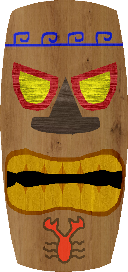
Here are some coats of arms I’ve made using GIMP:
(This one I’m planning to overhaul entirely)
They look childish compared to the ones made by others. Any ideas on how to improve them?
I’ve already explained the workflow. The main issue with your work is that it feels too flat and lacks a sense of depth, mainly due to a lack of strong overall light and shadow contrast on the shields.
Okay, I’ll try to figure out how to improve them at some point.
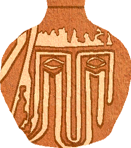
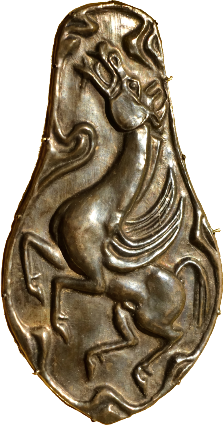
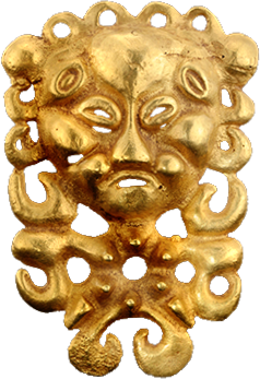
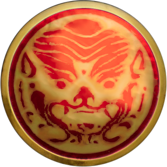
For the request of the author of Renamed 3k mod, I made also some optional icons for Xianbei:
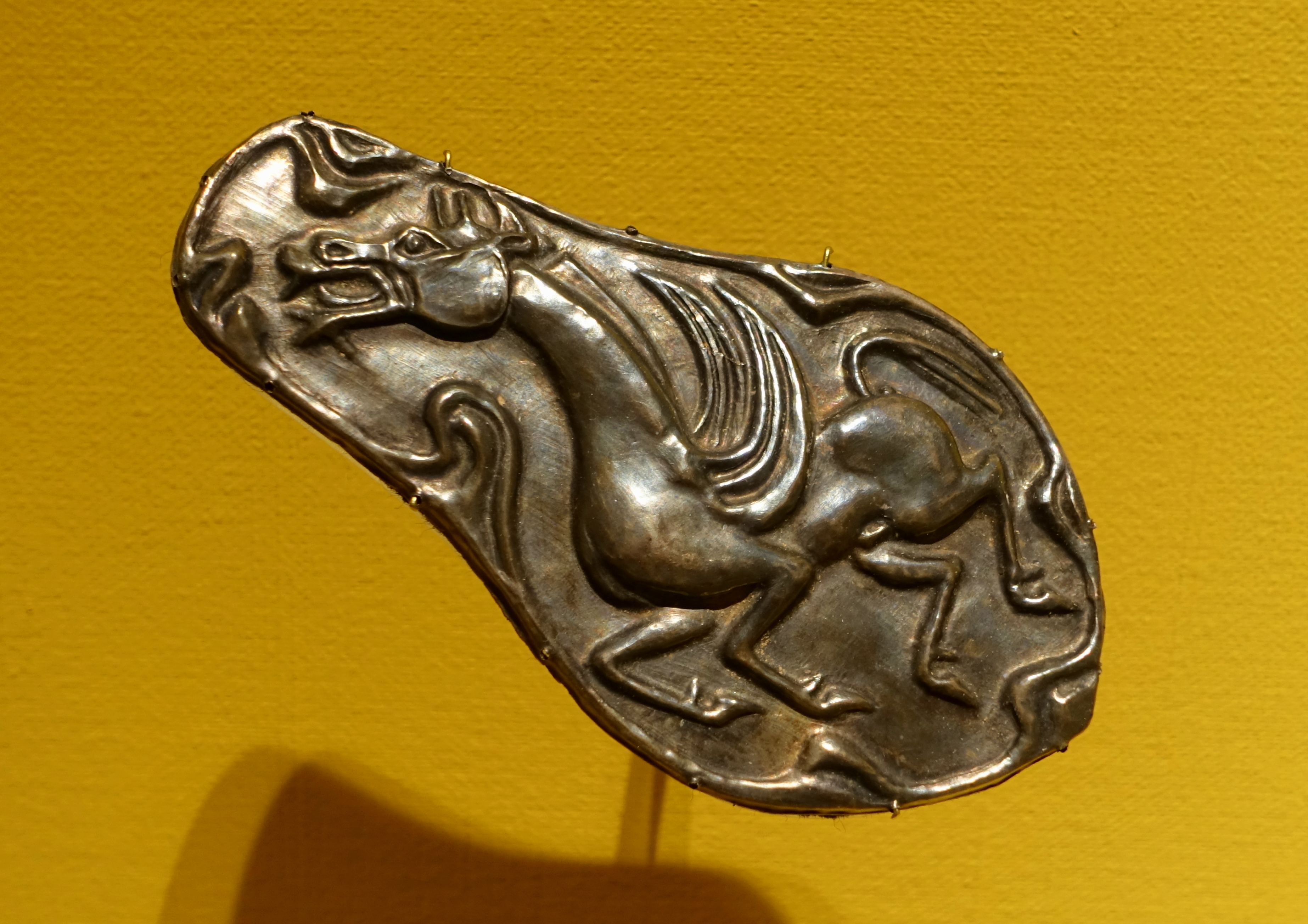
The first one is requested by the mod author referred to a flying horse plaque
The second one is a gold medal with Xianbei human patterns
nothing much changed to those two.
The third one is based on the pattern on a tile of Northen Wèi in this research paper, with the colors referring to the common red and yellow colors of Northern Wèi upper clothes
I thought about stylizing the first two artifacts like the Cumans or Khmer, but this might require me to redraw them, so I didn’t do that for now. I just made some deformation, color adjustment and bright- and darkness contrast adjustment.