Yeah I see what you mean. It does look slightly better. The stones are a bit more detailed and the river has a darker color.
2 Likes
Yes, i seen the 4k stream and the only things which seem Better in some way are terrains and water of River. That Blue Is pretty cool and i would like to see It also for the Sea Maps. I agree with the other points. The textures on units and Buildings are the same that i seen in the stress test.
1 Like
All models sometimes feel like they’re made of plastic. I wish there could be some improvement to shaders in general – I’m not asking for state of the art PBR, but, as seen with the better terrain textures, some things can be mitigated.
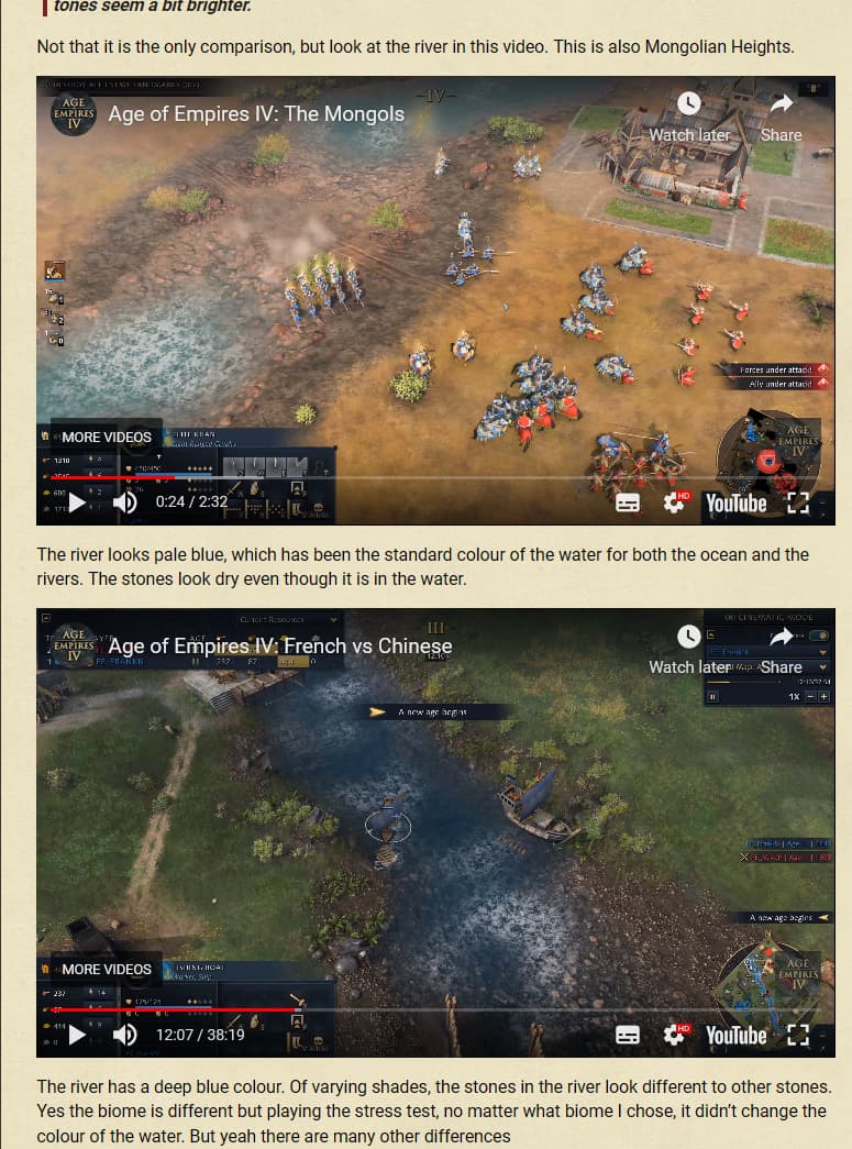
For those claiming there’s been no improvement in the latest videos, I can assure you Mongolian Heights looked nothing like this! The terrain textures and details have definitely been improved a lot!
2 Likes
This isn’t an apples to apples comparison though, as they’re different biomes. I personally think that some biomes look WAY better than others, and this could be one of those examples. 
2 Likes
First and most important: The gameplay looks amazing and I can’t wait to play.
Graphics and animation could be better in some parts and they will probably tweak some stuff after release. The gameplay still keeps the most important and so I am very happy for now.
4 Likes
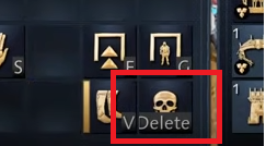
I wonder if the font for “Delete” will ever be shrunk down to fully fit the word in the button without cropping?
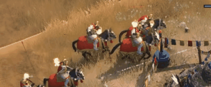
And the arc of these shots is pretty angular. Hope they can get smoothed out soon:
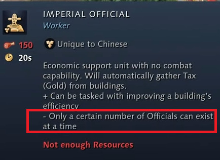
Why is this tool-tip so generic? Shouldn’t the game know exactly how many Imperial Officers can exist at a time? I feel it would be helpful to say the exact #. Possibly even somehow saying, “You have 2 of 5 built,” or similar:
This icon means “Supervise”?  Doesn’t seem intuitive at all to me. Seems like the eye should be the dominant image/silhouette:
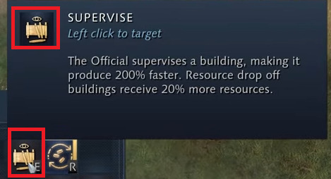
EDIT: Oh, yeah, very much so. I just saw even the icon above the officer doing the supervising has a big eye floating above him:
Currently has dust kick-ups from water tramples rather than splashes:
Really don’t mean for the post to sound negative, if it does. Just giving constructive feedback to try and maybe help bring more polish to the game, and trying to be more concise than normal. I think AoE4 looks pretty good as is! (except zoom and UI mainly could use most work)
6 Likes
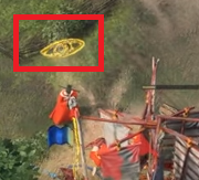
I had to watch liek 5 times to find where the rocks were… its relaly hard to distinguish them
hope they can do it mor elike AoE 3 where the specific hits get broken… and again its so hard to follow those stone swith my eyes
In that video Ic ant stop looking the fire, why does it look so fake and out of place. To be honest this is the worst fire effect I have seen in a game…
3 Likes
when it comes to the official, there is a button on the UI above the resources that shows how many you have, and by clicking it you can select them. not sure we got to see it in the video since it was in spectator mode.
1 Like
Illuminaty confirmed
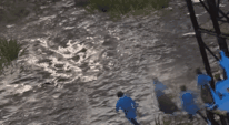
The water looks great except for that awful repetitive water foam texture they plonk on top.
Water foam needs to be more dynamic than that if you want to pull it off and not have it look like crap.
To be fair, getting water foam to actually look good is damn hard - I’ve created many water shaders myself, and the foam is always so tricky to get to look even somewhat nice. - but I’m a hobbyest, and these guys should have professional artists crushing this. Even so, if they can’t get it to look right then just get rid of it. The water looks better without the foam at this stage imo.
2 Likes
Hmm, good point. I feel its current state detracts from the beauty of the water, bases on my limited views of it
It maybe is better suited for just the occasional rocky reef areas of large bodies of water, where it’s in a very localized area. In the river, though, doesn’t work very well at the moment