Some thoughts on the Campaign menu

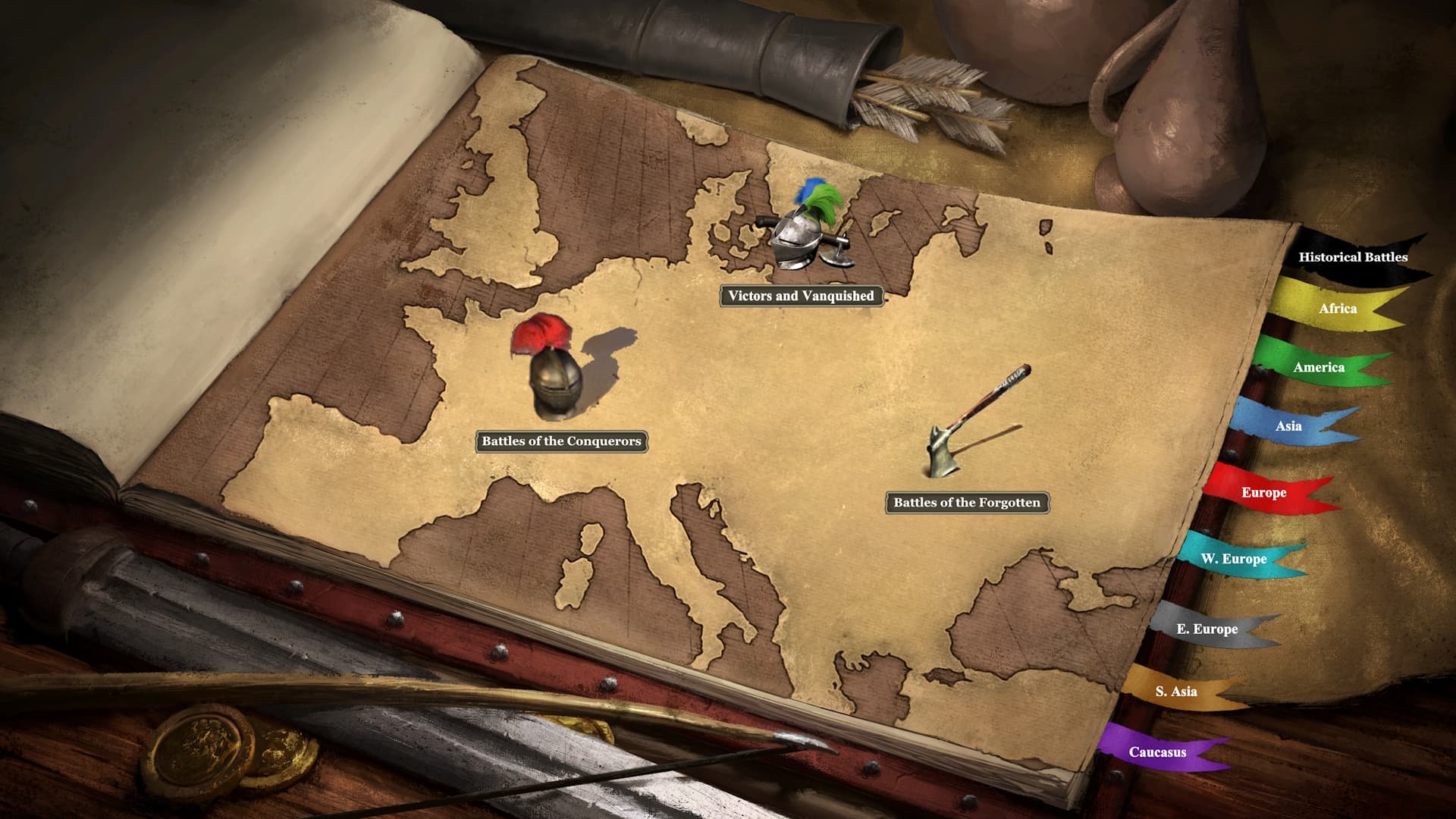
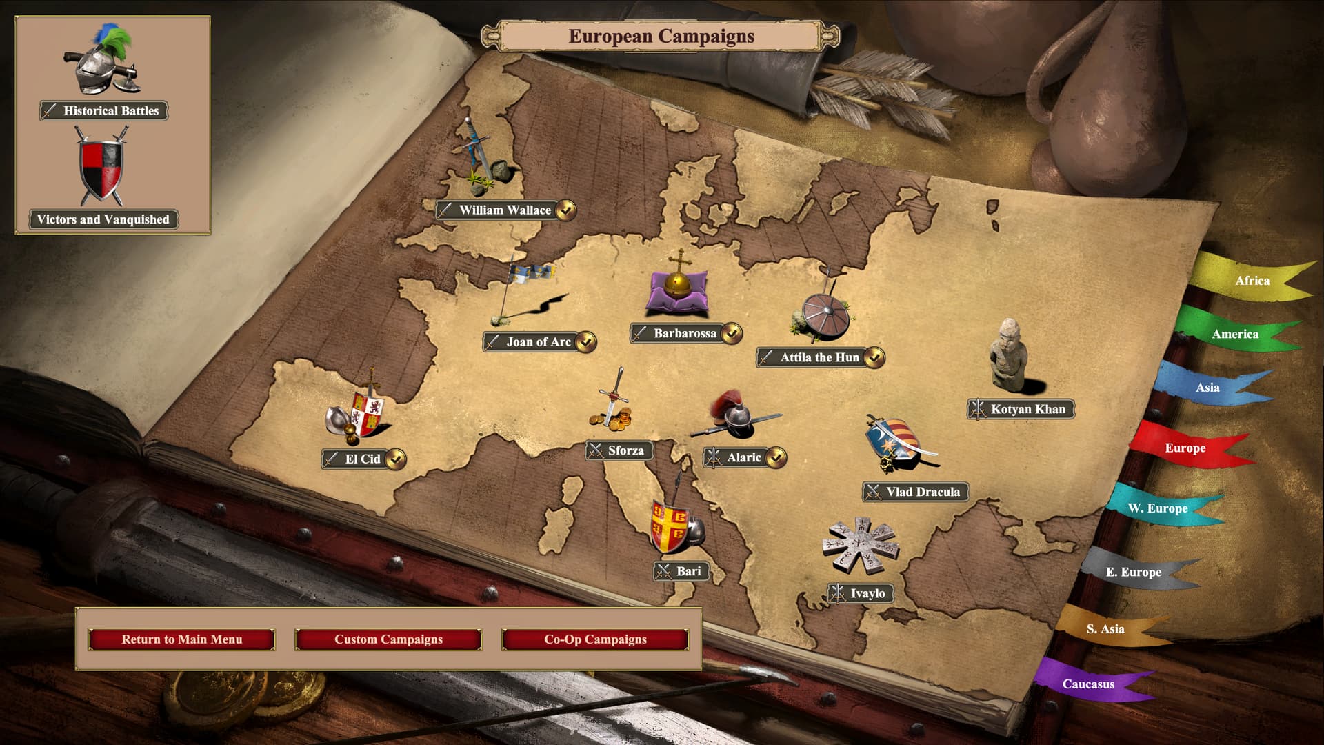
First off, I love the campaign menu in AoE2DE, it feels very immersive as an old book with ribbons marking pages for different geographical regions!

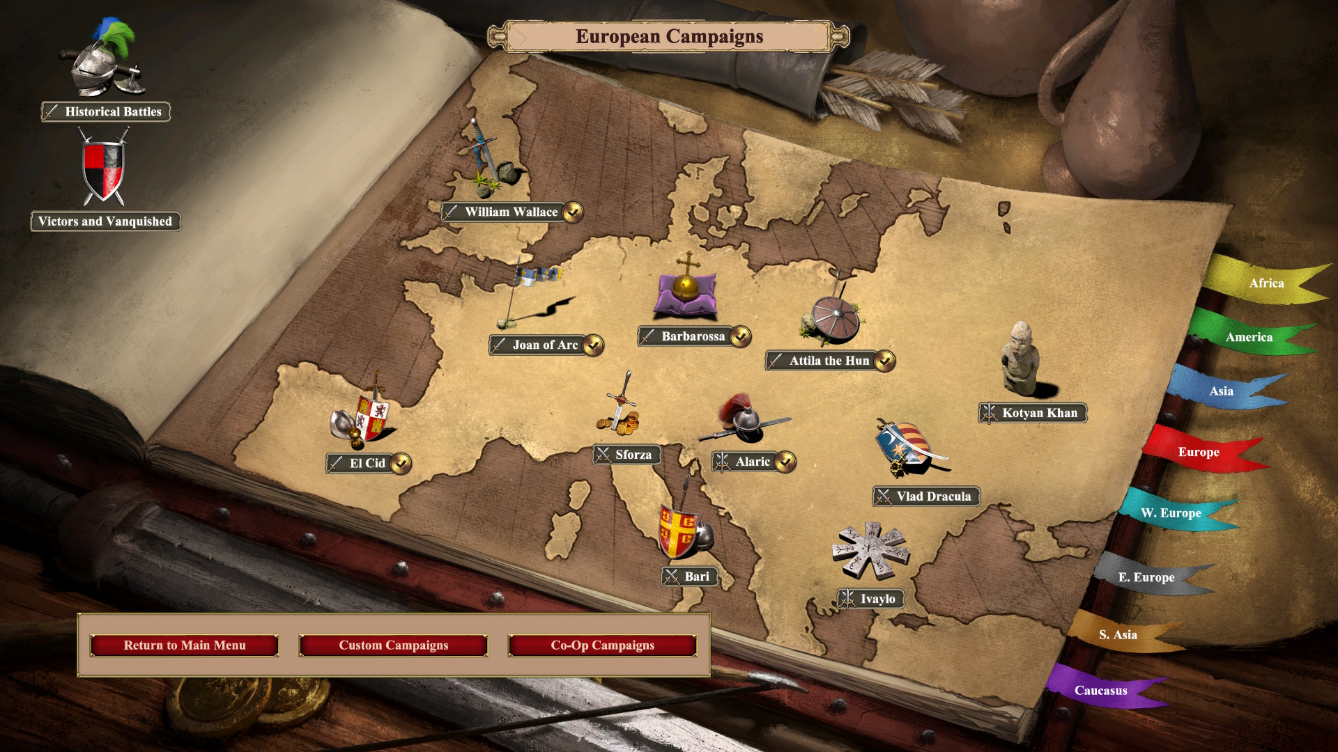
Which leads me to talk about the new position of the single-mission scenario (or battles) icons. Would it not be possible to use ribbons for those as well? I know there are already 8 ribbons and only 8 player colours, but surely it would be ok to cheat and grab 2-3 more colour nuances for additional ribbons, because the current implementation of the battle icons feel a bit lackluster.

if 10-11 ribbons would be too tight on the side, maybe the battle ribbons could go up top or down at the bottom of the book? This would also make sense to separate the campaigns from the single-mission scenarios.

So that’s my idea of a more finesse-y and neatly immersive implementation of where to put the single-mission scenarios (I am aware that using ribbons would remove the need for the icons, and I’ll get to that a bit later!)

My second thought is maybe we should have the Forgotten battles separate from the Conquerors battles?

Originally, they were separate in HD Edition. With Definitive Edition, they were merged; two “campaigns” - The Battles of the Forgotten and the Battles of the Conquerors - became one “campaign” - simply (and perhaps a bit dull compared to before?) “Historical Battles”.

But now there is a new section, “Victors and Vanquished”, separate from “Historical Battles”. Aren’t the events and battles in V&V also historical battles?

Which brings me to a new idea, fusing my previous two thoughts: why not just have one new ribbon for “Historical Battles”? This 9th ribbon would take us to a new page, not one where we have all of the historical battles at once, no. But a page with three icons: Battles of the Conquerors, Battles of the Forgotten, and Victors and Vanquished.

3 icons on one page should be OK. Sure, it’s not as crowded as the Europe page, but we have precedent in Caucasus, S. Asia, E. Europe, W. Europe, and America (and America only has two icons!).

We already have legacy icons for the Battles of the Conquerors and the Battles of the Forgotten. But I want to talk about the icon for Victors and Vanquished. Currently, it’s just the multiplayer shield (from the old main menu). People who don’t use the old main menu mod probably aren’t bothered as much as I am by this. But I feel the icon choice here is also a bit lackluster. But I have an easy solution for a suggestion! Why not take the icon which currently is for “Historical Battles” and use it for V&V while the Battles of the Conquerors and the Battles of the Forgotten get their legacy icons back?

13 Likes

12 Likes

I feel a good solution is pretty simple, and any fan of PC strategy games should have already known about it for 25 years - it took me two seconds to think of when AoE2DE did their main menu revamp in 2020.

Heroes of Might and Magic 3 first did it, and uncountable amounts of later fantasy games copied:

image

Let the book have both vertical & horizontal bookmarks.

In Heroes 3, this was used for different criteria of filters:

  • Horizontal ribbons are spells grouped by “magic schools” (skills required to learn them);
  • Vertical ribbons are spells grouped by usage, remaining spell points, and the “exit” button.

Example of a later game that used this design: Age of Wonders 3.
image

In AoE2DE’s case, all the “special” categories - Basic Learning (William Wallace), Art of War, Historical Battles, and now V&V can be vertical bookmarks.

Taking into account the visual design of the campaign “book”, they don’t have to be shaped like ribbons; they can be paper bookmarks sticking out from its top or bottom.

6 Likes

I think the way it is now is better than Historical Battles being in Africa (or any specific region, for that matter).

What about compared to my suggestion (which was not to put it in Africa or any of the existing regions)?

I know my mockup has Europe underneath, but it doesn’t have to, it could be any custom map, a drawing, or even a blank page:

4 Likes

Could be, but I think it’s almost the same as the way it is now so not much reason to change.

11 I guess we can agree to disagree. That box in the corner is an eyesore and I would much prefer a 9th bookmark for all the historical battles.

What about even just removing the box behind the icons? Do you prefer the bright blank background window?

9 Likes

I personally think any of these would do.

1 Like

The historical battles and Victors and Vanquished always floating there wherever I clicked is annoying.

3 Likes

Can I have that blank campaign screen? It looks a bit less janky than the version I made.

1 Like

You should have it already if you have the game installed, you’ll find it in:
C:\Program Files (x86)\Steam\steamapps\common\AoE2DE\widgetui\textures\campaign\campaign_selection

2 Likes

Aha! There it is.

Thanks for that! The official campaign background looked like it was cloned in certain parts, so I assumed you made it by hand.

1 Like

I hope that exporting the campaign and Historical Battles backgrounds to pngs in a separate folder didn’t mess up my game somehow…

1 Like

Probably not. But if it does you can always easily restore everything by verifying cache integrity in Steam.

1 Like


Thank you for demonstrating that even placing the two icons flat against the background’s dark corner is better than the off-center blank box.

6 Likes

Yes, this would be much better than the new ugly box.

Either looks fine, both look better than the ugly box. I think I prefer it with the map even though the geographical locations of the icons don’t mean anything.

This also looks better.

I’ve never played this game, but this looks really nice. I think AoE2 could do something similar, i.e. a page that is decorative rather than a map – like the decoration on the tech tree and other menu screens, but in the same book as the maps.

3 Likes

A mod should fix it right?

1 Like

I’ve never done a UI mod before but I was wondering this, I might look into it

2 Likes