Based on my own observation and comparision, it is noticed that some units in DE look more disgraceful than the original versios.
For instance:
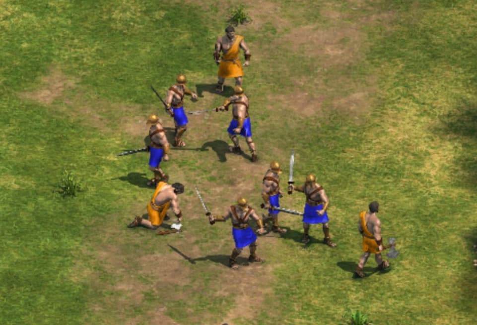
phalanx:
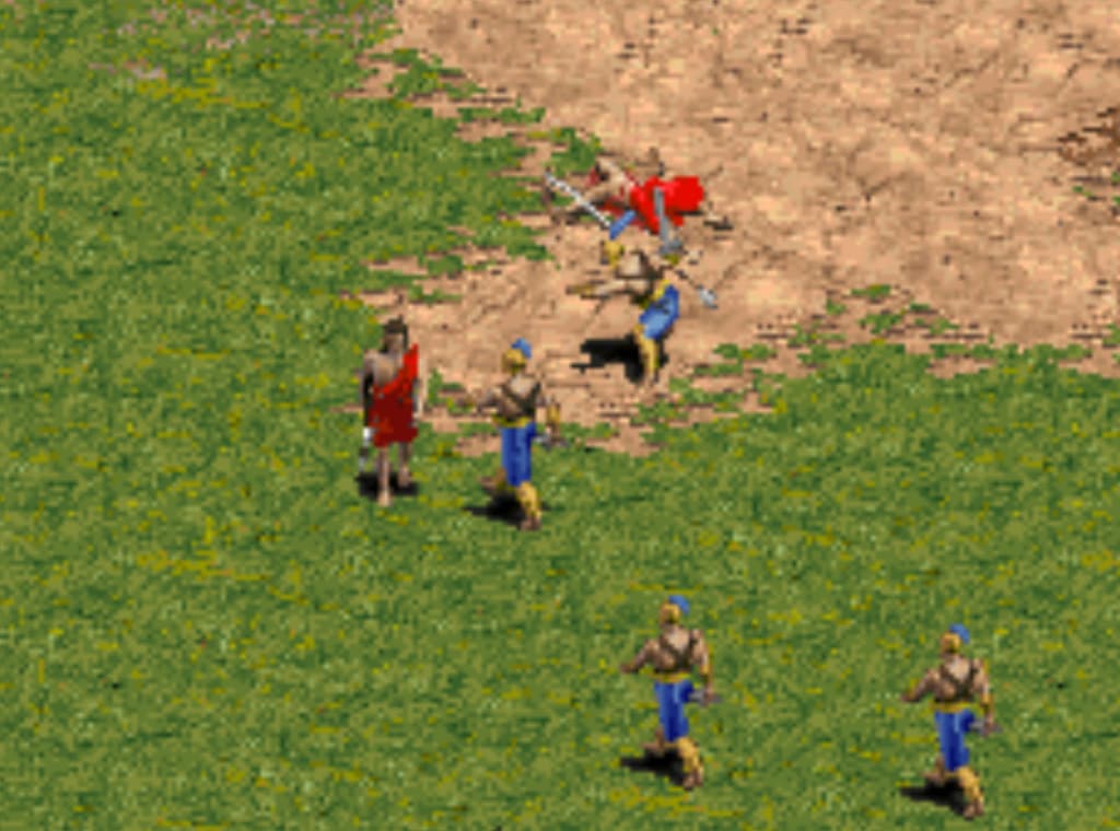
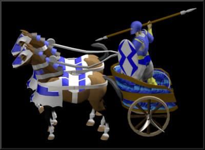
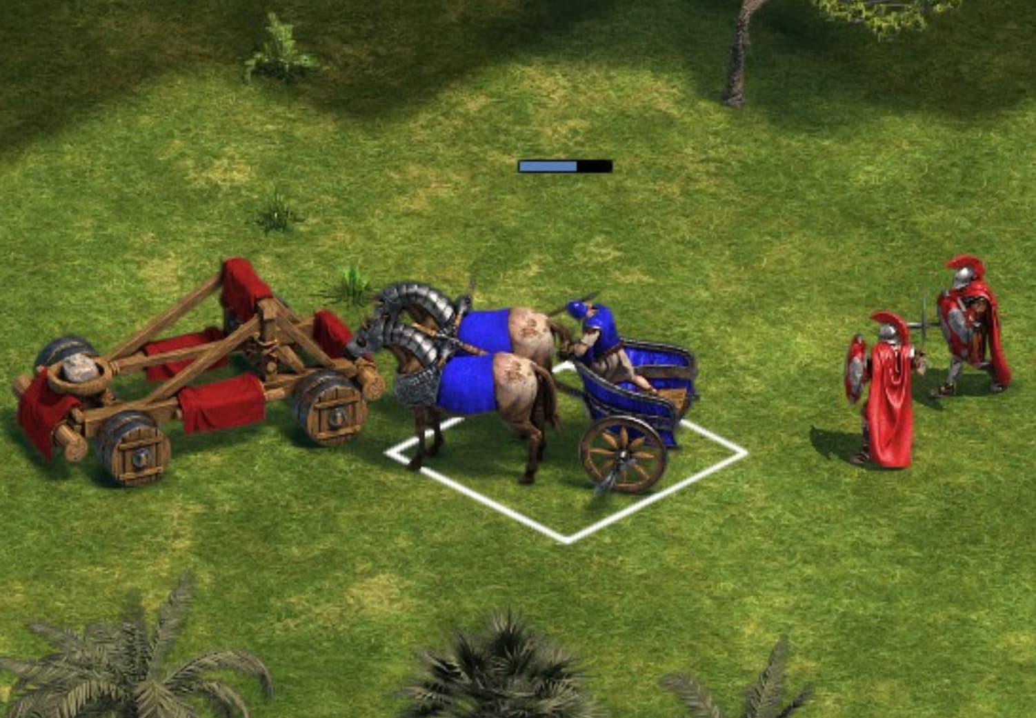
chariot:
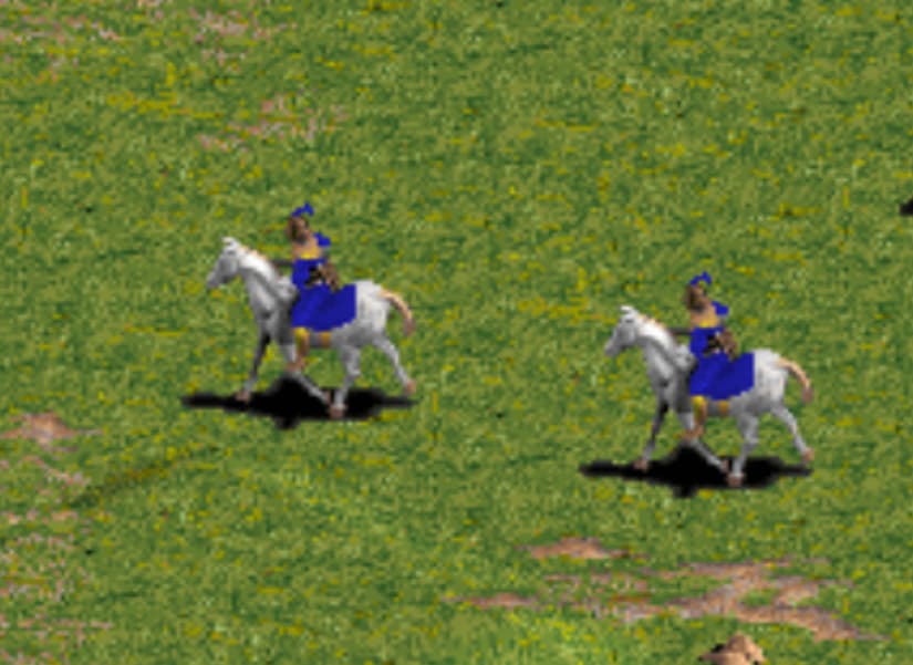
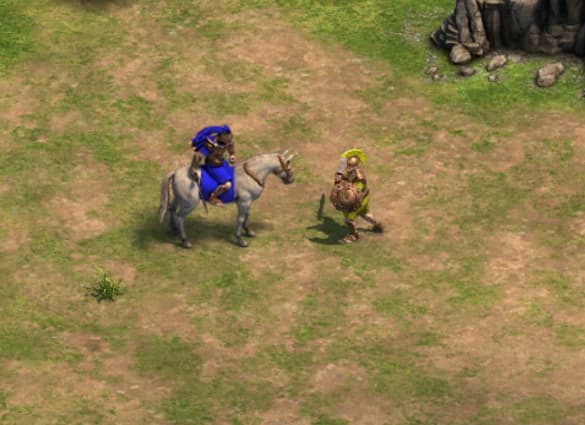
calvary
Based on my own observation and comparision, it is noticed that some units in DE look more disgraceful than the original versios.
For instance:
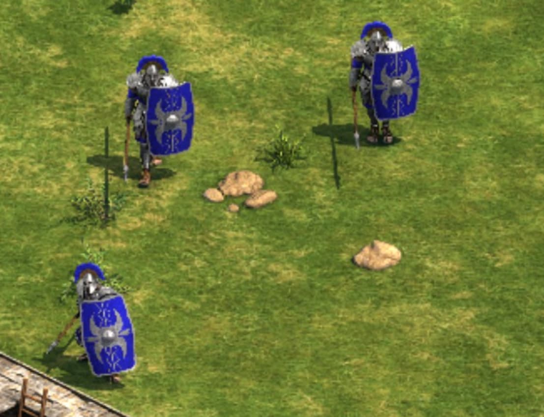
phalanx:
chariot:
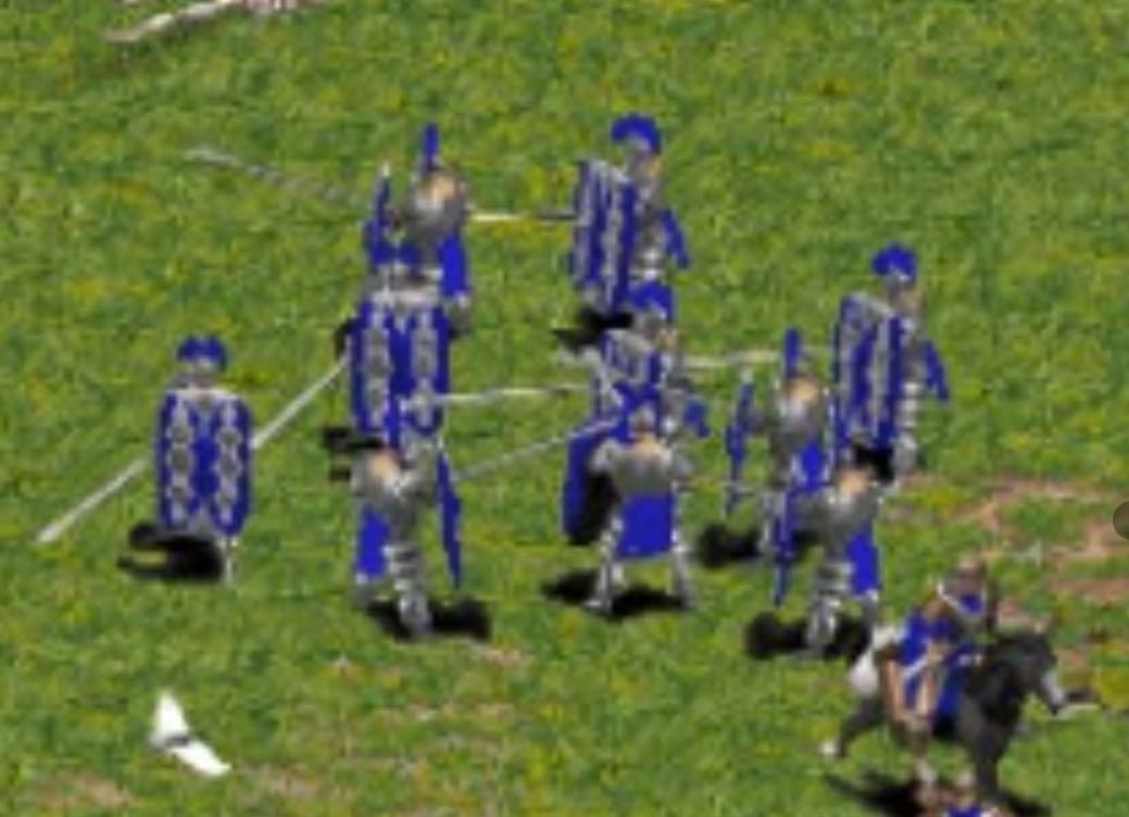
calvary
I can’t agree with that, but of course it’s a subjective perception.
I totally disagree. Old units look ugly and without historical accuracy.
The best of the D.E. are the unit and building redesigns.
I came from the aoe2 forum to say that youre wrong lol the de versions look better
The only unit that looks better to me in the original is Jason. ![]()
What is it specifically that you prefer about the original graphics? To me, the DE unit graphics are just like high definition versions of the originals - they’re all very faithful to the originals, and any design differences are very minor.
Describing either of them as “disgraceful” is pretty weird, to be honest.
Some of the old design have more cartoony and exaggerated features, like the longer hair of axeman.
But I prefer a more historical approach, like the phalanx. Anyways you can always play with old graphics mode.
I disagree. I think the new ones look better.
Much better!
Actually, the DE models are superior to the original versions of the models because the DE models have enhanced quality graphics. In fact, the cheat units in AoE1 DE all need to be given DE models rather than retaining the exact same graphics as vanilla AoE1. For example, we can take the Photon Man model from AoE2 DE and give it to the AoE1 DE Photon Man and other units that use the same model as the Photon Man.
well.
First, the blurry graphic make an illusion of realistic to some degree, because when your eyes didnt see the detail of model, your brain auto generate some element and add into it make you unconscious think it beautiful. Its apply to diablo 2 graphic, and every diablo 2 3D type from that on, and very close to those blurry picture always make you think that person in picture is beautiful than their real counterpart.
Second, DE design make some unit so overdone, spike, plate is down on earth and i didnt like that type.
Third, AOE from AOE 3 era to nowadays have a lot of problem with lightning, its shine, reflected and cartoonist to my eyes. cant take that kind of shining oily model to be serious.
Its the same way all of our broodwar fan always see the original better than broodwar remastered,the blurry do their work and make it real.
Much better!!!
I think the new ones look better.