the ui is this horrid “modern” design that is empty with no fantastic artwork or style. total war warhammer 3 and aoe4 also went with the empty black ui design and this trend needs to stop. some of the icons feel straight from the 2000s rather than something artists can make today. i liked some of the new portraits though
the animations are rough and not up to standards as well. just watching villagers mining or woodcutting feels unreal, its worse than aoe2, aoe3 and aoe4. really just compare villager animations side by side. even some walking/running animations are rough, with some units also seem to be floating over the terrain while moving their feet. they are not impressive. there is also no fun or style in many of these animations, they could use more love. they feel more like the basic and limited original animations than something from 2024.
terrain is also worse than aoe2/3/4. the gold mines mines, street and sand textures, grass and some of the foliage are below the standards set by recent games. the rocks seem to have a plasticy sheen to them, they should not reflect light like that. they are more reflective than the gold mines.
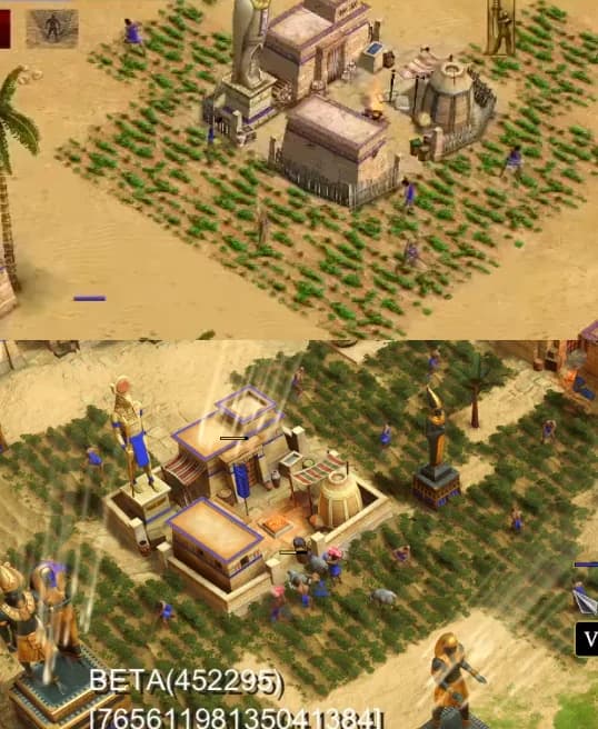
buildings are just terrible, they seem to be just an up textured copy of the originals rather than a vision of what they should look like, and it drags the games visuals down. farms are worse than any other aoe game. town centers also just look bad compared to aoe2/3/4. ditto for other buildings such as towers or houses. the gray/teal roofs of greek buildings are just not it. again compare the farms to other aoe games.
the vfx in many cases are just sad, though the building burning effects are actually ok. illumination from flames is still worse, i cant see them.
also sound design is also a step back from aoe3/aoe4? where is combat music, cheering after winning fights, the contextual voices. the battle sounds also seem worse? idk seems to be a step back than a step forward.
playing a campaign mission in aoe3 and aoe4 and then doing the same in aoem retold is such a whiplash in visual quality. its just worse.
this is more like an up textured 2000 game than a remake of the original with modern visuals. i expected a higher budget visual update atleast on par with aoe3 de if not better. what we got visually is far below that.
5 Likes
the attack delay from animations are also infuriating, causing units to constantly cancel their attacks if their target moves a tiny bit out of range. check out the Son of Osiris(SO) attacks from this video, so many shots are cancelled https://youtu.be/5-v1QPVWvng?t=1151
reminds me of grenadiers and warships from aoe3, would be frustrating to lose a battle because of this. either implement target lock so attacks are not cancelled regardless of delay, or better yet remove attack delay entirely so player skill and micro take precedence. worse than expected results due to your unit cancelling attacks due to the animation delay shouldn’t exist, this doesn’t happen in other competitive rts like starcraft.
also the SO attack animation like many other animations feels dated and lacks soul or style. the SO should be a showcase of mythical might in the setting, one of the most powerful units on battlefield. but the way he is aiming his staff taking his time like some geriatric shooing animals off his lawn feels goofy and basic rather than a moment of awe inspiring power. where is the love from the animators, its not the 2000s anymore.
alot of movement and attack animations need to be redone. the problem of units seemingly floating over terrain with their animations not in sync with the ground is also bigger than i thought for some units.
also the lightning doesn’t feel right. instead of the bright white/blue/purple/violet color shift its this strange light blue/teal color. its fine not to be realistic but can it be touched up a bit more? maybe a violet edge to the vfx and toning down the teal.
https://www.youtube.com/watch?v=sUP5ydeNSsc (real)
https://www.youtube.com/watch?v=Y_0OCZC8TVY (10 year old game)
also can we get more female variants of units? id like the occasional female pharaoh as well.
1 Like
I’ve also started playing free to play mobile games last week to accurately compare games of a similair style, and frankly they are way better than i remember. i could have believed just the animation budget of Wuthering Waves and Zenless Zone Zero are bigger than the entire Retold budget if they weren’t Chinese gambling games. how do they do it, endless wage slaves churned out of diploma mills?
but even then the quality and love shown in the animations and designs are way higher in these supposedly low quality free to play mobile games than this premium flagship title. none of the visual complaints i have about this game shows up except for the cartoonish style and the menus. the texture work, environments, monster designs, the vfx, and especially the animations are gorgeous. they are more pleasant to listen to as well somehow, while the battles in retold are kind of irritating and flat.
this is a premium title we pay money for upfront, the visual quality should match those free to play mobile games at the very least regardless if its cartoonish or not. in-fact they should be better. instead it looks dated and worse than aoe games released years earlier.
hello,
I think it would be interesting to have an audio system like in AOE 4, with the sound of footsteps in the arm and noise of horses’ hooves which become a much duller sound with an army of cav
with a sound direction and distance system like on AOE 4 with the sounds of pac, combat, minesweeping, speech… and I think that this would enormously increase the immersion of the game.
by what I hear that the sound has been redone but I have the impression that the sound system is the same as at the time and that we should have a system with distance and direction worthy of today (example in aom there are more mining sounds if it does not appear on the screen)
I’m not talking about changing them but changing the sound system to have effects and add footsteps sounds which changes depending on the size of the army
1 Like
at the least could you copy the the visuals and animations of aoe4 farms? currently farms and their animations are the worst in the series.
just look at how beautiful the aoe4 farms and animations are
they literally harvest the produce as they grow, its a joy to watch. you could argue textures and detail can be higher but overall they are easily the best in the series. so how did we go from that to this?
all the aoe4 villager animations are straight up better when it should be the opposite. aom retold should have been a showcase of all the skill and experience the animators gained from doing the de/aoe4 games. instead somehow we went backwards?
at least add some produce/color to contrast with the green base of the farms and have the villagers harvest them.
also the lack of combat animations for units are a straight up mystery. there are fewer of them than in the original game 2 decades ago. Age Of Empires 3 Caroleans have more melee and ranged animations than the entire Greek infantry roster, and they are better quality animations as well. how is that possible? why do i have to dial back my expectations based on previous games and the original rather looking forwards to more?
In some areas terrain is still woefully bad. Gaia lush also needs more colored detail to avoid having the map be this bright neon green. maybe add some flowers and fruits? a darker, more full colored creep that is less shiny with bits of branches and roots as well?
this seems like a very rough draft of what lush should be rather than a final product. i like the idea, the execution is not there yet. please iterate on it some more before shipping it like this.
1 Like
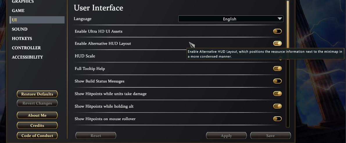
In the stress test you have a new option that put resources at the bottom right near the mini map. I am happy for this.
2 Likes
I agree with some your post. AoE 4 was actually developed by a different studio than Retold and the other AoE remasters. However, the visuals in AoE 4 were not well received by the AoE community. It has received heavy criticism throughout it’s lifespan over this. The desatured look to AoE 4 was a huge downer, and AoM Retold could definitely use more saturation and brighter colors. I agree though that the animations and effects in AoE 4 are more impressive for the most part than Retold.
The terrain in Retold needs a lot of changes. The farms are way too dark and obscure villagers walking across them. You can’t see any vegetables or the soil at all. That wasn’t the case in the original AoM. Why can’t we just have the colors and patterns of the original farms at least?
Many units, especially military units such as hoplites are missing animations. Overall the animations in Retold could be enhanced. The grass in Retold often looks like it’s spray painted onto the terrain. The Gaia Lush is a good example of that.
Maps like Savannah and Watering Hole needs serious visual updates just for clarity sake. Many of the maps are too desaturated and lacking color. It’s good that the latest beta made the colors brighter, but the lime green Gaia lush isn’t what was missing. Take a loot at the color of the farms in the original game above. Wee need grass, trees, and more textures using bright greens like that.
forgot to mention this before, most of the buildings have grown on me. outside of a few exceptions like early tc/towers and farms i don’t mind many of the buildings or the gray roofs as much as i did initially. most unit models are also an upgrade from before and are well done.
if the terrain and animations are improved i think most of the visual complaints would disappear.
still have some nitpicks like the Pharaoh/SO not showing sculpted pects and using staffs rather than the flail & crook to avoid looking like decrepit aged wizards, and the lack of female variants. or Nidhogg just being a massive disappointment all around.
the ui, portraits, sound system and heavily covered statues still need help though.
100% the Terrain and Animations are the biggest flaws with the visuals. Sure, some of the god portraits are miserable and possibly AI assisted, but it doesn’t affect the gameplay. Some of the terrain is so problematic.
Agree 100 percent with op.
Commenting on this because I have a fw other threads where people keep saying the majority likes the graphics.
I think the farms are way more realistic. If you’ve ever seen arable farming, you’ll know that the thicker the rows of green, the more fruitful the harvest. In the original, seeing how sparse the green rows were, and the fact that you could actually see some vegetables lying around atop the soil, makes it look like a famine is inbound…
As said above though, AOE4 farms are superior and have would be neat if they were implemented.
I’m fine with the graphics and visuals personally. But I will agree with the general consensus about the animations. Some units have less than Legacy, and for others they feel kind of janky…it’s hard to describe but not as smooth as Legacy? Do you get what I mean?
So many crybabies its pathetic
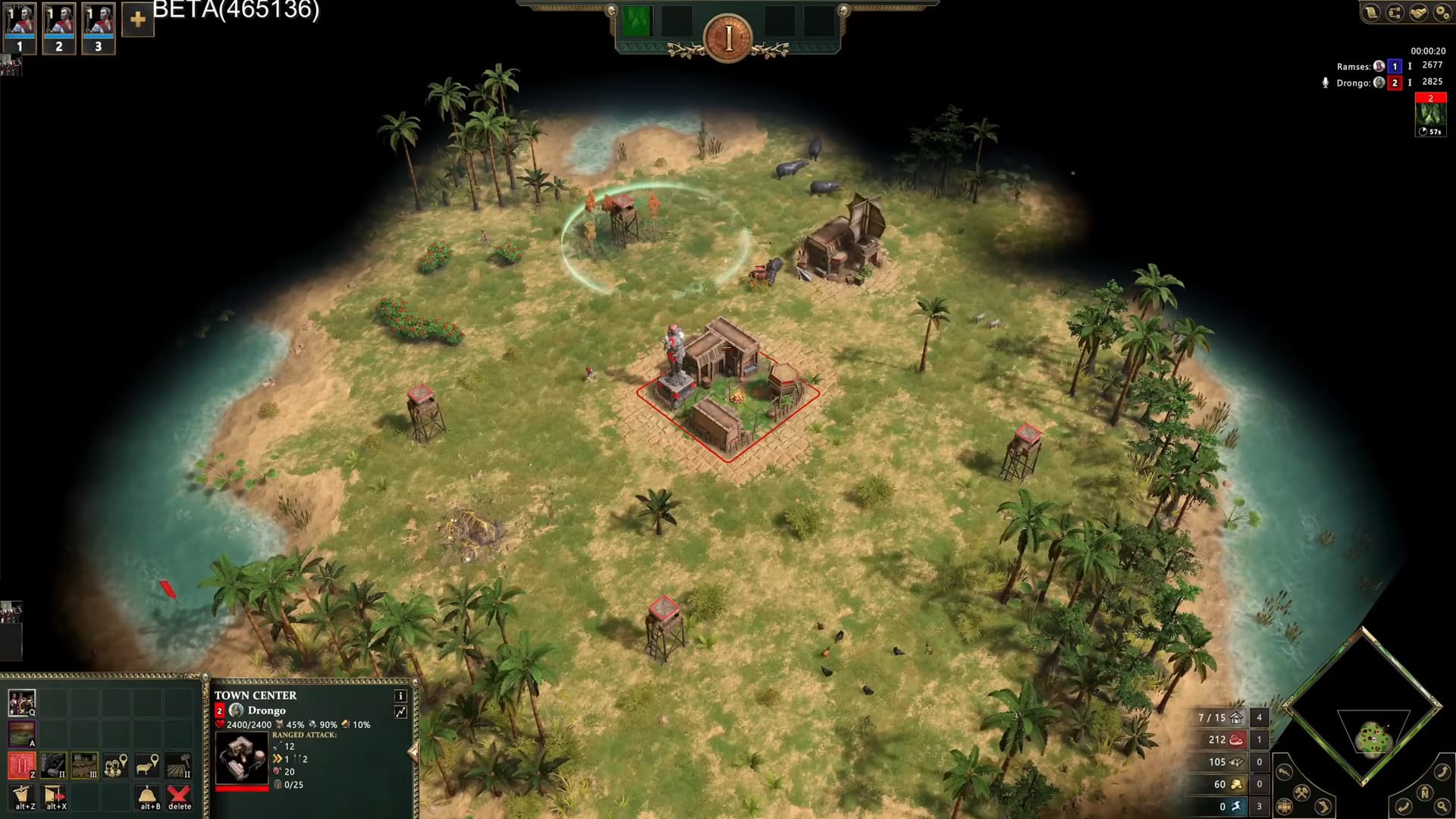
Clearly the default UI in Age of Mythology Retold was influenced by Age of Empires II Definitive Edition with similar placements of stuff. Also some of the crappy Age of Empires IV having icon in gold is also present

I am happy to have that UI option that was in the stress test because it’s similar to one of Age of Empires III Definitive Edition UI options I can’t stress enough how happy this makes me.
They should have the default Age of Mythology Retold UI be based on the UI from Age of Mythology The Titans.
thanks for the comparisons.
i honestly have to say i’d personally like to see the window with the buildings next to the mini map in the right corner and the ressources in the left corner. between there should be nothing so there is similar free space like in the current version.
I personally like the AoMR default UI layout and visuals the most. It combines slight mythological elements and small hints to the major god with a clean looking UI. I think it hits the perfect balance.
I play AoE3DE with the AoE2 layout that has the resource on top, I’m just too used to that by now. Kinda annoys me that AoE4 doesn’t have any options.
There are a few things I don’t like like the unit stats sometimes force you to scroll down to see all of it. AoE3DE shows like 3x as many stats and doesn’t have that issue.
The old UIs don’t really work anymore since they were made for 4:3 or even 5:4 monitors and now most have 16:9 or even 21:9 monitors making it a massive waste of space to fill the whole lower part of the screen with UI.
I agree about the AOE4 gold icons. I think they’re a bit soulless.
Especially when they sit next to the beautiful new technology icons. Those images are very detailed and very cool. I feel the could redo those few times with images to match the rest.
Same with the idle banners.
1 Like
I think it’s good that they look different then the Building/Unit/Technology icons so you can instantly tell what’s an action and what is not.