[SUGGESTION] Better UI for Event Challenges to Reduce Confusion

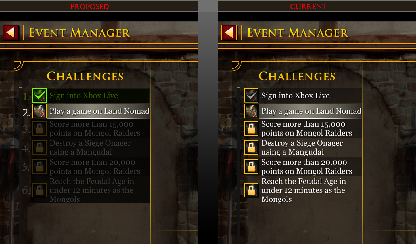
My proposed version on LEFT. How game currently is on RIGHT.

The UI is pretty confusing for challenges. There are ways to make the info a lot more intuitive to convey the meaning/intent.

I made a mockup of what would work pretty well for me, visually. This would be a step in the right direction at least, imo.

  • Intuitively and more efficiently gives more clarity/meaning of each list item
  • Helps show what is/is not possible at any given moment simply by adding numbers and using colors
  • Clearly shows what challenges I’ve already done (green), what step I’m on (white), and what is upcoming (gray)

By doing it this way, the locked icons more clearly mean that the event is currently not possible because you haven’t completed earlier steps. As well, it clarifies that the lock does NOT mean to go do it so you can unlock it! (Which is one erroneous way it can easily be interpreted at present.) Instead, with the proposed changes, it more clearly means, “Don’t do it because you haven’t done earlier steps yet!” (and/or it’s not time yet)

The font color scheme could be used on the detail panels of each item, too, for consistency.

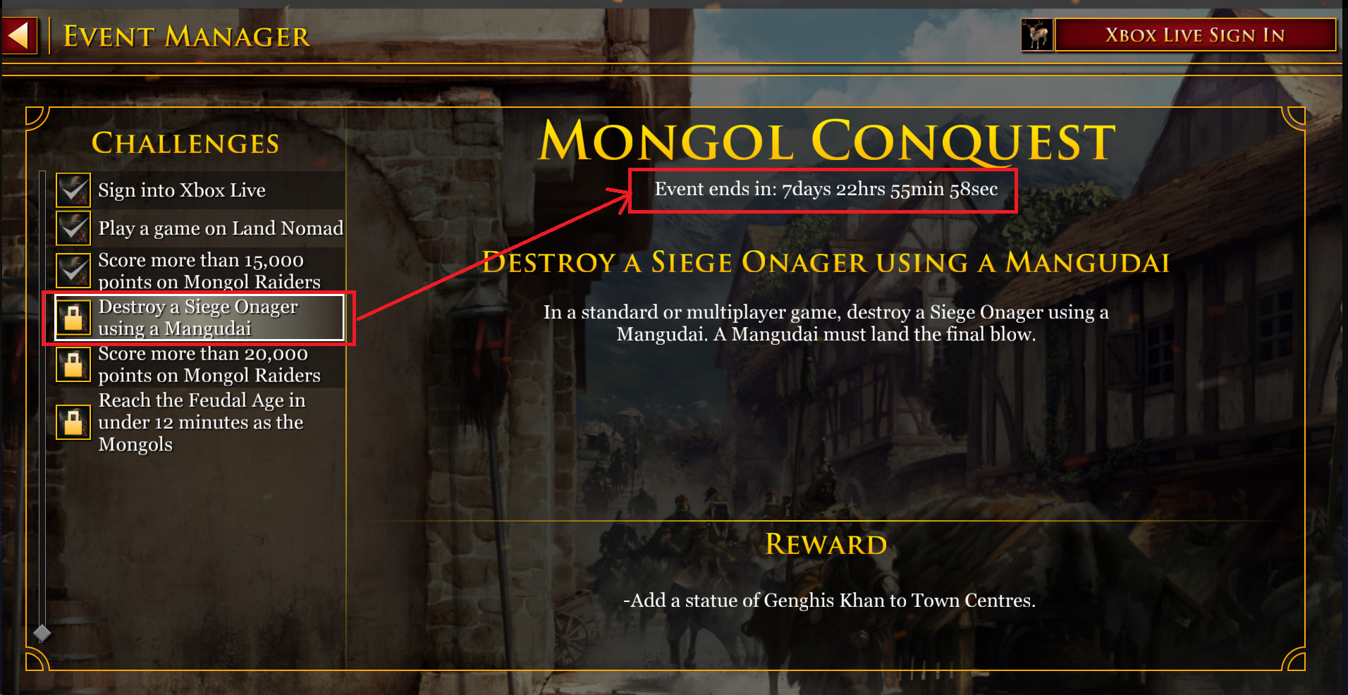
And on top of these quick visual color/number changes, it would help to also add some quick wording when you click a locked item, like: “LOCKED! Preceding challenges must be completed first.” And, “Challenge available in: 4hrs 2min 32sec”.

  • The latter could, arguably, be better placed next to the list item in a smallish font without having to actually click the challenge first. It’s strange that the locked items just have an EVENT countdown clock (“Event ends in: 10 days 23hrs 59min 19sec”)
 but doesn’t have a countdown timer for the actual challenge you clicked.
6 Likes

i mean there is a big lock icon on the other challenges, i’m not sure how that is confusing.

If you read my post, I explain how a lock can be interpreted as two different things. People see things differently, and judging by all the confusion expressed by several players over the months, one thing devs could do to reduce confusion is to make things more visually intuitive.

except that isn’t the truth. a lock has always meant something is locked.

And how do you sometimes unlock something in a game, like, say, a locked achievement? You play the scenario the locked achievement describes. You’re not looking at the complete picture

it’s not locked, its unearned?

and you follow the instructions provided, which literally in game tells you to do them in order (they are numbered for a reason) and there is literally a countdown when you get done with one that tells you next challenge is available in x time.

I’m glad your thoughts, somewhat by chance and somewhat by experience, happened to go to the correct side of each 50/50 decision gate 100% of the time and are able to enlighten us all. I had no idea what a lock was or what they might symbolize in an icon format. If we could all be so lucky, smart, and experienced, it’s clear that no company would need to spend any money at all on providing decent UI/UX design. Utopia! /sarcasm

You sure you’re not looking at my mockup? There are no numbers on the list in-game. I’m glad my mockup could help clarify your point :slight_smile:

I have a hunch you might be trolling me by now on purpose?.. if so, well played! But if not, then as I also explained above, the countdown clock on the challenges page tells you when the entire multi-challenge event ends. Wouldn’t it be slightly more appropriate to have, or also have, a countdown clock there to let you know when the next challenge starts? Why should that clock only be on the Main Menu; on a page you’re not looking at when you’re looking at the challenges?

If a person is on the challenges page and sees the event countdown, they might think, “Ahh, I still have 6 days to complete/unlock these challenges. Here I go!” (And then proceeds to manually set up the challenge’s scenario, waste an hour of their life to play that match, and then find out they didn’t unlock the padlock because it’s too early.) Yep, really great user experience. (Someone on a bug thread already did this
 three times, iirc.) If only they had the wisdom and luck to choose the correct side of the 50/50 decision gate that the UI didn’t make perfectly clear to them.

Oh well, I can sense you’re pretty set in your ways on this, and unwilling or unable to see the nuances. That’s fine. Just know that other people do see nuances, and also don’t share the same life experiences, education, time, attention span, button clicks, or whatever might cause a different world view on this than you. Those nuances can make things a little less than perfectly clear for some.

At this point, let’s let the devs decide if it’s worth their while. Either they keep getting frustrated customers on this (not me, as I know the deal by now; just like you)
 or they try to improve the UI to make things more clear. It’s not up to you or I. But I’m more than willing to give a suggestion that might help the situation. You aren’t one of the customers who has a problem, but do you see the feedback of others saying they have an issue? Is your solution to just let that feedback roll in every time there is an event and quietly mock them for, apparently, not knowing what a lock is?

still lock icons. sorry you can’t figure out what a lock icon means. /sarcasm.

no, i just can’t help but be shocked by people who can’t follow simple instructions. what happens after you complete a challenge? it literally tells you when the next challenge unlocks!

except it says “next challenge available” with the countdown.

i may be set in my ways, but at least i can read and follow simple instructions, which apparently others have trouble with.

Not for me. Last night it only showed the clock for when the entire event ends, days from now. The challenge countdown was only visible on the main menu.

You said they were numbered, tho. They’re not. I numbered them in my mockup.

Well darn those other people who can’t read or follow simple instructions! They should not be given anything that might help them, apparently?

so you’re not paying attention then? because if your in the menu for the challenges, it literally still has it locked until it unlocks.

true, but they are still locked until they unlock.

wow, we really have reached a new low if we have to make it even easier because people can’t be bothered to do something as simple as reading and following simple instructions.

how about holding people to a standard instead of holding there hand every step of the way. encouraging people to learn from their mistakes is not a bad thing.

1 Like

How much lock could a padlock lock if a padlock could lock lock? :smiley:

Many things in life, sure. But this is a video game and a piece of software. An aim of most programs is to have good user interface requiring as little cognitive effort and human processing power as possible
 or at least make a valiant effort to do so. It’s not like we’re being graded for how good we are at bringing all the disparate AoE event pieces together in a cohesive fashion.

Unless we will receive an exam at the end of events, I think it’s a nice gesture when software developers make good UI decisions, and go the extra mile to really nail it :slight_smile:

I also have a suggestion. Get rid of the locks entirely, and let people choose when and which achievements they want to do during the event.

Presuming they decide not to remove locking the achievements, then I think your UI changes are nice.

I understand that it could be read this way. As in if you thought the lock just meant, “this is a challenge you haven’t completed yet” as opposed to “this isn’t available yet”. It’s a reasonable mixup where you’re thinking the content is locked (which it is) but also the achievement is locked (time locked and by previous achievements) and you’re unlocking the ability to do the challenge. (I really hate this system)

1 Like

They want people to run the game in separate 24 hour windows to boost the daily player number stats.

I can see an argument that this is actually a good thing for all players, because if the game looks more popular in the Steam stats, I’d expect that to attract more players to play the game, and multiplayer games thrive on player numbers.

1 Like

Yeah, hopefully this is possible at some point, very true. I’ve never know the exact reason why, but it sounds like @breeminator probably nailed it. I had just figured it was to try and keep players engaged for a prolonged length of time. I didn’t know daily player number stats was a thing on Steam.

I guess one other reason might be to not overload their servers all at once with a mad rush of players doing everything on the first day or two? Maybe; not sure.

Yep, you got it!

MatCauthon3 - How is it helpful information, again, to show me when the Event ends while on the Challenges screen, instead of when the Challenge unlocks? It’s just potentially misleading, as described above; and encourages some players (as seen in other threads) to go try and ‘unlock the challenge they haven’t completed yet’ now before the Event ends, rather than wait for the Challenge to unlock.

I just completed the Mongol Raider challenge and now have to wait a few hours for the Siege Onager challenge to unlock; but that’s only mentioned on the Main Menu.

2 Likes