Hi everyone, I’d like to share some honest thoughts on the landmark designs for the Zhu Xi’s Legacy (ZXL) civ in Age of Empires IV.
First, big respect to the devs for redrawing all six landmarks – that’s a lot of work. However, visually they feel a bit “cut-and-paste” – many details look like reused parts from the original Chinese civ’s university, pagoda, and monastery, just rearranged. The colors are also too bright and saturated, which doesn’t match the real ancient buildings in China. In game, it breaks the immersion.
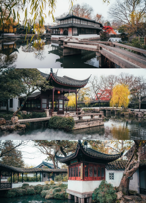
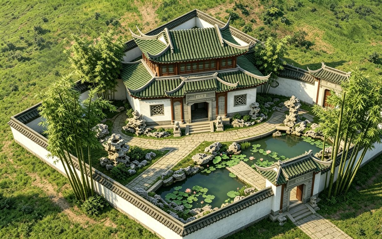
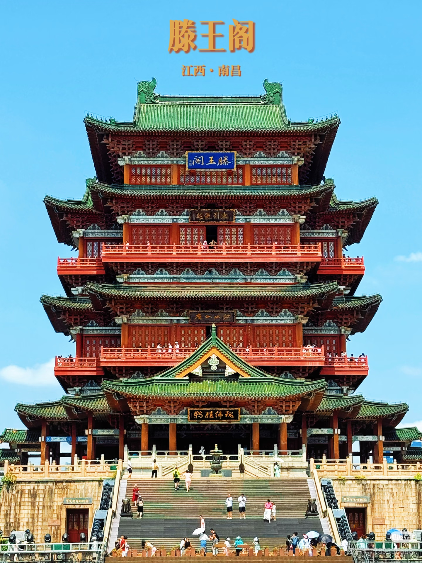
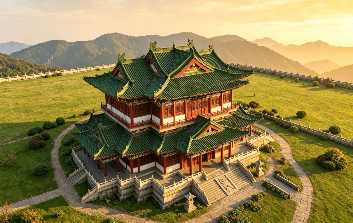
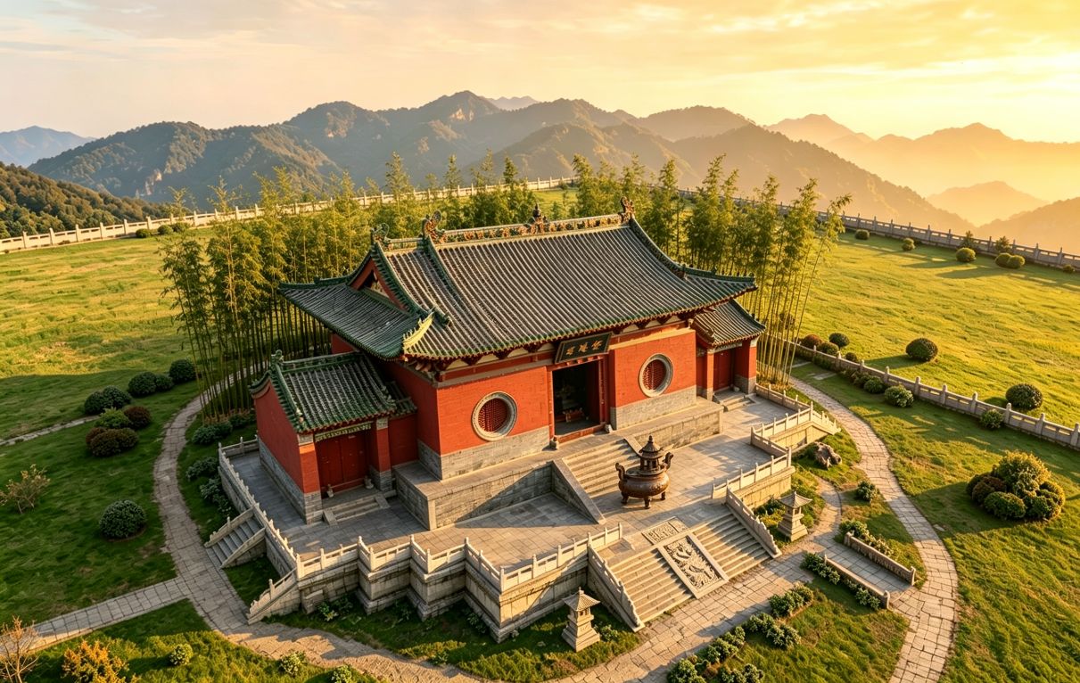
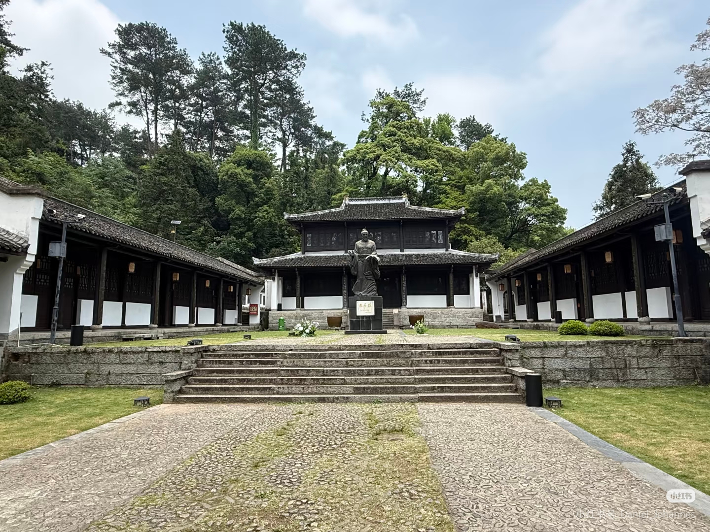
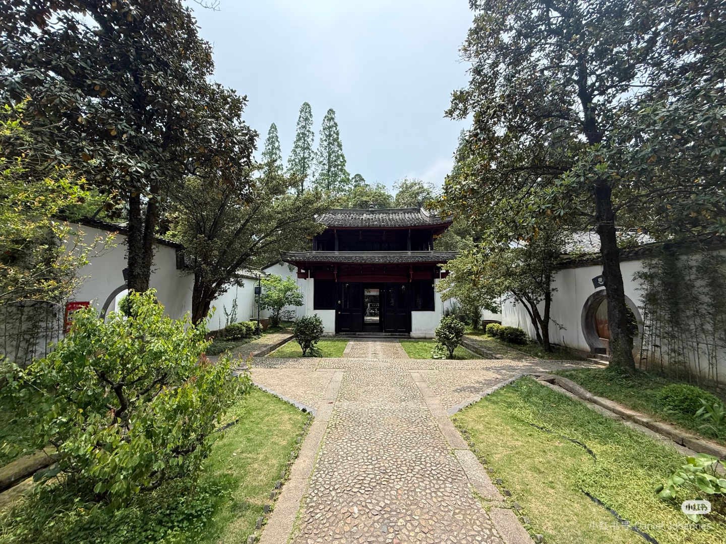
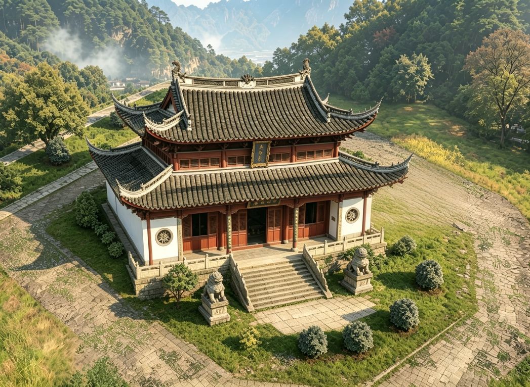
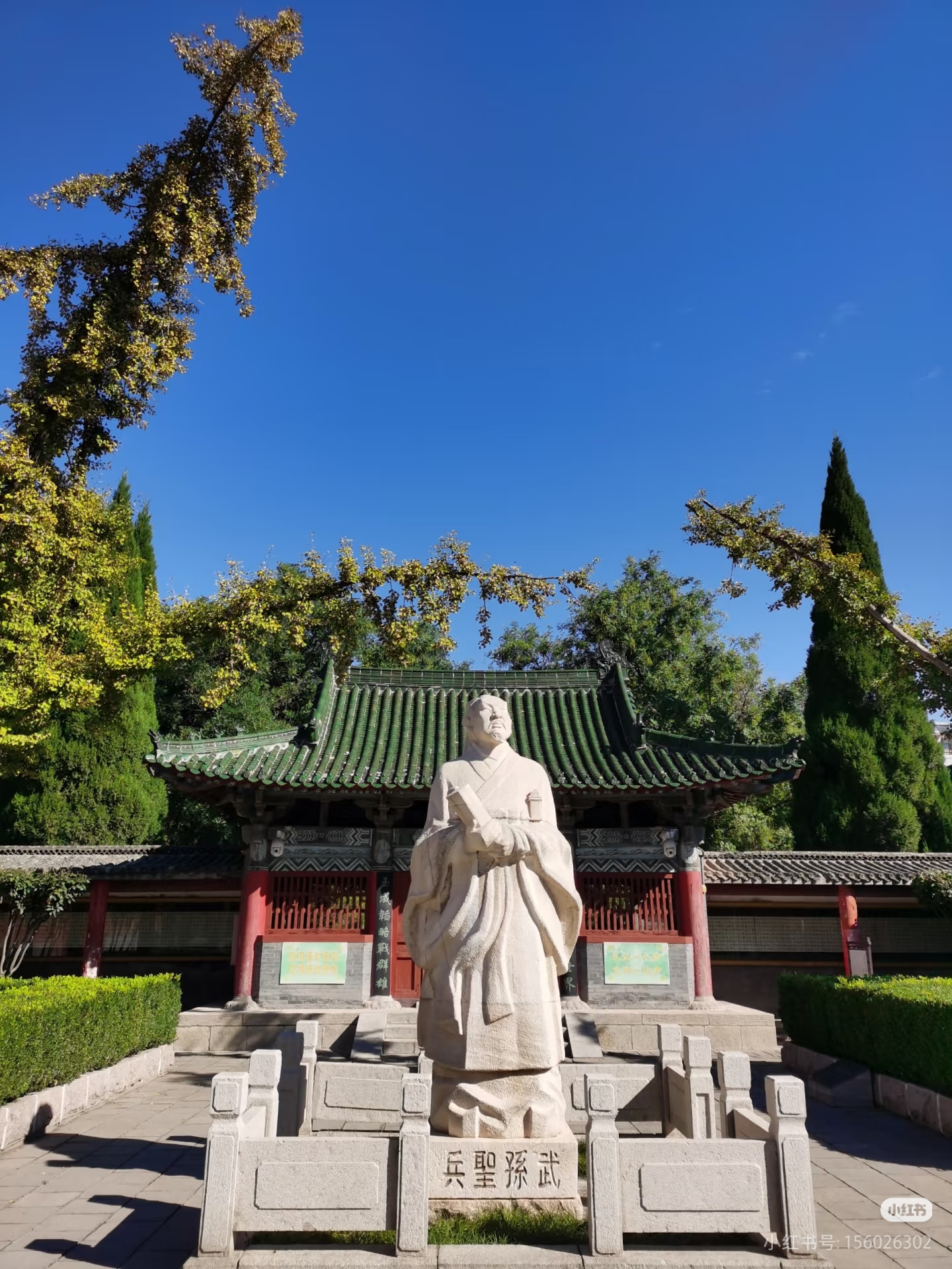
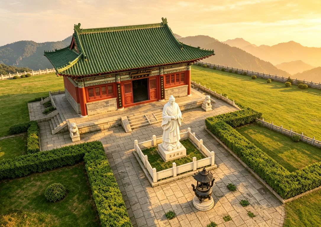
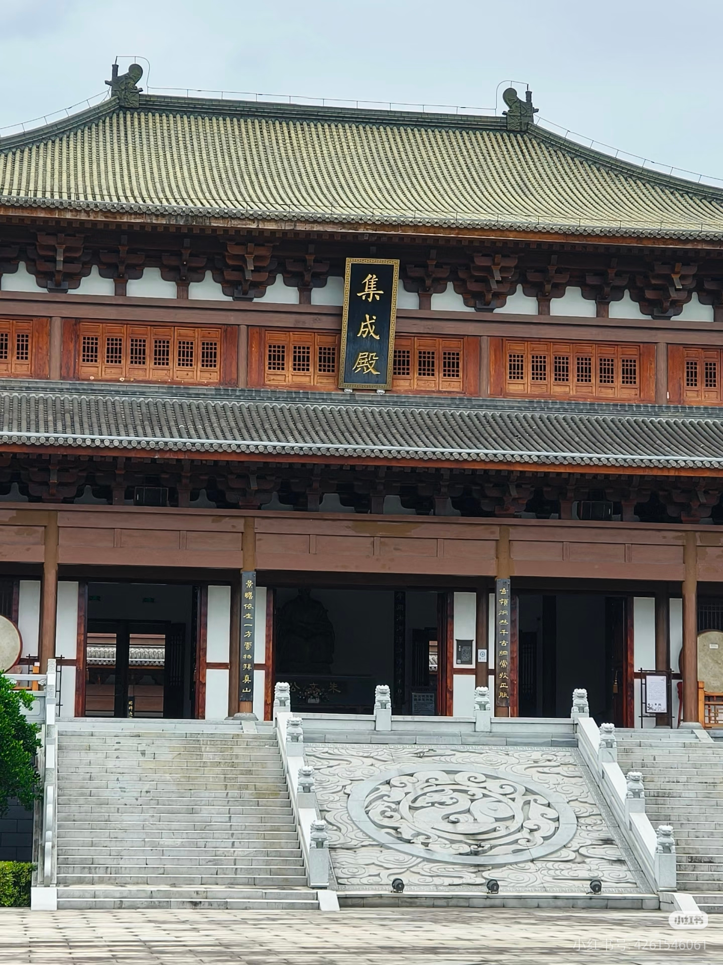
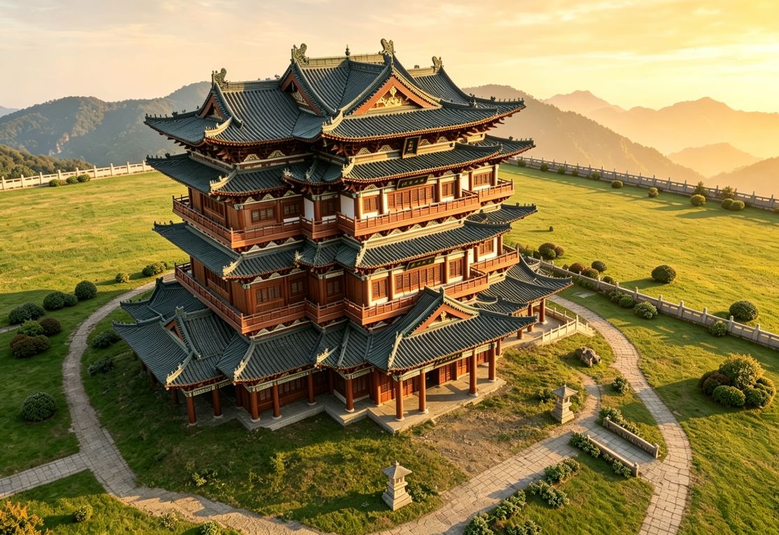
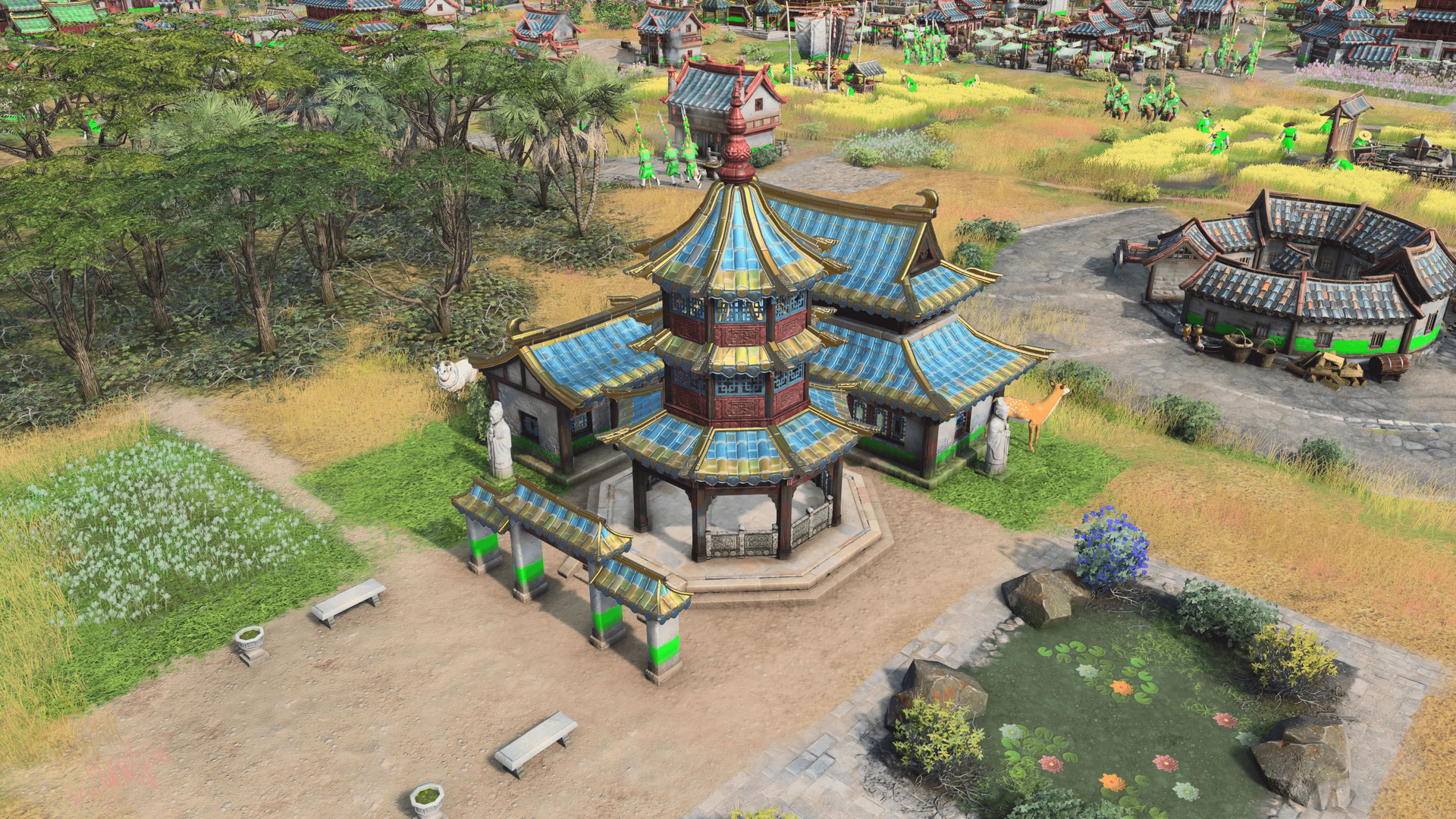
So I used AI to create some alternative designs, and I’ve attached real-life reference photos of actual sites: Meditation Garden, Jiangnan Pagoda, Lushan Academy, Shaolin Temple, Sun Wu Temple, and Zhu Xi’s Library. These show the real color tones, proportions, and decorative styles.
I’m not here to bash the current work – I just hope this culturally rich civ can get more accurate and pleasing visuals. If the devs ever consider updates, please take a look at these references. Thanks for reading!
I made some AI concept images and also attached real photos of actual sites: Meditation Garden, Jiangnan Pagoda, Bailudong Academy, Shaolin Temple, Sun Wu Temple, and Zhu Xi Library. The AI images aren’t perfect – just rough ideas to show the visual style of real Chinese architecture.
I really hope the devs might consider tweaking the colors and simplifying some details in the future, to give ZXL’s landmarks a more authentic feel. Thanks for reading!
The current landmarks feel a bit cobbled together, and a lot of the details don’t look very authentic – it kind of takes you out of the game.
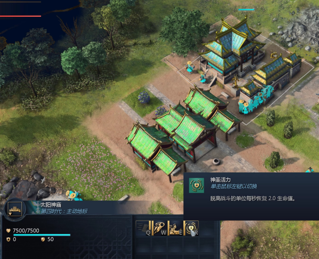
I gotta say, this is hands down the ugliest Landmark in the game.
First, it’s just a lazy, mirrored flip of the university. Not only is it crude, but it also lacks detail.
Then, that sky-blue color doesn’t fit at all, it’s not a traditional Chinese architectural style (green is way more common for religious sites). The same goes for the other Imperial Landmark.
Plus, the design is just too bulky. You’d never see two massive structures packed this tightly in actual Chinese architecture.
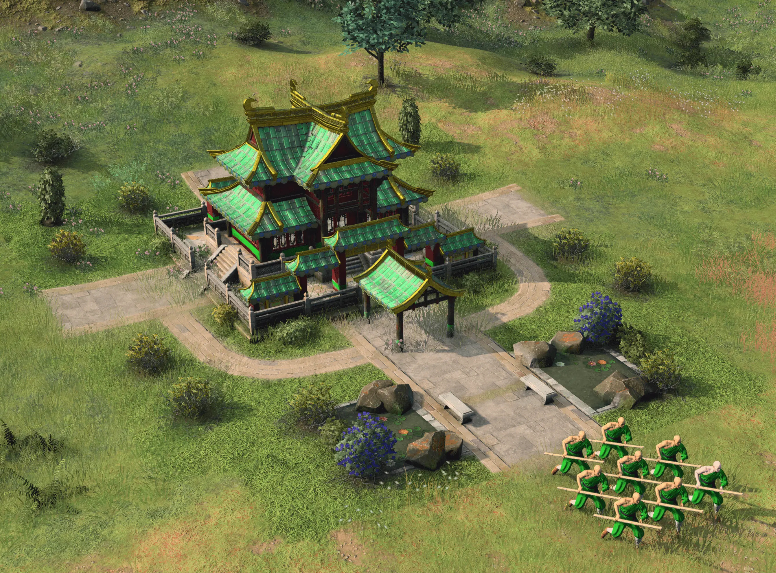
Honestly, I feel like ZXL’s color palette completely missed the mark.
The original combo of cyan roofs for normal buildings and gold for Landmarks was harmonious. But adding that overly bright green just makes the whole art style look weird. And don’t even get me started on the sky-blue — it has zero historical accuracy. Blue was only used in a few sacred ritual buildings in China, like the Temple of Heaven, and it was always a deep blue, not sky-blue.