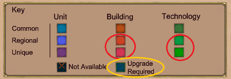
The bottom two colors for orangey red are hard to distinguish… not only between themselves, but with the top row, too, imo. Same for the two greens, especially between each other. Can different shades, vibrances, hues, contrast, or something be used to make them stand out better? I think especially for “unique” ones, the vibrance could be cranked to 11. Also, is “Upgrade Required” even used? I looked in like 10 different civs and don’t see that dark blue anywhere… I don’t even know what it would mean?
2 Likes