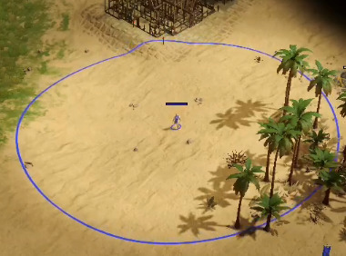
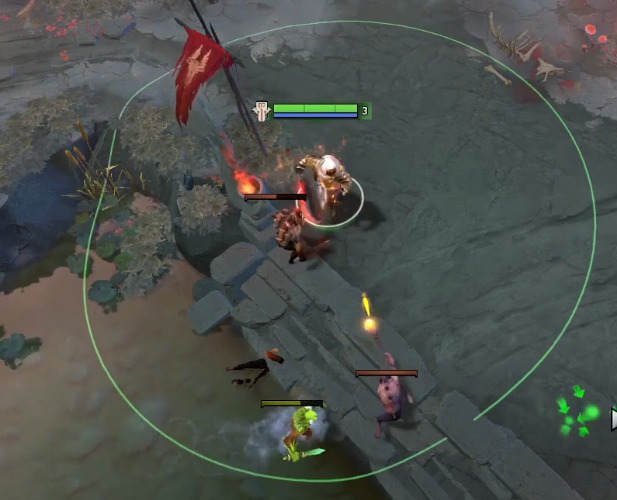
It is so distracting and doesn’t look right. Make it a dotted line perhaps. A thinner line.

It is so distracting and doesn’t look right. Make it a dotted line perhaps. A thinner line.

How else should it look like?
I’m trying to think of alternatives. There has to be a better way. That looks like a blue circle from MS paint.
Well, it’s fit for purpose. A dotted line would work too, but I don’t think they even have that in their engine.
The line should be fainter possibly. I’ll think of some other alternative. The line could at least be thinner and possibly a different color than the player color.
It could look nice and it could also turn the area that overlaps between 2 Oracles red or something like that.
Maybe make lightning bolts move between 2 close Oracles or something.
Bruh wtf? That’s called an indicator… something which is an seriously a gameplay improvement
Yes but it looks terrible. There has to be a better way to represent it like a thinner line like in DOTA 2.
