 GAME INFORMATION
![]() These details are CRITICAL; DO NOT skip them or your issue may not be reviewed.
These details are CRITICAL; DO NOT skip them or your issue may not be reviewed.
- GAME BUILD #: V. 100. 14.43676.0
- GAME PLATFORM: Steam
- OPERATING SYSTEM: Windows 10
ISSUE EXPERIENCED
![]() DESCRIBE THE ISSUE IN DETAIL (below). LIMIT TO ONE BUG PER THREAD.
DESCRIBE THE ISSUE IN DETAIL (below). LIMIT TO ONE BUG PER THREAD.
The icons and contents of some Cosmetics (To be more specific, original colour schemes and yellow colour schemes for Manufacturing Plant, and red colour scheme and turquoise colour scheme for the “upgraded version” of Harbor) for Ottoman Home City were not the same.
FREQUENCY OF ISSUE
![]() How often does the issue occur? CHOSE ONE; DELETE THE REST!
How often does the issue occur? CHOSE ONE; DELETE THE REST!
- 100% of the time / matches I play (ALWAYS)
REPRODUCTION STEPS
![]() List CLEAR and DETAILED STEPS we can take to reproduce the issue ourselves… Be descriptive!
List CLEAR and DETAILED STEPS we can take to reproduce the issue ourselves… Be descriptive!
Here’s the steps to reproduce the issue:
- Select the Ottoman civilization in the Home City menu.
- Select “Customize” and unlock the Manufacturing Plant (or Harbor) building skin cosmetics (Original colour versions and Yellow colour schemes for M. P. skins, or upgraded versions of the red colour scheme and the turquoise colour scheme for Habor. The former doesn’t matter if it’s “Normal” versions or “Upgraded” versions.).
- If you activate the Cosmetics you have unlocked and compare them, you will find that the icons and contents of the Cosmetics do not match.
EXPECTED RESULT
![]() What was SUPPOSED to happen if the bug you encountered were not present?
What was SUPPOSED to happen if the bug you encountered were not present?
The icons shown and the skins activated should be the same for the Cosmetics. The players should be able to understand the contents of Cosmetics just by looking at the icons.
IMAGE
![]() ALWAYS attach a PICTURE (.jpg, .png, .gif) or VIDEO (.mp4, YouTube link) that highlights the problem.
ALWAYS attach a PICTURE (.jpg, .png, .gif) or VIDEO (.mp4, YouTube link) that highlights the problem.
MANUFACTURING PLANT
“An upgraded version of the original Ottoman Manufacturing Plant.”
The icon and appearance do not match.

“An upgraded version of the yellow Ottoman Manufacturing Plant.”
As above, the icon and appearance do not match.

Also, as you can see in the screenshots, the same thing happens to the skins that are not “upgraded version”.
My guess is that the icons and the contents were set oppositely from the beginning.
Looking at the original version of this game (2005~2007), it seems that the building with orange walls was “Original” and the building with pale white walls was “Yellow”. However, in DE, it seems that the latter was mistaken as the original (The yellow colour schemes look more natural when considering the harmony with other buildings around it), and the icons and contents were set to the opposite one.
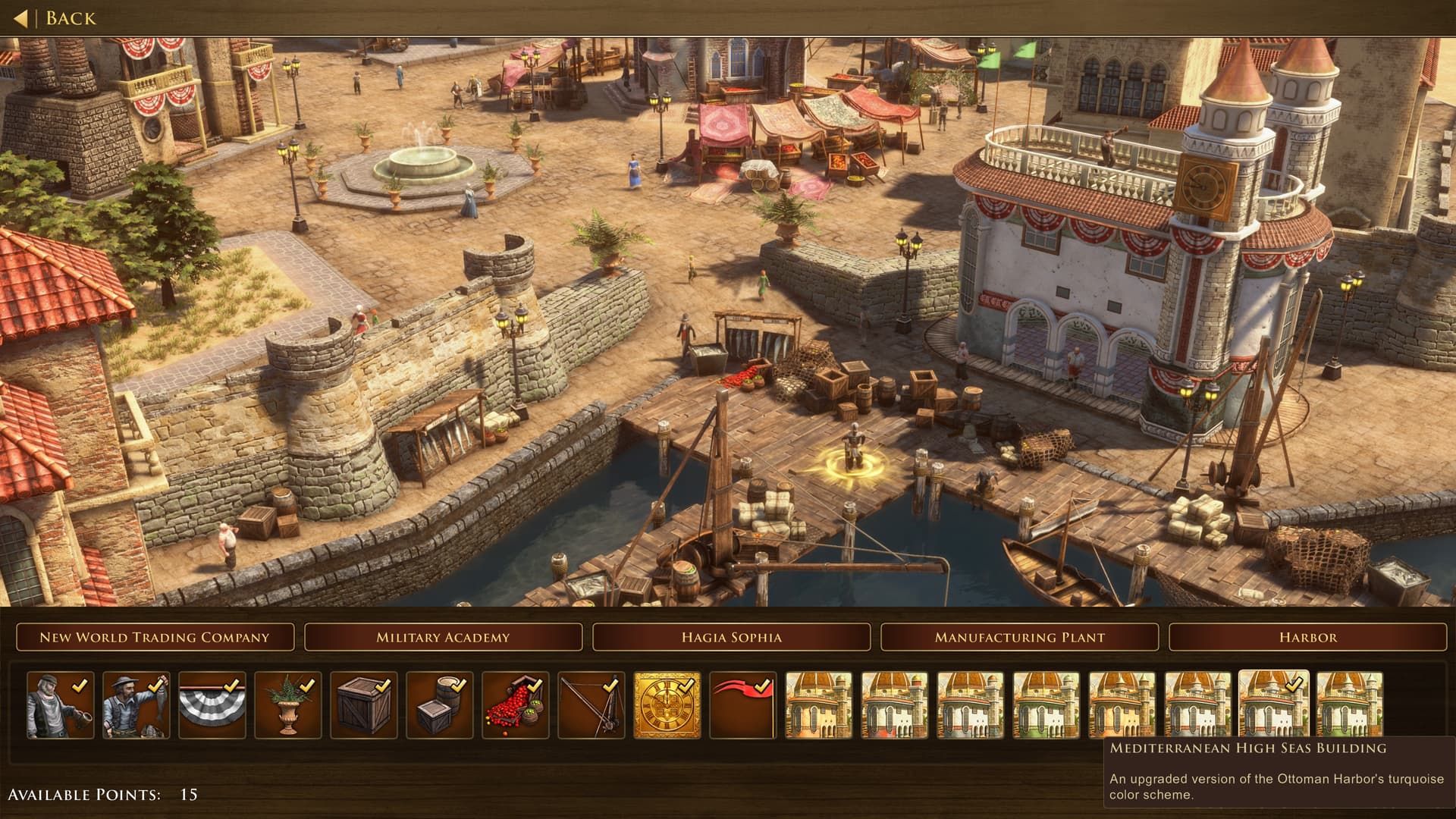
HARBOR
According to the description: “An upgraded version of Ottoman Harbor’s red color.” Although the appearance matches that, it’s icon probably represents something different.
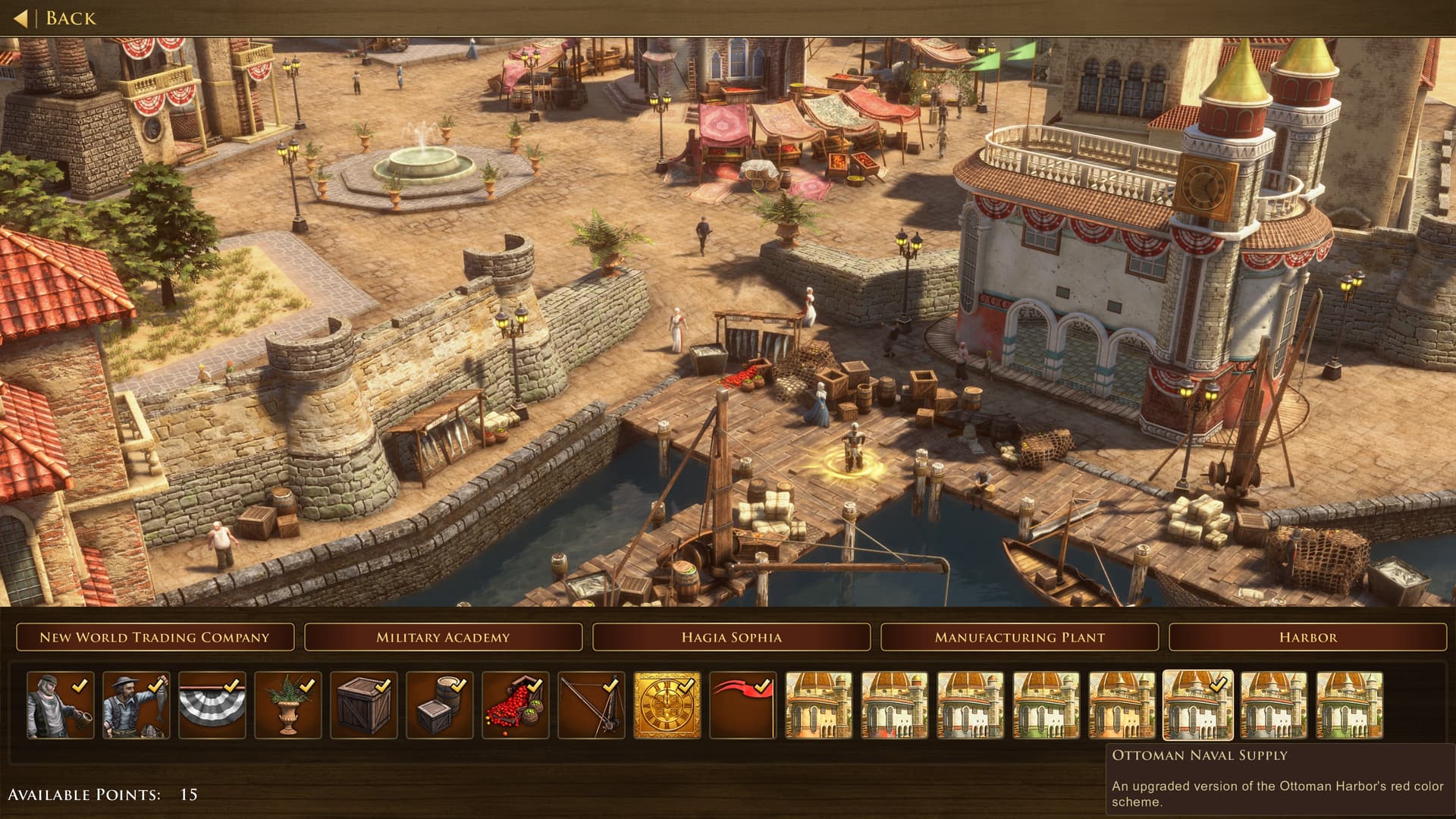
I have also uploaded a screenshot of turquoise one for reference. It’s icon is the same as the one above, but it is completely different appearance. Both icons are thought to represent “An upgraded version of the Ottoman Harbor’s turquois color scheme”.
GAME FILES (SAVE / RECORDING)
![]() Attach a SAVE GAME (.aoe3Ysav) or GAME RECORDING (.aoe3Yrec) of the match where you encountered the issue. Link it below if using an external file service.
Attach a SAVE GAME (.aoe3Ysav) or GAME RECORDING (.aoe3Yrec) of the match where you encountered the issue. Link it below if using an external file service.