Say what you will about preference, whether you enjoy realism or stylized games.
One thing a game should never do is pick one, then backtrack a bunch because of people wanting the other. You’d think that is compromise, but when it comes to visual aesthetics, you’re only left with a reduction of a vision as a result of that tweaking.
Take a look at this. With the original lighting, colour temperatures, saturation, building and villager sizes, it looks decent. You can tell there was care and hard work put into it, even if you personally prefer realism over it.
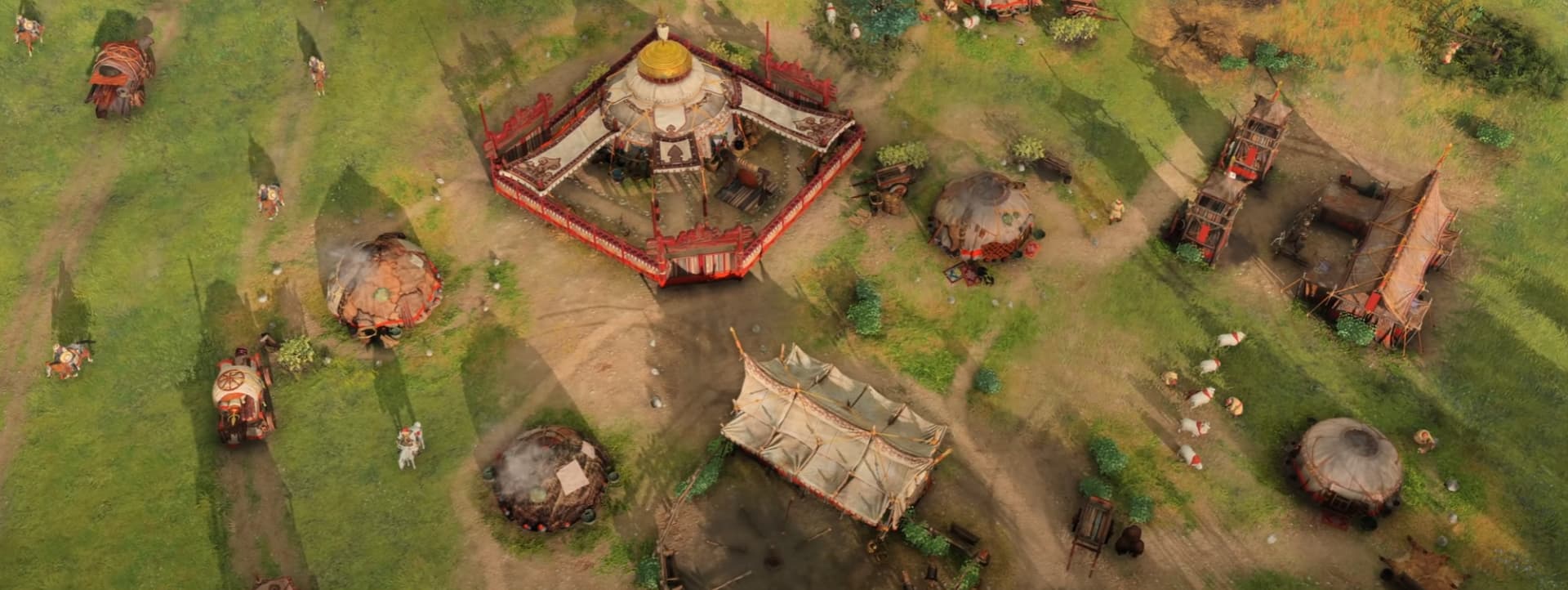
I recall a lot of complaints about how cartoony the game looked with its bright colours. The truth is that, shifting that only made the models (which are already cartoony), and the game look far worse. It was a halfarsed solution to attempt to please an audience who had an issue with the general aesthetic, and not just the lighting or colours of the game. That wasn’t the only destructive change they made, as reducing sizes for the production buildings was also another bad solution that takes away from the original appeal of the game.
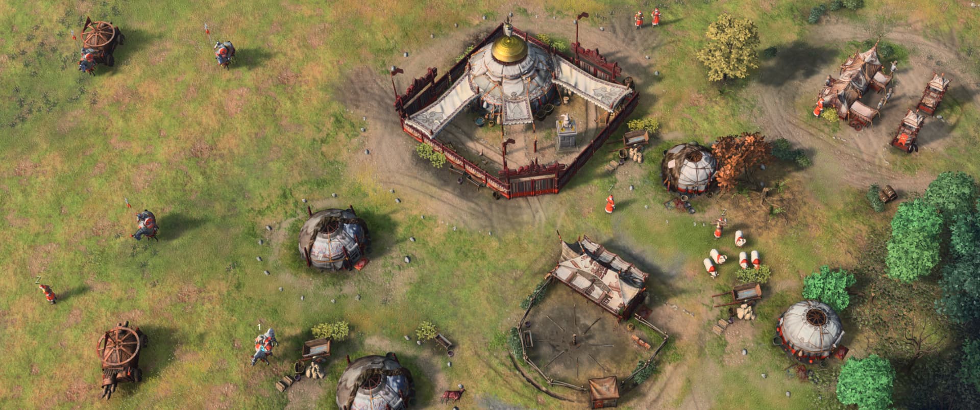
It should be undeniable, how much more visually incoherent the second picture is.
The game looked far better with its original aesthetic vision, regardless of how much it made it looked like a mobile game–which it still does, so much for that change. I mean, just look at how much nicer the foliage and environment feels with a warmer tone. Many trees in this game are very cold in colour, and likely needed that warm lighting to balance it out. And this extends to every graphical element in the game.