I’ve never seen a game that has so much eye candy potential but at the same time being so wasted.
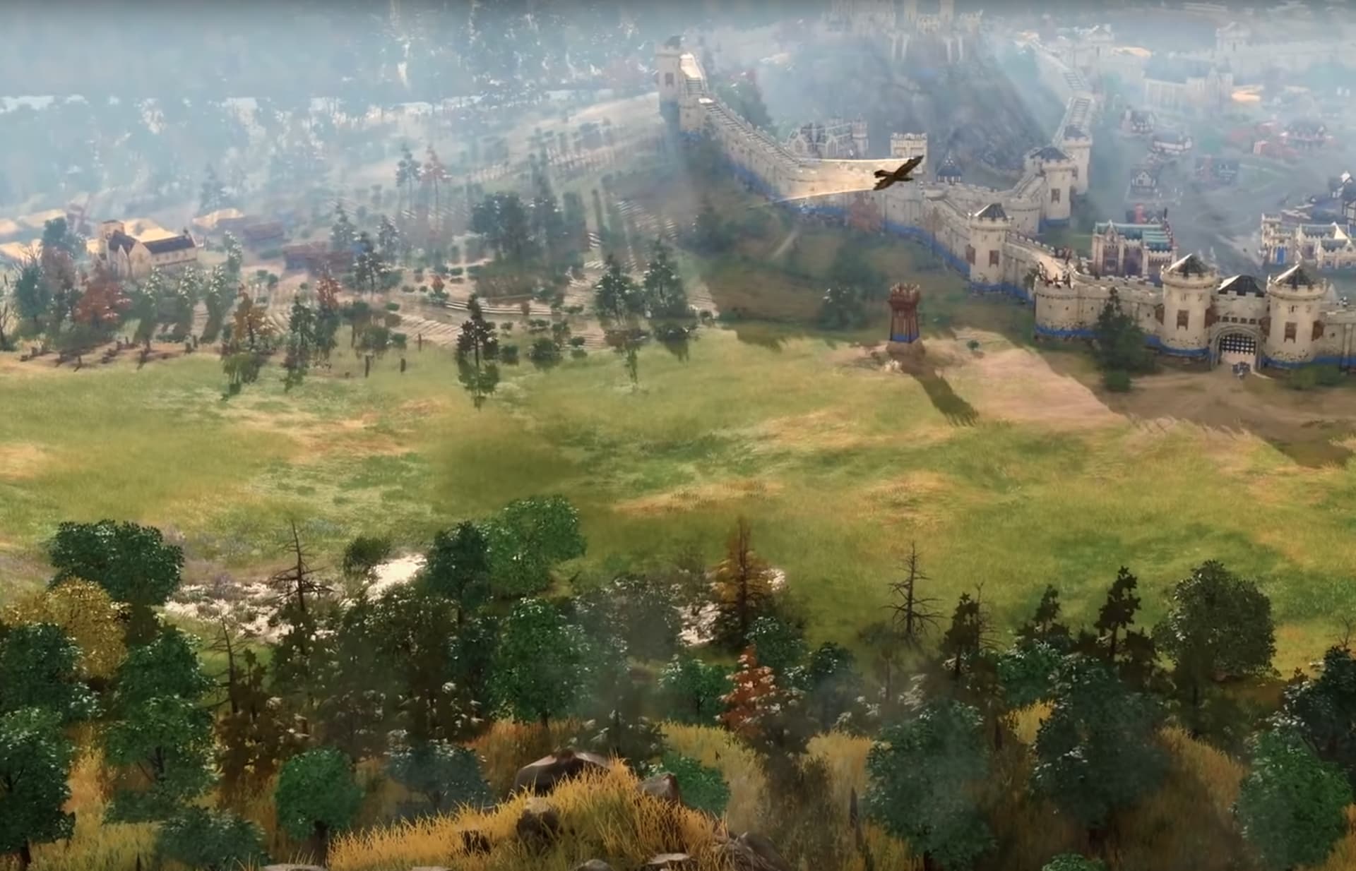
From the regular camera angle you would never realize, but AoE 4 is filled with little graphical details like puddles, reflections, god rays, buildings with torches that light up their surroundings. But for some reason all of this is hidden unless you really look for it. And I mean REALLY.
All the while, these graphics details are eating up resources but remain out of view. If I were Relic I would be putting all these things front and center in the default camera view.
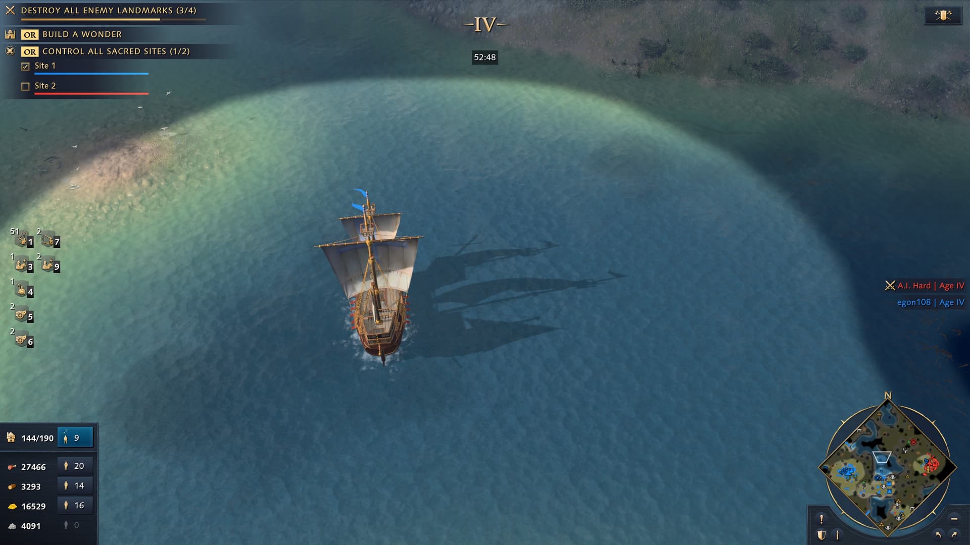
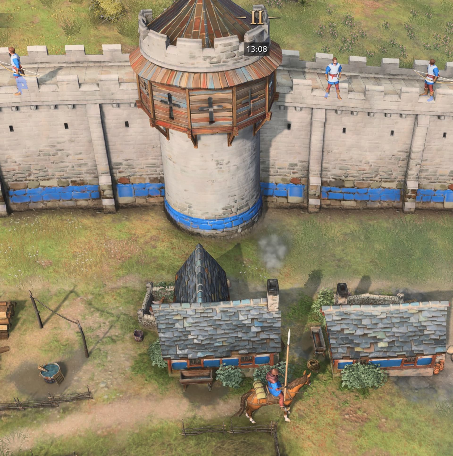
First, what I think is the most glaring hidden feature: Water Reflections. There is only one angle from which they can be seen and you also need to be fully zoomed in, with the light hitting exactly right and your subject at the very top, almost out of camera. Almost everything triggers reflections: boats, buildings, units. I suppose even trees and mountains do, but it’s impossible to tell.
The skybox has real clouds which cast real shadows on the ground (that we all know) but they also cast god rays (better seen in motion). From the default zoom they can’t be seen since the camera angle is not low enough to be able to see far into the horizon. Only when viewing the map from the top of a mountain they are visible.
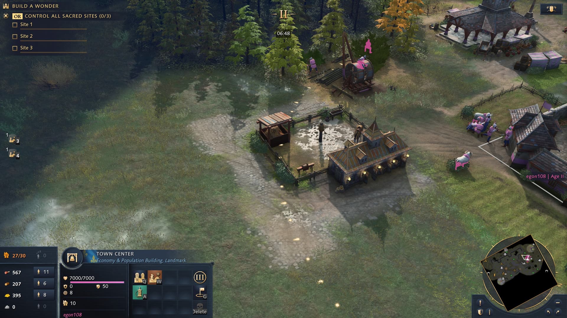
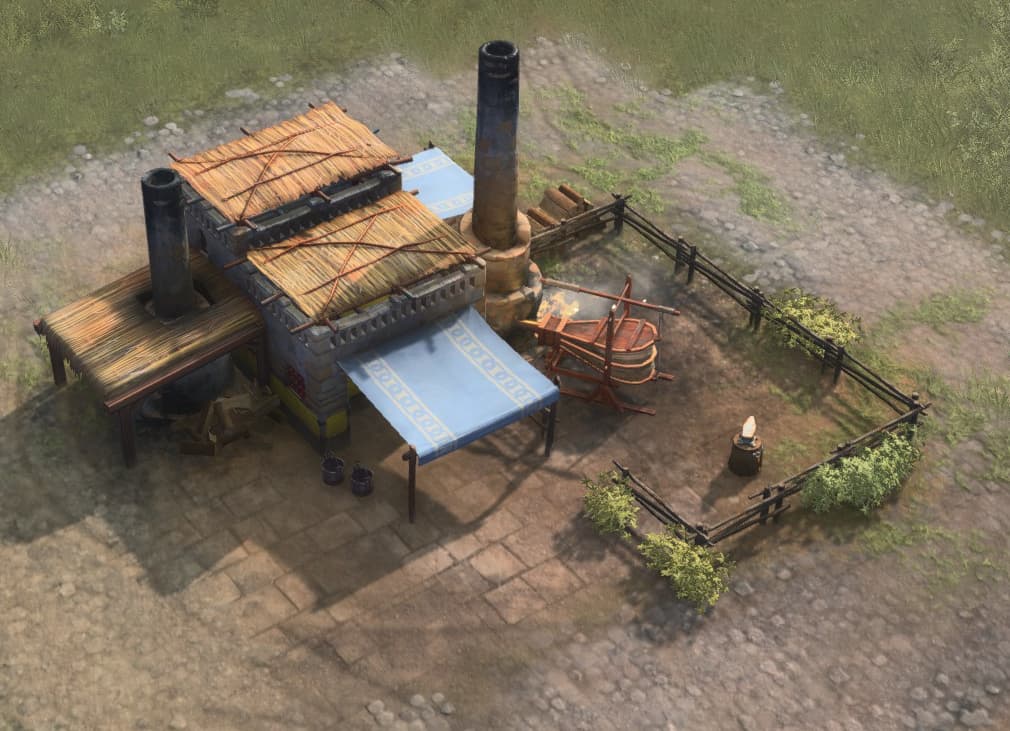
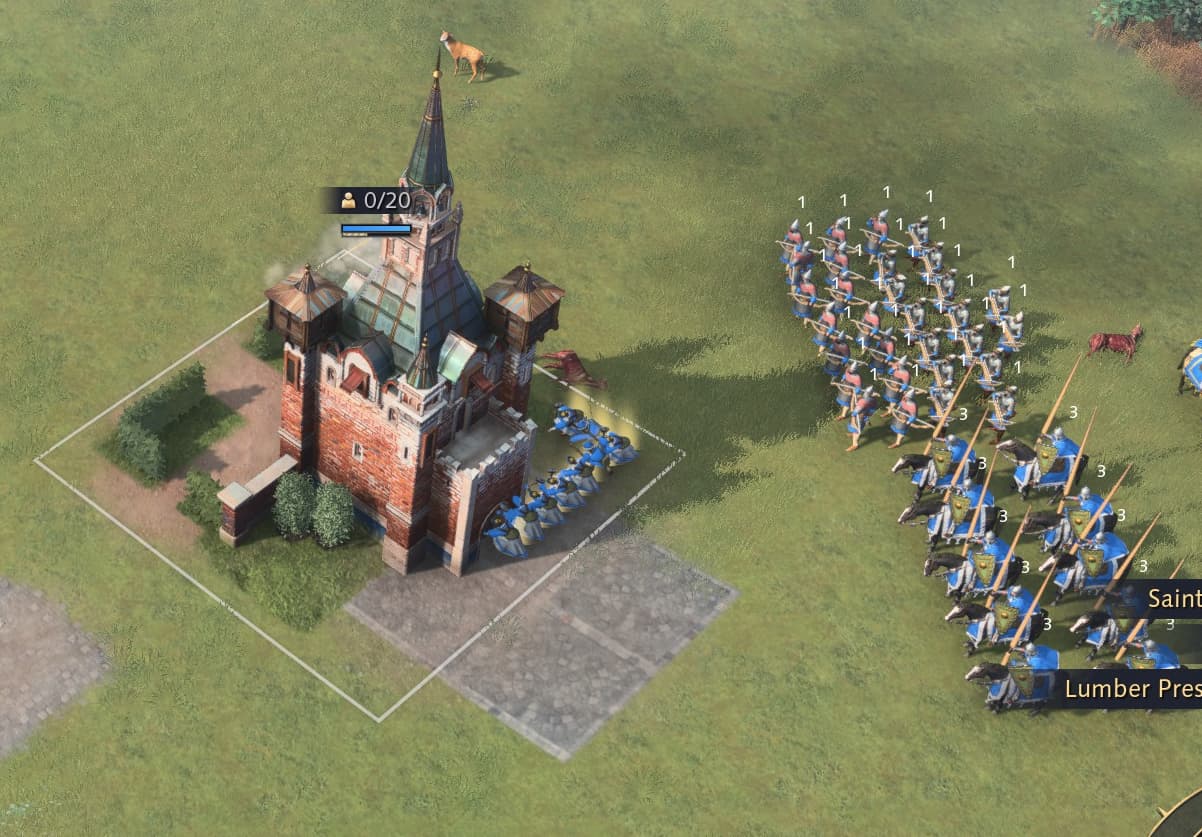
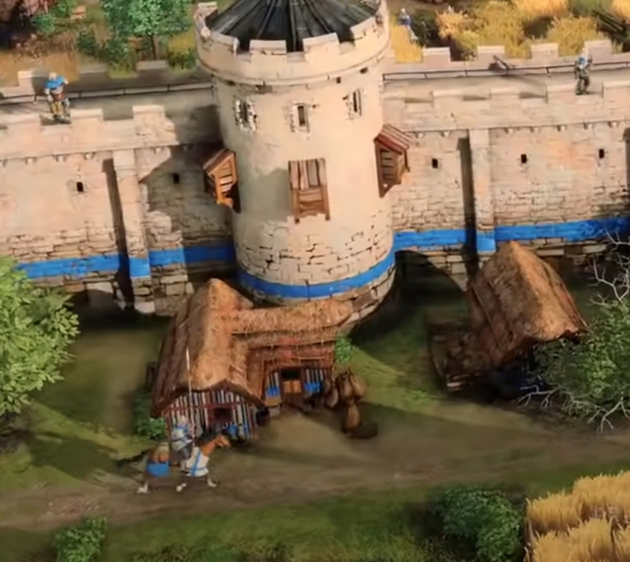
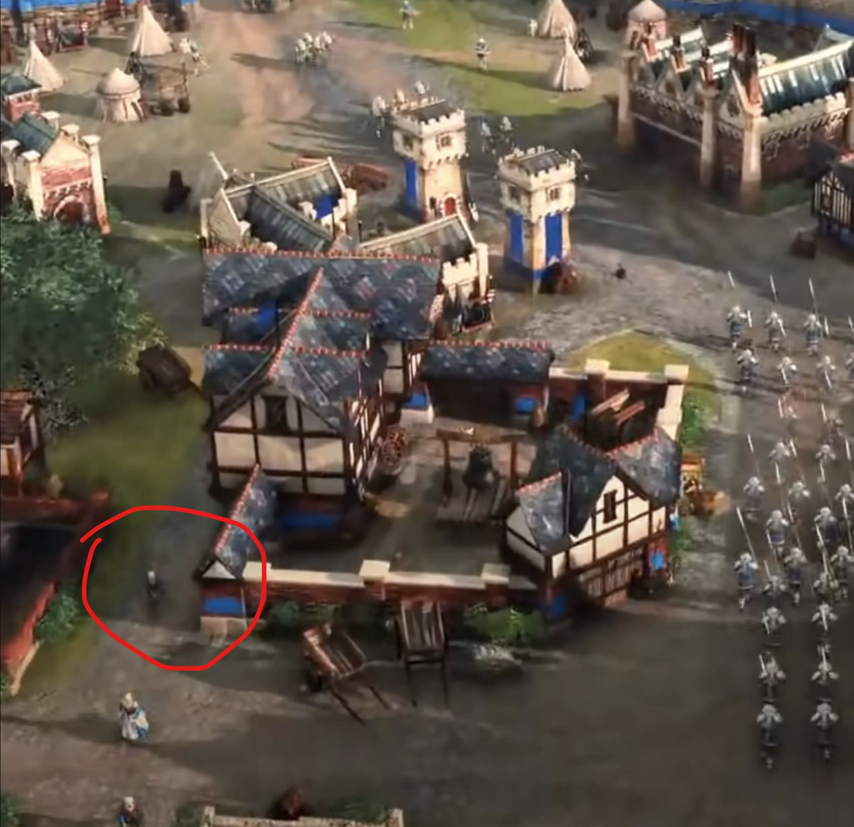
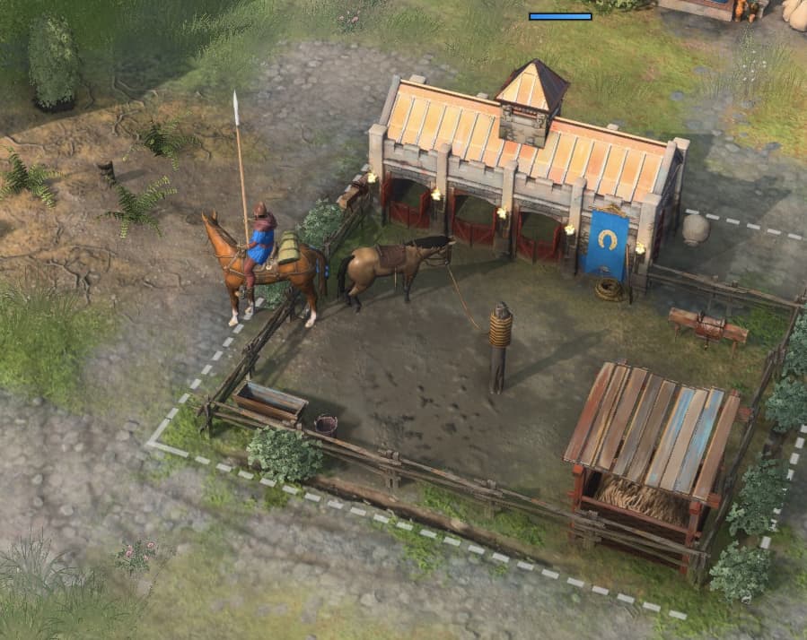
Reflective puddles randomly pop up from time to time in maps and around buildings (also notice the torches around the back of the stable - hidden from view otherwise!):
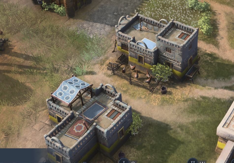
And building decorations that were probably intended to be animated but weirdly weren’t, like fire bellows, chickens, horses, rooftop tents and clothes.
Finally, I really get the artistic style the devs were trying to aim for. The color palette, haze and overall feel is that of a medieval painting, which could have worked but then you have the jarring, oversaturated team colors and super clean textures which destroy the look. The game ended up in a weird spot in between realism and painting, never committing to one or another.
Look at how much of a difference some contrast and sharpening, plus hue and lightness adjustments to some colors do to the game (compare the knights):
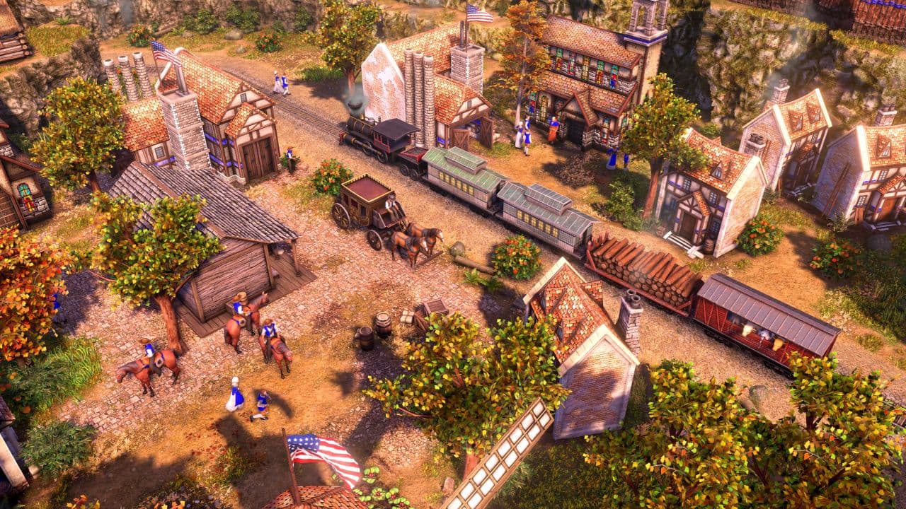
Farthest Frontier is what I believed AoE 4 would look like. These are modern RTS graphics IMO (and interestingly enough, this could be mistaken for AoE 3 DE):
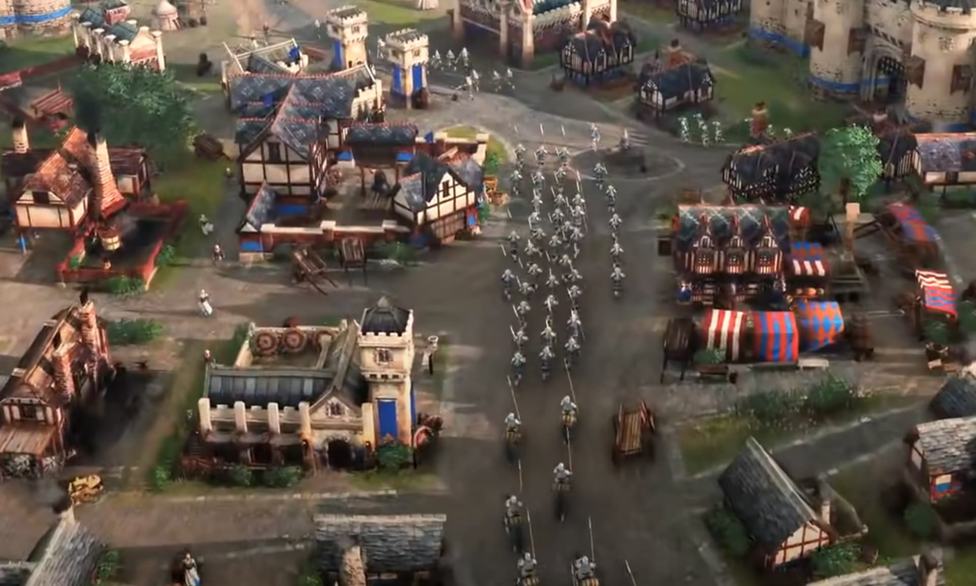
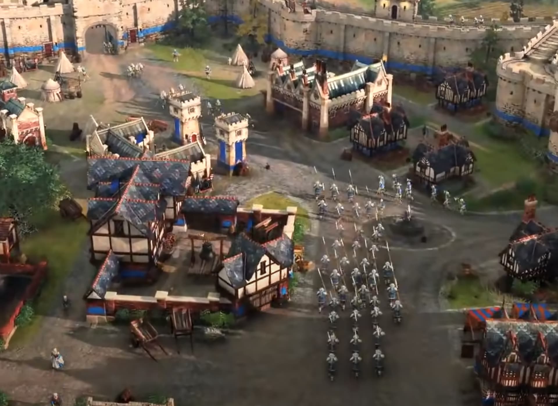
The terrain/ambient looks good but the units feels that they are not part of that world, that’s one of the problem that I have with the game, is easy to lose inmersion, buildings and ambient look semi realistic but units look like toys, also weapons…
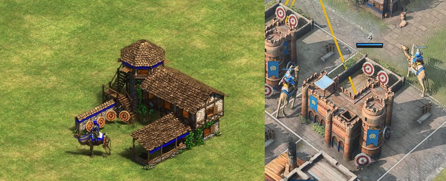
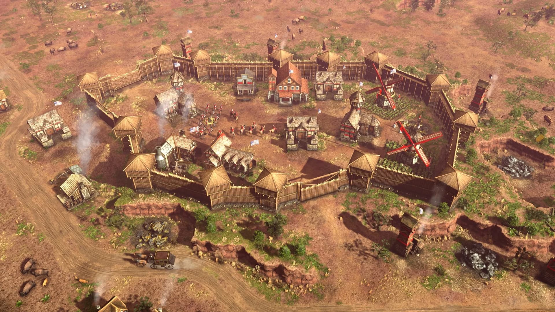
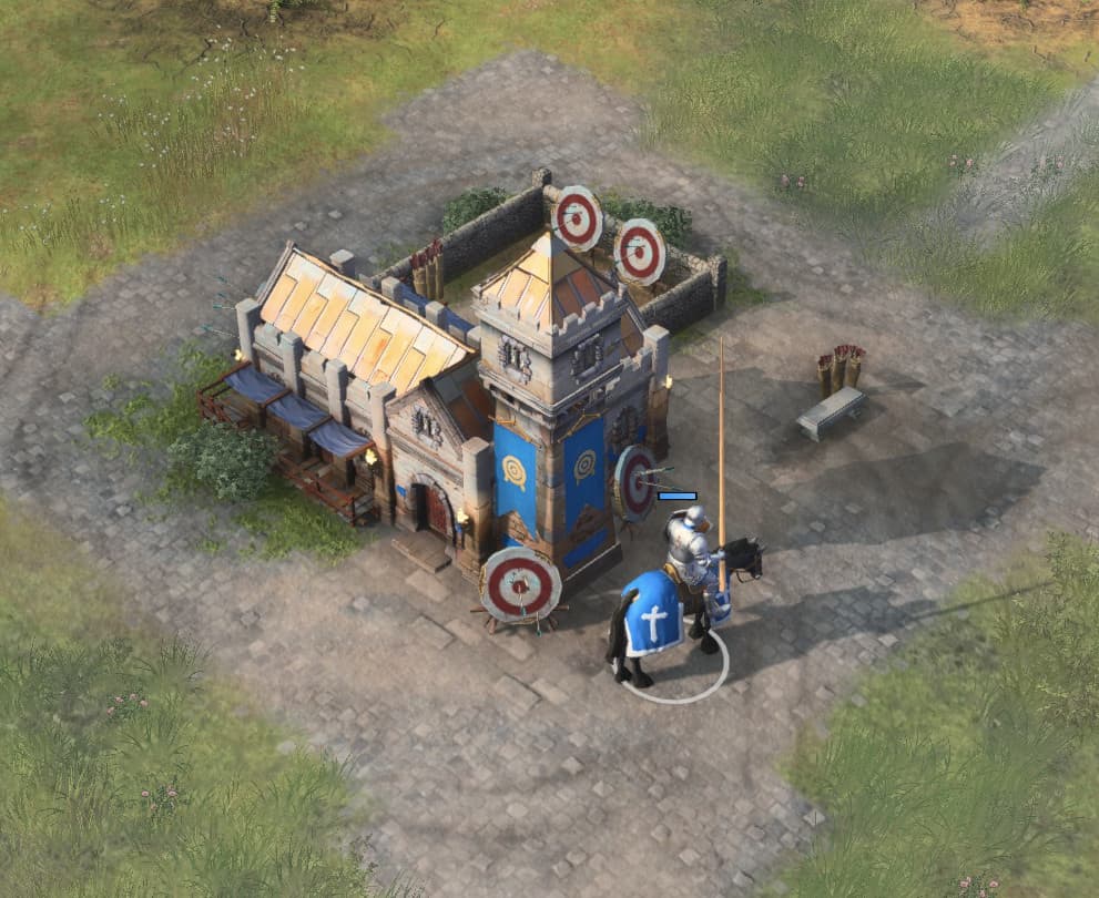
Yup, I completely agree with you and I’ve said it before that AoE 2 did the whole building/unit scales right. The buildings have an unrealistically small footprint, but they are sufficiently tall so units look like they fit through doors. The AoE 2 designers really did a great job of creating castles and cathedrals that don’t take a lot of screen space but look big and scaled properly for the units.
Look at the units closer to the castle’s door, they are appropriately sized even though the castle itself is unrealistically small, but your brain doesn’t care because the scale is right:
This is well put. Something about the scale just isn’t right in AoE4. It’s not just about increasing the size of the buildings (as there are mods out there that do that already), but the design of said buildings need to change a bit to make it feel more authentic somehow.
Regarding the post itself, I’ve been crying my lungs out since the Betas about the wasted potential of AOE4’s engine. There is an enormous amount of in game-assets that aren’t utilized to their fullest potential, or at all.
I think they sacrifice graphics and effects in the name of esport and competitions. Bigger units for a better reading and low effects for permits more people to play in a stable way
good post - and yes i hope the devs do something so we see the waterreflection more in normal few. also the other effects.
but farthest frontier is a bad comprehension, you can’t see and find anything there fast. its ok - because it’s an citybuilder. but for an rts it feels like the unfindable anything in spellforce 3.
Correct 100% that’s the reason we have pastel colors, small buildings, toy weapons etc, like someone said in these forums some day, if you give boxes instead of units to pros they will used it , like they use boxes instead of trees in age2.
That’s an extremely zoomed out screenshot. Compare that to AoE 3 (which is still very readable) and tell me if they don’t look very similar (both great looking, realistic-oriented games):
Someone correct me if I’m wrong, but isn’t the building scale off because the units got their size increased after pros were given hands-on time with it? Hence why the windows and doors look so small now compared to the soldiers that populate the world - they were probably meant to match the original size.
As for whether those buildings should have been redesigned after the units were changed, probably so. But considering especially the launch state of the game, I’m guessing the budget for redesigning pretty much every building in the game was not available.
I’ll be honest, at first I thought it was just an urban myth. The X019 trailer was a set of carefully curated cutscenes, but if you look very closely, a lot of buildings are different models than the ones we got. It seems the change happened quickly and immediately after the release of that teaser. Here’s a blurry screenshot of the video:
Look at that archery range vs the cavalry units next to it. Also look at that TC’s size. It’s massive (rightfully so). The towers in front of the barracks can also be seen at a different scale. In other shots you can see larger house 3D models which are not in the finished game. Clearly someone made the decision to change it all. The next trailers after this already have basically the final version we got with giant units and badly proportioned buildings.
One extra shot of a cavalry unit next to a house. The archers on top of the wall are also proportionally smaller than they are now:
Yes, the x019 graphic was really good. Too much brillant but very good in terms of sizes, proportions and feelings on a medieval world. I don’t know why they have decided to change this so much. Yes, professionale players had have a role in this choises but it’s strange.
As @AgeofNoob3936 said, there so much potential in Essence Engine but we can’t see It due some development choices.
I agree with you about terrains and Buildings: they are very good and also the trees are very detailed.
But the rest of the game seems old and not well represented:
1)Weapons: too big and too plastic;
2)Water: sometimes Is Amazing, like in Mongolia Heigts. So, Rivers are generally very good;
unit textures: the most of models are low and not well polished. In many units armours and weapons seem plastic. Other units seem Better like HRE knights during the third Age;
you can’t see the Battles more close and for me this Is a very back step from the AOE3de: this game has the best zoom in and out and players can choise what they prefer;
arrows and projectiles animations: horrible. X019 trailers was fantastic;
no other animations (chickens, war siege crew, men Who work into the blacksmith, horses in the stables etc) and i know that someone could think these things have not relevance because " i’ve to fight and not seeing a movie" but i can assure you that these Little things make the AOE so good for many people.
Now, Developers can improve all these aspects with a proper graphic DLC but the main question Is: they Will do It?
Now look at this giant scratching his head because he doesn’t know how he got so tall not to fit through the door. Also notice how that whole back door section was trimmed down:
Upon close inspection you can see that most of the buildings did not change that much, but the units were 40% or so smaller. The horse in the stable and the horseman next to it really tell the whole story. That’s about 30-40% difference.
I know Developers are reading this thread and what i would to hear from them It would be: “we are trying to improve graphic and optimizing the performances. You could expect more about It in the next months”. Stop critics, claims, and hundred of threads about the graphic aspects. New hype for the game and faith to developers. Do you wanna to see this game growing up?. Listen users.
For now, i only see updates oriented to competitive scene and 10 months have passed since the launch.
New civilizations are welcome but there should be graphic improvements. AOE3de done a beatiful work trying to balance all aspects: why don’t they tale ispiration from It?