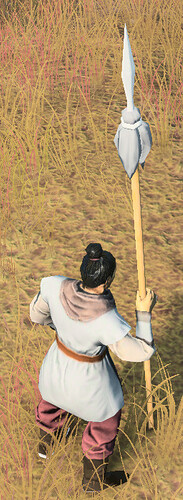
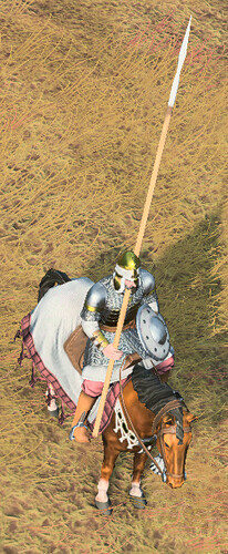
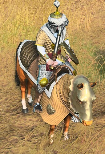
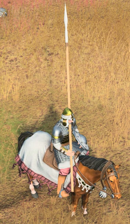
I hope you understand that we are talking about the metal parts of these weapons, yes?
People are using the description of plastic to refer to the lack of metallic shine. In fact, most lack any real colour, making it look plastic. This is because there are plenty of weapons in game that are too bright, making it appear that they have no textures.
Do I have to pull out the editor for this?
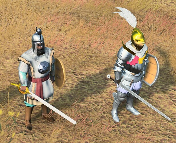
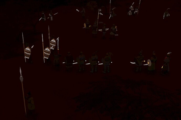
First, we have all MAA in the game. MAA in general seems to have a very light texture on their weapons, too bright (likely for visibility). If you zoom in really close, you’ll notice it is actually emissive. Emissive means these textures a source of light themselves and will not darken with the environment. In fact, there is a specific setting in the Engine that allows you to turn up and down the emissive light on them. The exception to these is obviously Delhi, whose texture seems almost entirely too bright, making it appear very much like plastic.
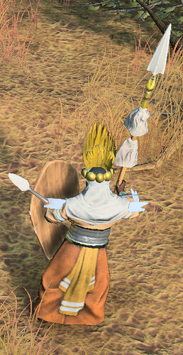
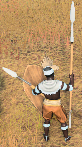
This issue becomes more obvious with Spearmen and some other units, like the string of Crossbows and Bows or the tip of Horsemen’s weaponry or Zweihanders in this game.
When you compare them to metallic looking weapons, they simply look out of place.
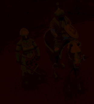
Here is how a dark scene looks with these weapons by the way. Is this solution really necessary considering there is next to no changes to lighting in this game? I very much prefer the metallic appearance instead. Anyhow, there are no shaders labled “plastic” so you’re technically correct–but I would go out of my way to insist that the bright white colour of most weaponry looks far more like plastic than it does metal.
And that should be the point.
If you’re wondering, neither the Ghazi Raider or the Musofadi Warrior’s weapons light up in the dark. Why should they? They ain’t plastic! ![]()
