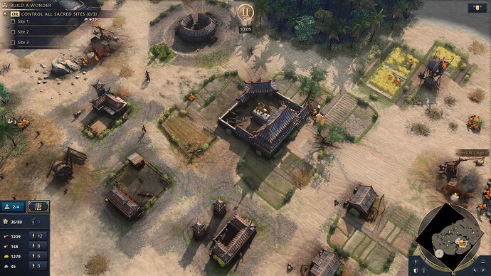
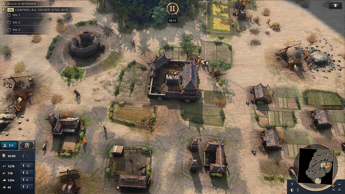
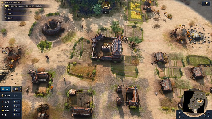
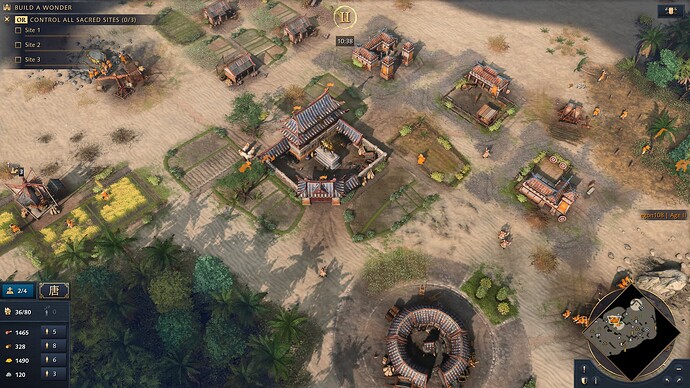
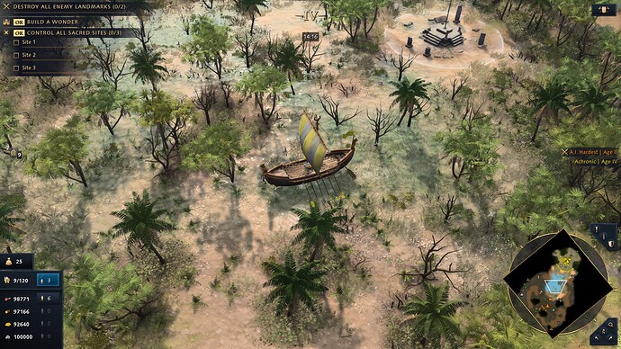
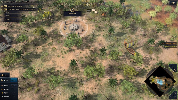
I would choose the first screenshot’s color temp and building/unit size with the texture definition of the second screenshot. There’s a great middle ground there, but we ended up with flat, drab plainness.
The first screenshot has a much softer and sunnier look much like the previous Age games, the second one is just washed out and drab looking
Yeah,the first photo look much better and is only some change of shadows…i think AoE 4 have much potencial of improve the game graphics in the near future…
Even the current game release has some potential, if only devs changed the sun angle or reflectiveness of some surfaces, plus a bit more saturation wouldn’t hurt.
The Sahara biome is the one I see most closely resembles the original trailers in color saturation and warmth. If you simply rotate the view you can see reflective puddles, rice farms with water in them, shadows with more contrast… It almost looks like a different game. This goes all the way back to my very first post when I created this thread:
Different angles than the default:
Pay close attention to reflective water everywhere, around the village, inside the stable, around the TC, in the farms, shadows add more contrast. Just add a bit more vibrance and warmth and you suddenly get another game:
Compare it to the standard boring plain default view:
Other biomes are even worse in flatness, as you proved with your screenshots.
Of course,Age of Noob showed that with changes of shadows the game improves a lot…
The new map Marshland has lots of potential to look great in different biomes. The camera angle prevents it from looking like, well, anything. Here is an image where I moved and rotated the camera to help showcase the water for the suppoused marsh.
And here is the default view with panoramic view. You can barely tell that it is meant to be water.
There are plenty of other examples in this thread about how the default camera angle does no justice to the visuals of the game; but, why? why has this not been dealt with? does no one care?
Yeah, they don’t make a good one…
I have absolutely no insight into why the camera angle is what it is, but I can say confidently that “no-one cares” is not it.
The decision of camera angle is likely made by a completely separate team / developer than the people who put the work into the maps. But that’s just a guess.
How much do you have to adjust the zoom + rotation to get the first screenshot? Trying to work out how “far” from the default setting you need to be.
its 60° ± a degree or 2, i too think this kind of rotation shouldn’t be required just to see a damn water reflection, its not even camera angle thing, its lighting angle rather
How much do you have to adjust the zoom + rotation to get the first screenshot?
Quite a bit, as my default angle is Panoramic so I had to get real close, and rotate around 90ish degrees.
its 60° ± a degree or 2, i too think this kind of rotation shouldn’t be required just to see a damn water reflection, its not even camera angle thing, its lighting angle rather
Yup, despite how I posed my comment, there are multitude of ways to “fake” that reflection, or to just fake water in general. From giving it depth or colour, to as you said changing the position of the light that affects it.
We know it is a transparent sheet with reflection that gets painted blue the further from shore it is. That is why it doesn’t work with the Marshland map, as the depth is insufficient for that tool to kick in.
The tools they’ve used for the water are inadequate. You don’t want to have to expend resources adjusting water whenever there is a new map or format, it should be able to hold water in these new environments but it clearly isn’t. Fingers crossed for a visual water rework, would add much depth to the visual fidelity of the game.
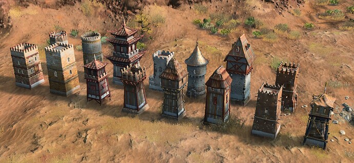
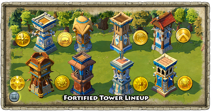
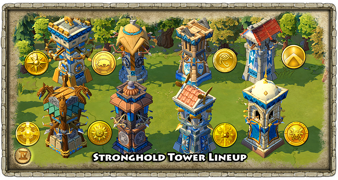
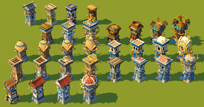
Maybe this could be in a separate thread, but I always felt somewhat disappointed that the majority of Outposts actually get smaller when upgraded. I forgot to include Delhi in this image, which also follows that trend. With the exception of China and HRE, it really lacks that “umpf”–Ottoman and Abbasid included as the historical accuracy portion overrides basic visual design in RTS games.
I take your image. I going to make another proporcion topic to devs that answer all the questions that people have with this issue.
This image comes me so good because compare all the towers and show how some of them have a good size and others not. So is not a playability question.
Spoiler: the Same thing happen with houses and other buildings.
English one looks like a tiny toy between all
![]()
There are so many issues in that screenshot. Not only do some of the outposts get smaller when fortified, but for some it’s not even clear which one is the fortified version, like the Abbasid and Delhi ones. Squared stone tower? Yes, both. Cylindrical stone tower? Yes, both.
The other thing that bugs me is that the outposts usually look the most imposing with the weakest defense available, arrow slits. For some reason they get this giant structure on top of them, but if you add a cannon emplacement you only get microscopic awnings?
For a game that cares so much about readability, it’s ridiculous that I have to wait until an outpost fires at me to know what upgrades it has.
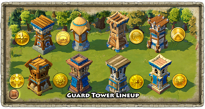
Indeed there are a lot of readability issues there. It makes me appreciate AoEO’s readability even more.
Readavility Is ONLY a easy way out. Each building has its own proportion and size (with the bad visual impact) because there were problems with quick changes at the end of develeopment.
I’m ok with those upgraded towers becoming circular, but they should at least end up bigger than the unuapgraded version.
The Chinese and HRE upgrades look great, the others need work.
Even just taking the look they already have on the stone versions and scaling it up a bit so it’s clearly larger than the unuapgraded versions would be a big improvement.
Having spent so much time caring so deeply about this franchise, particularly AoEO over the last 12 years, it’s really uncomfortable to see its rich visual language discarded for something seemingly arbitrary.
I mean, this is so easy to fix!
This only means that they don’t want to fix this!
If so, this game is ruined.
