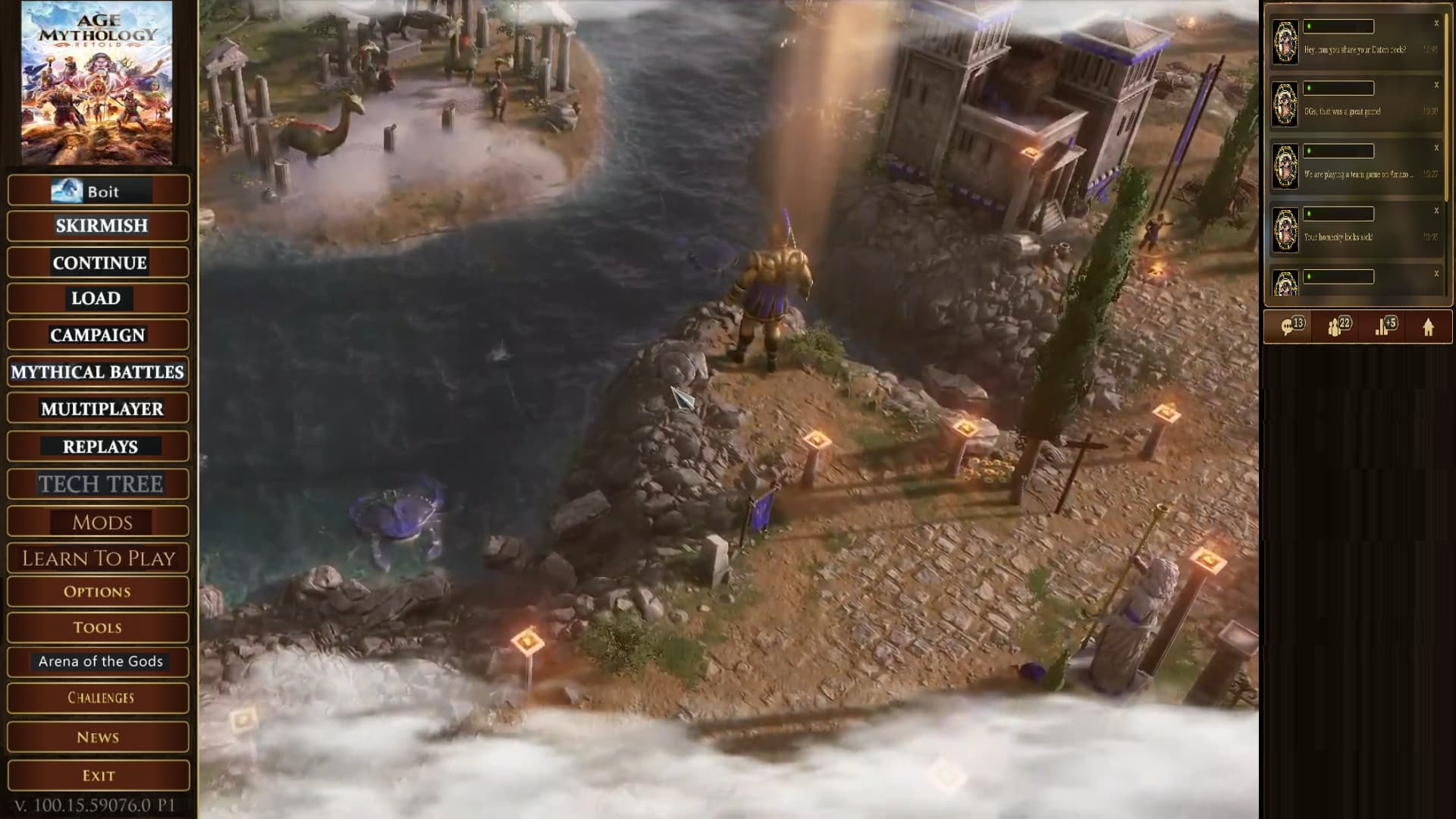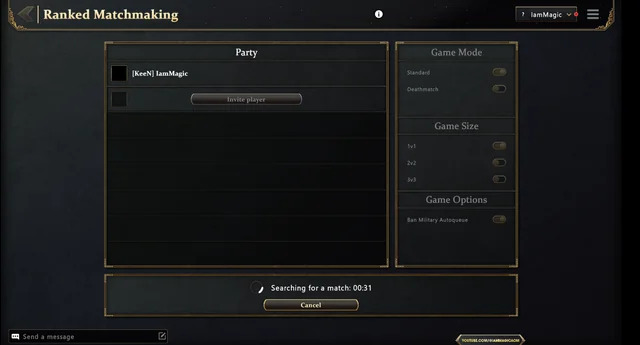
This is how it could look in Retold. You can see the searching 1v1 in the bottom left. You are able to interact with the rest of the UI and you have the animated background showing at all times.
This is how it could look in Retold. You can see the searching 1v1 in the bottom left. You are able to interact with the rest of the UI and you have the animated background showing at all times.
Yes the online UI sucks and that just seems how it is with games wish there was better designers for that.
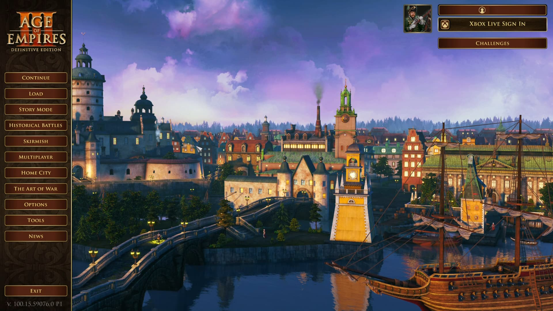
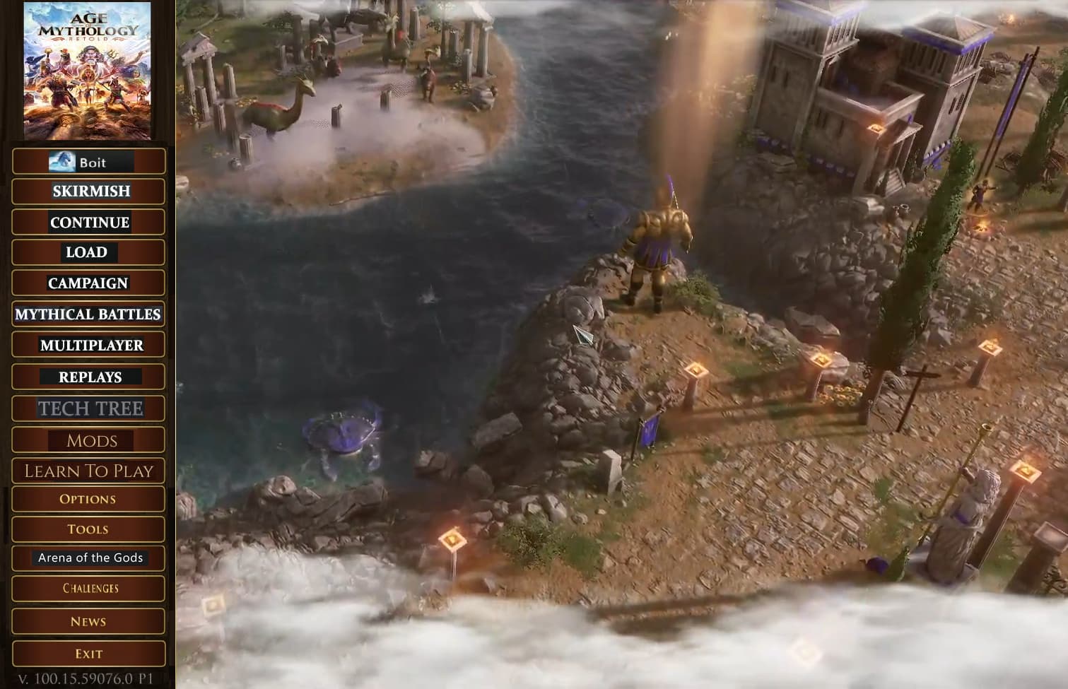
The following are quick images I took from videos online for Main Menu from 2 games.
I like the main menu in Retold. I just don’t understand why it swaps to a different menu screen for matchmaking. It should still show main menu for matchmaking so we can see the background.
The AoE3 HD main menu doesn’t allow for advertisements so that will never work. It also looks very dated.
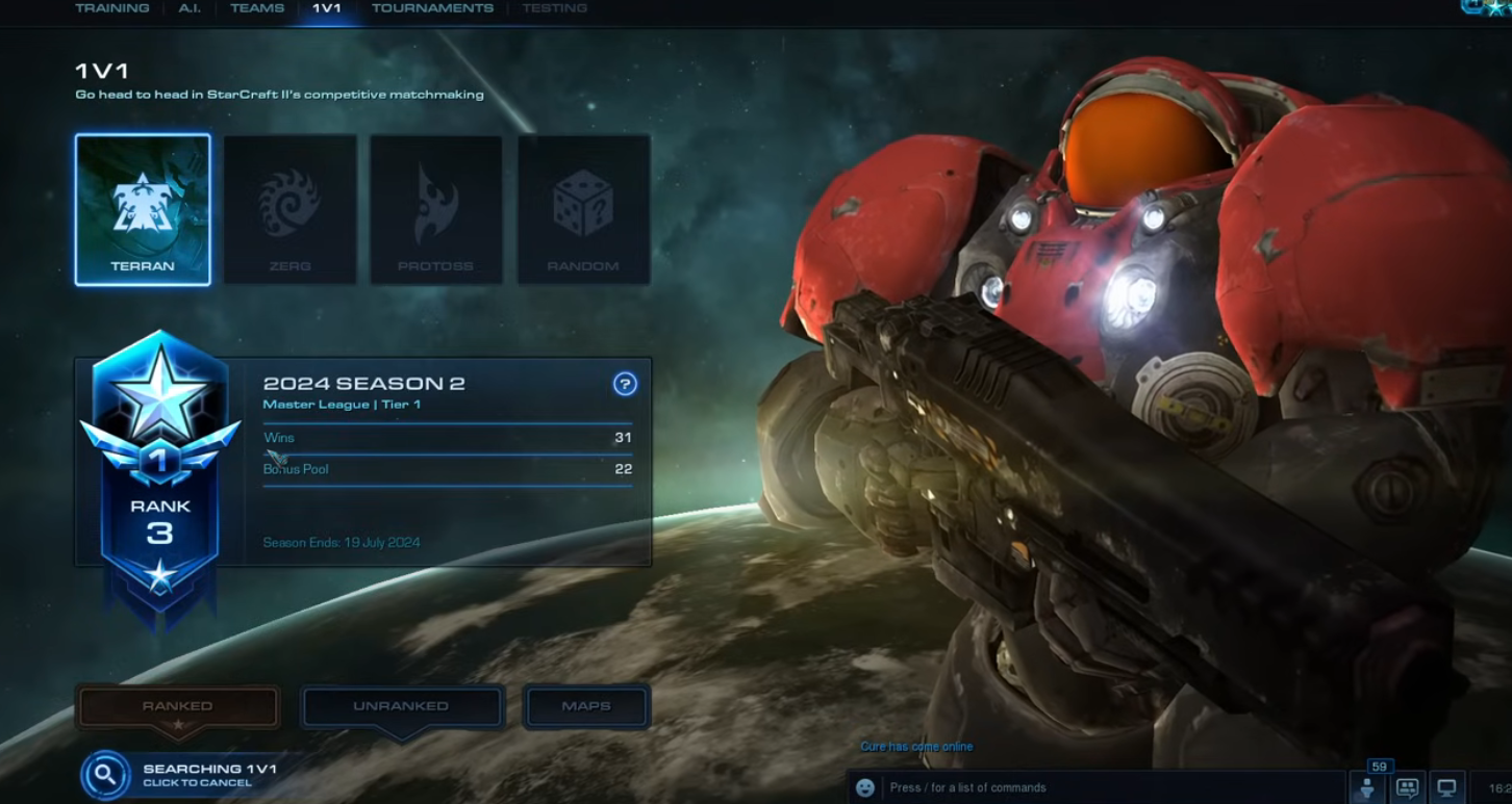
The SC2 main menu is the gold standard for RTS. The Retold main menu looks similar, but we shouldn’t be taken off the Main Menu when queueing for matches.
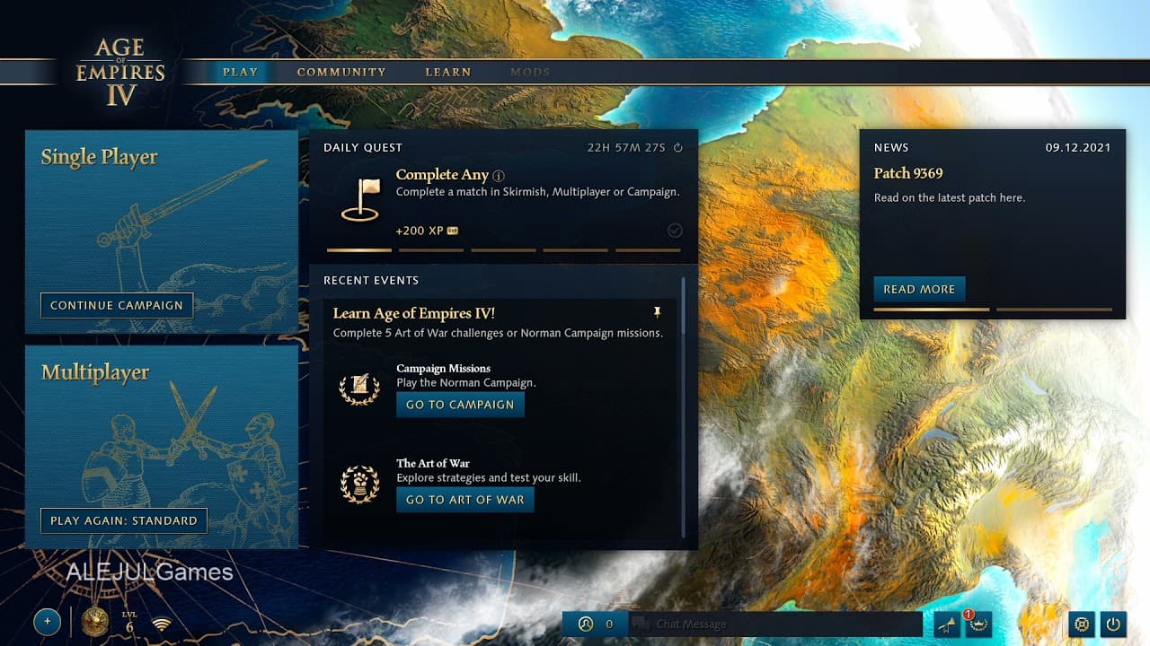
Take a look at AoE II and AoE IV menu they have had
Combine that with AoE III DE menu I showed and you can see AoMR has thrown some stuff from multiple AoE games to create a menu. I don’t like AoMR menu.
AoE III DE menu could use some slight changes but it is by far and away the best looking one. The News section is for announcements to be viewable at any time and when something totally new comes along they could do a 1st time pop up to see it like patch notes for example.
The AoM Retold Main Menu has an animated background like Starcraft II. It looks very modern. The SC2 Main Menu is so good.
The AoE 2 DE menu is moddable, but still looks like an old RTS game.
The AoE 4 main menu has no soul. It looks like an insurance app. The UI menus in AoE 4 are terrible. The worst parts of the AoM Retold UI looks borrowed from that game.
The AoE 3 DE main menu looks like its from 20 years ago, which presumably it is. I think nostalgia is blinding you.
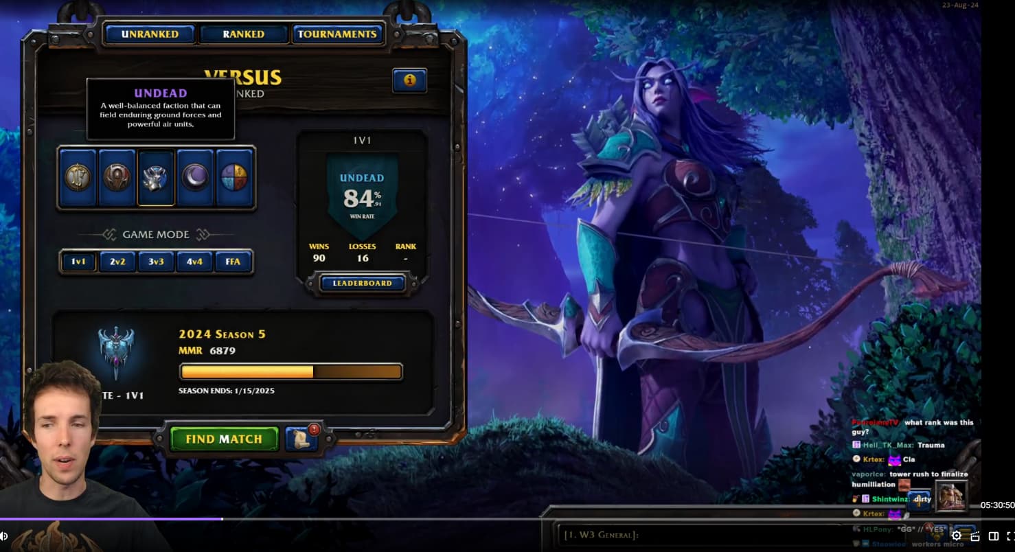
Notice how you can search for a match without leaving the main menu in WC3: Reforged. You even have chat channels in the bottom right. Retold would benefit so much from something similar to this.
I wouldn’t know I don’t play or watch anything StarCraft.
AoE II Menu covers some of the nice image so I don’t like it and I don’t like using mods in games.
AoE IV menu I hate the most from any RTS game I have played.
AoE III DE has so many buttons that are 1 click to take me to what I want. It could use some adjustments with editor,tutorial and mods 1 click buttons. The buttons don’t cover the nice images of a Home City which is a big plus for me just wish they didn’t mess it up with stuff at the top right.
Look at the Warcraft 3 screenshot I posted. Why is it that when we queue for a match in Retold it takes away from the main menu?
This screen just kills the immersion. SC2 and WC3 let you queue up from the main menu, as well as interact with anything.

A better UI is a nice to have, but first I’d like to see some ranked/ladder features like seasons, rewards, etc… Like we have in AoE 4.
Was anything like that ever announced?
i would be already happy to get matches. its exhausting. in all three modes. if the time to find matched would be under 3 min and relative certain you wouldn’t need a picture to look at during waiting. but if you don’t get matches 99% of the time something to look at would be very welcome but i would prefer to get matches ![]()