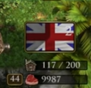
In this Image you can see that the white of the number indicating that there are two shipments is difficult to see against the partially white background of the british flag
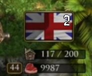
If we were to give it a different color outline then the number would be legible on all backgrounds.
Here is something I hastily did in paint to showcase how this is easier to read.
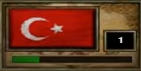
Edit: Furthermore the original games number is more legible than definitive editions number in this case. They have the shipment number in a black box on the right so that it doesn’t overlap any flag.