Three reasons why the aoe4 UI is simply overwhelmingly good!

I think it’s a mistaken attempt at a clean UI that will come of as approachable and “modern”. I generally applaud this vision but for unit/building UI “buttons” it’s backfiring. It’s not even hitting the marks they’re hoping for; this design is contrary to what modern audiences are comfortable with.

Unit/building buttons in AoE are encountered most often when displayed packed together in a grid with fairly small pictures; modern audiences are very familiar with this setup - you see it all the time in inventories for looter shooters / rpgs / survival games, etc. The one thing all those inventories have in common is that they are absolutely filled with colorful and diverse pictures. In fact, the more colorful and diverse items are the better and more engaging is the inventory. The building construction menu is AoE’s version of a grid “inventory”, it is literally exactly that in both form and function, and to have it be unicolored symbols is absolutely the opposite of what modern audiences are looking for. They want to have a inventory filled with tasty and shiny objects, not a Excel spreadsheet.

1 Like

and also @LostCord3 regarding the UI look - I also think it doesnt fit what we know as age. I actually disliked it until i realized why they used it.

However from the way the campaign is set up, to the ghost villagers, the whole thematic of age 4 is that you basically play a documentary of an empire (which you actually build up from scratch).like the ghost vils showing it actually took long to build stuff and its basically a fast forwarded history video.

Which is probably why the UI has this design. Its much more modern looking, sterile and looking a bit like business - because its all fitting the nowaday documentary theme. They use what a neutrl documentary probably would generally use. at least thats the way I see it now and with that in Mind, I like all 3, the ui, the ghost vils, and the campaign setup :smiley:

however, although i like the plain UI and I explained above why -

remember this was still a very early build of the game. That may also be why the building and unit icons were generalized. These pictures are probably one of the things included in the game at the later stage of development, its even possibl ethe UI design itself was a simple make it work and not look terrible approach. WHile I do not think the latter, and I am very fine with this UI, keep in mind its quite possible that at least the building/unit icouns could change. Although I personally doubt it :wink:

Yea it’s not a nine, it’s a backflipped six. Listen my friend, I am sure that they will come up with all sorts of excuses eventually to defend what they made, i dont really care about that, I have seen it all too many times in the past.

I still remember Philpp Boulle from Relic, lead designer of dow3 and current narrative lead of aoe4 asking the fans in an interview -while clearly baffled about why fans hated it- “did you guys actually play the game???” and things like “my answer to you is to actually play the game”.

Well guess what, we played it and it sucked.

When you’re a cook you have to cook the dishes the way your customers like it. You can’t serve an almost raw pork and say that you personally like it that way.

Some people on the forums see the devs as infallible gods that have to always be trusted and listened and everything they say or every decision they take is correct and there’s a good reason behind it. Well they’re not and they can actually blunder things big time.

The way I see it, the UI is just horrendously boring, unfun, unimmersive, uninteresting, lazy, sloppy, out of place, inexcusable and indefensible.

Listen, there’s an old saying “when you’re not sure which is the right way, always take the harder one”.
I could have probably taken their UI design a bit more seriously if that was actually the hard way to do it.

But it is not. This is the easiest and most lazy approach they could have taken. An indifferent dark blue background, same for all the civs and extremely simplistic icons for units and buildings, an all too convenient approach to not have to do extra work for each civ.

This is not something made with love or care, there’s no attention to detail, there’s no detail at all. It’s just the bare-bones thrown together.

The only thing that I can give them credit for is that they were true to their word when they said that they’re gonna do things like no other RTS has ever done before.
Indeed, no other rts has ever put so little effort in such a crucial feature like the UI. No other rts has ever taken such a misguided approach on game clarity as to reach the point to downgrade the game’s experience for the shake of it.

I wasn’t even joking when I said that Power BI has more beautiful icons. And that’s an actual business app, not a video game that’s supposed to be fun.

2 Likes

Sorry, but i voiced my opinion here. There is a Design Philosophy behin Every aspect of a Game, and i merely stated what i think they went for.which ist the modern documentary Style.

And maybe you are Not quite Up to Date regarding Design choices, but nowadays Icons get AS simple and generalized AS possible. But of course there is an Argument for mir Detailed ones. Which i dont think really fits here. The modern Doc Design explains that aswell.

You May Not Like the Design Philosophy but i can assure you creating the generalistic Icons ist more Work than using in Game Models for Icons.

Also has nothing to so with devs, i Like the Style in the documentary context.

And the Info given in this ui is pretty good too.

But i am Sure PPL Like you will create an old school ui and all will BE fine :wink:

1 Like

dow3 followed those modern guidelines and we all know how this ended up.

They don’t have to be low res models closed up in small boxes. They could very well create colorful drawings to represent units and buildings which is the best approach. Just look at aoe3 with all its portraits and numerous game cards, we even have an example within the series.

Well yes, the way things are going, half of the game will have to be modded to be enjoyable.

I am sorry if you cant enjoy the Game WE das so far without mods. If i dient Like ui i could still enjoy the Game, but of course ui is quite Important. But AS with all, devs will never satisfy Every Player which ist why mods die age2 for example got so popular

I think that some units look bad especially when zoomed in. However some look pretty good like the elephants and some of the Mongol units.

2 Likes

Where is this screenshot from?

2 Likes

Steam Page of age of empires 4 :wink:

1 Like

looking at these screenshots, aoe3 and StarCraft did it better.

in aoe3 it tells you right away the armor, the attack, the speed, the bonuses, the rof, and the damage type without needed to hover over any stat. almost every aspect of how a unit performs is right there in the stat page, and I hope aoe4 takes after it.

3 Likes

Yes. The UI improved in every iteration of Age of Empires. AoE3 was better than AoM, and AoEO improved on that, too. What I see in the publicly available images is a big step backwards. It is discouraging.

1 Like

THe simplistic UI icon are definitely dissapointing for me. Takes away so much immersion just to make it look sleek and modern. That doesn’t fit a medieval game in my opinion. I want medeival fluff in there!

2 Likes

it isnt a medieval game. Its a modern documentary about medieval empires as a game :wink: (thats what the campaign style suggest, aswell as the ghost workers, and I love it now that I realized that).

However surely someone will mod a "classic UI soon^^

Even if you manage to mod your UI (which there are none of a year later), you can’t play with it in multiplayer. You’d have to roleplay in some skirmish like a goblin all by yourself, or convince a bunch of people to install a new UI to play with them in custom games. This goes for all other mods too.

I’m happy to have seen them at least think about the UI in the last patch. But, literally pasting an icon on the empty background of the dull UI is just not enough. AOE4 is in dire need of resources for improvement of basic things like UI, mods, water visuals, lighting, better camera angles with more zoom options, animations and some environmental assets like nature, trees, cliff textures and proportional adjustments to buildings.

I’ve made multiple of mockups in the past that tries to address these things while keeping it in the same style as the game currently has. For instance, a very basic RTS feature that is missing from AOE4, here;

More on this image in my post here.

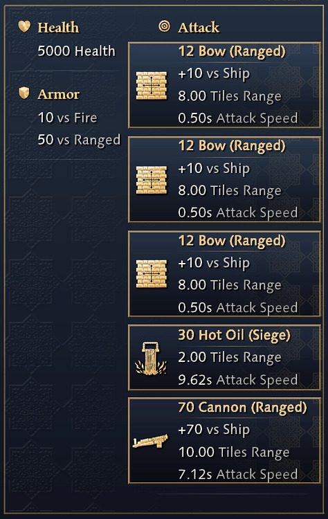
Or for instance better ways to show a building’s attacks;

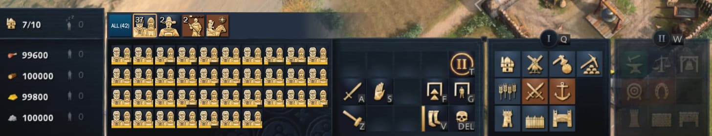
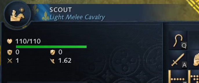
Or better utilizing the space for unit icons (which for some reason are always cutouts and shrunk);

image
image

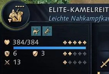
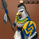
Or even an alternative style unit icons, trying to combine the charm they brought in past games alongside the same modern design principles utilized in AOE4;

Spearman_128x128

Ultimately, I really do champion the idea of them rehauling the UI themselves over relying on mods. For example, compare what COH3 got to AOE4. While their UI was bland and soulless initially, they were far more invested in listening to their playerbase, which actually led to a redesigned UI with the same charm of the past COH games before they even launched it.


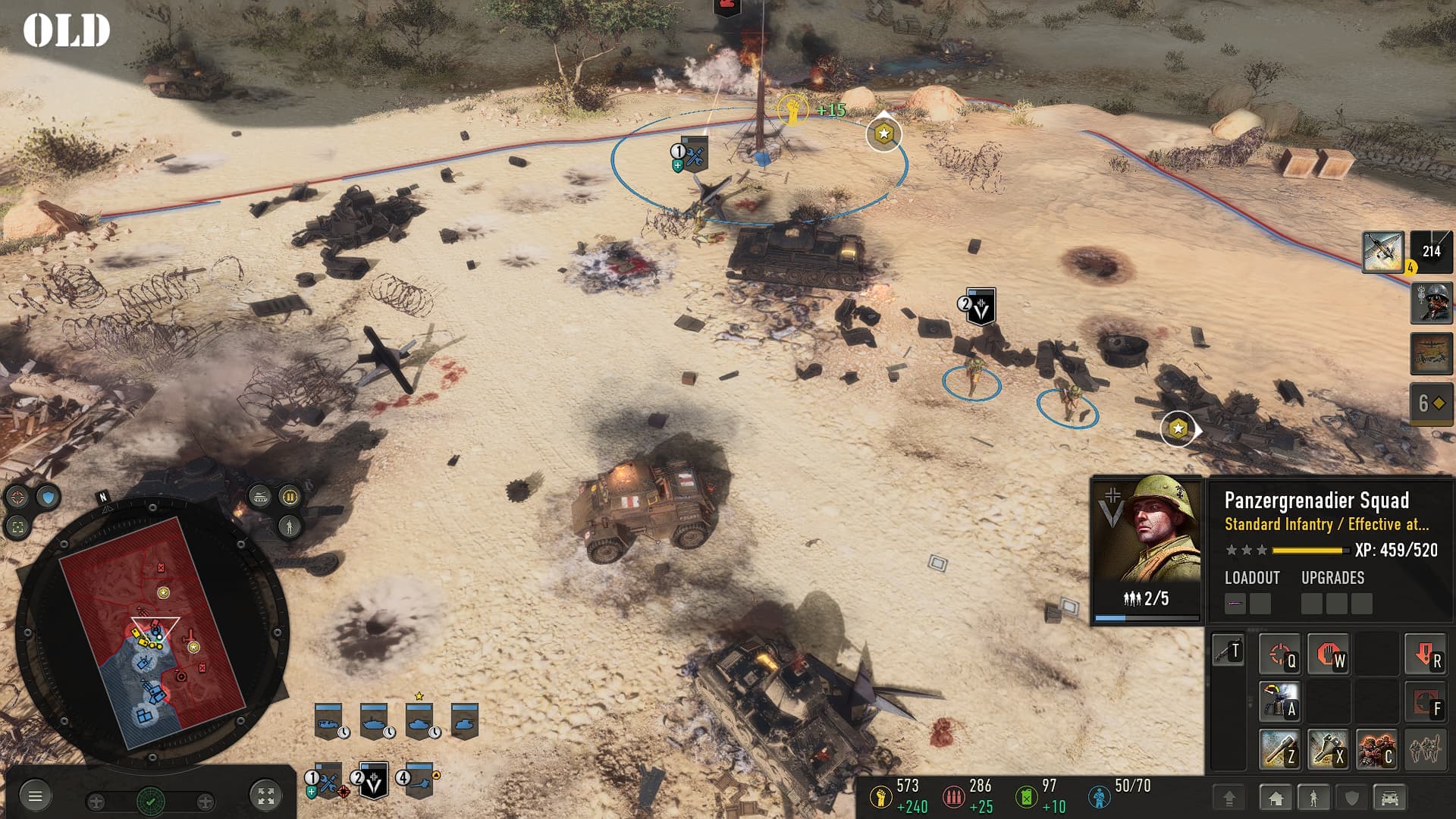
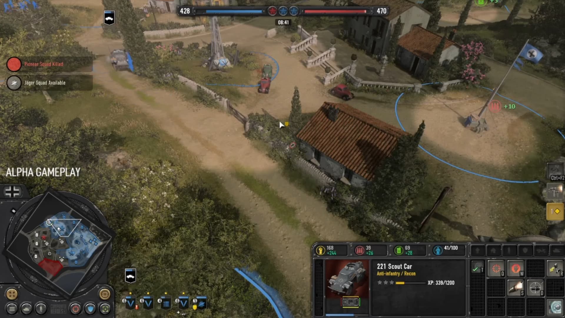
Yet, here we are in AOE4 a year later, and all we get is this.

image

I really really wish we would have gotten the same treatment.

2 Likes

I agree. I really like the AoE 4 UI.

AOE4 UI is the worst in almost all AAA RTS franchises!

the only thing i hate is, the enemy is seen as AI easy or medium, but i can’t see which nation it is.

Good stuff agre, if the game would have this UI and personalize mod to be able to use in all games like AOE 2, it would be a huge if not gigantic step forward, please developers, we believe in a future