Three reasons why the aoe4 UI is simply overwhelmingly good!

I said this elsewhere but this must be a more appropriate thread:

Something that really bothers me is how all units and buildings lack proper images in the UI, I mean… that’s so basic. In every title you have an artistic colorful picture to represent the said unit or building which made it satisfying managing them and looking at them, be it buildings or units.

I feel like they just went with the easy and lazy solution here to avoid creating unique images for each civ.
I think it’s something that screams esports again, clarity, simplicity, ease of access but very dull and uninteresting design.

7 Likes

I have to make a mea culpa in this thread, it’s not only the hard numbers for stats missing. I was probably taken away by enthusiasm and it just didn’t occur to me that we dont see each individual selected unit in the UI anymore, which is one of the most important UI pieces of information in an RTS.
So I’m not of the opinion the UI is good anymore.

In any serious RTS we would have something like this which lets us micro our unit selection (selecting a specific unit, pulling away wounded units, a specific group etc either by clicking or + shift or + ctrl clicking) from the HUD, because it’s not ideal to select them in the 3D screen while they are moving.

aoe2

sc2

And AoE4:

So we can only see groups of same type of units or all of them?! Surely we are going to see individual units in any selection as well, right? This is extremely important.

I was wondering why the UI was so clean, like something extremely important was missing, well there it is…

7 Likes

While I agree the dark blue and sharp edges are more pragmatic than thematic, it cannot be overstated what wonders it does for the contrast between UI and the main gameworld. 2D rts’s get that contrast mostly for free due to their nature, but I have found many 3D rts’s struggle in this regard and I’m happy to see that AoE4 very clearly does not.

Unlike you, though, I am not a fan of the iconography ( other than the color coded structure categories - which I think are great ). While you can definitely get used to them I don’t think they are as intuitive to new players as Relic thinks and can end up as somewhat of a hieroglyphic mess; I have this same pet peeve with other Relic titles. I think carefully made, and iconic, colorized pictures would come off as much more memorable, and they can be made to contrast with each other much better than unicolor iconography ever can.

2 Likes

Very beautiful village.

But pain are units and arrows.

1 Like

Its very basic to have such a UI.
A civ based ui or border with unit pics in it would be alot better. Even if they don’t want to change the UI. Just a possibility to have unit pictures instead of the basic icons would be better.

I’ll just put the Stronghold’s UI here for an elemental comparison. Not only is it personalized for each civ, but also look at the beautifully designed and colorful images for each building.

Was it really hard to do something like that? They are all categorized in tabs that show with a simple, clear but also colorful symbol what this tab is all about. There’s no need for brown-green-blue backgrounds, yet it’s still a clean and organized UI.

Even stronghold’s units have portraits but looks like Relic just decided to take its inspiration from Excel. Seriously, even Power BI has more beautiful icons.

2 Likes

Everything the developers did you say is lazyness

Saying “me and most of the people” is an ignorant opinionated statement

2 Likes

I completely agree here with the group of people that believe that civ based borders and unit/building pics or art is better then the simplistic ui and icons that are there now. I like the immersion feeling it provides.

3 Likes

The UI is extremely good from the perspective of usability and clarity. I also like the clean and simple look, though that is a bit more subjective.

2 Likes

I like the UI and how clean it looks! I do wish that every unique building, technology, and unit had a beautiful unique image like AOE2 and AOE3 do. Just look at the amount of history, detail, and immersion that having unique icons does for AOE3 DE:

4 Likes

On 1 using a number to select a type of unit seems pretty cool as well as how it shows the types of units you have on the left of the screen. However what if there is more than 10 units.

The UI as shown in the fan preview is really disappointing and a terribly uninspired, unimpressive departure from the entire series. No more unit portraits. No civ-specific icons. It’s drab and looks slapped together.

9 Likes

definitely glad aoe o crew is around and I am not the only one who thinks this…

2 Likes

If there were no unit portraits in AoE1, there would be no Wololo or Rogan memes. I am absolutely shocked to see anyone walk away from the unit portraits, which by showing a close-up image of each unit plays a huge role in pulling the player deeper into the world. We play at such a zoomed out altitude that we need the portrait to feel like we know the unit. They give such personality to the game.

I cannot defend this decision that we are seeing in the fan preview video.

7 Likes

I think it’s a mistaken attempt at a clean UI that will come of as approachable and “modern”. I generally applaud this vision but for unit/building UI “buttons” it’s backfiring. It’s not even hitting the marks they’re hoping for; this design is contrary to what modern audiences are comfortable with.

Unit/building buttons in AoE are encountered most often when displayed packed together in a grid with fairly small pictures; modern audiences are very familiar with this setup - you see it all the time in inventories for looter shooters / rpgs / survival games, etc. The one thing all those inventories have in common is that they are absolutely filled with colorful and diverse pictures. In fact, the more colorful and diverse items are the better and more engaging is the inventory. The building construction menu is AoE’s version of a grid “inventory”, it is literally exactly that in both form and function, and to have it be unicolored symbols is absolutely the opposite of what modern audiences are looking for. They want to have a inventory filled with tasty and shiny objects, not a Excel spreadsheet.

1 Like

and also @LostCord3 regarding the UI look - I also think it doesnt fit what we know as age. I actually disliked it until i realized why they used it.

However from the way the campaign is set up, to the ghost villagers, the whole thematic of age 4 is that you basically play a documentary of an empire (which you actually build up from scratch).like the ghost vils showing it actually took long to build stuff and its basically a fast forwarded history video.

Which is probably why the UI has this design. Its much more modern looking, sterile and looking a bit like business - because its all fitting the nowaday documentary theme. They use what a neutrl documentary probably would generally use. at least thats the way I see it now and with that in Mind, I like all 3, the ui, the ghost vils, and the campaign setup :smiley:

however, although i like the plain UI and I explained above why -

remember this was still a very early build of the game. That may also be why the building and unit icons were generalized. These pictures are probably one of the things included in the game at the later stage of development, its even possibl ethe UI design itself was a simple make it work and not look terrible approach. WHile I do not think the latter, and I am very fine with this UI, keep in mind its quite possible that at least the building/unit icouns could change. Although I personally doubt it :wink:

Yea it’s not a nine, it’s a backflipped six. Listen my friend, I am sure that they will come up with all sorts of excuses eventually to defend what they made, i dont really care about that, I have seen it all too many times in the past.

I still remember Philpp Boulle from Relic, lead designer of dow3 and current narrative lead of aoe4 asking the fans in an interview -while clearly baffled about why fans hated it- “did you guys actually play the game???” and things like “my answer to you is to actually play the game”.

Well guess what, we played it and it sucked.

When you’re a cook you have to cook the dishes the way your customers like it. You can’t serve an almost raw pork and say that you personally like it that way.

Some people on the forums see the devs as infallible gods that have to always be trusted and listened and everything they say or every decision they take is correct and there’s a good reason behind it. Well they’re not and they can actually blunder things big time.

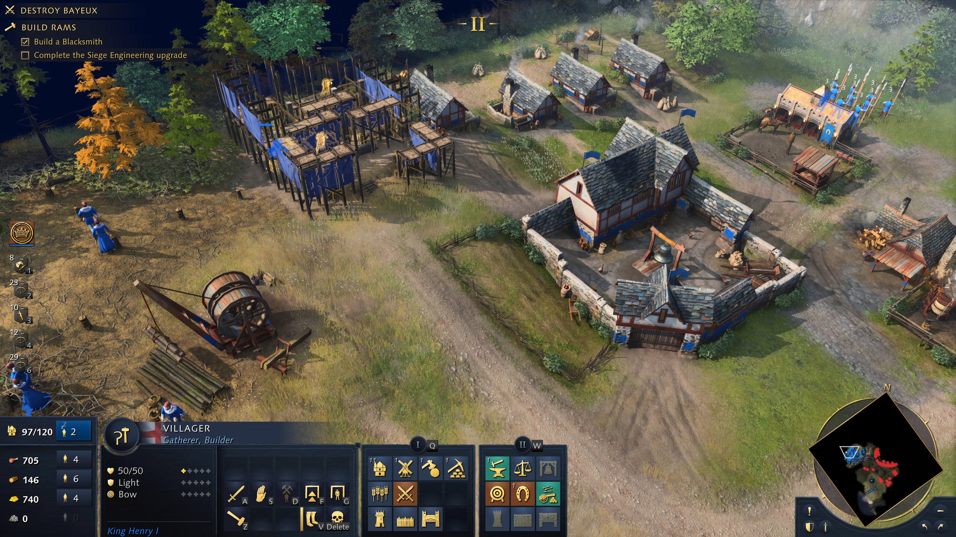
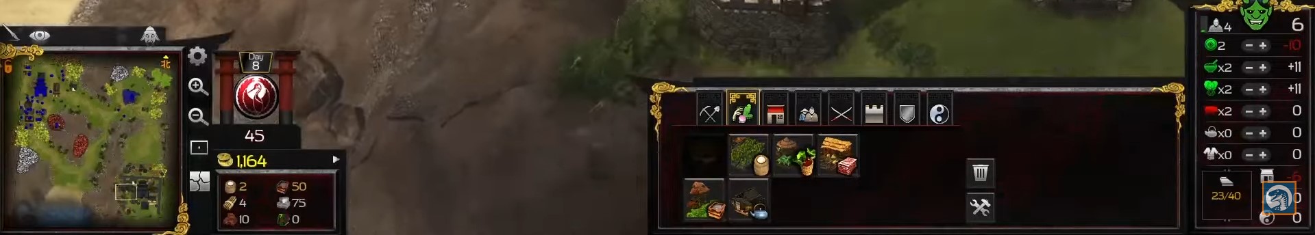
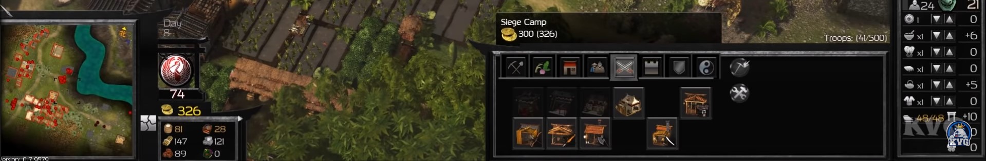
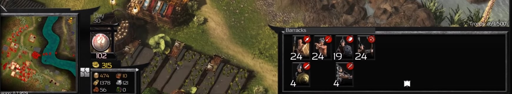
The way I see it, the UI is just horrendously boring, unfun, unimmersive, uninteresting, lazy, sloppy, out of place, inexcusable and indefensible.

Listen, there’s an old saying “when you’re not sure which is the right way, always take the harder one”.
I could have probably taken their UI design a bit more seriously if that was actually the hard way to do it.

But it is not. This is the easiest and most lazy approach they could have taken. An indifferent dark blue background, same for all the civs and extremely simplistic icons for units and buildings, an all too convenient approach to not have to do extra work for each civ.

This is not something made with love or care, there’s no attention to detail, there’s no detail at all. It’s just the bare-bones thrown together.

The only thing that I can give them credit for is that they were true to their word when they said that they’re gonna do things like no other RTS has ever done before.
Indeed, no other rts has ever put so little effort in such a crucial feature like the UI. No other rts has ever taken such a misguided approach on game clarity as to reach the point to downgrade the game’s experience for the shake of it.

I wasn’t even joking when I said that Power BI has more beautiful icons. And that’s an actual business app, not a video game that’s supposed to be fun.

2 Likes

Sorry, but i voiced my opinion here. There is a Design Philosophy behin Every aspect of a Game, and i merely stated what i think they went for.which ist the modern documentary Style.

And maybe you are Not quite Up to Date regarding Design choices, but nowadays Icons get AS simple and generalized AS possible. But of course there is an Argument for mir Detailed ones. Which i dont think really fits here. The modern Doc Design explains that aswell.

You May Not Like the Design Philosophy but i can assure you creating the generalistic Icons ist more Work than using in Game Models for Icons.

Also has nothing to so with devs, i Like the Style in the documentary context.

And the Info given in this ui is pretty good too.

But i am Sure PPL Like you will create an old school ui and all will BE fine :wink:

1 Like