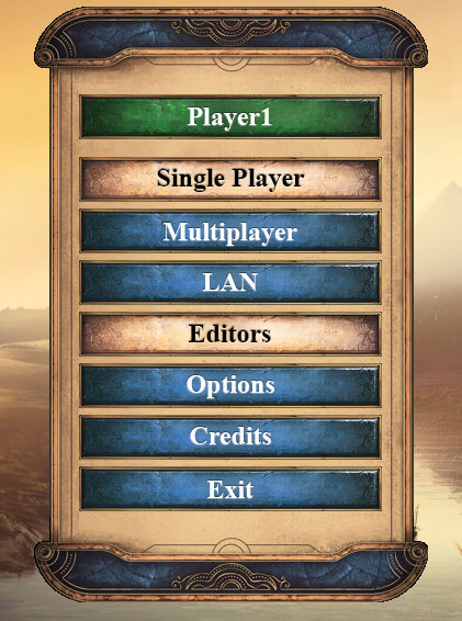
I find the buttons on the main menu and lobbies difficult to read. The blue is too light for white text. The background of the buttons should darker. It’s also difficult to read the white text on the light brown background in the popup menus.
Also, why was a sans-serif font chosen for the UI? A serif font seems like it would fit better with the games theme. I also don’t think the text-shadows fit with the games style. On the buttons, the text should look like it’s chiseled into the buttons.
I made a quick mockup of a change to the main menu.
