idle unit flags should be on the bottom next to the unit que, which should be either beside the map/on-top of the resource count on the minimized ui or ontop of the unit command/build screen depending on player preference from the menu. right now its split into 4 corners of the screen for no reason.
top right should only have player names, game time and menu options. i should not be looking up there at all in normal game play. upper left is the same.
unit ques should show a single icon with the number of units queued per building. making 6 hoplites from 2 barracks should show 2 hoplite icons with the number 3 on each of them. right now the individual icon for each unit queued is a pain.
when queuing a unit from multiple buildings, clicking once should que up that unit from each building.
rally flags when selecting buildings can be clearer, aoe4 did this better. shift clicking flags should also be clearer like in aoe4.
make the mini map sit straight rather than diagonally by default. the current positioning is just wasting a lot of screen space for no benefit. why is it positioned this way?
initial villager spawn should always be in the direction of the closest hunt. or hunts should spawn near where initial batch of villagers always appear. its unneeded rng.
rework farms to neatly fit into town centers and resize granaries. its a pain currently with no gameplay benefits.
have stockpiles on gold mines snap in place to allow villagers to fit between them. currently you either eyeball it or just give up and slam it right ontop of the gold mine.
cant sort through custom lobbies by clicking on players/game mode/region/password lock on top.
have a green READY text by our icons in the lobby when ready to make it more clear
tech tree has a box and scrollbar for each major gods benefits when you could probably fit them without it for most of them. mouse scroll wheel works for this scrollbar, but doesn’t work on the horizontal scrollbar for techs. scroll wheel should by default scroll you you horizontally on the tech bar no matter where the mouse is, and there should be be a left/right scroll button on the very edge of both sides of the screen rather than a bar at the bottom.
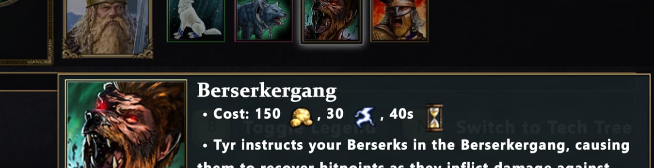
some of the bottom tech tree info boxes are partially cut off like berserkergang on a 4k screen:
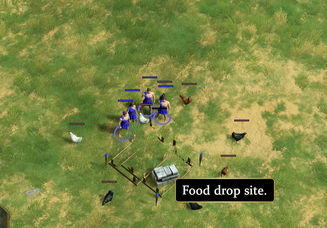
some unit hitbox/collision is really bad. pathfinding is abysmal all around, units get stuck on the most minor thing. villagers need to ignore livestock and villager collision/hitbox when building and gathering. they get stuck on each other too often. an example where villager are blocked by a single chicken from building a granary:
units need help with targeting. for example when i order an attack on a unit that goes into fog of war or dies, just move towards that location and then attack move the area rather than dropping orders. raiding after scouting villagers is more work that it needs to be, and attack moving towards those villagers could result in the army attacking buildings on the way instead. currently they drop orders and in the middle of a raid and its a pain. attack move can and will fail at times.
infantry/archers need more unique colors and poses. when upgraded its hard to tell different archers and infantry apart due to similar armor and color schemes. please add more unique colors to each infantry unit when upgraded and employee more unique silhouettes and animations to better differ between them.
special attack animation hitbox/collision is wonky. for example titans will slam the ground underneath them and then half a screen away the units that ran from the animation get blown away while the units directly under the attack are unharmed. how the animations and hitbox act in this game makes it hard to take it seriously. you should be able to dodge abilities, and their hitboxes should match their animations. also a lot of these animations are disappointing, the titans especially could be better.