How come? I wonder how can you even defend this opinion as those icons literally build on what the franchise has been doing and improving since the dawn of time. You either haven’t played this franchise at all or you always hated what it has been doing with its UI/icons. Decide.
Exactly. And looks like even among the council there was no unanimity on important designs like this one. Each must have been pushing towards their own personal preferences.
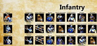
to be fair here, age 3 DID add a lot of color and background which 2 and mythology didnt have
I think that may be the sole reason. I actually like the nojn-background ones better, but they must fit the UI. (They do in age 2 where they are on a very datrk background - they dont in your shot from mytholgy)
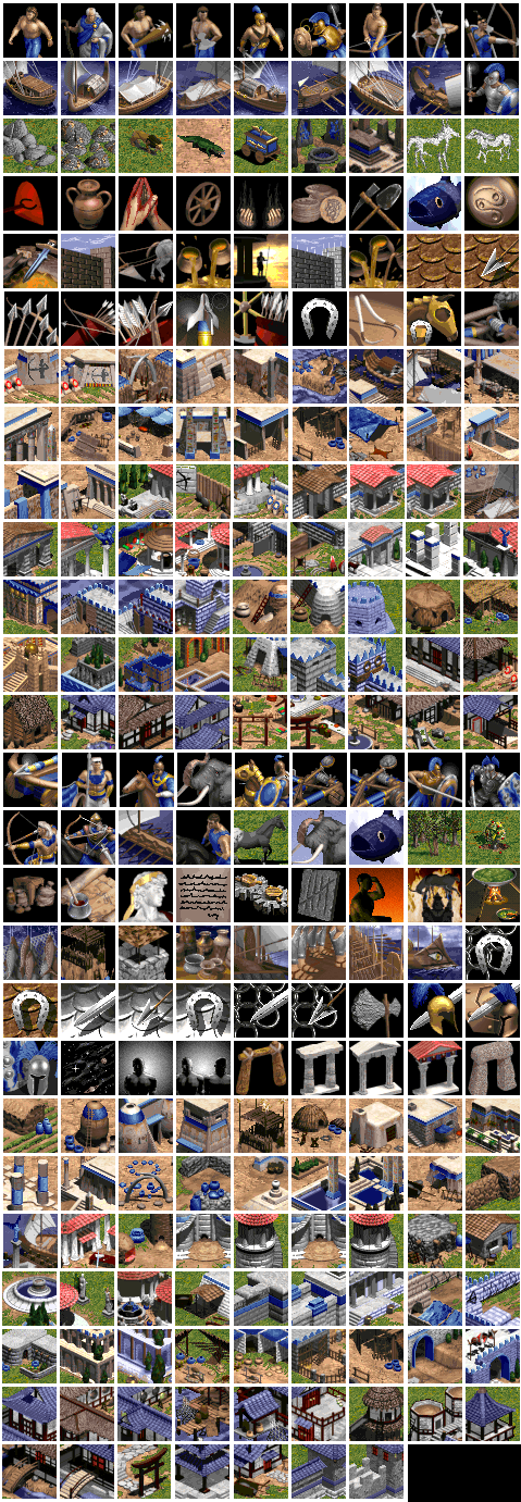
Because the icon designs in AoE 2 (and to a lesser extent, AoM) are much simpler and are better standardised.
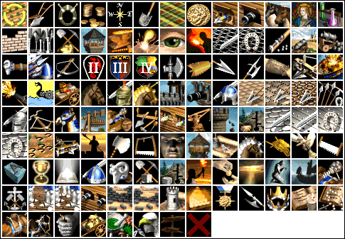
The AoE 3 icons have quite a range of art styles and in many cases have far too much happening. I think the icons with the gold backgrounds are ok and the resources icons are alright, but beyond that, AoE 3 icons are pretty trash.
But they follow the same principles. They are just at better resolution and the units are actually drawn rather than compressed in game models.
I admit that they have some more background color but thats it. aoe2’s icons that you said you liked are way closer to that rather than what you see in aoe4.
If you dont play for immersion and you get satisfaction only by competitive play and winning then YES, you dont care about none of that. It’s all trivial. But for the rest of us, it is not.
I am not sure tbh, if I like age 2 or age 4 icons more, certainly not 3
Short elaboration by me- they chose a general modern documentary style which is displayed in may elements of the game.
Most promindent of course is the cutscenes from campaigns, leading to the buildings and people with golden outlines, then into gameplay.
The “ghost workers” also fit into that approach/design.
We saw now that the fog of war also will follow these guidelines of golden lines.
Basically we play a modern documentary.
And while the age 2/3 icons are beautiful, They were designed to fit a medieval time (age 2) or a card deck (age 3).
This is what I mean - they do not fit the general setting/graphics guideline of age 4 as modern documentary (at least to me).
The most fitting one might be to include actual real life pictures of what is portrayed, although that would be a) a LOT of work and b) probably too overwhelming/not quite fitting each nation
Which is probably why they went with iconized, basic symbols rather than beautiful pictures.
Same as a documentary likely does. They dont try to be beautiful, more to illustrate.
All in all I think age 2 icons fit perfectly in the age 2 UI as its theme is medieval.
and the same goes for age 4 with the icons looking more modern, simplistic, somewhat golden, and on a dark blue background, being stylized.
I hope this did explain good what I am trying to say. Of course it is just my personal opinion.
As said I also did like aage 2 Medieval style UI, but it just isnt what the devs had in mind in age 4. WHich is also good because it would then have even moer age 2 remake vibes (may very well be a reason for the decision to go modern looking UI)
In one hand, I kinda like how sober and clean the UI and icons look. In the other hand, this new UI and icons lack any personality, and Age games always had a lot of personality and cool, representative icons.
Also, as Andy says, probably part of that said council is not enthusiastic with the result, too. And don’t forget that the “council” is formed in a big portion by people that is there only because of being mediatic AoE community-related people (especially streamers) if I’m not wrong. So expect a little portion of valid, reasoned wisdom, and a lot of “that’s amazing” by the ones that are only being compliant because love their new role.
I honestly love how the new UI looks. When you play the game the UI is really not in your focus. So a UI that looks clean and gives you the infos you need to know at a quick glance is perfect to me. I especially like the iconography for the techs in the house of wisdom. They are so easy to read even for a new player and to me that is great.
We have lots of players from AoE3, AoEO, and AoM. And all of us like that ofc know AoE2 as well. I once was an AoE2 player, as well as every other game. It seems the people with the most feedback are able to pull from all the games. And the best competitive players were from AoEO and AoE3. AoE2 players not so much.
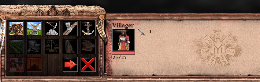
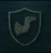
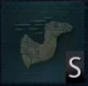
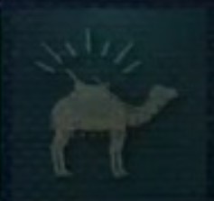
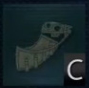
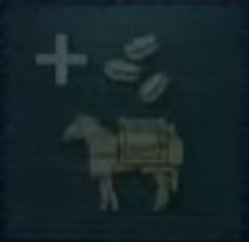
I really wish we had unit portraits. The tech upgrades are usually pretty abstract, and those camel ones seem fine, though some of the meanings do not immediately jump out at me. But how they feel in the context of a game is all that matters.
They reallllyyy need to just go the way of the rest of the series and not have these crappy trendy minimalist icons. Give me a ■■■■■■■ screenshot of each unit for their icon I don’t even care as long as it’s clear what I’m looking at