When the discussion with all those people criticizing the UI and asking for change was taking place under a thread titled “3 reasons UI is overwhelmingly good”, obviously it would go unnoticed that nobody in there liked the unpersonalized and generic looking UI icons.
And now we heard the devs proudly saying that it was the community council that influenced those UI icons. Which makes one wonder whether the overall contribution of this council was eventually for good or worse…
From what I have seen in this forum, most people preferred the more personalized, traditional UIs that we knew with every previous game. Beautiful, colorful, detailed and unique for each civ.
They were adding much more to the game than the current ones that resemble more like something between traffic signs and Excel’s ribbon
I like the new UI. Maybe not better than the old one, I can’t compare them. But it looks well and better to use. But I hope for all the fans of the old look that you can install mods for alternative UI. Maybe they even give us an alternative UI directly in the game
oh for god sakes. if you think for a bloody minute that everyone on the council likes those horrible icons, you cannot be helped in your witchhunt.
The units are supposed to be our best friends. We are supposed to see them on the screen and look forward to clicking on their charismatic portraits. They should not be hidden behind sterile implements. We need AoE4 to speak our language. Every detail matters.
Units in Age never have symbols for icons, they use portraits. This helps bridge the divide between the player and the units on the screen. Units are often way too small for us to notice lots of details, and human beings are drawn to look at faces. The unit portrait serves a critical role in humanizing the game, and the developer’s refusal to see that pattern in age games and embrace it is irreconcilable. I hate this UI. It is different for the sake of being different. It has absolutely no value to the game and only makes it feel distant and cold.
Looks like you are the minority tho. If most of the council actually disliked this much this UI, we wouldn’t be having the devs themselves publicly stretching how the council influenced these UI icons.
We probably wouldn’t be having them at all.
So my point that the council overall played its role into that, stands strong.
But I agree with the rest of your reasoning. It’s just terrible.
Sometimes you need to play around with a game to actually feel and see how everything plays out, maybe it’ll do the same here with the UI.
Time will tell I don’t mind it, and I think we just need to have a bit of patience until we get it in our hands at this point. The overall game is done and there isn’t going back to changes unless it’s balancing issues at this point. I’m just glad we’re getting AoE4 and hope that this will make AoM2 possible as well as future AoE installments.
I dont feel comfortable addressing how anyone but myself feels about those icons, so I won’t. But please don’t speculate how anyone else thinks about them. Let people speak for themselves.
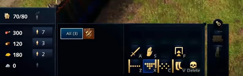
I like the UI icons, they are clean and easy to read and I also think they look good aesthetically. The problem for me is that it seems we dont have a unit/building selection box on the UI showing units separately, but rather all grouped together in the same type of units. This hinders micro a lot, but I would have to test it out to see why they chose to do it like this.
the fact that I dont even remember tem really because I focused on gameplay shows me they are well done because they didnt abstract me from gameplay.
However I can see that the modern documentary style is not liked by everyone. Thats ok I however doubt they will change these icons. So maybe mods will. But add9ing unit profiles, I dont know, they dont really fit. maybe a modder fins a way.
I didnt speculate how you feel you are not the council, just a member of it. I know that you don’t like them as much as I do but if I am to take the devs’ words seriously, it’s an arguable speculation to say that the council overall liked those icons.
They are great for if one just plays competitively. Or have some kind of vision disability.
Not only that, but since the units are also grouped by their generic types, those unit icons are also the same for every civ. I saw the Abbasids having the same exact type of icon with the English although visually, in-game, they look different.
aoe3 impressively created numerous of such icons and showed the way of how it’s done. I doubt a mod will be able to create something like that for each civ with such care, and if they do, it will likely take a lot of waiting time.
I hope the borders of the UI “squares” (not the layout of the UI itself) comes in different colours, preferably one with a wood grain finish. Those blue colors feel too futuristic and soulless to me, like a house with white leather couches and glass coffee tables.
But on a more serious note, the UI looks a bit simplistic, but I think it has everything there that needs to be there, it’s a bit odd to have the resource count display on the left hand side, that’s my only big complaint, I hope there will be an option to change that to the right hand side or the top.
that System with all these pictures made sense in age 3 and ONLY there
Because these are all home city delivieries, so they have to be on one screen but easily destinguishable.
The only instance where so many info is given in age 4 would be the tech tree. There, it may be possible Unstylized icons are used, although I doubt it. they will be more like tne buiding delivery symbols in age 3, which themselves are quite simple.
Hiwever we didnt see the tech tree yet, so it may aswell have icons for each unit. But I am sure as the UI is that way, it will be just sa staylized as the rest.
This is fine, but if anyone is really annoyed by that, in 2022, when modding is possible, I am sure each icon can be interchanged with a handdrawn one, if one wished to do so^^
well, its a modern documentary you are watching/playing, so the color firs. But I understand the want of a color you personally more like.
Lets stick with colors only first, as they are easier to implement. Maybe change it according to player color and then make it possible to change into brown for example. Wood grain finish seems a bit more special so I doubt such change/ option would happen
they took parts of all player bases, so they are as representative as a well done survey. Of course a closed beta may also gove feedbakc, but for most of these things, a small playerbase was a good idea to have been influenced by. you can see this in how age 4 still clearly is an age game.
I don’t think the UI is as unpopular as you claim. In this graphics thread: Graphics likes/dislikes Poll
53% of players said they liked the UI and 25% said they disliked it (leaving 22% indifferent).
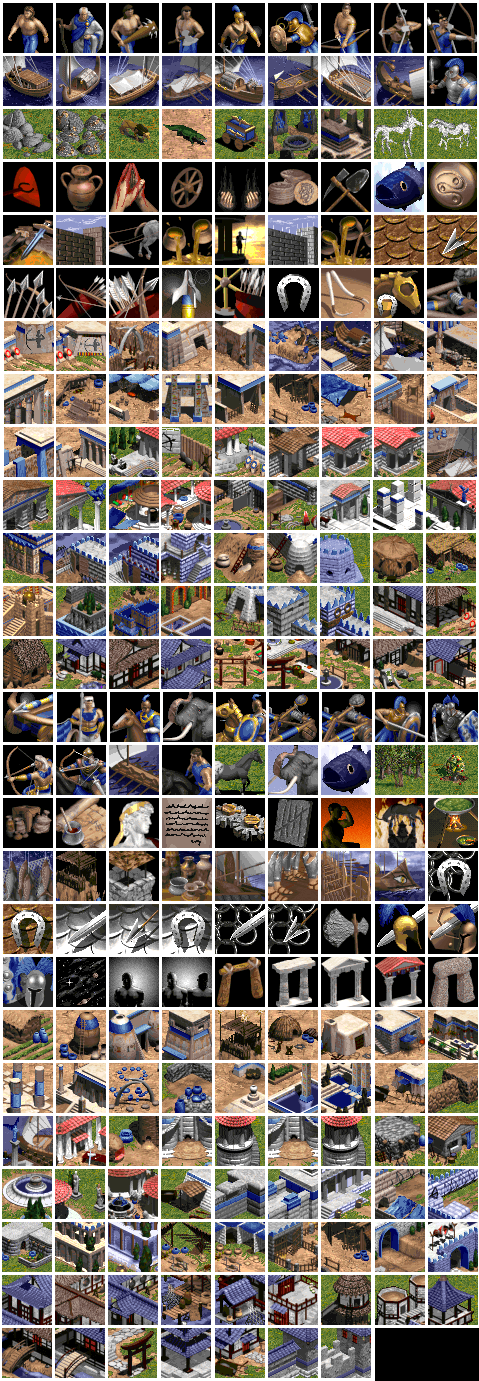
They are a great example of how icons could be made while being detailed, colored and artistic. The same exact principle applies to the UI icons. I did not reference this image to show the deck system but to show you the icons. aoe3 has tons of them, made an in an excellent and appealing way.
These polls say very little to me. Not only are they created in an extremely poor manner, with a thousand of options and sub-polls, but their sample is also extremely small. There are actually 2 polls squeezed in there, one specifically for people to say what they liked and a separate one for people to say what they didnt like. These percentages are each for their own group.
You can’t get people’s attention to vote about the UI with all those options and even more important issues like were the arrows, the proportions and the graphics around them. Some vote specifically for their top priorities to reach higher precentages.
Other people may not even pay a lot of attention to the UI during the trailers and not even remember about it like Heinrich above who didnt mind as he said. But if you show them side by side the two versions, they will tell you which one is better and which they prefer.
I’ve actually always disliked the icons in AoE 3. They’re messy, and unclear, and there’s very little standardisation. AoE 3 is a great example of how not to do icons.
I see, in that case I will say that age 3 also had stylized ones for buildings - and I think the ones in age 4 look as nice, with less detail (which isnt necessary).
BUT of course more details/ beautiful Icons are possible. They would however not really fit the documentary style imo.
Anyways, as soon as modding comes, PPl may start to experiment there
What i more meant was that because of the deck system, age 3 had to have some more beaztiful card artwork icons anyway, which is probably why they went with it for the general UI aswell .


 I however doubt they will change these icons. So maybe mods will. But add9ing unit profiles, I dont know, they dont really fit. maybe a modder fins a way.