I would like to make a few suggestions for QoL improvements regarding the updated UI after the most recent patch.
Resource gatherers location
Currently, we have the following order of elements in the “'default” layout:
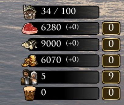
Before the most recent update, gathering villagers were shown to the left of the food, wood, coin icons. Could this be the case again? Showing the villager numbers next to the resource numbers (and possibly the resource gather rates) makes it a lot harder to read. The old layout -which is still preserved in the “classic” HUD layout, is a lot more readable.
Buffer for connection icons
In the current layout, whenever a player is experiencing connection difficulties, either a snail or turtle pops up in the scoreboard. This however affects the scoreboard width, causing the scoreboard to fluctuate back and forth, which I’d say is somewhat of a nuisance. I would suggest padding the scoreboard width with a buffer the size of the connection icon, making it constant in width to prevent the current “twitching” effect.