It isn’t enough.

So first, I’ll acknowledge that this is going in the right direction of adding more flavour and style to the UI. However it is very minimal and there are lots of opportunities to add more flare and ornate elements on the current UI without the need of changing its format, like around borders or better use of space. Oh and adding actual unit portraits.
Don’t get me wrong, this isn’t a complaint about trying at all. Rather, to signal that this addition should be magnified. Company of Heroes 3 were lucky enough to get UI that reflects the immersive experience that those who play RTS games tend to look for. They got this months before the release of it, mind you.
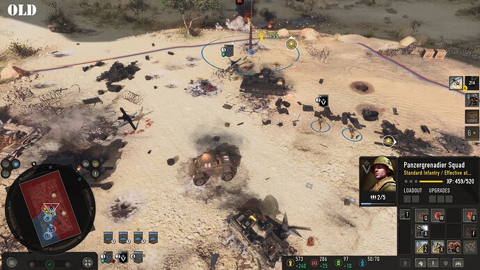
From this
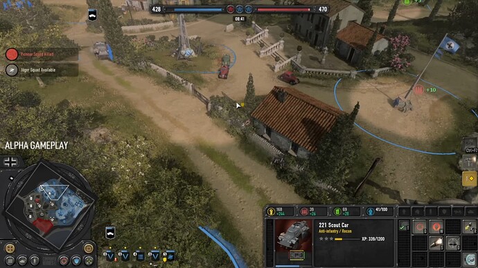
To this
AoE4 should not be an exception. I think it is time for us to get the same UI makeover.
EDIT: If this post comes across as combatitive, let me explain that few people have touched on the subject of the UI changes in the PUP. So this post is partly made to stress that, yes, keep changing it, and no, this is not enough–giving feedback where there is little.
4 Likes
I think that the aoe 4 UI is much cleaner and i much easier to understand without knowing what is what. Tell me where do I see what the unit does, how strong it is and what’s it s armor is I have no idea where I see that and that’s the most important info for a unit. If I select a unit I want to see all it s stats that a relevant to me, I see no stats that matter to me in the company of heroes UI. on top of that u take a zoomed in screenshot from aoe4 and compare it to a zoomed out screenshot, how can u even compare the two is beyond me ?
2 Likes
It seems that you misunderstood the post.
Like I stated in the post above, there is still a lot of space to improve the UI without altering its current layout.
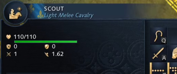
I’m not asking that we should copy CoH3’s UI format, positioning or graphics. The first image is showing the new addition in the PUP, basically the only new aesthetic thing to the AoE4 UI. The other two images are showing a comparison in Company of Heroes 3’s past and new UI to show how drastically different and improved it is.
As you know, this is pretty much the first time they change AoE4’s UI for the sake of aesthetics. So the point was to contrast the amount of effort put into each games UI in their attempt to improve it, and how the PUP addition is lacking despite being in the right track.
I’ll reiterate; I’m not asking for our UI to look like theirs. Instead, imagine the effort they’ve put into their new UI, being applied to AoE4. What is shown in the first image is far from that, and that is the point of comparing these two UI updates.
2 Likes
I don’t really see one of those company of heroes UIs as much more immersive than the other. The first is just missing a bunch of things and not laid out as well. I guess the second has a little bit of metal texturing on borders, but that’s not the huge difference between them.
I think we just need UI mods, let people do it how they want.
Personally I prefer the unique civ elements to be subtle and the UI to be clean and uncluttered.
My biggest wish is to be able to arrange and populate the grid panels however we like. I would probably only use 3 myself and sort them differently than by age.
2 Likes
UI mods would be pretty great. I believe I’ve heard about some projects tackling icons, but not so much the entirety of the UI. Although, I’ll be honest and say that this shouldn’t be necessary. The game was released at a very high price with many lacking features (notably a proper campaign).
And then there is the time to consider. It has been a year and this is all that has been done to the visuals of the UI. Unlike the examples above, where the CoH3 developers went above and beyond to address their community, months prior to launch.
UI really should not be ignored, and it needs a facelift.
1 Like
I play the open multiplayer test and one things that i don’t like was the UI. Missing information and hard to read. Too much contrast colors too.
I prefer aoe4 UI, far from perfection but is simple, clean and readable. I can’t waste my time in the UI while in combat to reach out the info that i need
1 Like


