This is taken from the PCGamer preview so this is how the game is actually going to be launched, not going to change anymore, but I’m doing this more out of curiosity on why would someone qualified and in the right mind decide to do the UI like this for an RTS of the scale of AoE.
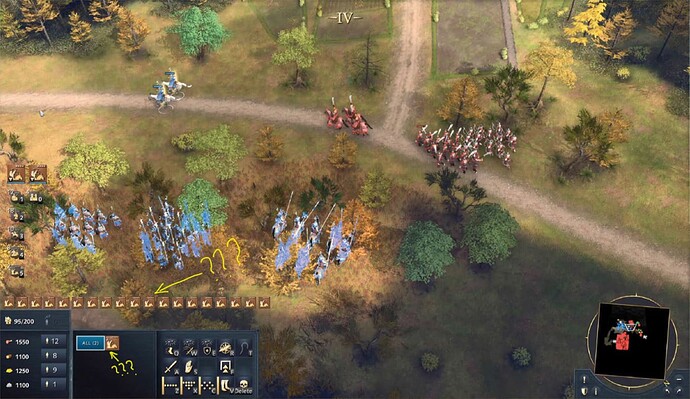
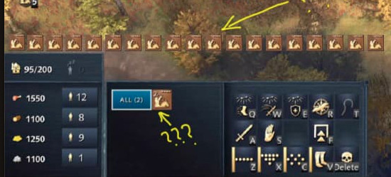
Image 1 is how the game UI is: selected units are grouped together in the same type, while queued units are listed individually - so the complete wrong way around in both cases (the queued units weren’t present in this particular screenshot, I took the liberty of editing them in because this is how queued units are actually listed).
.
.
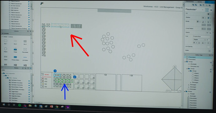
Image 2 is a basic sketch of mine just to get an idea on how the UI should logically look like for a proper RTS game on PC like Age.
The only explanation I can think of, besides dumbing it down, is having more main screen space (but at the same time they decide occupy the freaking middle of the screen with the Chinese dinasty button?!).
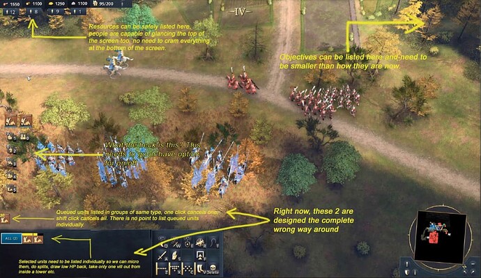
Well, if there is anything that needs to be present in the UI besides the basic stuff, it is the UI selection box listing units selected individually. You dont make compromises for that.
Therefore, in order to make more space, if this was the reason, things like the resources, workers on them, and pop can be listed at the top of the screen. Gamers are not dumb, they are quite capable of looking at the top of the screen as well in a glance. It has been like this in proper RTS games for decades and nobody complained. It is pointless cramming them all in the bottom of the screen and then complaining about lack of space. This releases plenty of space for a proper wireframe to see your selected units.
So, folks, please picture this, can you imagine that some people in decision making positions for AoE4 actually sat down, thought about it and decided that units selected should be listed grouped together, while queued units should be listed individually. This is how amateurish this is. Now Adam Isgreen tells us that he has this huge RTS background in his CV and knows RTS inside out, but actually greenlit such a design decision for the UI?! Please…
Yes, AoE3 didnt have a selection panel and that was a BAD design decision. So instead of taking whats good from AoE3 (e.g. manned crew) and leaving what is wrong behind, instead of taking what is good from AoE2 (e.g. UI selection box) and leaving what is wrong behind, some great minds in the development process thought it would be a good idea to make the game like this? This is my curiosity.
(and I’m not even getting into the design of the buttons, how confusing they look, that’s yet another discussion).
Also, in the PCGamer interview, Quinn Duffy mentions they weren’t looking to surpass and replace AoE2 by any means. Wow, what a terribly modest mindset to be pleased with so little. So instead of being bold, motivated, perseverant in creating something even greater, exceeding predecessors, having most of players switch to AoE4, you basically admitt you don’t have it in you to make something greater and AoE4 is just an alternative. So much for reviving the RTS genre. AoE4 is going to be just another game with a rather insignificant playerbase compared to others.


 I thought I was initially doing something wrong when I was playing in the Stress Test.


