In a different thread, I briefly mentioned an idea to color-code villagers vs. military unit icons in the lower-left panel of screen (the panel showing your selected units). @phoenix1089 took it a step further and proposed maybe having different military types get unique color-coding for their icons.
To see how this might look, I created three quick mockups below. They show three different icon colorization methods/ideas. I also mocked up a small button in the lower-right of that panel that would let you toggle between the options on-the-fly; to let you pick the one you want to use without having to pause the game to go to the Options screen.
I think some players might like this. The icons, as is, are sometimes hard to distinguish between unit types, so this would help see what you have selected at a glance, to make for speedier selections or de-selections.
- The color-coding could be pretty useful in and of itself, imo. But combine the idea with the current SHIFT- and CTRL-selection abilities of those icons, and it could be even more useful.
Here are my mock-ups. (I tried to upload as ‘actual size’ screenshots. Not sure if forum will cooperate with that. Click each image for best view):
1. Colored Border around Full Perimeter of each icon

2. Colored Border along Bottom-Third Portion of each icon
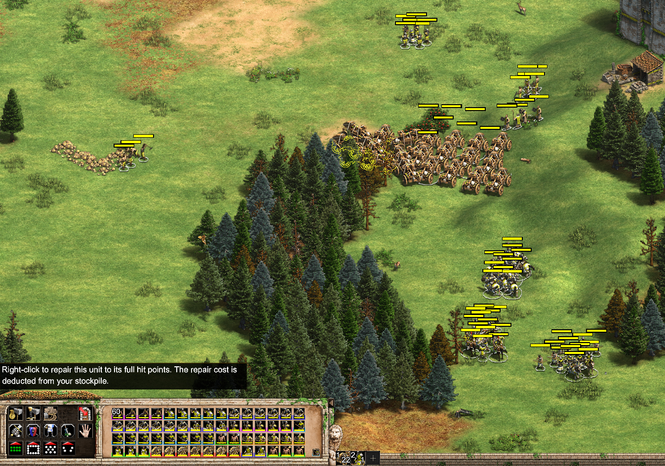
3. Colored Border only along Bottom of each icon

-=-=-=-=-=-=-=-=-=-=-=-=-=-=-=-=-
PS: I tried seeing what a toned-down version with more muted colors (less vibrant) would look like, and came up with the following. I had to dim the background color of the panel a bit to see the colors well enough. I only did a mock-up of this using the full-perimeter version:
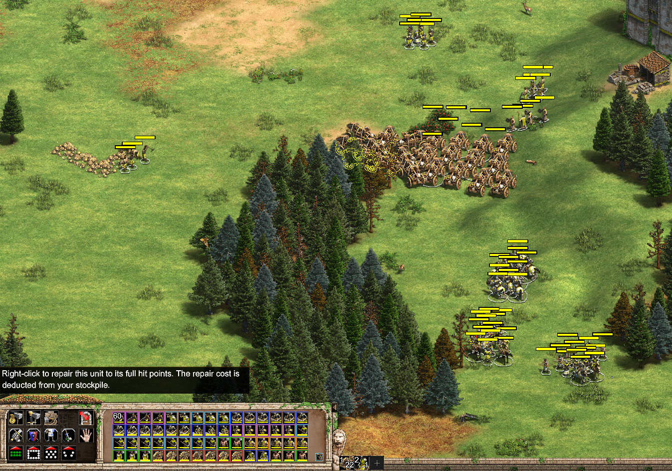
In these mock-up examples:
- Cavalry are dark blue
- Infantry are light blue
- Archers are pink'ish purple
- Siege are red
- Monks are orange
- Villagers are green
Variations for color-blind players could be devised. Sheep and cows (not pictured) would get no colorized borders. Naval units (also not pictured) could get their own color of some sort, but considering they’re pretty easy to discern by their nature, they probably wouldn’t need a color, to be honest.
Note: I know I might have accidentally color-coded certain units incorrectly (e.g., I might have colored some archers accidentally as infantry or cavalry, etc). Also, I’m not proposing that the color assignments need to be what I mocked-up. Please don’t pay attention to trivial errors like that; focus instead on my intent and the overall concept.
-=-=-=-=-=-=-=-=-=-=-=-=-=-=-=-=-
I know the mock-ups look pretty colorful, but that’s, honestly, hard to avoid. Ideally, I wanted less saturation/vibrance which is why I made the toned-down test, but when actually creating the mock-ups, it was evident you need some vibrance to be able to distinguish between unit types well enough; especially if you don’t dim or change the color/intensity of the panel’s background.
-=-=-=-=-=-=-=-=-=-=-=-=-=-=-=-=-
Feel free to vote for the one you like best. No matter if you vote or not, what are your constructive thoughts for, or against?
Please look at the mock-ups before voting.
Where do you prefer to see icon perimeter/border coloring?
- 1 - Full perimeter
- 2 - Bottom-third
- 3 - Bottom only
- 4 - I don’t want any borders. Keep it the way it is.
0 voters
-=-=-=-=-=-=-=-=-=-=-=-=-=-=-=-=-
PS: When I get more time, I might do a more simplistic mock-up version where all military units get the same color or visual treatment; only so it’s easy to distinguish them from villagers. (Or villagers get the same visual treatment, but military are left non-colorized.)
PPS: I have no idea why some of the yellow health-meter bars in the game currently are 2-pixels tall, while others are 3-pixels tall? That doesn’t help my mock-ups. I prefer 2-pixels tall for all of them. It seems the 1st and 3rd row have the 2-pixels variety; the 2nd and 4th rows have the 3-pixels.
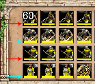
And because of this 2-/3-pixel issue, I refrained from including a mock-up I made where the bottom border line was thicker. Thicker colorized lines butt right up against health meters that are 3-pixels tall (i.e., no gap between the yellow meters and my colored lines). It looked weird to have my lines butting up against some health meters and not others. In a way, I think my ‘bottom only-but-thicker’ unit colorizations look more readable when on the 3-pixel tall health meter icons than on the 2-pixel tall ones. Regardless, I’ll include that mock-up here for fun and/or discussion: