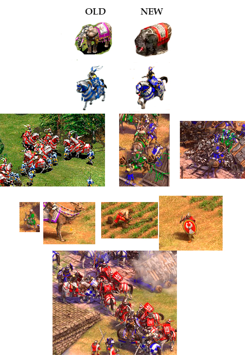
Hi, Am i the only one that consider that a lot of the unit graphic details on AOE 2 DE are kind of hard to see?
YEs, they are beautiful, but i really need to make an effort to see their awesomeness.
i think there is something in the colors palette that make them too equal, and low contrasting with the grass background.
Probably, the skin of the soldiers and some kind of foggy style do this.
I think that using a stronger white in clothing could improve unit visualization.
But, the real problem of this, is that you can not diferentiate them fast enough when they are on big numbers.
Do you consider these units easy to detail?
(all images has been taken from officially released imagery)
5 Likes
By watching these images, you are right!
good point.
A friend of mine once said: “developers paint the game black and sell it as a remastered version!” - as a reference to the resident evil 2 remake.
The individual units look amazing and all, but when the melee mess start i doubt i will be able to realise whats going on and micro accordingly in a reasonable time - at least until i get used to it.
the problem with fancy graphics… This happen a lot.
This was an issue with Age of Empires: Definitive Edition too. For realistic graphics, the readability of units and buildings on the field is sacrificed.
In the end it end up okay i believe. Once you’re used to it everything is as clear as before. At least for me.
but the base units of AoE was better.
Yes not clear enough. There may be a colored border outside the units. as if they were behind the buildings
Yes. i agree. In AoE DE too. When there are a lot of units, it gets kind of confusing
2 Likes
It does look a little hard to see
2 Likes
I agree, it is a bit harder to see, but after playing for 10 hours i got the hang of it. It will never be the same, but i think it is not such a big deal… your eyes need to adapt to new models. I still think these graphics are worth the loss. I enjoy much more. i like the realism it brings with it.
A lot of visual clarity is lost, they did away with the original 256 color pallette. Now we have more gradients and less contrast.
They took a gem and turned it into a stone. It’s a terrible change for rts.
1 Like