For a little more flavour to the units, here is a suggestion to change the current UI of selected units.
Here is how it is currently
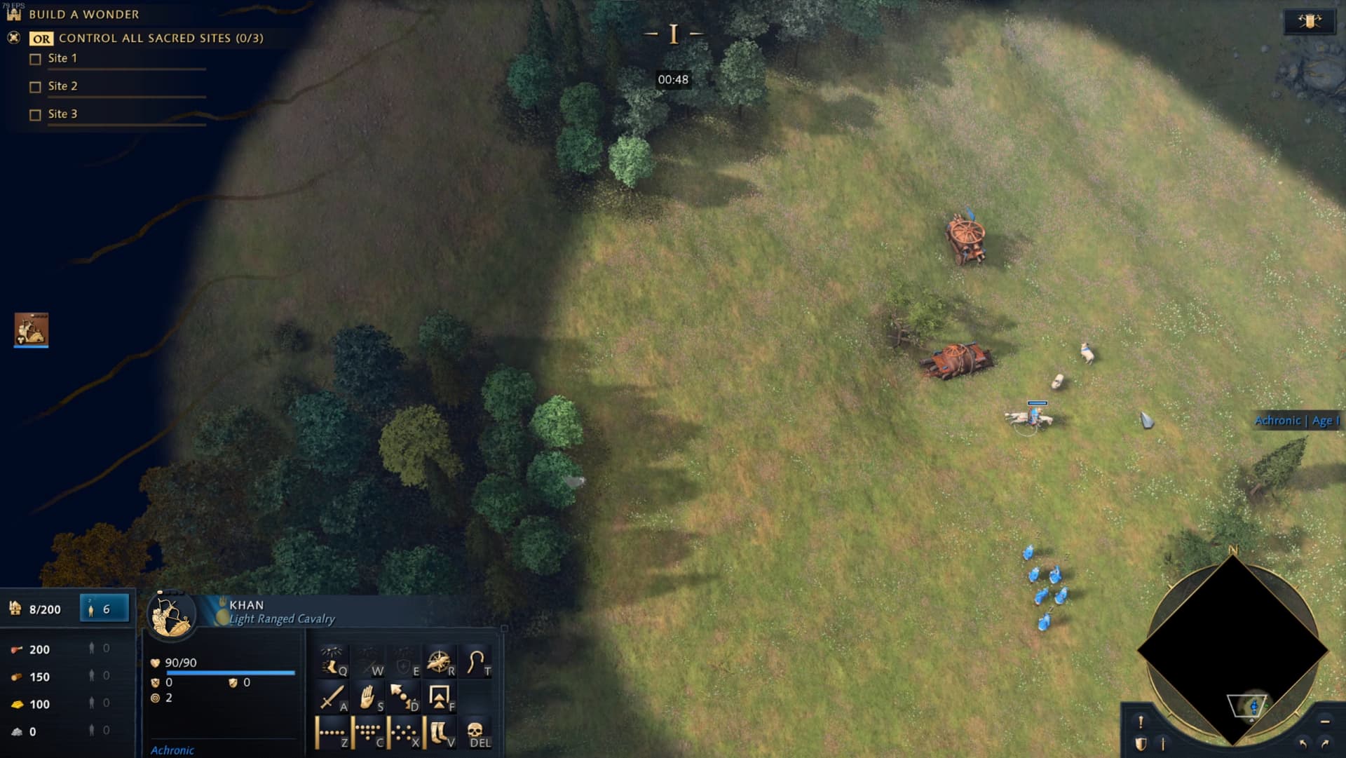
And for some context, here is how much space it takes on the screen.

As you can see above, there is a lot of empty space. I guess we can see the whole icon, but do we need to? One thing a lot of RTS tend to feature is a colourful portrait of the units you select. This is distinctively lacking in AoE4, but does it need to? I’m not suggesting we make new portraits, but rather, we can better utilize our current icons by scaling them up to give them more of a presence on your screen. Here are the suggestions.
Here the units are better utilizing the space, this should be better for gameplay as well as it should allow for quicker recognition at a glance of what you’ve just selected. Remember, not everyone has perfect sights nor giant screens, so the current implementation does not cover a lot of players.
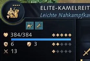
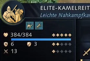
There is two things lacking in this suggestion however. One, is the “Unique” symbol. I don’t think this is a necessary symbol to be featured for the portraits, but if you do, just imagine it being plopped to the bottom right or left, no problem. The other thing is their “level” or age upgrade. Looking at units stats in the middle of a fight is not very easy, so they go a long way along with their names, in helping us identify the units at hand.
Here is another set of suggestions that includes that feature, allowing us to enjoy both better portraits as well as the utility of their levels.
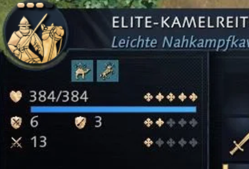

Sure, it doesn’t fit into the circle but, does it need to? Critical information is being displayed at the very forefront and it is also better utilizing the space, the icons. This should fulfill the needs of the most hardcore of the players as well as more casual, immersion oriented players.
Here is a final image with the suggestion laid on top of a full screen.