Quote, where I asked you to stfu. I have not accused anyone giving polite opinion of trolling.
Next time when you encounter word, that you don’t know, then just google it. No need to start asking for translations every time when unknown word comes up It felt weird, like you didn’t put in any effort on purpose. Maybe I overthought this tough. Shouldn’t have been important issue in this topic.
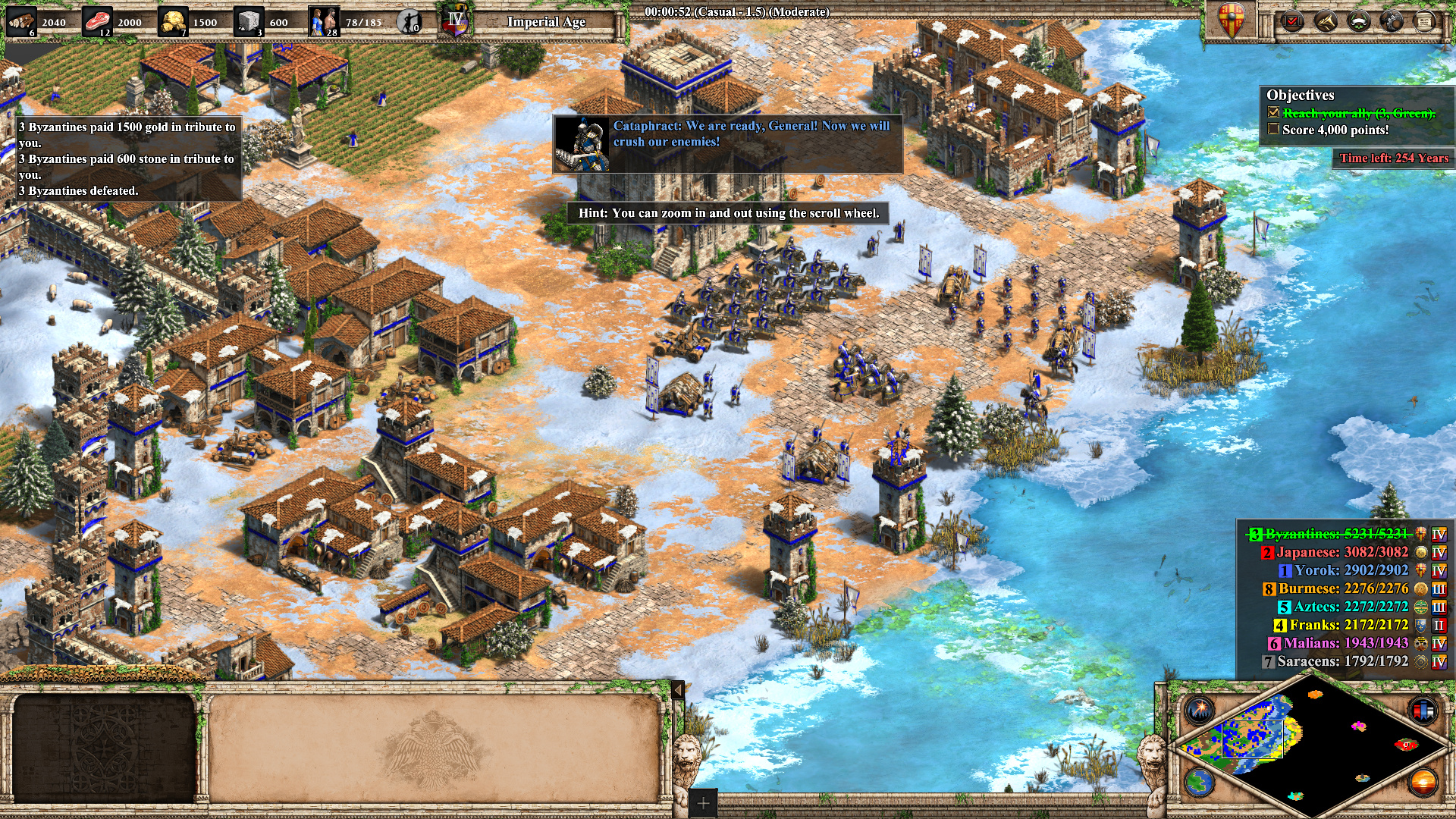
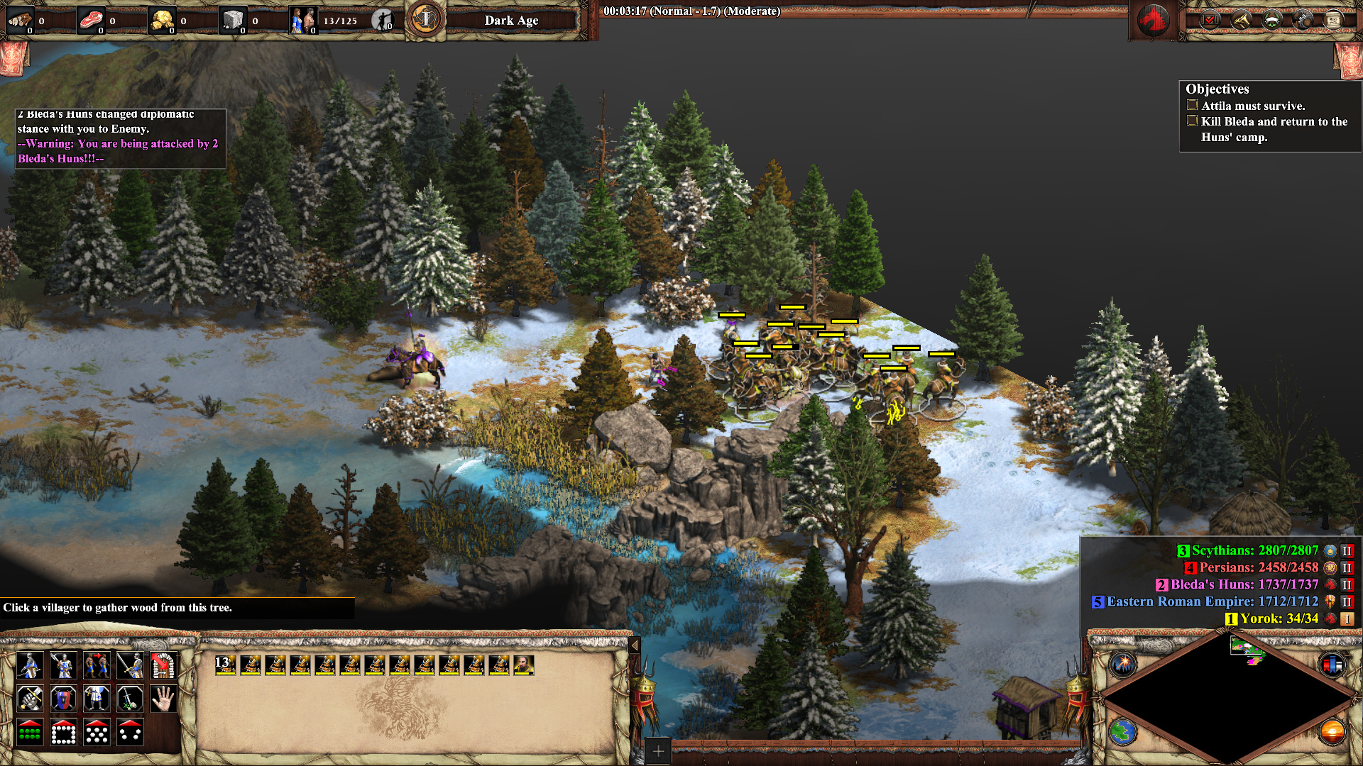
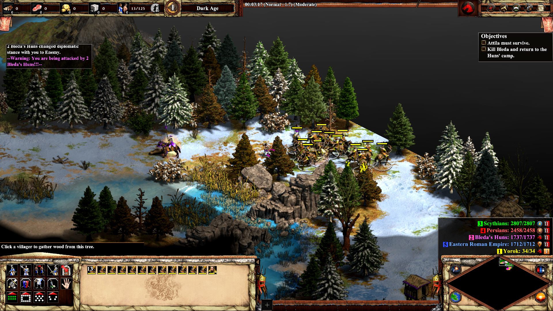
I think the difficulty in distinguishing units might not be that easy to pin down by screenshots alone.
After all, when sees a screen in-game, it’s often more like an ant-hill.
Would it be possible to compare replays side by side?
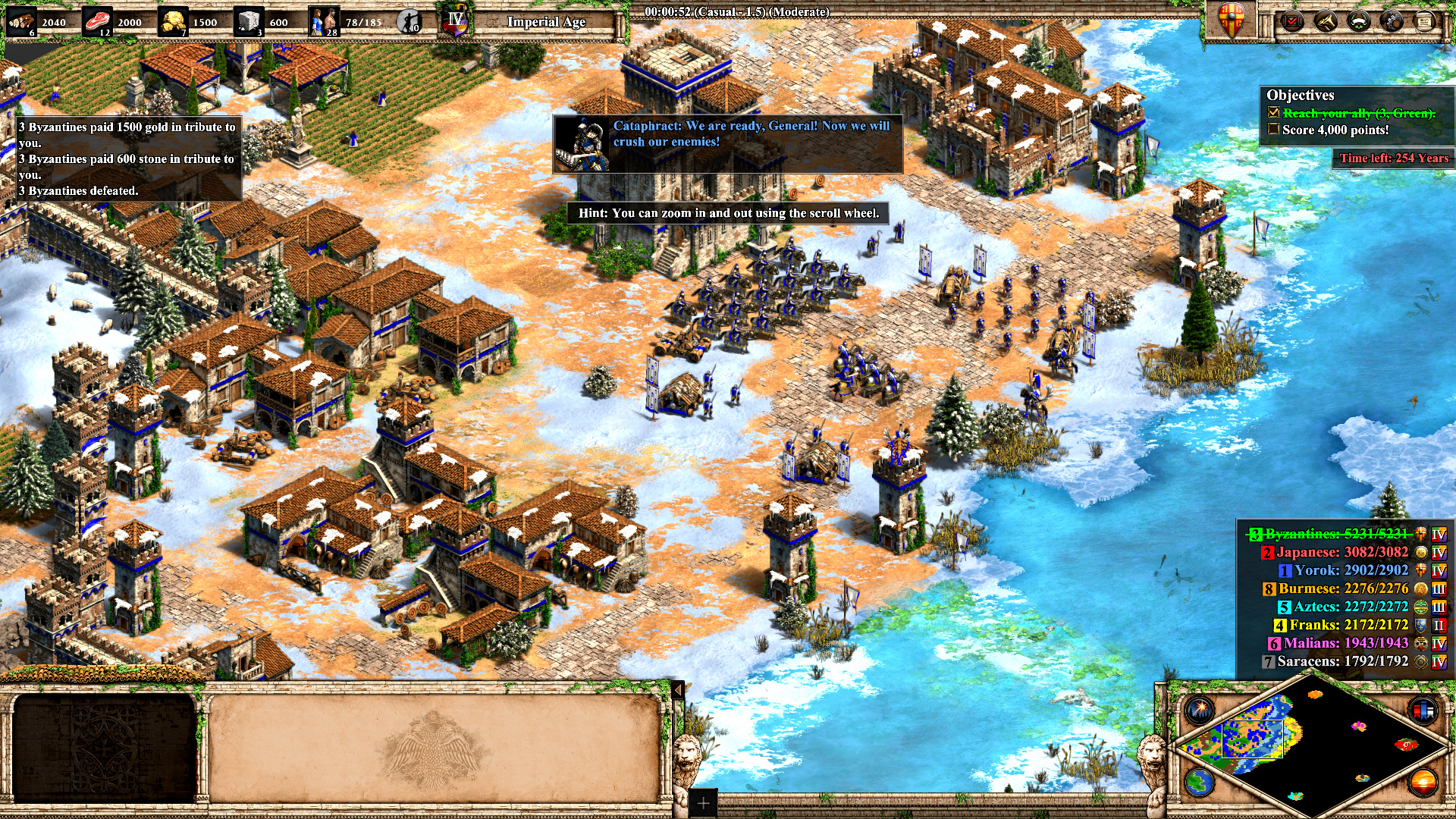
The screenshot you’ve posted seems to confirm my suspicion: with the stronger contrast the units just jump out more. So sure, I think this could work well but of course we’ll see how the OP feels about it.
Personally I like the new colours / contrast more because the units just gel better with the environment (they look like they belong there basically) but directing the player’s attention by “colours” was always a thing in game design, it’s sort of part the language we interact with games now so putting more emphasis on that makes a lot of sense.
Thank you for the screenshot, it’s quite the difference. If you toggle back and forth the “layer of fog” over DE becomes very apparent.
Maybe this whole issue could be best solved by making color contrast customisable? This way developers would not need to spend time on integrating old graphics into game (+ creating appropriate “old” graphics for new units/buildings/etc).
The final solution must be a bit more nuanced than just upping the contrast on the whole game window. Imo it should be tweaked graphic per graphic so that this ‘vague’ aspect gets minimized. This will have an even better effect than your screenshot. And removing the gradient on shadows will have a positive effect.
The argument for classic mode is not soley for visibility, many players just prefer the old unit/building designs. I believe a true definitive edition features a classic mode and an improvement on the current graphics.
@OwnAirplane3203 actually yes! side-by-side comparison the higher contrast version is significantly better. The un-muted colors definitely help to differentiate and if the devs don’t go for a classic mode this would be the next best thing. Thanks for the effort.
@SvenSvensonn I agree with this. I’ve been trying to pin down that “layer of fog” for a while, and it very much seems tied to the contrast. Like you said, it’s not the full story, but the higher contrast version is a marked improvement over my original screenshot.
I still feel like AoE II is like chess in the sense that nobody should be out there telling the world they need to play with a re-designed knight and rook in order to participate in the competitive scene, but that’s what we’re faced with with this definitive edition. If I have to get used to change, maybe the devs will at least throw me a lifeline in the form of higher contrast.
Much appreciated to everyone who has contributed constructively to this thread.
Yes, if someone makes a video of gameplay, increases contrast in video editor and uploads it into youtube. I am too tired to do this right now
If monitor supports it, then can change monitor contrast to test its effect in game.
It might be too much work for developers to implement classic graphics into game. But color contrast customization should certainly be possible to do and I am glad, that it seems to help
Here is another original vs altered contrast comparison. I am not certain, how much to alter contrast. Everyone can try themselves in Gimp.
Have you guys tried to alter gamma under graphics options? With 85% gamma I get this look of original @csaArmistead screenshot situation (Tariq campaign)
Wow, I’ve been switching back and forth between the original and the high contrast image and in my head it was just:
bad… good. bad… good. bad… good.
Quite a striking difference!
Somewhat related:
It’s always been difficult to distinguish yellow and orange as well as blue and teal from one another.
The units often don’t have very much on them that’s colored. I don’t think that DE actually changed the overall “signage” area on the units one way or another (or at least not much).
It’s perhaps just a general Age2 design-choice that can’t “afford” low contrast/a muted color effect (if those are the right terms).
I’ve tried to check if there’s screen filter software for Windows that increases contrast, kinda like Flux but with a different focus, but alas there is none that I could find.
I’ll definitely try maxing out the contrast setting on my monitor to see if that helps.
This “fog” you get (not meaning fog of war) is really strange.
Why is it there?
What does it want?
Why doesn’t it go away
Cmon use your common sense. Solely the idea offends
@ImpliedNine8738 no it is not tonedeaf
If our preferences is to play with the old look and sound, then I dont see why this is not absurd, just play the original, then again Im not trying to troll anybody, and also I dont see anything wrong with the word nostalgia (at least in my translation). Again, I see no problem adding a toggle for this so every player feels confortable, as I said I shall put it in the bottom of the list (Im not in the developer team rest assured).
Anyways Im happy you seem to find the issue in the contrast. Have you tried
in the game settings?
Also
Check vignette on / off for that weird fog you talking
@csaArmistead, @SvenSvensonn, @ImpliedNine8738
Here are a few more original vs increased contrast comparisons. In each case I increased contrast in Gimp by 15. IMO problem with increased contrast is that it makes some UI elements too dark.
If increased contrast is preferred by many people and makes units easier to distinguish, then certainly developers could add an option for it
Btw, IMO it is wrong to suggest people to simply play older versions of the game if they don’t like some changes in DE. It is normal, that people want to play newer version of game with its improvements and playerbase and want to customise its features according to their preference.
All are definitely better. It’s still hard to tell whether those archer units are xbows or abalests (I know they’re arbalests after zooming, but not immediately obvious to me).
I reduced the gamma a bit in-game to try and mirror this effect. It’s worked to an extent but not as well as what you’ve done.
Cavalier and Paladin is probably doable with enough practice. Although they’re still a lot more similar looking than in the original game. So far, I still have difficulty sometimes. I’m playing very zoomed out … but I have no problems with any other units besides the skirmisher.
The problem with Skirmisher versus Elite Skirmisher in DE is you can tell easily from some angles but from other angles the elite skirmisher looks VERY like a normal skirmisher.
I’ve got trouble with color differentiation.
I suppose that’s always been a bit of a problem, though I think it’s worse now.
How do you do with distinguishing say…your orange elite skirms from the opponent’s yellow skirms?
[I suppose you might not have been in the situation where that happens a lot, yet though]
Yes, that’s exactly the problem I’m having with E skirms … you can only see their shield difference from some angles.
So if you have a bunch of crossbow and your opponent has skirms in feudal … and you go to approach their base and then they hit castle shortly before you get to their base … and you see their skirms … the question is “Have they upgraded to elite yet?” (because Xbows with Bodkin can often defeat non-elite skirms but they get destroyed by elite skirms). …
And then the problem is … IF they ARE elite … then if they approach you from a certain angle … you can’t tell until you’ve already lost a couple of Xbows 11.