I wanted to do this for a long time. Now i overcame myself. First of all: I really like AoM Retold and AoM in general but i personally think some designs really could be better/different. This is no harsh criticism but more some sort of love-letter. Feel free to agree or disagree with my ideas/suggestions. I would really like to know what design choices were behind some decisions and i really hope there will be either an AoM2 with some new design approaches or the very talented and passionate Retold-Team or some Modders will look into this and change some models/art i listed below.
My ideas/suggestions for the following units/gods (WIP):
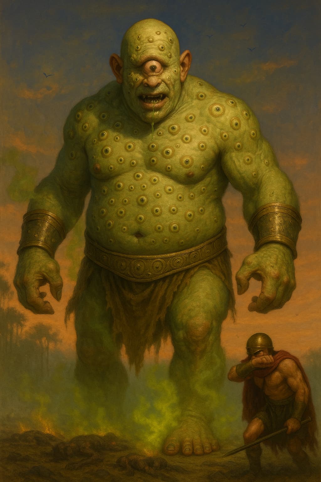
I like the change for Argus, if I remember correctly he was more described as a giant with 100 eyes. I am not sure I see a huge difference in the representation of Oranos and Lampedes? Both are subtle improvements that better represent them
Uranos: you are totally and completely right. changed the image. now i think he looks superior and much better and how i reall hoped his image ingame would look more like. i hope you like it more too.
Lampedes: she is changed also just slightly its about the details. 1. she looks better and sexier now to “lure” people. (not like a succubus but more like a Yuki-onna/wisp-mother. 2. maybe you missed it but i changed the “torch” to a mace with light to make it more menacing and practical for “potential” melee combat. 3. - and this is the most important point: she floats over the ground. hovering. she is basically a sexy death-fairy/banshee now and not a older human witch. i think this suits better and makes her more interesting (even tho i am still a tiny bit sad Hekate doesn’t have empusa as her myth unit)
Argus: yes indeed that was the point. thanks for appreciating and pointing this out! Argus unit was the primary reason i wanted to make this and will be one of the most drastic changes. most others are “just” slightly (but in my opinion much better and more fitting/characterstic) changes. i mean i overall like many design ideas/aproaches. but since the community is so active and devs are so open minded and brave towards changes and new ideas i wanted to give this a try.
its still a work in progress. and i can only make a few image generations so my options to try ideas and slight changes are limited since i do not pay for the service.
I didn’t dislike any of the images, but they look similar to what we already have. I think both the Oranos images are far superior to the current portrait in the game but your second attempt definitely looks more interesting and a better representation
Yes. If only one change could be made, it’s this one. In the old AoM:the Titans (2003) Lampades gave the impression that she slightly floated above the ground appaering more otherwordly. The current one looks like she awkwardly shuffles forward in the dress and is a downgrade in both aestetics and animation. Would even be easier to animate.
(also still want to improve it a bit, but i personally like this version very much even more than the “mutant” we currently have ingame even it looks kinda cool ngl but i think this much more fitting and looks more like “time” and less like pure destruction. i think this would be a more “drastic” change similar to Argus and a GREAT reward-image similar to Poseidons.)
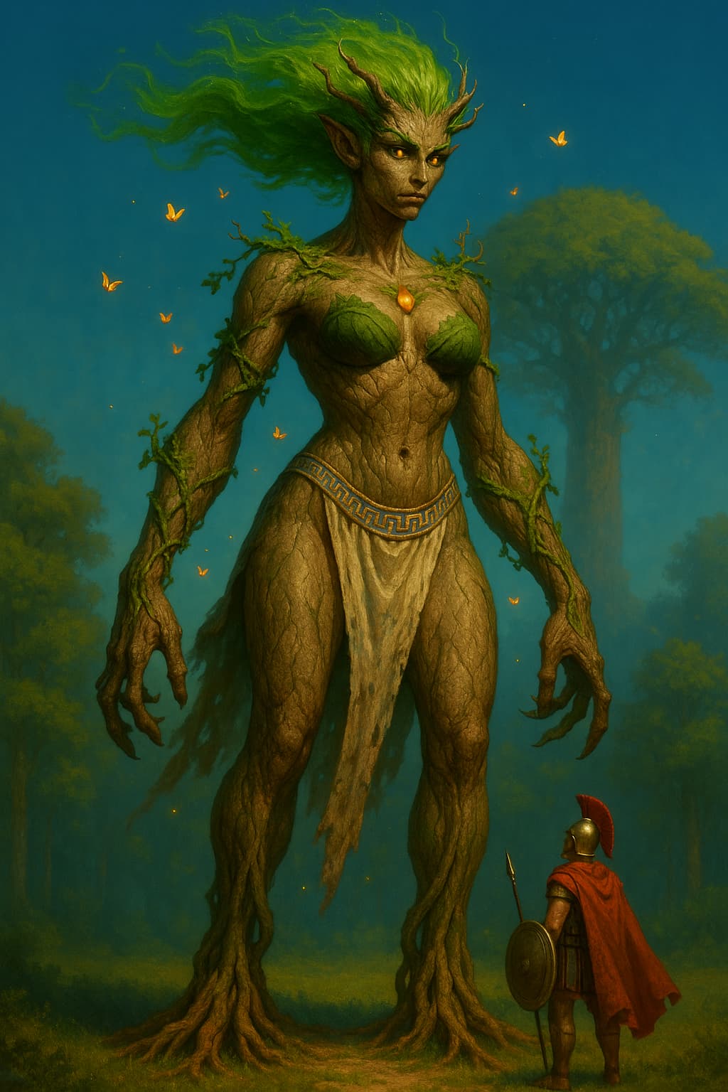
Dryad:
apparently i cannot share it cause a tree-woman mostly out of plants without any clothes is apparently against the rules even it doesn’t “show” anything…sigh - seems like i need to improve this one…
The major issue with unit design in AoM for me is the size of some of the chinese units. The Qinglong for example is the same size of a titan, should be reduced IMO.
First time I seen it I thought it was a titan or Mythic Age GP.
i will give mummies a try and how i think they should look more like. i am personally fine with the avengers (but maybe it would make more sense if they would be out of stone and magic to give the size more sense?) i also want to give sphinx a try and i personally don’t like the look of the anubus upgrade (i respect the idea of giving them more dog-like feet but it looks really odd in their move animation since it still relise on more human feet/leg shape)
i have to say i still think cyclops should be a bit bigger and more stocky looking. so you i guess its a mix between some “should” be a bit smaller and others “should” be a bit taller/bigger.
But i personally am overall fine with the sizes of myth units.
I appreciate the contribution but this topic is about visuals and general design decisions. not “just” about size. so, please, stick to this. if you just want to criticise size then make another topic. thank you.
any gods images or myth units you would like to see have slight (or maybe even more drastic changes?)
Not sure if it was ironic or not, myth units size is ok for me, except some of the chinese as I said.
I understand and will respect your request about not discussing size on this topic although for me the size is an important aspect on the visual of units.
thanks for understanding. i also understand your point of view now better. you/we can talk about size if you add a bit more to it like suggestions maybe and i also kinda understand you think the water dragon is too big, i think the unit could be smaller too but not too much it still should feel like a big dragon and mythic age unit. (thats why i always wanted e.g. fenris broot to be bigger with better stats and reduce the pack-bonus a bit.
i think myth units still should feel magical, majestic, scary and towering over all other units. more some could be slightly bigger and some slightly smaller. thats my opinion to that.
I would be curious to see your thoughts on improving the promethean upgrade visual. At the moment it looks awful! Probably, one of the worst changes. I’m not sure why a creature made of mud and sediments gets lava pouring out of it as an upgrade. I’d prefer to see glinting minerals and darker coloured mud. Maybe more defined facial features to show they are more ‘refined’?
i will give prometheans 1000% a try cause they are high on my list too. i am not the biggest fan of them in general but i do like their design (especially without upgrade!) more than the original.
anyway, i think i finally found a way to share some versions of dryads without breaking the original style too much:
There is a lot about the Atlanteans I’d visually overhaul, personally.
Giving Kronos a sickle or scythe would be absolutely true to mythology, but other than that, his appearence could stay as it is.
When it comes to the other atlantean gods, except for Gaia and Oceanus, all of them could use a more “monstrous” look.
Especially since there’s the prometheus titan in the Atlantis campaign, and it absolutely does not match the portrait of the minor god Prometheus. While Gaia and Kronos do have matching titan-forms and portraits.
This would create consistency within the Atlantean pantheon, and provide an illusion of distinction to the Greek one, even if they’re actually the same mythology.
Yes, Dryads are disappointing currently. The Titans was clearly up against a tight deadline for release. It was so obvious all the short cuts they took. A lot of the Atlantean units were lower poly/ resolution, looked rushed and unfortunately this has now spilled over into Retold
EDIT: Not being low poly or low resolution, I mean the fact that some of their myth units were uninspired to cut down on production time means that the updated versions are still based on shortcuts
i underestand what you mean with “rushed” but i think its good you explained it more for some others. thanks for being so often on the same point of view.
totally agree. really good points Armilus.
THANK YOU!
Also here my first try of the Promethean redesign and what i think it should look more like (and hoped it would look more like) - feel free to criticize constructively:
a lot! thank you for the feedback! I will gave it a try and i am curious if you guys like this one better!
i am honestly surprised the majority of you guys like new Kronos so much. He is one of my personal favourites too. your explenation cuts it to the chase/summarize it pretty well what i thought when i had this idea and image in my head. makes me very happy.