not talking about style vs realism, though i do think it leans too much into cartoonish vs “romantic?? classical??” or fantasy art style. game should be stylized, but not in a phone game sort of way. something both real and unreal, as if your actually in an age of legends and heroes. high fantasy?
the problem is the videos and screenshots ive seen so far are not as good as i had hoped, certainly worse than aoe3 or aoe4. id also argue aoe2 de is a better looking game. maybe its the lighting, shaders, vfx or something else, not sure. but it already feels visually dated by 5 years or more compared to other aoe games.
also god powers from the trailer such as lightning doesn’t feel as impactful as they should. maybe its to reflect gameplay impact but the lightning ive seen in other games like in warhammer total war, destiny, elden ring and baldurs gate feel and sound way more awesome that bolts hurled by Zeus.
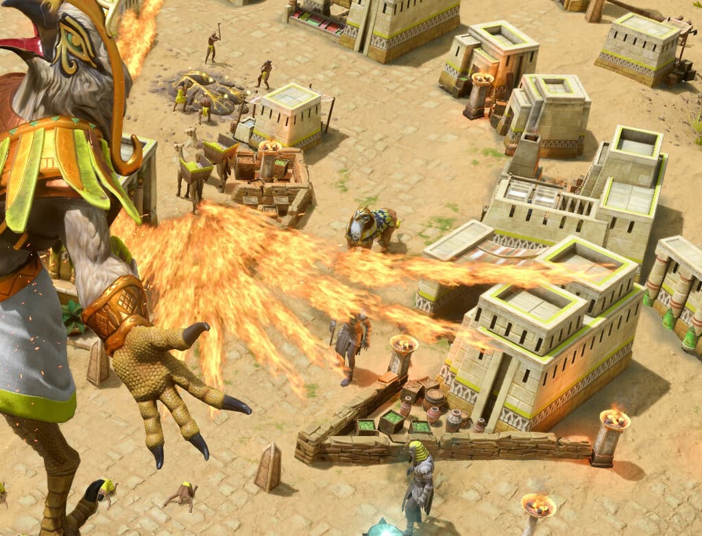
but by far the worst unit visually was the laser croc. the beam looks like a dated flame thrower texture, it’s more silly than impressive or intimidating and could use an improvement.
of course i would rather have a bug free and polished game over a pretty one disaster. the other de games suffered so much from unacceptably terrible launch states. if this game comes out in the same state as aoe1,3 or 4 de than all the visual improvements wont mean anything.
1 Like
I don’t agree.
Are you confusing bad video compression artefacts with a bad looking game?
Currently there is no uncompressed 4K footage of the game to actually see how it really looks like.
9 Likes
sub par fire vfx screenshot taken from another thread:
there has to be a better way to represent solar wings than these bad fire effects.
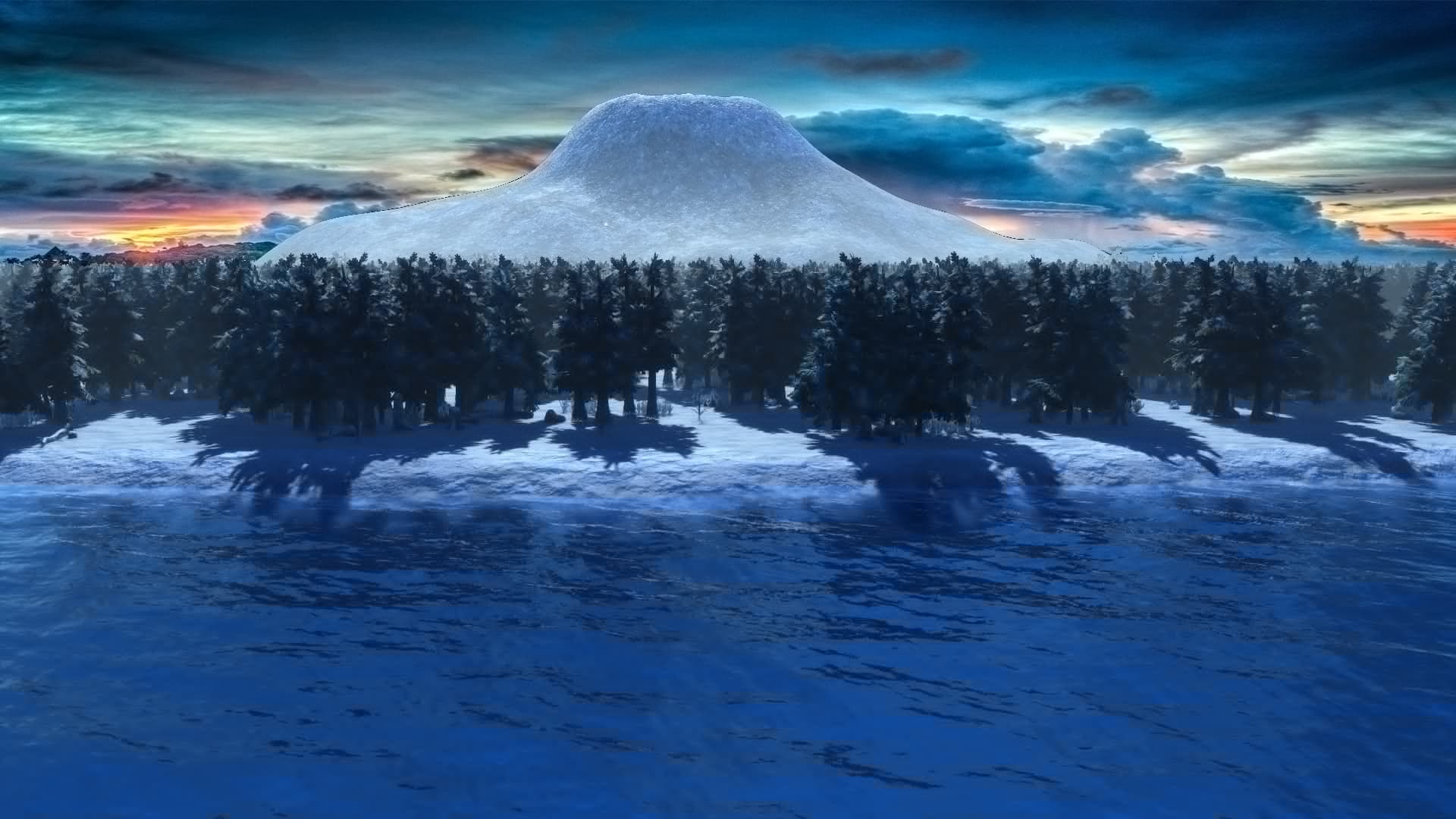
overview of starting town and environment, looks worse than aoe2/3 and aoe4.
the overall picture just looks worse, maybe shaders or something. the gold mine is the worst looking yet rather than an improvement. the tower, town centers and grass/ground also look worse than previous games, just compare them to aoe3 and aoe 4. maybe its textures, idk.
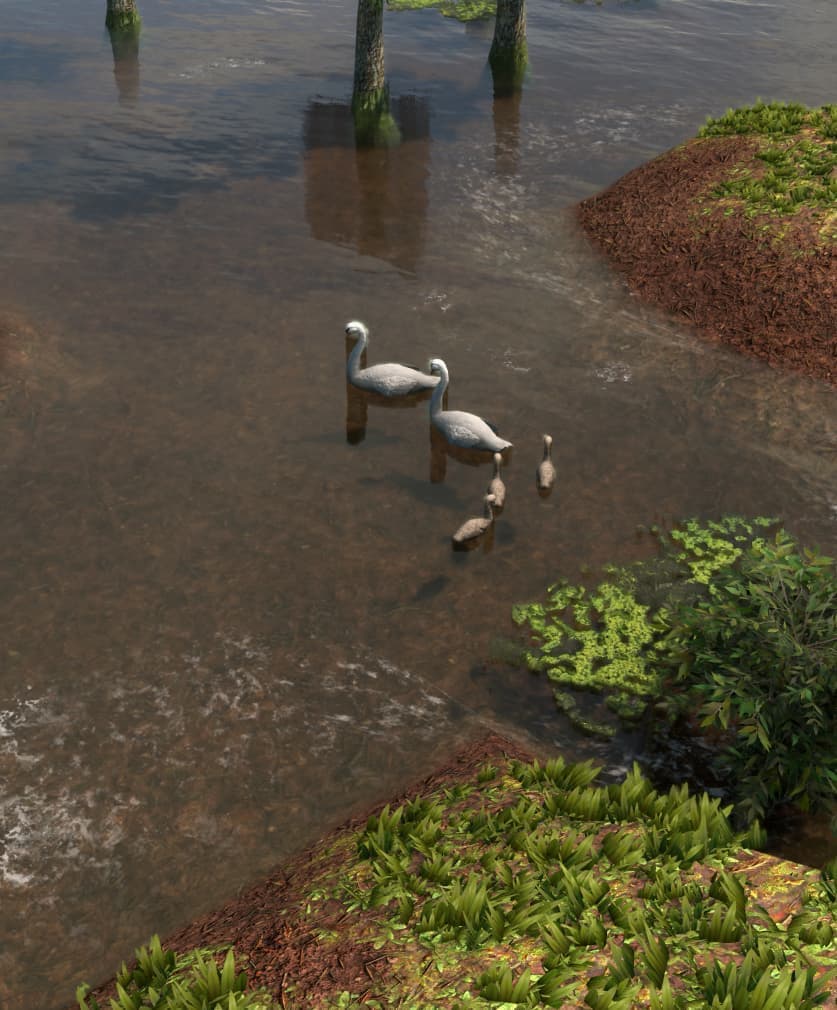
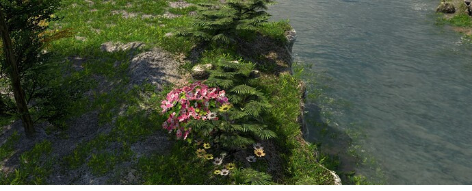
unit, wildlife and tree models look fine though.
ui and icons also looks much worse than previous aoe games. they look like something from 2010 at best, aoe online had better ui and icons. does not compare at all to modern rts games or the de remakes.
as for the laser croc:
the textures, sounds and vfx/impact just isnt where i would expect them to be. they really do seem like old flame thrower effects shot in a fast straight line rather than solar beams.
1 Like
I do think the animation of giant units and some god powers are underwhelming. They should feel more impactful.
2 Likes
The visual resources are not as expected, but they are not bad either, just some occasional improvements:
Removing some of the plastic effect, making the game more realistic.
Not only should the texture and art of Kronos look more real or convey the fear that the expansion’s cover art used to convey, it being improved and more frightening, the rest begins to show itself little by little.
1 Like
Yes, what a horrible game:
4 Likes
In the new video that I saw, the graphics looked much better. Even things like the goats and sheep were far more detailed.
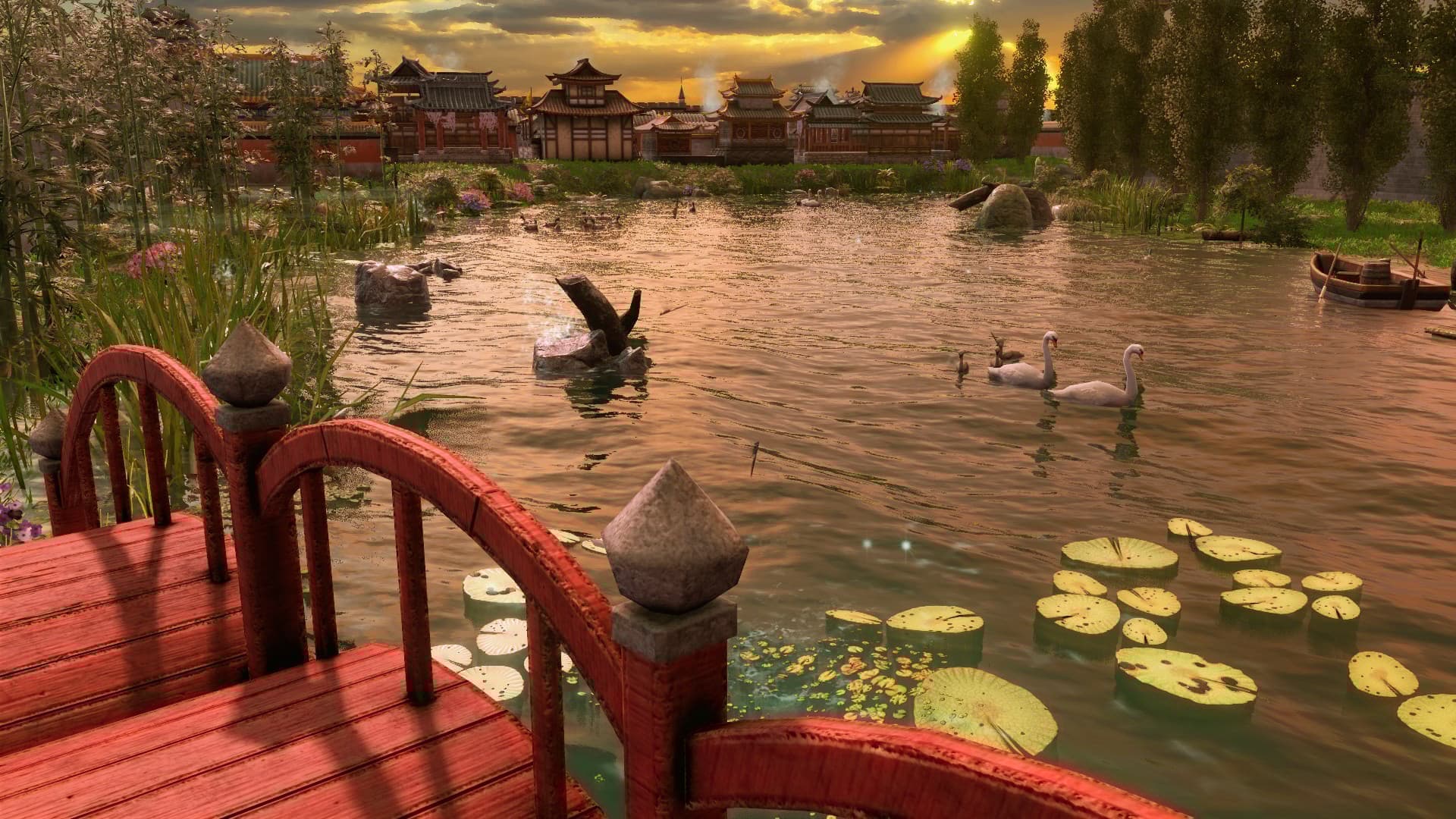
The graphics of Retold are very good. The color pallete is on-point (sunny atmosphere, great details). It’s everything that I had wished for Age 4  .
.
8 Likes
What about water? I wish it would be as blue as the original. It would match the sunny vibe.
I think you guys are too focused on the water when it’s obviously only one variant like we currently have in the editor.
In old editor you have different water types like different plant types.
I think the water looks now way more realistic but I totally understand why so many of you are urging for some ######## water 
I think the visuals are quite stunning. Just give it time. I think it will grow on ya!
4 Likes
Saturation is too accentuated and Anti-Aliasing is underwhelming (it gets too blurry). AoE3 can handle fully customizable color palette for all the players, and so should AOM. Unfortunately though, the settings for sharpness or a decent outlining, instead of that clownish one in the accessiblity setting, doesn’t exists for it. I hope they implement it in AOM.