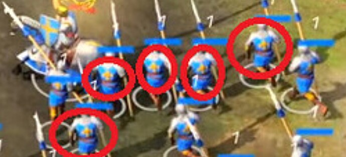
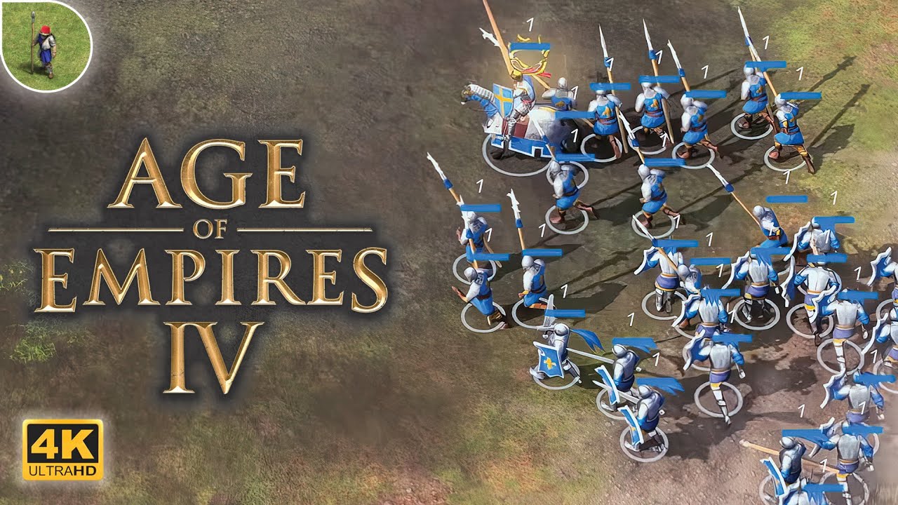
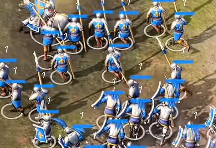
In the scene on the tournament, the blue soliders have a yellow Fleur de Lis on their back, which is generally considered a symbol for French.
That’s what I thought at first but do an all-in zoom and you’ll see that it is just a yellow cross, like the one on the horseman’s shield
Their shields may have the Fleur de Lis on them. Though they may be stylized crosses as well.
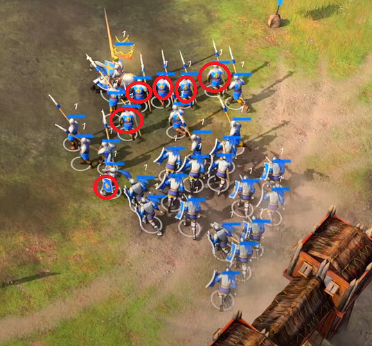
if you look closely you can see the Fleur-de-Lis
![]()
On the upscaled and zoomed footage from Age of Noob they look like they might actually be bottony, patonce, or floury crosses. All forms of heraldry.
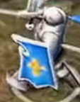
i dunno after staring at his video in highest possible quality, it looks like a Fleur-de-Lis
here for the people who want to see it by themselves
I hope that it is the fleur de lis and that it is just not clear enough.
Or else I don’t see much of a distinction with the English crosses. Their helmet types actually differentiate them more than their symbols.
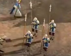
Do these animations also look very primitive for you?
Better animations are already in AoE 3 from 2005.
Either it’s an early version of the game or a major shortcoming.
Looking at it, you do not feel both a breeze of novelty and the spirit of AoE. It’s more like a fake AoE.
Plus those stands with spectators - something weird and stupid.
I don’t want to believe that this is a full-fledged part of this series. Here you can see a regression compared to the previous games in this series.
You can also see that this game will be geared towards online play. These stands are probably some special quick skirmish mode.
All this looks infantile, almost like Fortnite in the RTS version.
I hope this will be Age of Empires: Online 2 - and that’s how it looks.
AoE 4 should look serious like its predecessors. The trailer from 2017 shows chronologically ages - that’s why I pray that on April 10, it will turn out that what we saw is AoE Online and real AoE 4 is a completely different game about a truly new age.
If in fact AoE 4 turns out to be what we are presented with, this Announce Trailer is disinforming and disappointing.
Since AoE 4 is medieval, this trailer should instead of talking about the new age, it should be about the return to the old age “the most popular for the AoE game series”.
agreed, hopefully we can see it in better details in the event, and more so knowing more about what civs we gonna have on the release
You can see the units doing movement that is impossible in AoE3 like walking sideways facing the enemy.
So you say it look to much like AoE2 and not enough like AoE2 at the same time?
Have you ever seen Age of Empires Online?
Are you blind?
It literally says Age of Empires 4 in both the recent announcement and the 2019 trailer, there is no hint for an AoE Online anywhere.
New Age doesn’t mean they have to use a different time frame.
Likely means something like new Age of RTS gaming.
I don’t want to jump to conclusions that early, we haven’t seen even seen one minute of gameplay in total, let alone contiuously. There is a lot that we haven’t seen yet.
With what I’ve seen, I’m not against it. Even with the first trailer, I don’t think its too colorful and far from being cartoony, as some called it. Maybe a little bit to much saturation in the colors, but reducing that, and I think I’m completly fine.
Cartoons have bright and vibrant colors, but also as reduced style, which I can’t see here. Just bright colors don’t automatically mean a game has a cartoon-style.
Age was never meant to be a dark game. Bruce Shelly is famouly quoted “the sun always shines in Age of Empires”. I think that is in destiction to something like Warhammer, with its “grim dark” approach. So having bright colors is not something that doesn’t fit Age. Age1 was quite a bright color palette.
One of the reasons Age2 seems to have less bright colors is, that it was designed a 256 color palette. Compared to the 16,7mio today normal on 32bit (compared to 8bit, which is 256) that is huge difference and the color palette needed to be chosen carefully to make a coherent art style. (Sidenote: id Software famouly had a very reduced colorpalette, because they needed 8 degress of shades per color for their lighting in Quake 1, reducing their effective color palette to 8 per level).
Also: keep in mind its an RTS played from a camera perspective far away from the units, small differences in animations and details aren’t visible, compared to something to a first person shooter. Details like the seeminly oversized bows are there make them identifyable from other units.
I general, I think a lot of people are way to critical and hate everything that is not EXACLTY as they had in the past. There has to be an evolution, without it, we wouldn’t even have Age2, but Age1 with all of its shortcommings. Or maybe just Dune. Or have no computers at all, but live in caves as hunters and gatheres as our ancesters did for thousands of years. And there is nothing taken away from you, if you like a previous game better, go play that. But don’t try to destory something new.
Also, it seems to the norm on the internet to hate things for the smallest of details, often ignoring facts, other details or just plainly don’t think about something for more than a second. If everybody would do that, a lot of arguments wouldn’t even exist in the first place.
One thing why I don’t want to jump to conclusions fast is that none of use here haven’t played the game yet. Watching a trailer, especially frame-by-frame and with zooming is very different to play the actual game. I personally didn’t like the art style of the Links Awakeing Remake, but once I played it, it didn’t bother me at all. Graphics in a computer game are primarly built towards playing the game, not so much watching it in a trailer.
Plus those stands with spectators - something weird and stupid.
Having stands in a tournament is “weird and stupid”? Covid hasn’t been taking place for that long to forget how public events work. Medival tournaments have had spectators, so it is completly normal and fits the theme.
You can also see that this game will be geared towards online play. These stands are probably some special quick skirmish mode.
Take a look at the minimap: why is a snake-like-part uncovered? My guess it that this is a campaign scenario, were you first have to travel to the tournament grounds.
And that it is built to be played online is not a bad thing, the Age scene thrives online.
All this looks infantile, almost like Fortnite in the RTS version.
I honestly don’t get how you get to that conclusions. Just because of the bright colors?
I’m not sure if that is news to you, but there were bright colored clothing in medival times. The clothes of knights and other royalty were colorful, but destinguish themselves from the common folk. Armies had different colored clothing and shields to distinguish friend from foe.
Also, it could just be that you can tell your units apart from the enmies - if all were brown/grey with minimal colors, microing would be frustating. Just see how much talk there is in this thread about the symbols on the shields - and that is quite big, compared to the size of the unit. But depending on how the unit stands compared to the camera, they can be distorted and hard to identify. So the colors could just be a gameplay choice. And at the end of the day, Age is a game, not a documentary.
AoE 4 should look serious like its predecessors.
So, a grim dark grey’n’brown? I don’t anyone would want to play that.
There is a difference between graphic style and graphic quality. I dont like the graphics I have seen so far. But thats my opion, if others think it looks nice then I cant complain
Not the biggest fan of the artstyle, but if it’s like in Civilization VI that the graphics grow up on me that’s great  I actually prefer them over the greyish Civ V ones nowadays. The essential aspect is gameplay, rest is not that important in my honest opinion.A great looking snoozefest is still boring.
biggest aoe4 shill on the forum
It looks like cartoon trash. I will be giving AoE IV a well deserved pass.
If you noticed, the units make very abrupt turns just like in AoE 2 and 3. I would expect a current gen game to have smooth animations at least. Even arrow movements are very janky.
Character movement and interactions in general need to be polished, because right now it’s too basic for current gen. They should have “movement start” and “movement stop” animations, and special idle animations, to make this game feel more real and alive.
On the upside, the lightings, colors, plants and buildings (not the units) look incredible. In my opinion they’ve knocked it out of the park with this one.
 thé game is beatiful
looks like a good balance between aesthetics and performance
