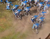
I’ll be honest with you. After see these few gameplay sequence i don’t have good feeling whit the final result.
What are you opinions about this graphic style?
I think they are fine. They are trying to make it available to as many systems as they can, while making it look like an upgrade. Look at AoE3 reception.
I play AOE3de a lot and with Super sampling feature the graphic looks really Great. I don’t see this with AOE4. I Hope Relic Will improve It a bit before the release.
There were many discussions about that but It seems developer didn’t see them After all.
I love it. The style if fairy realistic but with bolder colors so that things are clearer. As a color-blind person (red-green), bold colors really help.
Like I said, they aren’t trying to please people who prefer graphics over gameplay, they want as many people as possible to enjoy a fun game
I hate the UI’s style. I prefer the hand drawn icons of the rest of the franchise. I also hate that the task indicator for units is a glowing blip like in mobile games instead of a flag.
After watching the clips again, I am left with the impression that it is the movement that impresses me most. The switch to 3D is definitely the biggest change, not so much the style of the figures. There will probably be options to go with extra details and less. That would be fun to analyze.
I say, let’s give it a chance. Without playing it is hard to say.
Not going to lie I prefer AOE2’s style. This one seems weird. It will have to convince with gameplay.
This soft smoothness that others compared to units made out of clay is satisfying and pleasing to my eyes. Let alone the benefits of this style on performance.
The design of the units themselves however looks somewhat generic, as if they lack an identity.
I admit that we do not know how many civs exactly do we see in these two scenes. Is it just 1? or 2? or more? Both sides look way too similar.
I’ll wait to see more of it before saying anything else.
Putting aside that I still prefer 2d for this kind of game, I feel like the unit colors are a bit unpleasant right now. They should probably be a bit darker and maybe less saturated, however these things are easy to fix. What really matters if that the gameplay is good.
I think they look good, but yeah. I will always enjoy AoE2 graphics, there’s just something about them.
We only have like 2 seconds so it’s hard to judge.
A very important part of visuals are animations, something that a 3D game can do much better than a 2D game. In a 2D game you have to save each sprite as an image, that would lead to gigantic file sizes if you had like 10 different attack animations.
In a 3D game you can use the same animations on different units that share the same weapons. Why should a French swordman not be able to use the same animations as the English one?
Also 3D allows to visualize upgrades better, something that can be seen in AoM where the weapons and shields change depending on armour upgrades. This way you can know what stats an enemy unit has without clicking on it.
Something that AoE3 didn’t do anymore but that might be mostly because they don’t have the classic weapon and armour upgrades anymore.
3D graphics are obviously superior in a lot of ways because 2D sprites are just a screenshot of 3D graphics. So even if you would want a 2D look it would be better to render it in 3D in real time.
But tbh. we are 20 years to late for this discussion.
Style wise. I think it can be a bit to colourful but we only saw player 1,2 and likely 3 (yellow) so far. There was also 1 white unit but that’s likely not a multiplayer colour.
Also I hope they have accessibility options like AoE3 to change each individual player colour. That can also be used to make the colours less bright.
Global post processing and colour correction options would be nice too if some players prefer a less saturated look. I hope they are a lot of options for map creators too.
I’m more concerned about history accuracy in the visuals, it seems like English Age 1 Swordman already have heater shields while the axeman still have round shields. Where are the iconic Norman kite shields? How can you make English infantry without kite shields?
From the graphics looks a fantasy game, like the settlers, not an AOE and i don’t like it.
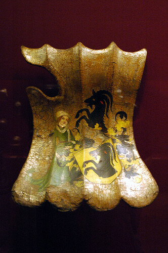
Never seen concave shields like that in history (but maybe i’m wrong).

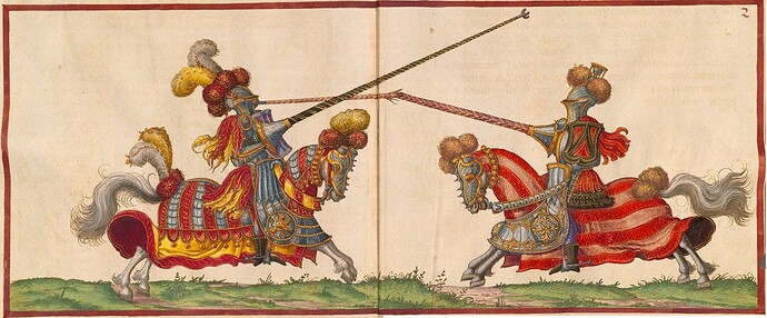
those are jousting shields, considering that the sequence is a joust, maybe that aren’t the normal shield of the units
A joust is 2 heavily armored knights on horseback with a lance on opposite sides of a long fence charging eachother in the object of knocking the other off his horse with the lance. Not a crowd of militia massing into a ball and running at eachother
My thoughts were similar but I think it is more of a design issue of the units.
At first glance they look almost stereotypically boring.
Muscled blonde guys in hoodies or full plate armors charging in while swinging their huge swords around.
But I am hesitant to judge yet. We may just feel in that way because every little mobile and browser game that walks the line between fantasy and history spams those images uncritically.
The English and the French knights specifically are the most common and most iconic ones of Europe. They’ve ended up being used as template by every kind of game around that wants to depict the middle ages in some way. Accurately or inaccurately.
Also if those are indeed two different civs that we see, I’m a bit concerned that they use the same symbols. A simple cross of different color.
And the health bars… maybe they should be slightly higher above the units? I actually mistook them for blue capes.
Late Mediaeval shield type. That fits to the generally modern looking style of the units.
They were never that common in England but the troops are clearly French.
They were first used for Jousting but later adopted by infantry. They are named Targe but so are Scottish shields that look totally different resulting in 90% Scotland related search results.
That’s also the reason why I thing Age 3 is going to be the Late Middle Ages and Age 4 being the Renaissance.
As far as I know they are called ecranches, not targes. I’m also pretty sure they weren’t used by infantry in war as far as I know, only in lance jousts and in judicial duels.
How come they are ‘clearly French’? It’s all speculation as there’s absolutely nothing particularly French on those soldiers.
That’s a general platemail with a penacho on the helmet, commonly used in the late middle ages - early renaissance by many European people.
Including by English, Germans, Lithuanians, Flemish, Spanish and of course Italians if not by more of them. Milan specifically had some of the best armor craftsmen in Europe, with their plate armors being famous the world over and cost great sums.
If they really intend to give unique visuals for each civ’s units, they should also add unique insignia on them to clearly denote their origin. I see nothing clearly French here.
And for all we know, those exact units may not even be a playable variation.
they have the Fleur-de-Lis on their back

