Hello folks. I just wanted to share my opinion regarding buildings. This is not a graphics rant, I like the style and graphics, but I noticed they missed many things more related to texture details and innovation than graphics.
One of the biggest chracteristics of all AoE games is the amount of details on buildings, because architecture was so important and relevant by the early years… So AoE always made architecture and Gaia one of its biggest features.
Unfortunately I feel like AoE 4 has a lack of detail on buildings, and the silluette of them is so confusing and hard to difference from others.
I want to share some examples.
I know proportions has been a topic already, but still not fixed at all. Elephant is bigger than houses and millhouse and other buildings for example…

Well we know its a real problem but lets move to the lack of details. in CoH 3 we have a lot of details in buildings.
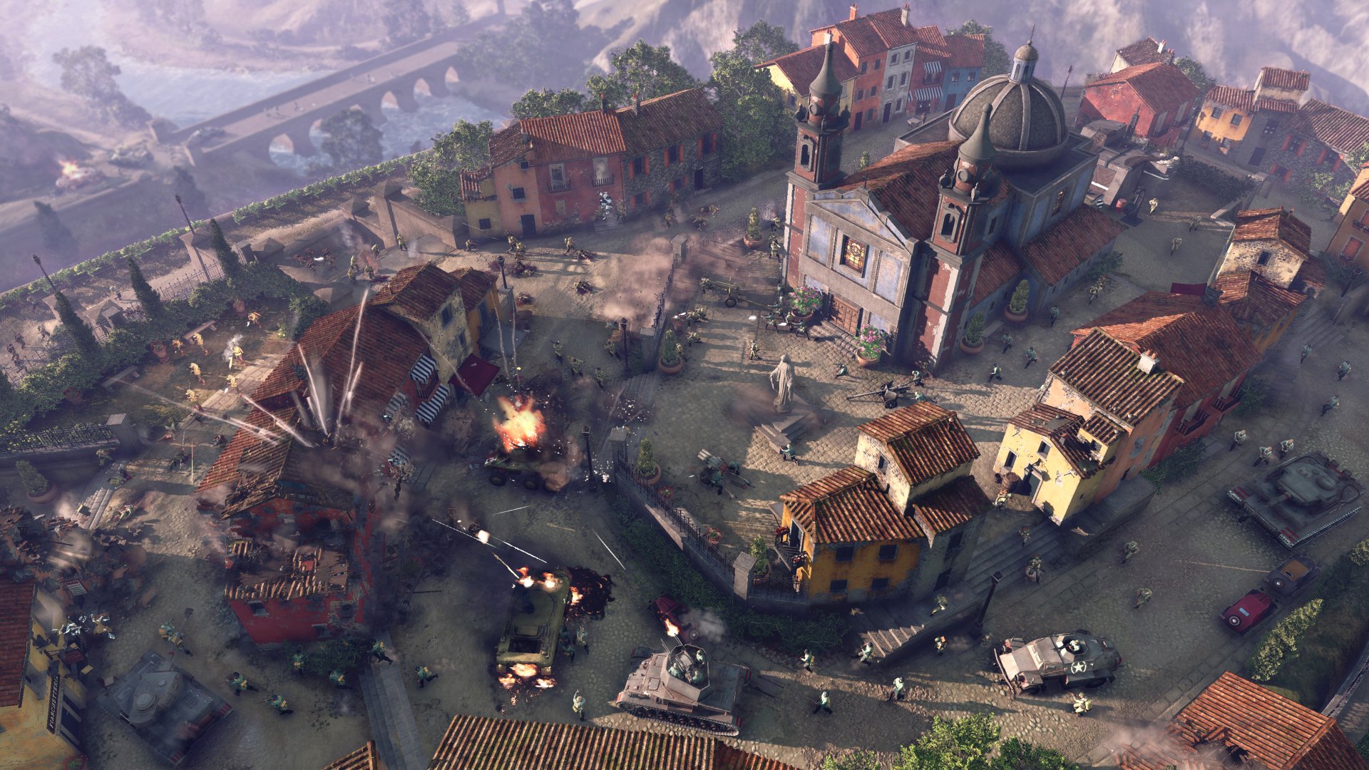
You can see the roof details, different colour tones, dirty and different materials that make it looks more realistic. Lets see an AoE 2 example too:
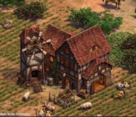
Here you can also see those little but beautiful details that makes the game get a good appealing.
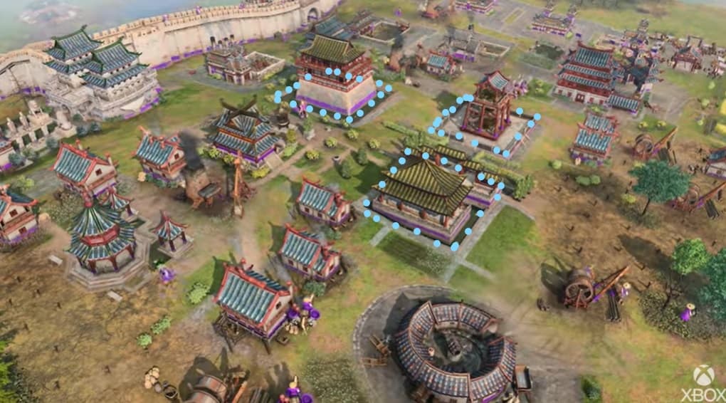
Now lets see the same bulding in AoE 4:
A complete lack on detailes.
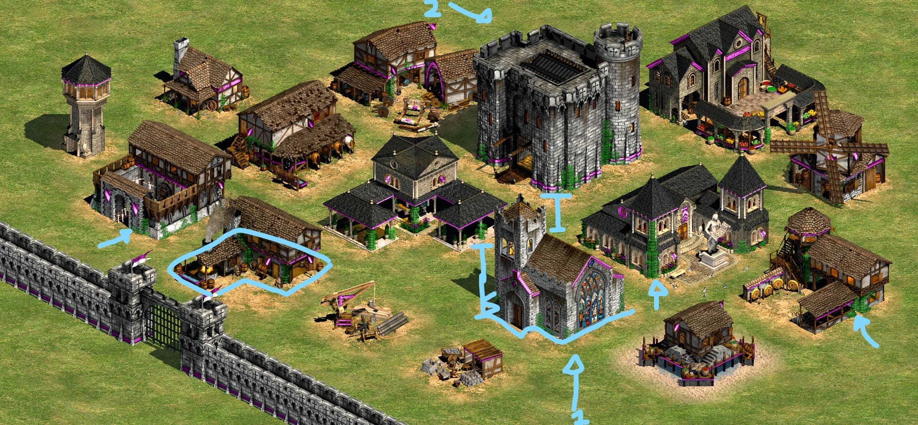
Other noticeable problem I have found is the simetry in buildings. They are all squares, with no asimetry in position neither shape. They definetely need to work in the siluette of the buildings…
Lets take a look and notice how they look so symmetrical and square shape, like if it was a lego game:
Now lets see what AoE 2 did. They firstable worked the silhouette of the building (who ever that studied art like in my case knows how relevant is the silhouette as in characters as in architecture). You can notice a big difference between all buildings but still keep the architecture style according the culture. Also notice the flora growing on buildings, the dirty walls and the amount of details used in the textures. Notice how a castle is bigger than the church and so on. And last but not least, I like the asymmetry more in the position of the buildings, notice how they are like in 3/4 located regarding the camera, giving a more interesting view side (hope in gameplay camera is postioned in a way we get that view angle)
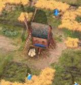
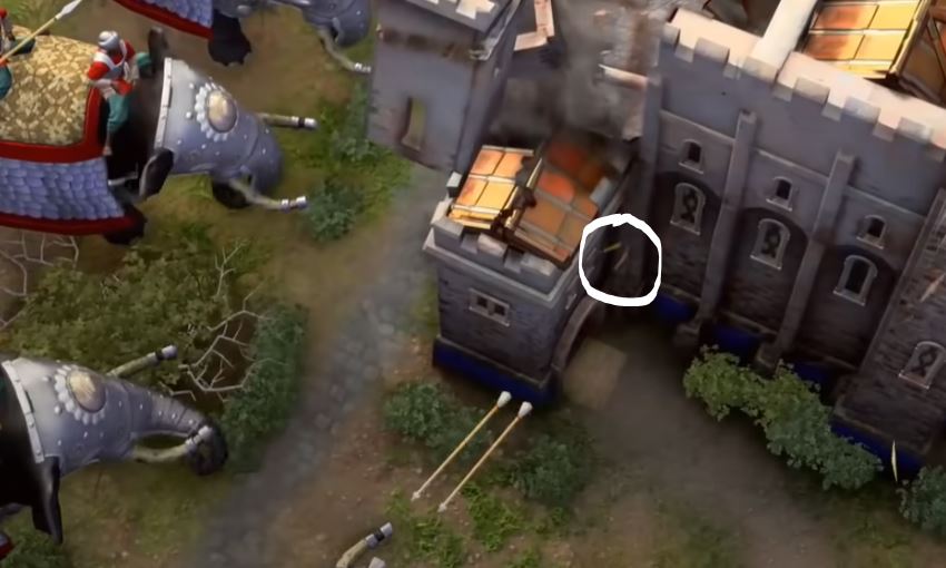
Something really badly executed and I hope they fix is the ´´magic arrows´´. In CoH 1 you can garrison units, it looks reallistic and makes the game feel alive. That would be nice if instead of magic arrows we get an unit firing those arrows from the inside of the building or at least see a ballista firing them. But units in towers and castles even ships would make it more battle realistic and definitely that would be a funnier experience, instead of the ´´magic arrows´´ as showed in this picture:
To conclude I want to try to understand why there are many people upset on this game. I think it is due to the 2019 trailer. When I first saw it my first thoughts were: what an amazing game its going to be! its just pre alpha and it is looking stunning! For some reason that I still do not understand, the game mostly buildings) is looking way to different 2 years after.
2019 preview:
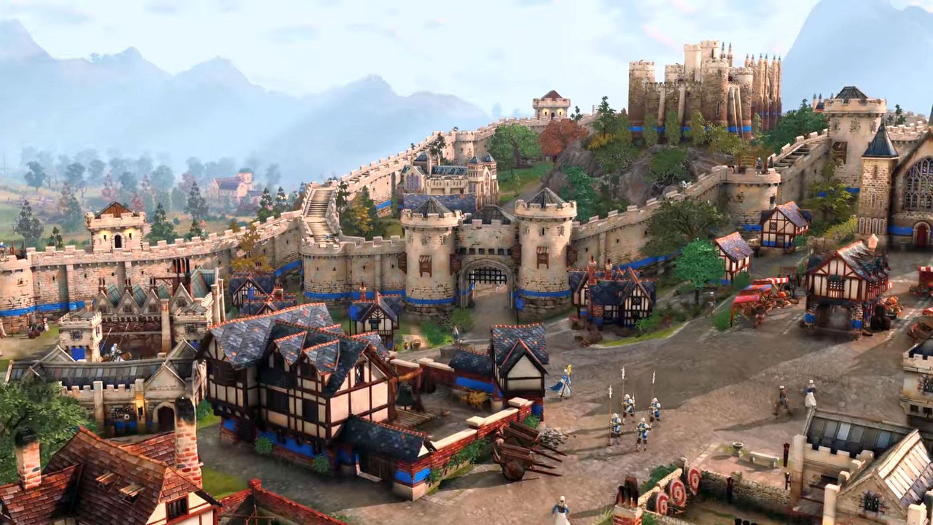
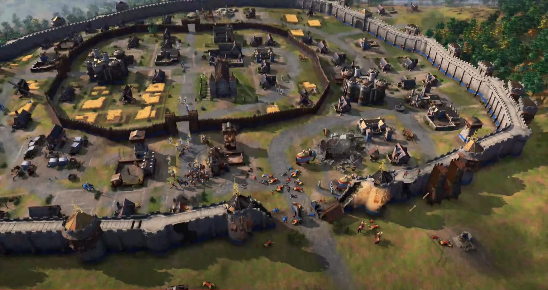
2021 footage:

2019 preview:
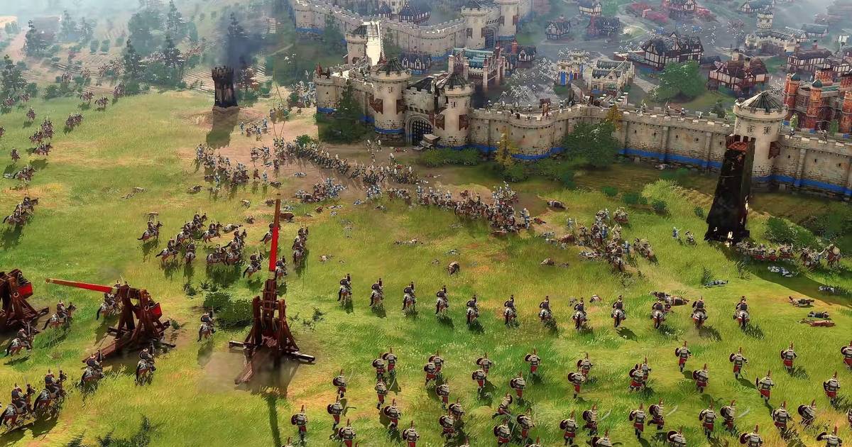
2021 battle:

What happened to those building details, colors and good contrast? Were not those the right proportions?
What do you guys think? I hope devs can see this and take notes and I hope this helps the game to look better and bring better results. My comments are far from spreading hate, I just want to contribute to the improvement of the game to have a succes of a game.
I also shared some thoughts in cool things they can still add to the game, you can check it out here:
 They are still pretty bad for a 2021 release. Especially, taking into account this is an AAA game and the Devs used the same engine for CoH 3, which is looking amazing.
 , you also showed CoH as a sort of “good example” but if you look at CoH… stuff is visually unreadable, that’s a terrible art style for an RTS.