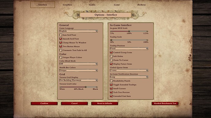
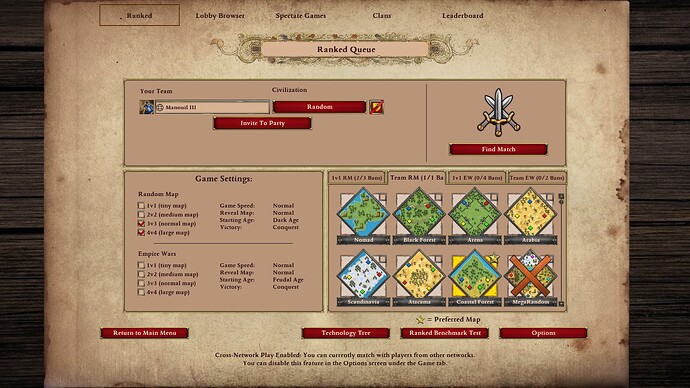
After having some time to adjust to the new UI layout when picking your Civilization, are you enjoying it? I personally miss the ability to hover over a Civ to quickly scan their unqiue techs and bonuses…
Was just wondering if anyone else felt the same and hopes the hover feature will return? My assumption is the console civ selection UI wasn’t very user-friendly, hence the update
I know this is a very nit-picky complaint, but I haven’t quite adjusted to clicking vs hovering yet. It is a bit more time consuming…Interested in hearing others thoughts that are also on PC
Thanks

