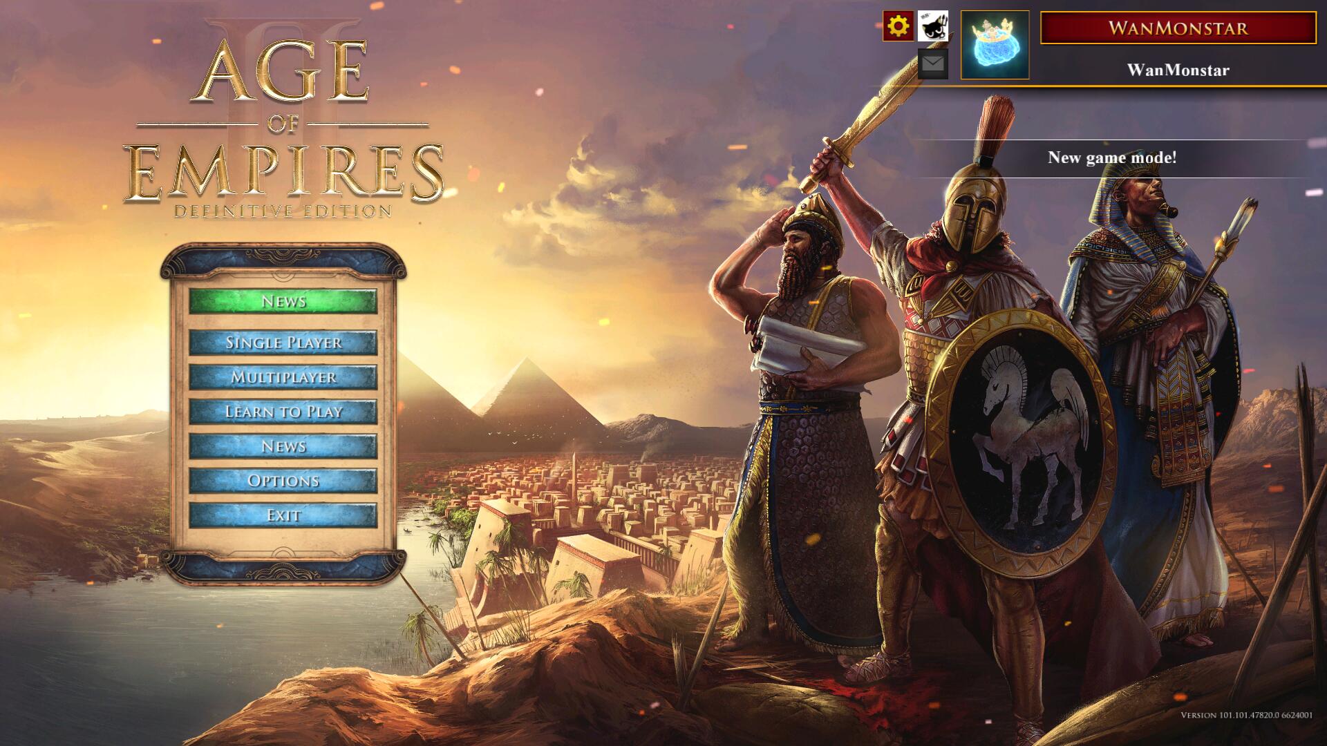
What do you think about this idea?
9 Likes
I love it! It looks quite clean and modern.
It looks great. Love it! 
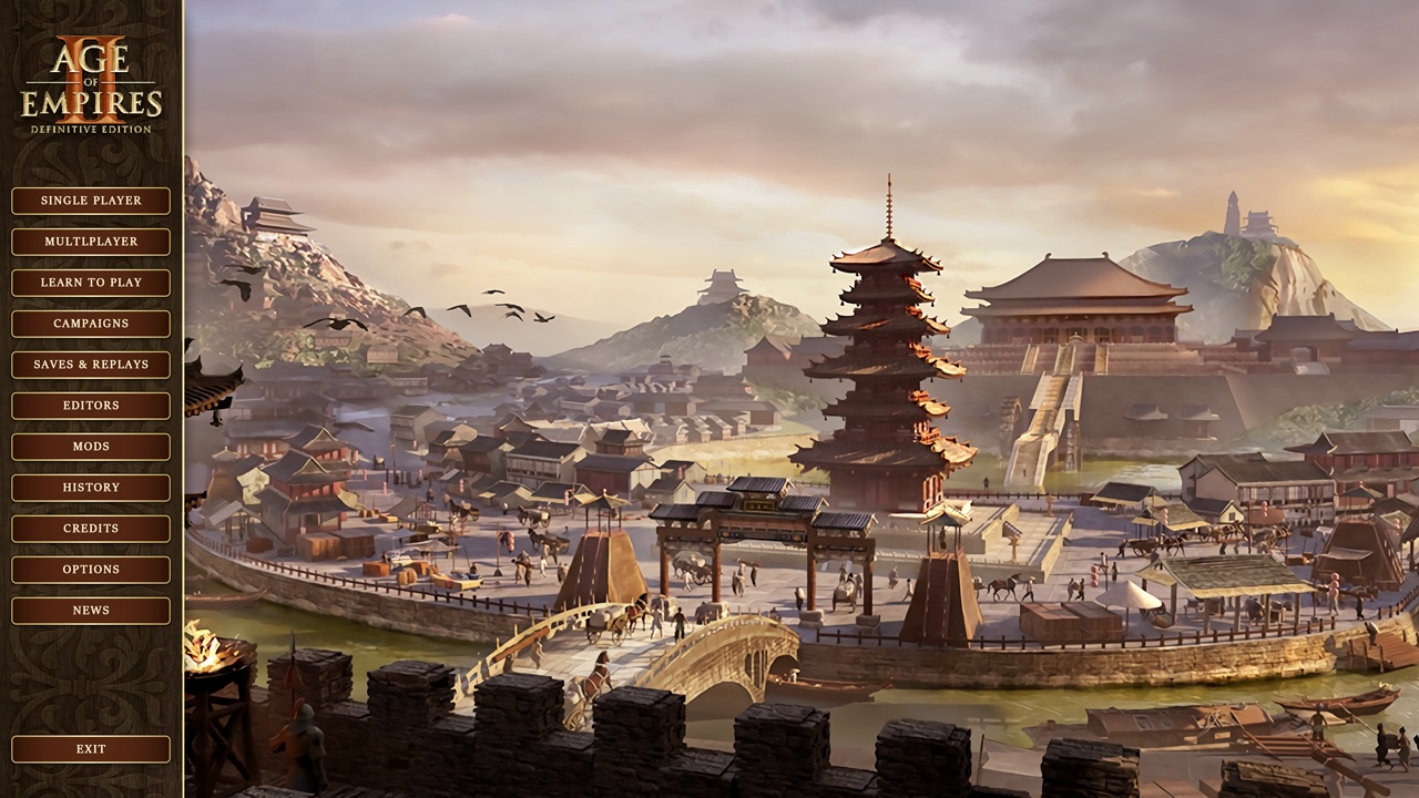
Great work! I really love East Asian Architecture.
1 Like
I think it looks amazing.

Looks clean, but I don’t like that all the buttons are the same color, size, and have all caps font. Visually, nothing distinguishes one button from the next, except with how many letters and what letters appear in each button. That’s something, sure, but not a lot. I’m not a fan of software developers removing all colors in UIs and icons/buttons to maybe 2 or 3 max, as if that’s the only way to create a theme. With no color distinctions, I feel like I have to read through or scan through every button looking for the one I want. If there were different colors and shades of color, possibly grouped with buttons that have the same intent or priority, and possibly symbols used alongside certain words, it’d be easier to use for more people and probably more visually pleasing, imo. Devs talk of accessibility for color blindness and the like, but don’t always consider visual vs. auditory vs. auditory vs. kinesthetic users out there.
The above screenshot as a whole has a ton of gold and brown/tan. Doesn’t do much for me, personally, but I know using more than two colors goes against the trend of modern UIs
Don’t get me wrong… muscle memory would kick in after a while, so scanning the full list becomes moot eventually. I just wonder why everything needs to look exactly the same with the exact same colors, is all.
Please don’t worry. I’ve shared the same feedback for the present AoE2:DE UI, since every button is red, etc.
1 Like
The main menu buttons use the same color for the purpose of simplicity. Obviously, the authorities are also aware of the questions you have raised, so they have developed a new main menu for aoe2.
I don’t want to get into all the science and opinions on how best to make a user interface (after all, I’m by no means an expert, but feel some things should probably be fairly common sense… and I think I’m learning over time that I wish UI/UX designers would be careful of too much trend-following and textbook reading in this discipline without a good amount of real-world observation and personal analyses)… but while the AoE2:DE menu revamp (including the main menu) may have aimed to address some issues, and may have succeeded with a few things, it opened up other issues which I won’t get into. And the ‘same red button everywhere’ issue, if I can call it an issue (I only know it is for me), remains quite strong.
This is a quick montage of various AoE2:DE screens displaying the red button. Most occasions have them next to each other with little or no distinction except what the button, itself, says.
- The map selection buttons are somewhat okay since there is a thumbnail of the map above them, for instance, but that’s a highly isolated example more than the rule.
But, either way, it’s clear, there’s a red button appreciation going on  It’s just an observation. One person’s point-of-view
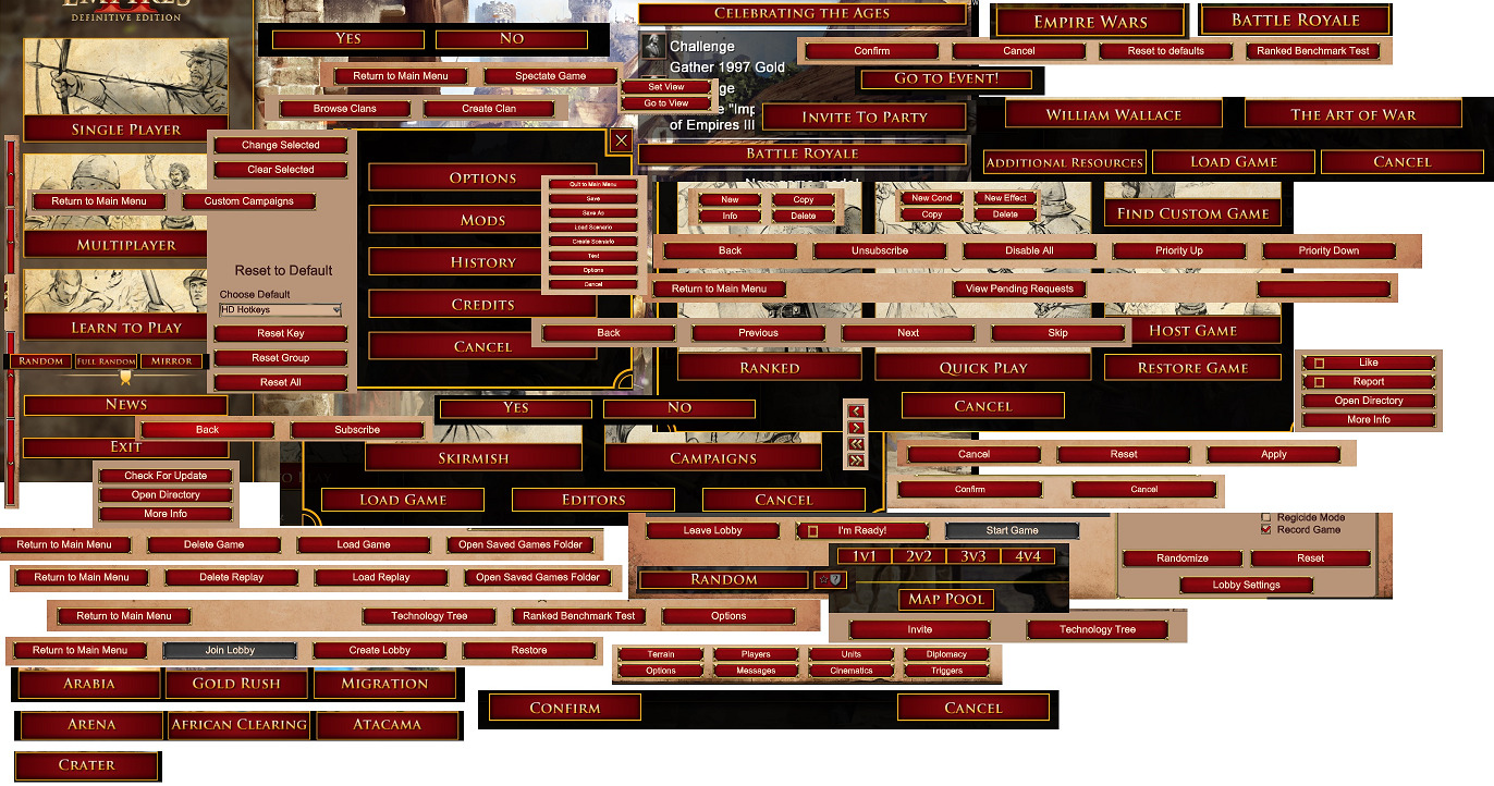
And this red button issue coincides with my feedback above, where I talk about the same button size/color is used in the mockup in OP. Trust me, the OP mockup looks cool, and I know the limited color palette aims to create a cohesive atmosphere or theme. (I’d personally prefer a little more color, but that’s personal preference.) But the functionality aspect of it (intuitiveness, efficient readability, find what you’re looking for fast stuff) is what would suffer, imo
I totally understand the whole desire for creating a theme. But it’s possible to have a strong, cohesive theme while using more than two colors or one shade of red, imo.
2 Likes


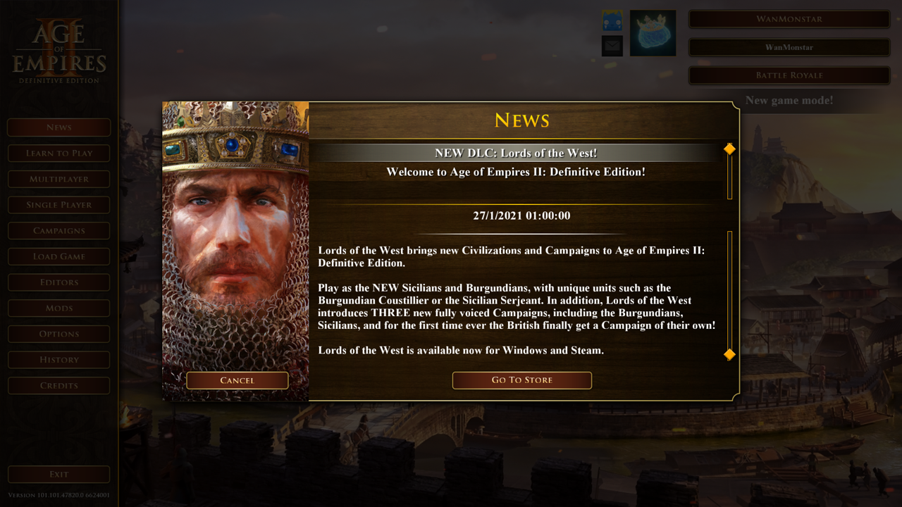
Is this your latest update to the menu or not yet implemented?
looks amazing. as a suggestion, have the ui bar at the bottom of the screen rather than to the side and make the logo much smaller or removed. easier to click and a wider rather than taller background is easier to appreciate.
1 Like
Ha, I just want to imitate AOE3 DE
Exciting changes Wan this is the best Menu Mod right now. Would you also try to change the remaining red buttons to brown inside the quick play and multiplayer lobby? Thank you for the great work!
1 Like