AoE 4 vs AoE mobile, lets compare them

Now it is time to talk about the units and buildings designs. I love devs because they did a great gameplay and stable solid game in terms of performance, but on the other hand I wish they had better communication to know what to expect and what they are working on.

Well said that I want to share my opinion (it is only my opinion, I want to hear others opinions of course)

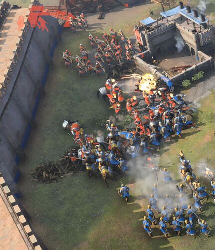
I thought it was only me who was struggling with readability. I found so many people complaining about the readability problems the game has in terms of units and buildings. It is even more noticeable when you age up, because you canā€™t tell any significant difference between ages.

I personally loved the gameplay and sound design, but the game was a pain for my eyes all the time, since it was really hard to say who is who and what is what.

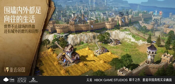
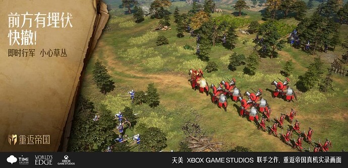
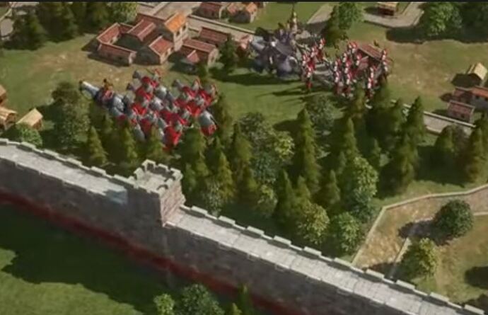
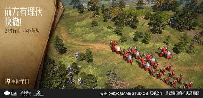
I wanted to compare with another games, but then I just realized the first mobile gameplay was released, then it is perfect to compare since its a 3D game and its made for mobilesā€¦ (need low settings)

Notice the video is in 480p and still works as an example. This is the video in case you want to check by yourself: AoE mobile graphics

AoE mobile game


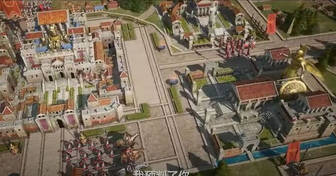
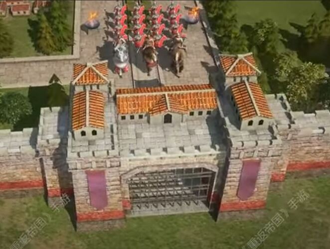
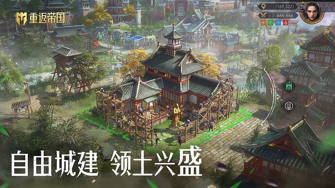
Also notice how amazing and full of detail the buildings and roads are. You see monuments, statues (how come they didnā€™t add any to the buildings), flags, bridges, flowers, waterfalls and a lot of other details that makes it a good experience visually speaking, and again for mobileā€¦

AoE 4

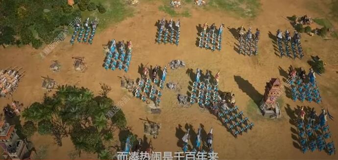
When I first heard from Adam the units are not that detailed and bigger than some buildings because of readability my first thought was Ģ Ģthanks dude it was really needed, sounds really good, it is a good idea tbh, because clarity is importantĀ“Ā“ but then after playing beta I just realized the things they are sacrificing are not working as it should? it is really intriguing if they are going to add more details and fix that visual side, but for now it is looking very bad in terms of readability, it must be something in textures, contrast, colors or just something else, but the true is the game is 2/10 (IMO) in readability terms, it is still looking like a pre alpha with just 1 month for the releaseā€¦ and did I mention how hard it is to distinguish among your siege weapons and the enemy ones? add some crew on them or some culture representation on those trebuchets, idk it might have some more creativity to help the readability on those?

Well, I hope I was clear in my explanation, I know devs could say they are sacrificing graphics for performance and readability, but in terms of performance the mobile game units are looking better in detail and in terms of readability while AoE 4 is not doing well.

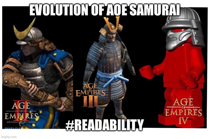
I found this funny meme that explain it very well, I mean there are many ways to figure out how to make it look better without sacrificing performance, and we have been posting about it for over a year and we keep looking the same problem in that aspect, so will devs put more attention to it (which I consider important) than a Ding Ding sound? thatā€™s the only thing I have heard they will change besides the zoom rantā€¦

21 Likes

All I see are blurry screenshots taken by a potato.

19 Likes

I do not think I can agree with you here. age 4 graphics are gorgeous to me. I do not believe that mob has anything age 4 doesnt- maybe because of the 4xxp shots where I cant even find said statues :slight_smile:

However it seems to be the case that many of the models may be shared between mobile and PC, with PC getting better textures. Just from the looks of it. But that seems fine to me.

6 Likes

They also added huge units that kill any immersion due to their scaling.
This is manually designed, not automatically generated like AOE4. You will have to compare it to the AOE4 campaign when it releases.
Additionally, mobile games in general suck.

4 Likes

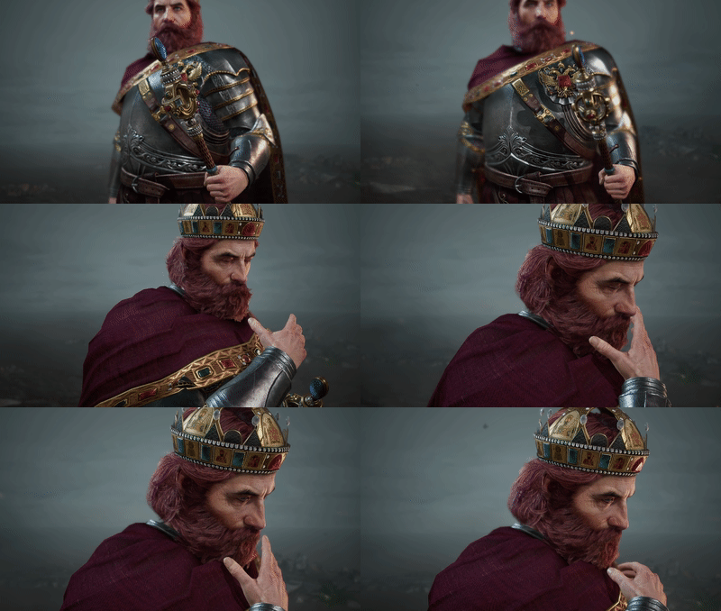
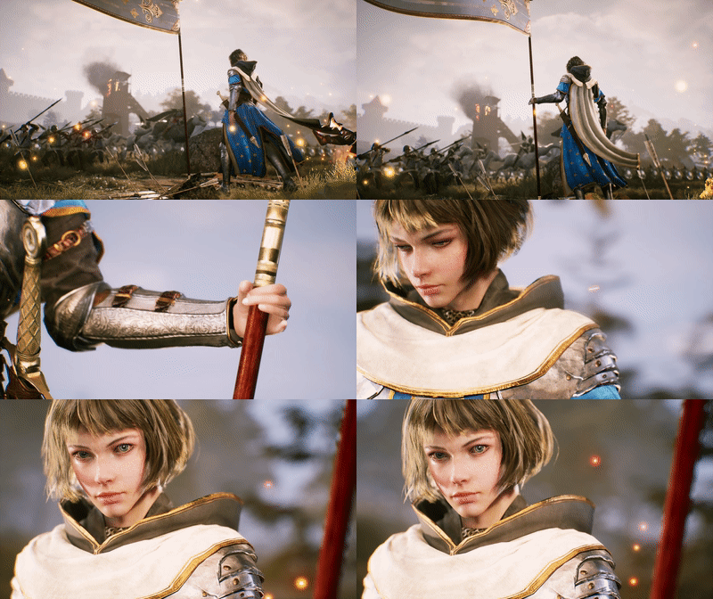
Honestly, they both look like a mobile game in term of graphically appearance. The only details I wish they had copied from the Age of Empires Mobile was the 3D rendering of the respective leaders.

2f1e861d563b5782f9dcd23ac8b98a382762120551041858055.jpeg

2f1e861d563b5782f9dcd23ac8b98a386279028446314199693.jpeg

But also other visual components of the game:


7 Likes

if you really think to have those graphics at launch you are really wrong.

7 Likes

No. But Iā€™d like to think that Age of Empires IV could of had those graphics considering that itā€™s a PC game, but apparently I was wrong.

9 Likes

Genshin Impact is a Chinese mobile game and has a pretty decent graphics, even by today and PC standard. Just because something is a mobile game doesnā€™t automatically mean it wonā€™t be true to the trailer.

Age of Empires IV on the other hand is a PC game made by Western company and I had high hope for this one.

2 Likes

excuse me , but it is a pc game that was ported to mobile :slight_smile: , and from all the screenshots you posted only i do believe in one .

this image is the only one that i know that it could be the real mobile rts game that we need

2 Likes

It was released for mobile and PC the same day so it couldnā€™t have been a port. And even then the statement is still true that it is a mobile game that you could download on your phone.

Age of Empires IV shouldnā€™t have any excuses for that unless they were planning on going into that direction.

1 Like

RTS in general are quite CPU heavy, since there are many damage modifiers and calculations to be considered.

This is the reason the mobile RTS game uses squads and probably has no AI.

AOE4 can run on integrated graphic cards (as you can see in the minimum requirements), so it might either hint to a XBOX release later down the line or implicate that Microsoft wants this title to run on any GamePass userā€™s PC.

1 Like

Genshin Impact has to only calculate engagements with a handful units on your visible screen while a RTS has to calculate every unit on the map.

Also, on mobile things like textures etc. are toned down but it still results in massive slowdowns in regions like Inazuma because of the many effects there.

The graphics are highly stylized just like Breath of the Wild and you need a PS5 to play at 60fps.

4 Likes

Sorry man, but i have to Admit that this mobile version looks Better than AOE4 in some way


3 Likes

there is only one screenshot that it looks real and from real gameplay .

And is this. You were the graphics top fan of this forum , THOSE MODELS are AWFUL , it looks way more worse than aoe4 . also i dont believe anything from that game until they show real gameplay.

4 Likes

image
image
image
Those werenā€™t in the actual game but there is no way someone can say that they arenā€™t the same art style. That looks like AoE4 on ultra graphics mode, I donā€™t see why they canā€™t add those options later on for people who want them.

4 Likes

This. Perfectly said.

3 Likes

Woah, wait, what? Are we agreeing on something about the graphics??

1 Like

we areā€¦

20 characters.

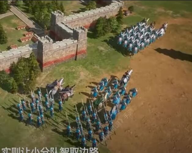
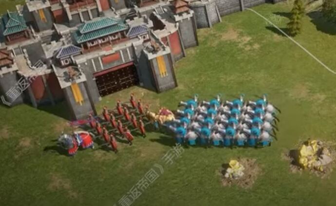
Thank you, some people seems to have not read the whole post where I clearly said it was 480p, folks today dont have reading comprehension I guessā€¦ but these pics are better to explain what I said, you can perfectly distinguish those units, theres good contrast in colors and edges that makes it easier to read visually speaking. Something I also noticed is the real asymetry, each civ got its own units design which makes it richest again visually speaking.

1 Like

Thatā€™s what I am asking basically, I am talking about readability, people are confusing terms here. I never said graphics were bad, stop doing thatā€¦ we are talking about readability. We need better definition in units and buildings, better contrast and so on to make it easier to read. I like the style already.

On the other hand I like it more that the asymmetric units, all civs got real different units instead of the same units with different skins. It makes it more enjoyable visually speaking.

1 Like