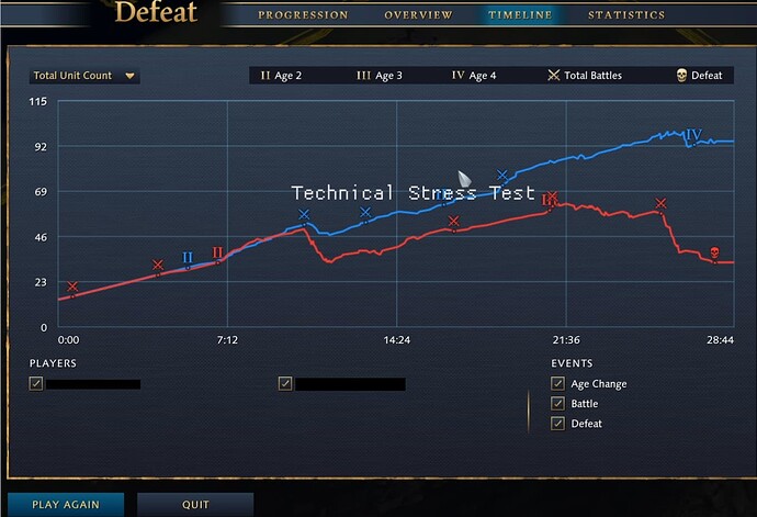
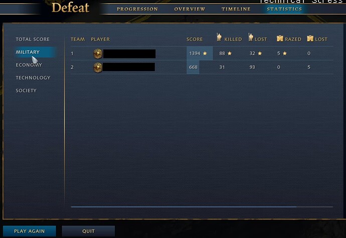
The stats screens in AoE4 Tech Stress Test maybe felt a little lackluster to me. Did anyone else feel the same?
I was hoping for more advances in the info and presentation over past AoE titles.
More detail, more user interaction with the data, a wider variety of stats, filters/sorts, and more charts, in general. (Admittedly, though, I didn’t notice the “Total Unit Count” drop-down menu in upper-left of graph screen, so maybe there was a lot of new stuff there? And I didn’t click column headers to see if they re-sort.)
This mockup was one I thought of a while back they might draw inspiration from. Could even have a slight snap when you get close to major events/milestones:
But at least if we’re to go from the Tech Stress Test, the stats screens seemed a lot like days of old with no graph interaction or ways to get more precise info on the graph itself..
PS: I think it’d be nice to have a bold and maybe brighter font face for the values that were highest; and not just stars. I’ve circled those values here. Would help readability, in my opinion:


