that and the contrast is also way off
1 Like
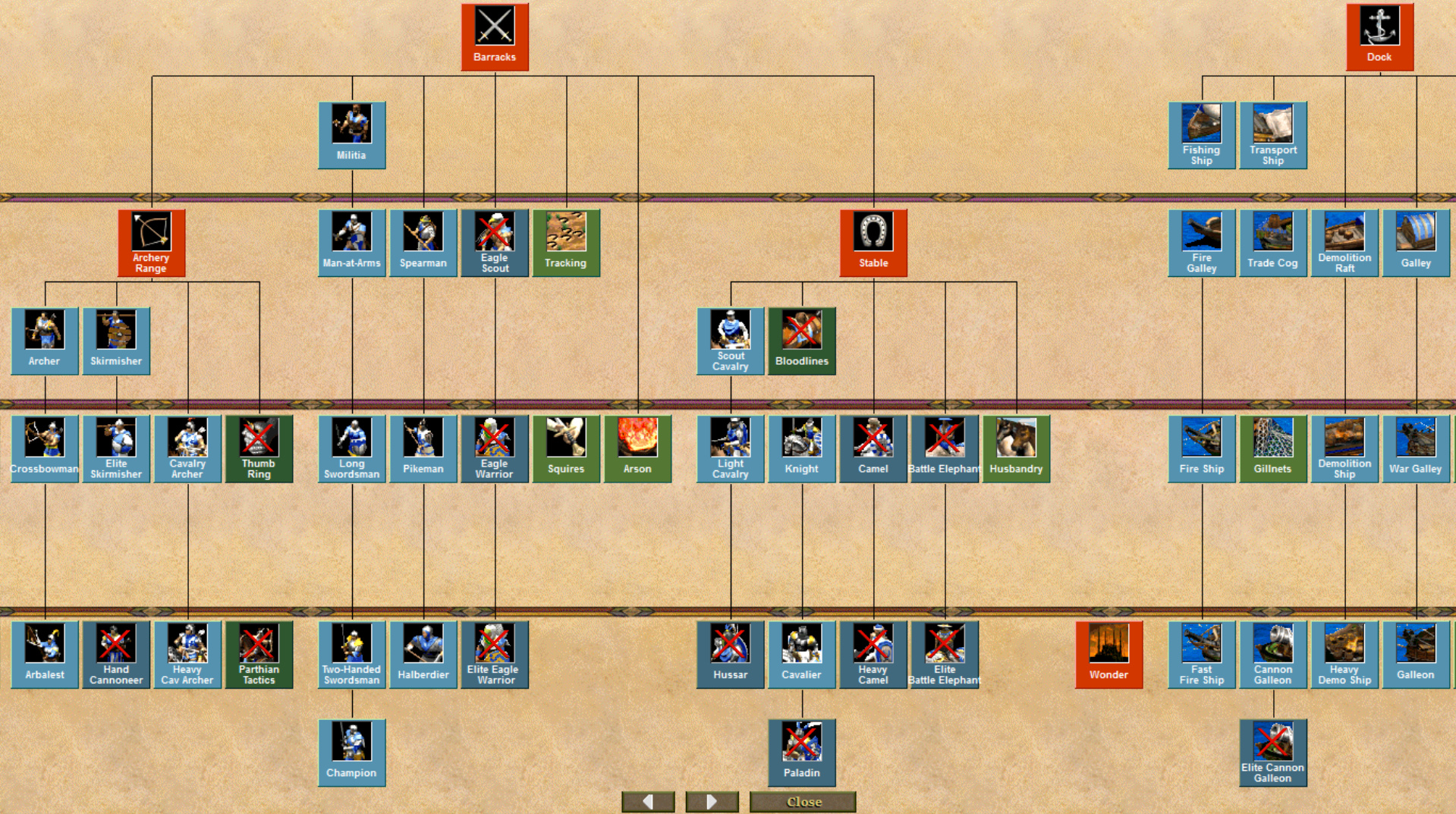
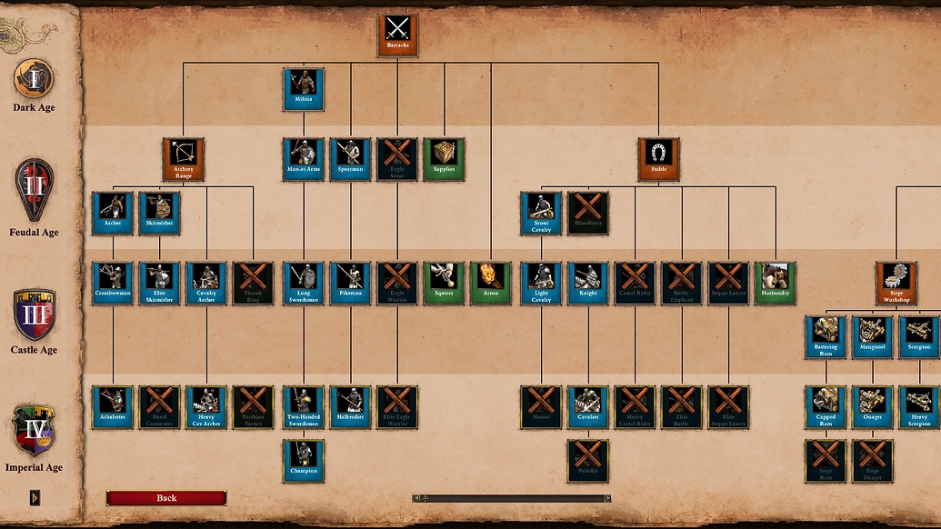
Not a screenshot, but this site uses DE icons Age of Empires II Tech Tree
How do the unit icons look so clean on that site, compared to my game?
1 Like
You’re right, it doesn’t use the ones from the last patch so some are looking better. I assumed they updated those too and post it carelessly 11
My icons have always looked that bad 11
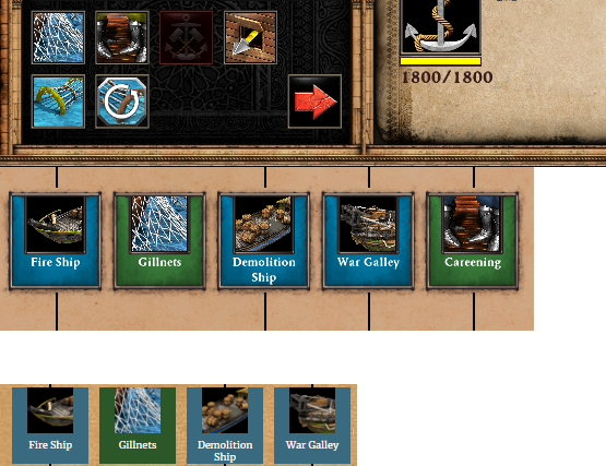
I mean look at how ingame and ingame techtree gillnet icon looks like for example, compared to the one at the site you linked. And all the other icons too. On the site the icons are much clearer imo, less random white dots to distort the picture, namely the demo ship icon.
Yeah, they must have smoothed the icons themselves for their site.
Yes they probably did, however the ingame icons should also look clear. That’s where the icon’s appearances actually matter at.
If you look into the game files, the icons are all very clear and high-res. So it has to be a problem with the ingame scaling of the icons.

4 Likes
Pretty neat. Indeed, whatever the problem is, a fix at some point would be nice.
E: maybe if the icons were a bit larger, could help. The UI setting only goes up to 125% and still icons look so darn small.
1 Like
I’m from the Ayllu community. HardNRG. Participated myself too and sadly lost in the first game. x]
1 Like
Not a screenshot, but this site uses DE icons https://aoe2techtree.net/#Britons
Yes I use that site, however I feel it’s a bit sloppy so I want to ask for an ingame screenshot for a fair comparison.
The problem is not that DE icons are low res or unsharp, my hypothesis is that they were designed zoomed in and then downsized for use in game. So there is too much information in a small icon = they look messy. This also explains why when you zoom into the game, all of a sudden everything looks much sharper compared to regular zoom level…
That and ofcourse the old models look much cooler.
Briton tech tree (grey)

Briton tech tree (blue)

Persian tech tree (red)

For some reason the blue and red used for the icons look like the spring color set, even tho I disabled it.
2 Likes
Thanks.
Just look at what they did… Why is there so little outrage?
The classic icons are far more recogniseable, colorfull and cool looking.
The archer line, skirm line, militia line… the paladin 
Absolutely depressing. If they want to make an ez and direct improvement to the game, implement a classic icons toggle.
Because it’s subjective? The new icons look much better to me, the champion and hussars don’t look something from the future anymore, you like nostalgia? Stick to HD.
Now what they did with the contrast for achieving icon matching player colors is outrageous
you like nostalgia? Stick to HD.
Don’t disrespect me. And to narrow down my opinion to nostalgia… Like I would not prefer these icons if I honestly believed they were better at doing their job.
The old icons are objectively more recogniseable, better color separation, each icon looks much more unique compared to others. Look at the arbalest, it’s plain obvious.
If you don’t see this, then I don’t know what to say.
And yes, I know it’s subjective that I think they look cooler.
For me it depends. The new LC icon isn’t the most inspired thing ever, the new hand cannoneer icon is super cool. Also on the old icons I could never see the cav archer’s bow or the warship’s ballista.
There should be a mod for that around here. After all we already have classical soundtrack, classical sounds effects and classical colors so someone somewhere must have made one.
Because there’s no reason to outrage. They did listen to feedback. They will do so again.
The older color (OG DE Blue color) is better than the new color. But DE’s unit icons, in general, are easy to distinguish.
3 Likes
Because there’s no reason to outrage. They did listen to feedback. They will do so again.
They never made changes to improve the icons afaik, other than player colors… And you don’t need to come here to make assumptions.
But DE’s unit icons, in general, are easy to distinguish.
We are not talking about the icons as a seperate set. Either they are equal, better or harder to distinguish compared to the previous icons. The only intent of my post is to compare them to the classic icons.
Just look at the 2 example pictures above, don’t even enlarge the images. It is immediately clear that the top icons are more easy to recognise. The classic ones are bright and colorfull, the DE ones are dark and bland. Why do you think traffic signs are made out of bright colors and not grey and brown tones?
The older color (OG DE Blue color) is better than the new color.
That ugly dark blue? Definitely not. However the classic AOC colors are prettier colors imo
Spring COlor COnfusion - #5 by PacificWheel208
Is having a beta-known complaint (blue icons for all units) changed an assumption?
They are still fairly recognizable. There’s not brown tone here afaik.
AOC colors are lovely, but the OG Blue color is by no means ugly.
Considering the patch is released a week ago… Boy, you are too demanding.
I say a hotfix to fix the Malay’s weird bug is more important atm.
Will the colors need a hotfix? No, they can be improved in the next month.
DE ones aren’t dark. They have a layer of black to them, but that is by no means considered dark and bland
1 Like