I prefer the DE colours to the AoC colours. AoC unit icons were also mostly fantasy, while DE icons and unit models are much more realistic and accurate to the Middle Ages.
I mean, the AoC Archer looked like he was wearing a breastplate and no helmet, while the DE Archer is still helmetless, but has padded gambeson, which is far more accurate to an Early Medieval support trooper (except they really should have a helmet, no one went to war without a helmet).
The Spring Colours are way better than the base ones too, and also more accurate, as the Middle Ages were quite colourful, specially in the battlefields, where you had to distinguish friend from foe at a glance, and camouflage was inexistant (except for skirmishers, which often were poor peasantry conscripts, and would even get friendly fire a lot, because they could not afford a proper uniform and soldier could not distinguish them from looters or even the enemy).
Since you put little effort in understanding my points, consistently lack a logical foundation, are unwilling to think critically and want to shut down critisism because of your assumption that it will receive dev attention. I’ll just let your comment sit there. Please don’t respond to my posts.
@JonOli12 I also prefer the blue of the spring color mod over the default DE colors, since it is not so harsh.
I hear your argument on historical accuracy, and you are right. However that is not my priority since this is a game and not a history simulator, it can be historical as long as it is also equally distuinguishable compared to the classic icons.
The “game, not simulator” argument is only valid for gameplay, not for how units look.
I know you have been holding that back for a chance at throwing it to my face, but you failed massively at it.
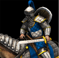
A Medieval game should have units looking Medieval, and DE went to great strides to actually update a lot of models so they would look more authentic, like the Cataphract, which actually looks like a Cataphract now.
Try to understand what I am saying, I think it is great that they are more historically accurate than before. However they should put in some extra effort to also make them stand out more.
I think we can all agree that there is room for improvement, that’s all I want to say.
I disagree, it looked like typical Western European Heavy cavalry from the late 15th Century, and not like a Cataphract at all.
I only wish they had gon further with the redesign, and gave it a Lance.
Then again, I wish the whole Knight line had a Lance.
Bad examples, since they are actually different stages of the same units. You would never mistake a Crossbowman for an Elite Skirmisher, for example.
They are also easily distinguishable, no matter how you look at it. A lot of people even agree that the 2H looks more like an Imperial unit than the Champion, just because of the painter pauldrons (Yellow no less, which was an Imperial colour all throughout the world).
It looks like its going to trample in its own dress right now. Already had that discussion earlier on some thread and someone even came and posted a picture of a cataphract, as if to prove their point, but instead proved my point. Cataphract dress has a hole in the front to let the legs have room to move. The DE cataphract however does not have such a hole in the front of the dress, so it would just trample in it.
I said it looked cooler. I don’t really care how much of a real cataphract it looked like in the end. I mean, we have the war wagon 11. Also with its mini-skirt, it did not look like its going to fall over while running.
And there it is, the hole in the front of its mail dress. But the game Cataphract does not have such a slit. So the new cata does not look like a cata, it looks like a damsel in distress.
Meh, the ventral slit is an easy fix, if the devs want it, but all in all, the new Cataphract is more authentic and accurate, even the helmet and mail.
Eg; If you want to depict what unit is being created in a spectator overlay, then it is important to distinguish Two handed swordsman Vs Champion. Also take into account that these icons can be displayed in a smaller size.