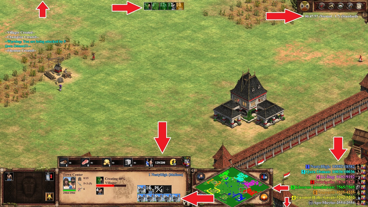
https://www.ageofempires.com/mods/details/15476/
Mod details on link above. I always wanted to be able to move things around on the screen and finally Nili inspired me to do it (see vid below). I tweaked his idea to make it a bit cleaner but it's essentially the same kind of thing with the resources and minimap but with a few extras like chopping off the extra bit of the resource bar where it usually says "Imperial Age" and leaving just the icon so that the red text commands like "Not enough food." are visible, moving the control groups left to make space for the mini map, moving the timer, moving the global queue to the top centre and removing the top and bottom bars for slightly better view of the battlefield. The problem I've always had when I'm booming is forgetting to spend resources, so I moved the resource bar so I can see it more clearly to remind me not to hoard. I appreciate this takes a bit of getting used to and not everyone's cup of tea, but I really like it and thought some of you would too. Works really well for widescreen displays. Obviously could change some parameters to taste.