I finally found the problem with the graphics. Hope developers can read this. AoE 4 graphics are great, but failed on this specific things!

As a game developer and 3D expert I have been thinking and thinking all these days about why is AoE 4 not looking good at all, even (believe it or not) it has great graphics. First, if you do not believe it has great graphics and detailed units, look at this video linked Zoom in on those beauty graphics

Then why is AoE 4 looking that bad? I did my own investigation and got to this conclusion:

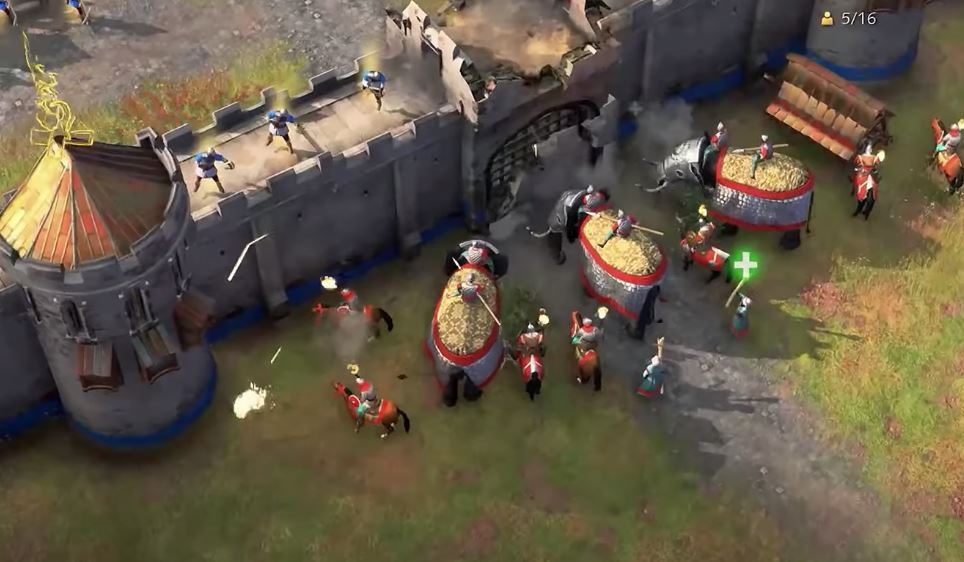
1-Animations: the animations are mediocre, somehow bugged and do not look clear. We usually work with breakdowns, then polish the animation to look fluid later. Maybe this game is in the breakdown stage, thats why it looks so bad in that term. And some other animations are just bad decisions, for example elephants look like dancing instead of attacking a wall… Watch this video elephant attack and compare with the elephant attack of the picture.
I cant say its completely realistic, but definetely a better and more undestable animation that let us know the elephants are attacking and not just dancing…

2-Lack of detail on units: the units need shining effects on their helmets and weapons, also some more details on their textures, the cloths especifically, it would add a feel of realism, instead of looking like wearing blankets…

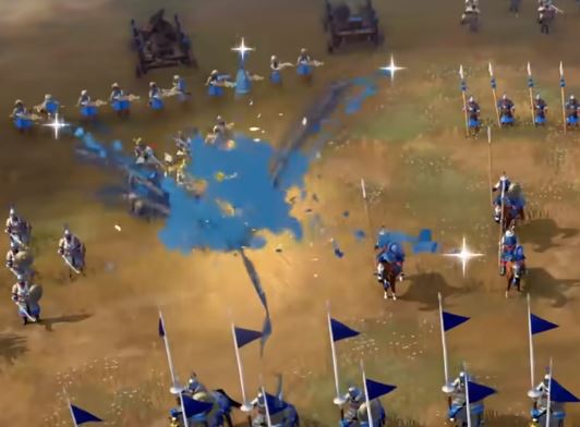
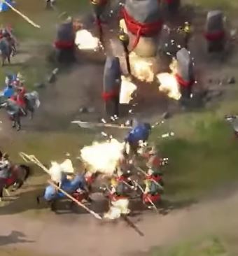
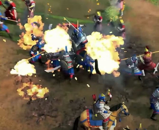
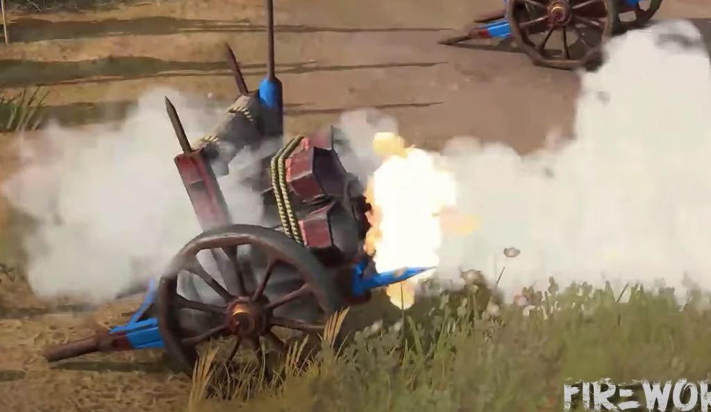
3-Bad physics: the fire looks so unreal, not matching the terrain and units detail. The blue smoke with shining disney like stars for example, looks like a clash of clans effect, doesnot match neither and we do not see dust nor blood in a battle field… more realistic physics would add more battle feeling and less mobile feeling…
somke4
somke3


4-Last but not least, looking siege weapons moving magically alongside detailed and realistic units doesnot match… they have to add operators and animations that makes the game as real as the detalied units, otherwise there will be a visual gap that will be distracting. They can realate AoE 3, they did a great job on siege weapons, and CoH did even better, they let enemies steal a siege weapon after killing operators.

5-Human less ships: the ships without people and oars look as bad as operator less siege machines. While having great building and units details, it does not match at all. Castle throwing arrows from a hole instead of an archer doing that, or fishing ships without fishers on them, make a big and bad contrast among great terrain, building and units. That match up between unrealistic animations and effects and detailed props is the gap they need to work on.

I think units proportions are not that bad, because they want clearity on the battle field, and I agree that, since you will be managing soldiers for the 90% of the time. You can relate AoE 1, it does not look bad in my opinion, visually speaking. Giant weapons would look better with shining effects on them, but those colors from the preview are dead and makes it look bad, because the less detailed prop is taking to much attention… I would like to see them more detailed first before reducing the proportions.

The colors from the 2019 game look so wonderful in my opinion, that contrast of colors make the game so beautiful and modern feeling. Hope they dont get confused by ´´cartonny´´ graphics and colors. Colors were great by then, and to fix ´´cartoony´´ graphics they need to add more detailed clothes and weapons as already explained. Once again, look at the linked video and you can confirm those units are not cartoonish, they are very well made and detailed. The ´´cartoonish´´ look is due to the lack of details, cringe animations, operator less units and buildings and out of place physics.

After all I am pointing on all of this by my own experience, I am not making a discussion on this, just want to contribute on my loved saga. I want this game becomes the best odern RTS and give us all the happinness we deserve.

Greetings lovely people and do not waste time arguing, just add your own thoughts on what else would help, so we can have the game we all expect :smiley:

32 Likes

The colors from the 2019 game look so wonderful in my opinion, that contrast of colors make the game so beautiful and modern feeling. Hope they dont get confused by ´´cartonny´´ graphics and colors. Colors were great by then, and to fix ´´cartoony´´ graphics they need to add more detailed clothes and weapons as already explained. Once again, look at the linked video and you can confirm those units are not cartoonish, they are very well made and detailed. The ´´cartoonish´´ look is due to the lack of details, cringe animations, operator less units and buildings and out of place physics.

4 Likes

This sums it up pretty well… I too like the artistic style, but as you say the elephants are so stagnant just sort of nodding their heads, in some shots in mid air only, while AOE 3 Elephants had whole body movements.

I totally expect them to add crew to siege, not because they said they would, but because someone is going to read these things and realize they should.

I do not expect much to change with the sea fare though It would have been nice to make sea faring as interesting as land battles.

And I agree its not the art that makes it look cartoony but the lack of details, siege crew, and poor animations (archers and explosions/ fire) The buildings are amazing, and even the units are really good too (though some proportion issues)

I hope they push a little harder, even delay if they have to… for a really great timeless game to last for ages.

3 Likes

now here i would mostly agree with the issues you point out, but also keep in mind the fan preview version was already over a month old when displayed.

Animations are certainly something to work on, and the unit details aswell. Although I would rather say the unit polys/resolution rather than details, because they DO have details. They are just not very clear to see :slight_smile:

Physics I am not sure about, I mean in age 2 buildings burnt forever. But the special mongol ability DID seem odd to me aswell.
Blood probably wont be included and I am quite fine with that. let modders implement that, its not THAT much of a reason for bad graphics.

I also doubt siege weapons will have operators, as they never had in age, which is fine. (excluding bombard cannons here), aswella s human less ships.

1 Like

I thought you said units weren’t detailed? :face_with_raised_eyebrow:

2 Likes

´´Greetings lovely people and do not waste time arguing, just add your own thoughts on what else would help, so we can have the game we all expect :smiley:´´

Thought I said do not waste time arguing?

But anyways, just to be clear, there is a lack of details in clothes and weapons as already explained. The units themselves (besides those specific aspects already mentioned) are very detailed and well worked, in terms of face, polygons, hair, colors. So instead of arguing unnecesary stuff that does not come to the case, you should be more constructive, put attention to the meaning of the message and not waste my time and others in things that do not contribute anything. Thanks.

Alright folk, thats my opinion as a game developer, I know what I am talking about and this is my contribution, you can agree or not, but you are not contributing in anything. I think some people take some of the feedback of this new game as AoE2 haters. My thoughts come from my expertise as a game developer, it does not matter if previous game was A or B, I contribute according my expierence. greetings.

Graphics could be better
From what I have seen the graphics look fine when you see shots that are zoomed farther out, like they will be when you play. The worst shots are the zoomed in ones, but you don’t play zoomed in anyway so I’m not worried about it

1 Like

IT seems to me Like you wrote from a high horse tbh. Would Love to know which Games you Develop.
Also its a Forum so PPL Like me will BE commenting on your Views or ideas.

I actually Likes your reasoning but i do Not agree with all of IT.

And while the Game is mostly Played in zoomed Out state, If they offer zooming in, the Assets should be of a good quality- from an AAA Studio. In the age Preview they were Not.

However AS i mentioned they already Work in eine of the mentioned Problems.

I dont See where your agressive Tone Comedy from.

You say it yes and that is what the majority of players think :wink:

Just not. The graphics look rather bad, when you see them from a bigger distance.

The close up shots are also not much better. And really no, the players want to play the close up shots, if this is already advertised by Relic. So Relic beats himself with her own weapons at the moment. The graphics in the near and far view are indeed a serious problem in the game.

1 Like

Graphics certainty need to be improved, and I’ve heard they are working on them
But from the regular playing zoom they don’t look THAT bad, but I am not that particular about graphics :slight_smile:

I hope the devs make some changes that people are asking for because I feel the community won’t leave Age of Empires 2 for 4.

I’ll be watching for these changes that the community want and hopefully this would lead to everyone in each of the Age niches will come together in Age 4.

Let’s hope this time a game company will listen to their players. So far the Age IP since the DE’s began were so good to use and THEY CONTINUE to be so good to us as a community. I remember requesting African civs in Age 3 DE. I remember seeing the community discuss Age of Mythology DE and the devs responded.

Xbox as a brand has been good to consumers in late. It’s awesome. I’m sure that trend won’t go away.

3 Likes

As it is now AoE4 looks already miles better than AoE2 and I think that if the gameplay is good that quite a few player will switch to AoE4.

1 Like

no, the towns from above actually look stunning, brimming with detail

None too. The far view of the game looks graphically very weak, not to mention details. You obviously see a game, that the majority sees differently.

1 Like

Im talking facts here. Look at the trailer part where they fly out of the toen and you can see the cathedral, walls etc. This is pure detail in polys aswell as textures.

Your facts are your facts not mine. They twist facts.

I am not talking about the recognition of details from high above rather about the poor color saturation of the vegetation and that the units look like a cartoon.The color saturation of the vegetation is very weak, every child sees that from near and far. The difficulty is, that the units are not detailed enough, and you can see that from further away.

all right, it seems Its impossible to discuss with you. there is a general neutral fact base, which is that the buildings do have the polys and details to look brautiful and detailed. I am sorry if you do not see that, but it is neutrally visible for anyone who worked with 3D and texturing. It seems you didnt.

If you talk about the poor color saturation then dont talk about graphics looking bad. because they do not. I am unable to evaluate color saturation as this is not my area of expertise, however I do like the current looks (which is a personal opinion and may very well differ from yours or the fact about the color saturation (whichever that is)

You are the problem not me. They even become personal. On every single unimportant contribution, you submit criticism and twisted the facts for nothing. And yes, please do not discuss with me anymore. I do not need any justification. You are a very annoying guy and always you want to have the last word.

They are twisting facts again. I am not talking about this thing. Check out my posts above.

The poor color saturation has to do with the graphics. They seem to have no notion about the theme.

They contradict each other. If the color saturation is not your area of expertise, you can not judge the graphics either because the graphics are related to the color saturation.

If you like the graphic, is that your thing. But please let the other people have a different opinion of that case.

I thought I made clear what I focused my argument on? The polys and textures of the models are detailed. which makes the technical graphics in general good. (which is hardly a personal opinion)

color saturation is more of a personal decision and if you dislike that, its fine.

If you make a statement from that that the graphics are"rather bad" looking, when seen from a bigger dtstance, I can not agree with that. Which is fine too, isnt it?

I am not looking to havin a last word, I just think there is no reason to call the graphics in general rather bad looking, if you are able to specify what exactly your problem with them is - which you did in a later post :slight_smile:

So all is good,
We have different opinions on the impact of color saturation regarding the graphical style :slight_smile: