Has anyone noticed how aggressively blue it is in every map?
As I understand it, the fog in the map help create godrays and shadows by using clouds that blocks lighting from the “sun”, and so remain as an important tool for them to deliver those features. But, visually the execution comes across as poor when the fog flows over absolutely everything like a filter, even in climates that we don’t perceive as cold.
There are three things I think that could greatly help the visuals of fog in this game for rather little effort.
Colour temperature
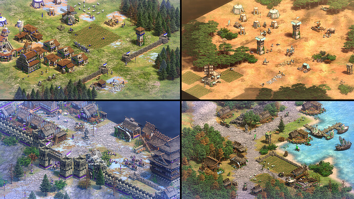
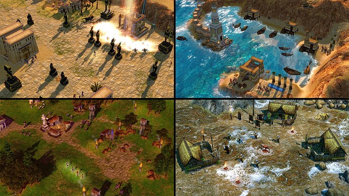
The first, would be using the fog by assigning a different hue to it for each biome, helping to differentiate them from each other by enhancing them with correct colour temperatures that we associate with those biomes. Like for instance, an orange hue to a desert map. This is a very common strategy in video games as it helps distinguish between environments easily, and is seen present in AoE2:DE, AoM and AoE3. It just works yet is lacking here. If you’re struggling to visualize this, here are examples;
Fogless Fog of War
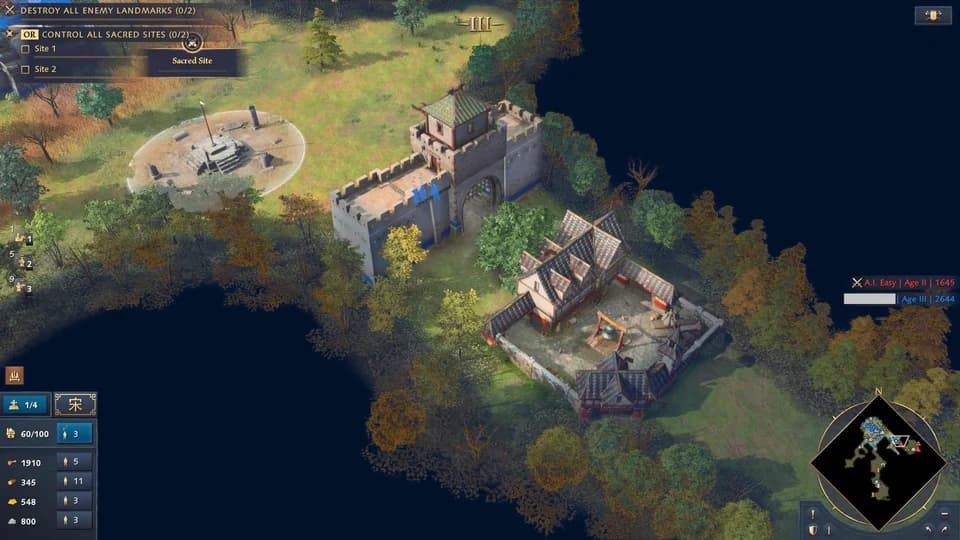
This second way, would be to prevent fog from covering the Fog of War. As seen in below, this helps making the scene with its intended lighting and colour temperature “pop” much better against a dark background that better separates the scene. By isolating the scene, it also helps colours like blue differentiate themselves as this would remove that overwhelmingly blue extension, making it ironically feel less “gray” as previously dominant colours would have a better chance to stand out, while also now better complimenting opposite colours. It also removes this feeling that there is a blue filter covering your screen, which muddles the presentation by making everything generally look blue.
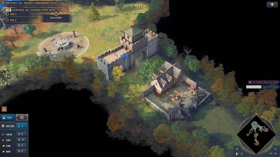
Here is an altered image that strips down the saturation of that background Fog of War. Reminder that the fog is still present in the actual lit up scene, and this highlights how much it covers everything.
Smoothness
And as for the third way, I have brought up in another post, but to summarize, here are two videos of comparison. AoE4’s fog seemingly ticks slower, but it also doesn’t “blend” well and instead pops in and out in large chunks. I understand that this is something you can easily ignore when playing, but it is also a post about improving this feature and I think it should be addressed. This would make it feel a lot better.
And here is a contrast to AoE3, where it feels much more natural and less blocky.
I think AoE4 has a lot of tools available that with a little tweaking could make a world of difference. And here is hoping this post brings some much needed attention to the game’s visual execution of fog, something that while in the background, has a massive impact on the aesthetical presentation of the game.
At the end of the day, this is not a big deal and I hope people won’t react to this post as if I’m implying that it is. This is just a post trying to adress some some ways that they could improve fog, tell me what I missed!


