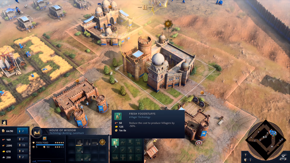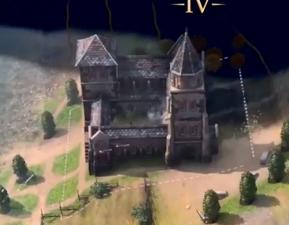
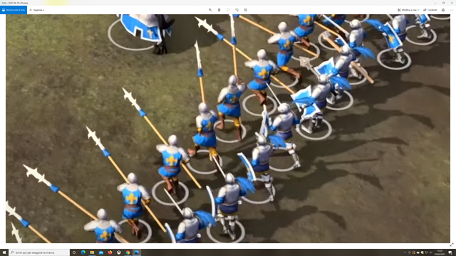
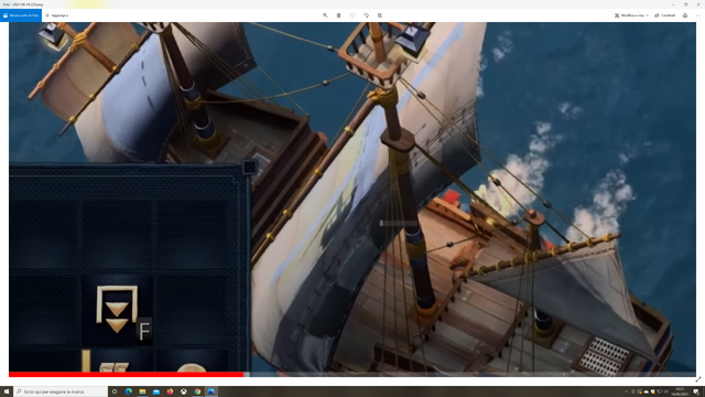
This was the original Building sizes. Now we have the city of midget. Lol
This was the original Building sizes. Now we have the city of midget. Lol
That outer box doesn’t denote the old building size. That box denotes the area that units can path through but that other buildings can’t be built within.
I’m impressed with new showcase.
I hope we can see longer gameplay because it will make people much more excited than watching cinematic camera movements which makes game looks like ugly but actual gameplay is pretty good looking.
I don’t know this guy but this video take a look to the all discussions have been made about graphic concerns
")
And i’m pretty agree with him.
I am still waiting for the 4K video of the latest news to appear on youtube. But as far as I could see , some improvements have been made , they still have to improve the animations and graphics a little bit.
But remember they are not showing footage from the present time. This videos are compiled and edited at least a few weeks before an event. Considering that development for the Release version goes as far as October. They have at least 3-4 months to improve things , and this is what they will do.
We need to provide feedback to them , structured and on point so that it is much more easy to read and compile in a set of useful data. And I do think they will improve on what we notice as a community.
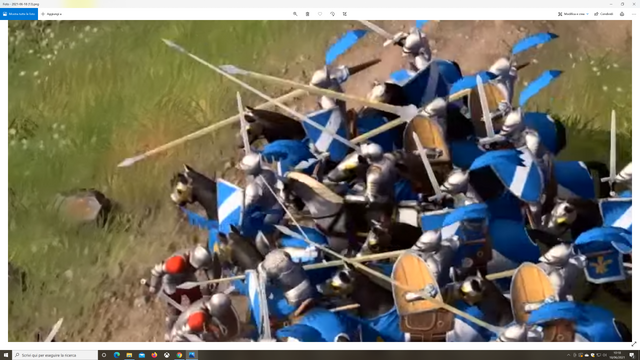
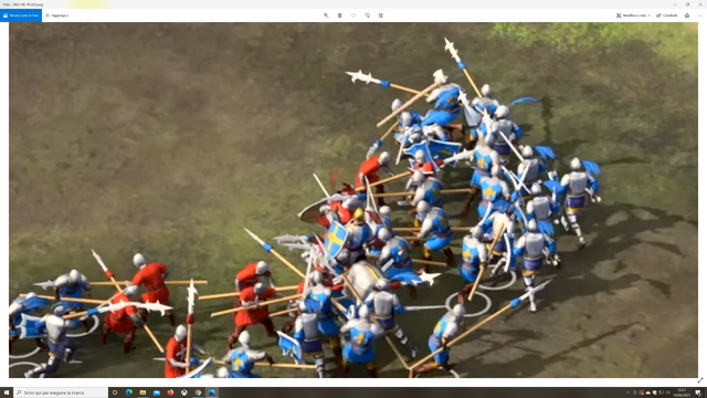
Regarding the naval combat , i do believe it’s not as good as it could be , but it’s not awful either. Someone made a comparison to Lord of the Rings Battle for Middle Earth II . Which is my favourite RTS game of all times , and indeed at some level a 15 years old game does better than AOE IV , like unit scaling , much more realistic shaders especially on armor and weapons , manned trebuchets etc… All we can hope is that they will actually address our concerns even if post release updates are required to make the game perfect .
PS : Yes , not having people manning the cannons and no people on the ships does look a little off to me. I would really much appreciate if at least they could at people at cannons and stuff . As I know that ships according to AOE have never had a crew 
And also please just stop with unit readability , they have added a lot of complex mechanics and features in the game that if you are a new player you will need time to learn the game with or without readability. What we want is a little bit more realism , to actually feel like you are in the medieval times and not at Disney.
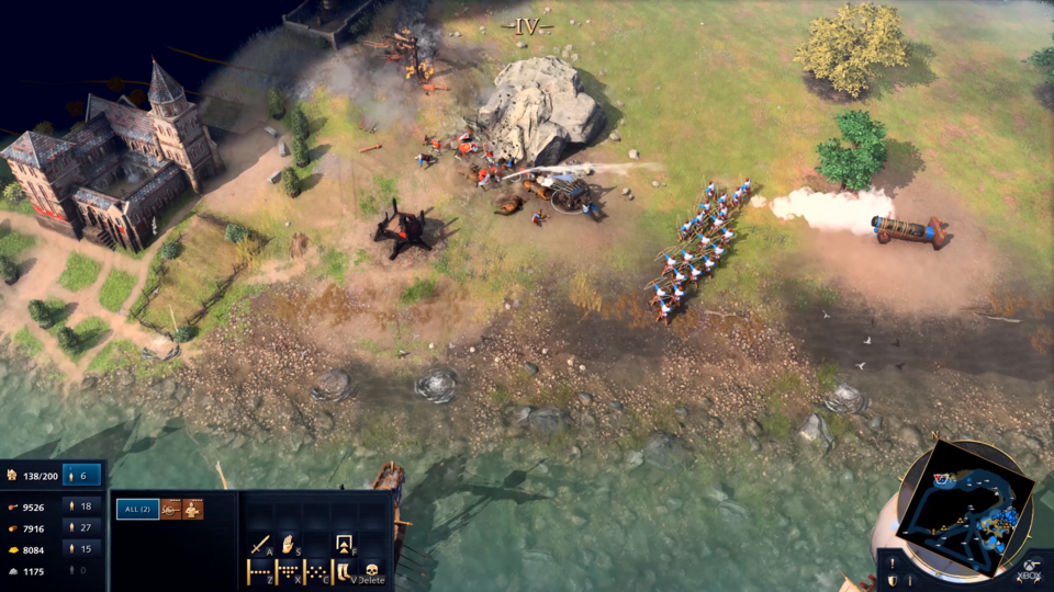
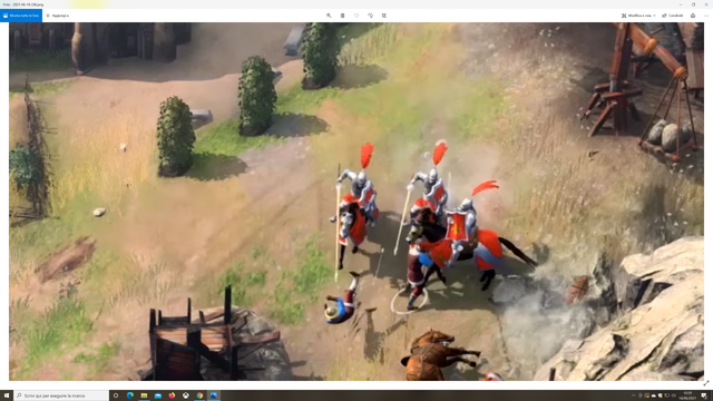
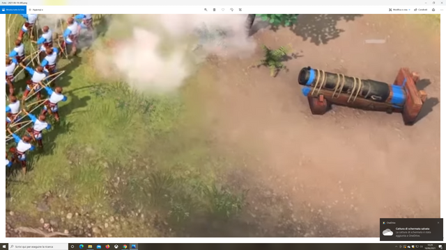
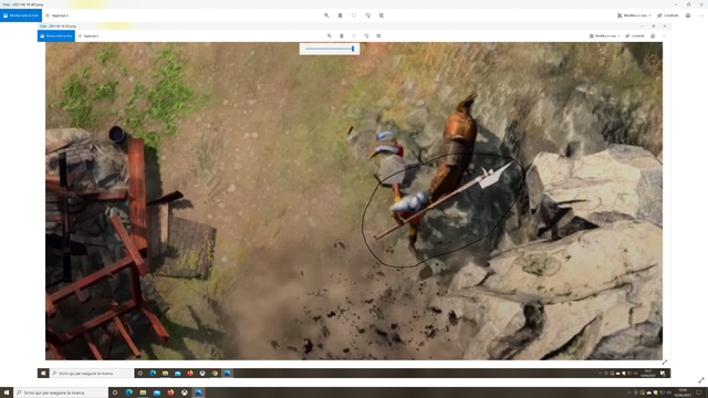
It’s time for another “deep video analysis impressions”. I took screesnhots from the 4k source by the Xbox Showcase extended on youtube.
Units:

Navy

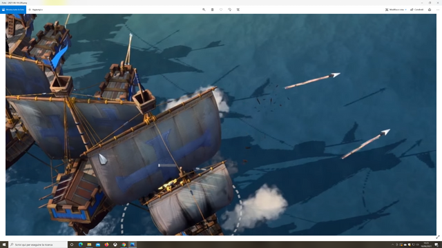
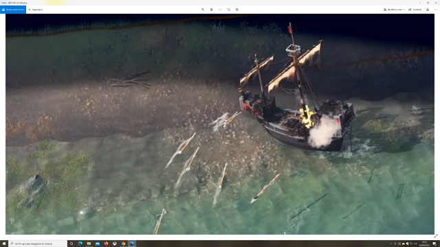

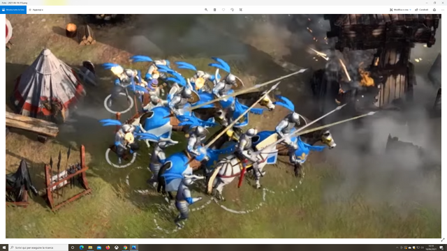
Siege wepons:


My preliminar impressions:
2)weapons sizes should be changed and the blades colour too… They look “plastic” but there’s a really good example that developers could be follow:
this is a perfect rapresentation of a weapon: excellent model and color. Developers should take this.


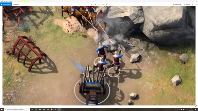
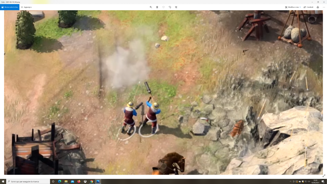
the models are very good in these images but they needed of some people to moving them and preparing to fire.
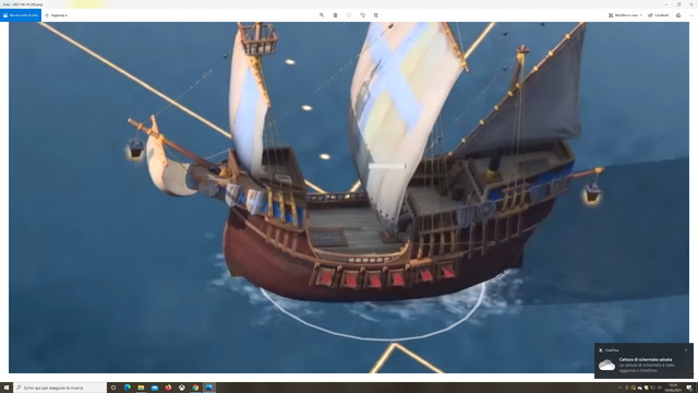

Also here, models are good but water it’s Horrible. Developers have to change or improve it. It’s not good.
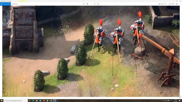
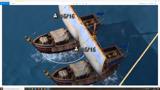
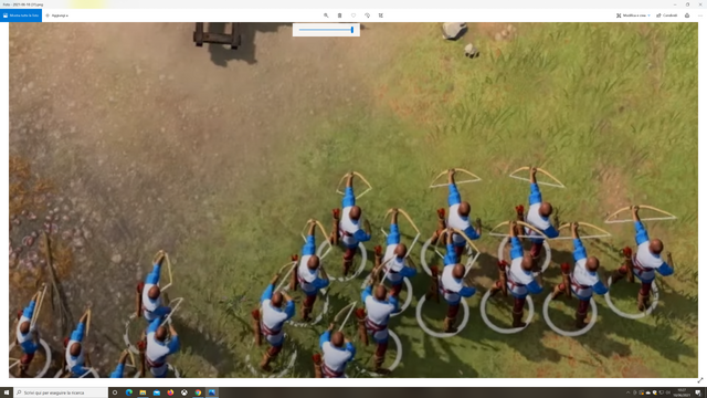
Please, units can’t have the same building proportions: it’s unrealistic and stupid. I know that there are “readability and competitive reasons” for this but introduce some options to change the building sizes for everyone who wanna play with more realism. The same sizes we’ve seen on x019 would be perfect.
So, this trailer it’s better than the previous one but a some more improvements on unit textures, water, siege weapons and building sizes would make this game much better for the main player base, imho.
that’s all.
I think I’ve explained this elsewhere on the forums but it may have been overlooked. The only building scaling option that would work would be in the z-axis. If you change the dimensions of buildings or units in the x or y axes, the models become incommensurate with the hitboxes.
What this means is that if you reduce the model sizes, things will interact over large distances (i.e. no contact) and if you increase the model size, the models all clip into eachother.
Luxus picture
Best,best
Great post man , I agree with what you posted . Hopefully they can implement this changes , or at least some of them. I really want people manning the cannons and more shading and textures on the weapons and armor. I am glad they have fixed the arrow and weapons scaling issues. They could further improve the building sizes , like make them 10-20 % bigger.
Keep up the nice posts.
I agree with that.
This may complicate the display, but we still need to have the sieges working with people
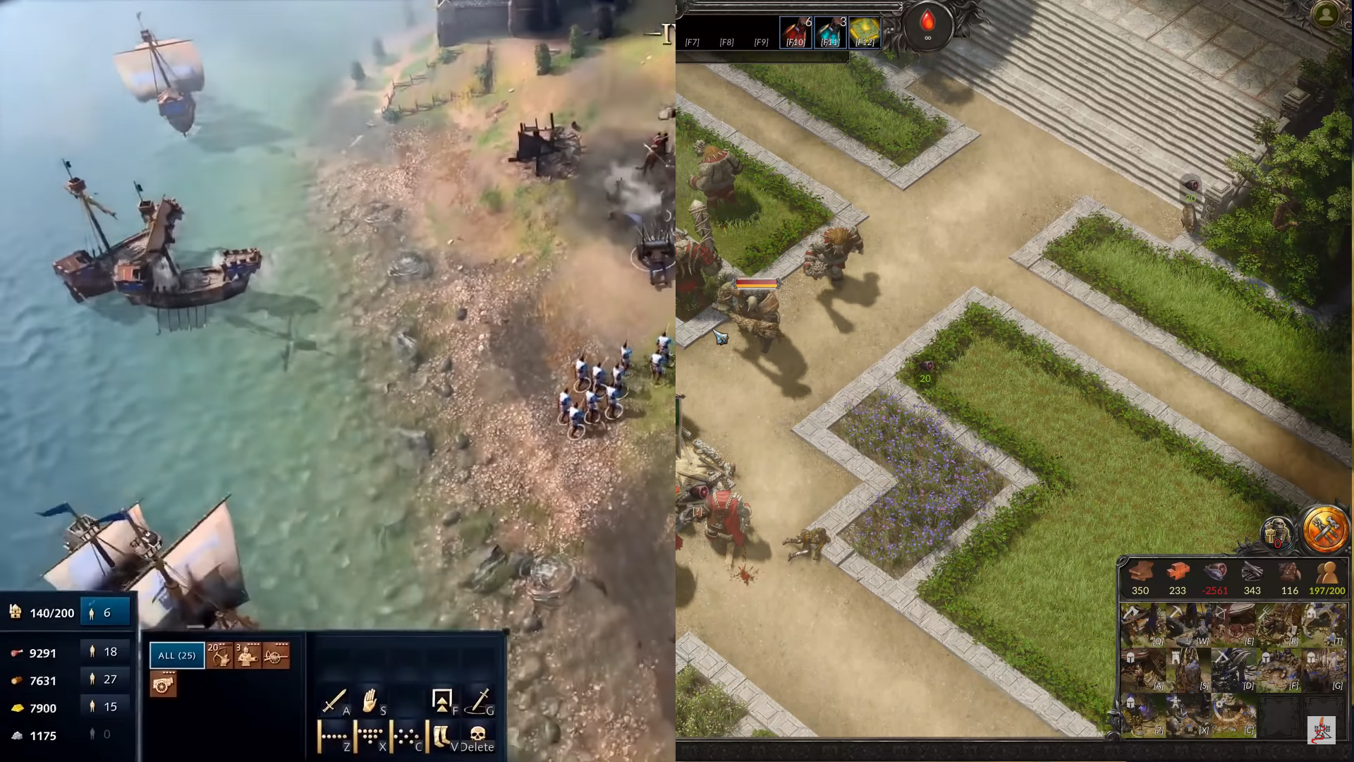
After watching a new video, I did just out of curiosity put it half/half to Spellforce 3
I just do have a weird feeling AoE4 looks somehow blurry and lacks contrast.
-look how small is the minimap by AoE4
-look how simple are the icons by AoE4, while SF3 did do there more effort.
-Look at the difference from grass to sand.
SF3 had a very nice solid designed UI, by AoE4 you can see a lot of gaps
-a small line between resources and units commands
-quite some free space by AoE4 Minimap UI
Altogether it looks like behind SF3 is more effort.
I do think the icons on AOE4 fits better than in SF3. In this case I can’t see what building is. No need to have a small picture icon.
On grass and sand I don’t know but in real life is mixed and not separated. It looks like a garden scenario where is clearly separated, so I don’t understand your point here.
I do agree with you about the mini map, it’s really important for the gameplay and should be bigger.
I think the lacks of AOE4 are not the interface, and the ground terrain. I think tose are good. Scale and unit textures maybe it’s a good point to be discuss before this one.
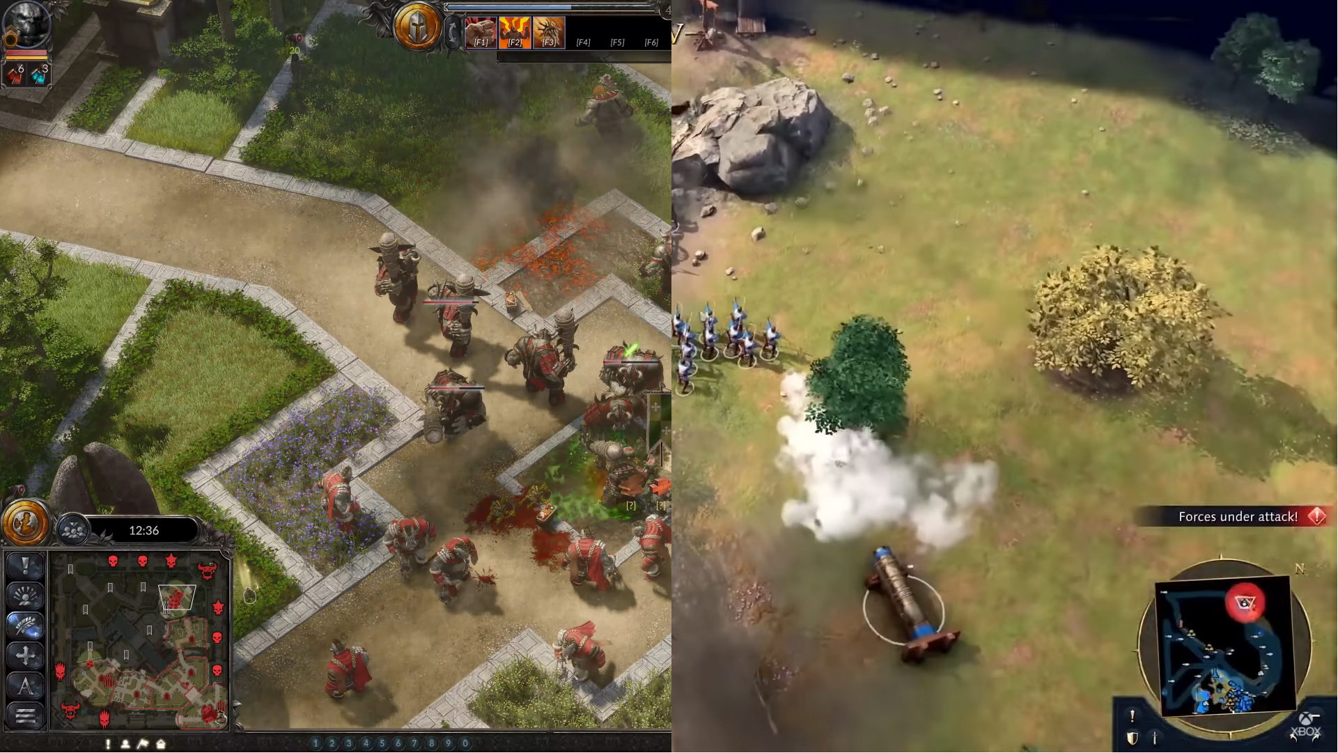
The graphics in Spellforce 3, are great, but it is not always so clear what is going on, on screen. This is the worst scenario for a game like AOE 4. To not be clear what is is happening.
The graphics in AOE 4, if you are not zoom in a lot are great. You will never zoon in so much while playing the game.
I totally agree with you, Spellforce is a pleasing game to watch but sometimes can be confusing while playing, at the other hand Age 4 could use some more detailed armors, not by adding textures but by having a little bit of more better coloring for metals and maybe some sort of craving in them or something?
They can have layered armours with colored cloth part to make them extinguishable
Here comparison of official material
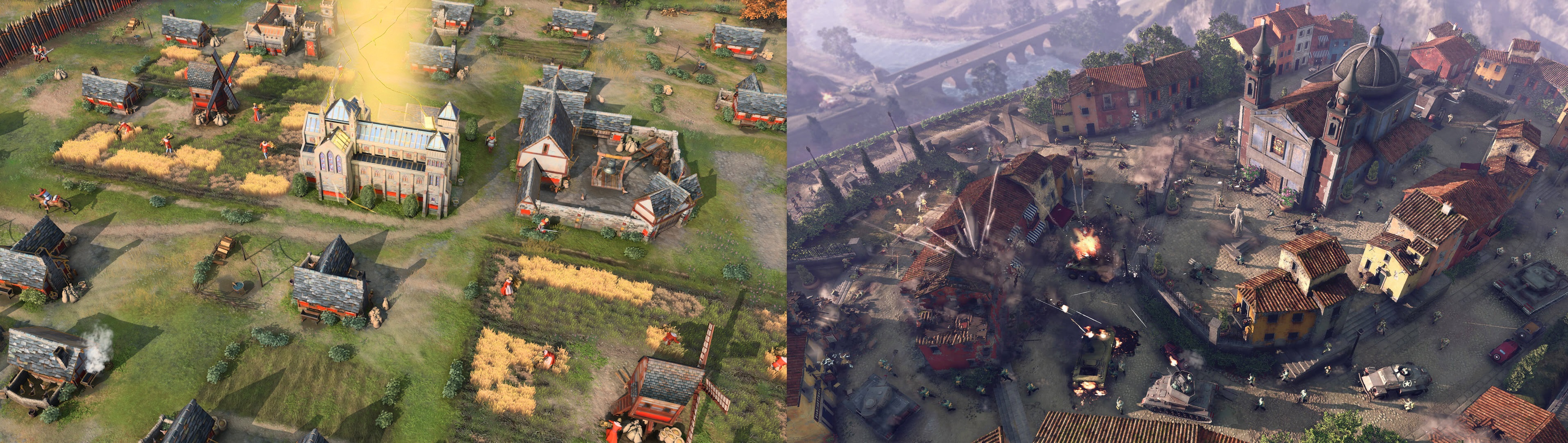
CoH3 vs AoE4. Why can’t we have Coh3 Graphics?
My Potato PC is 5 years old and can run CoH3 on Max Graphics.
maybe because i cant even see units in the right and will not play this game because i know my eyes will be tired very fast?
Because these are different games that have different goals. One is RTS about WWII, and the second is RTS Civilization. You need to go to the bottom of the forum with this question, in the topics to the pursuers of realism in games.
If You need, You can activate “accessibility options”,
than it gets much more easy to see where who and what is.
And than it’s better visible/readable than simply clay units with too large weapons.
It has nothing to do with realism, AoE4 simply looks outdated by modern day standards.
How does it not have? You just wrote that COH is better because it looks more realistic.
No need to wag.
And as the person above correctly noted, in the second screenshot you cannot see any units without huge icons on top, he is right, the game is not readable without an additional interface on the screen.
AoE 4 looks really good, it is bright and colorful like Civilization 6, and yet it claims to be accessible, more people can play it, it is more accessible, so you are wrong.
And you also don’t need to do necroposting.
Exactly. CoH solves this by having floating icons above the squads. AoE isn’t a squad system so having 200 floating icons for 8 players would be super annoying and bad for the game. Hence units need to be more readable
His name claims to be an RTS fan but he clearly cares more about graphics than gameplay