I remember Age of Conquerors night menu. That was cool too. Also in HD menu was moddable. There was Constantinople Main Menu I liked and used.
3 Likes
https://forums.ageofempires.com/t/new-ui-sucks/108625/3
Take my reply from this thread here as well.
2 Likes
They should roll it back. Adds nothing and is actually in my opinion ugly.
6 Likes
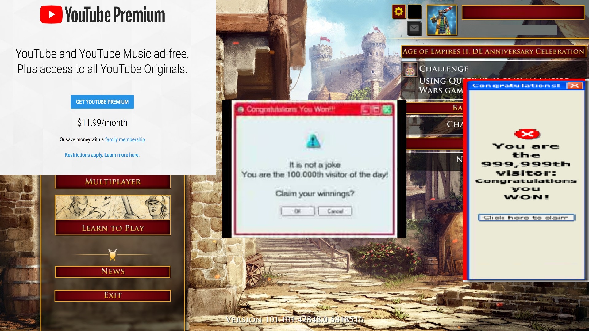
Here is my fix. There are few empty spots on main menu. I propose to gave ads in those places.
Big + of my fix is that if player wants to buy new shoes while starting AoE II game he can find one via new ads system. Or if someone wants to buy YouTube Premium.
39 Likes
Made me laugh out loud.
What a nightmare this would be.
4 Likes
Old UI was intuitive and used screen space very well. It only needed an extra symbol on the left for replays (and Art of War and News now). Arguably it was just as fancy with having nice symbols for each thing instead of only buttons. I wonder what guidelines we’re followed when designing the new UI. Laggy and unskippable animations should be a big no-no you’d think.
15 Likes
I was just trying to watch a replay, took me 3min to find it.
However, lets wait a few days and see how the new UI is once we get used to it.
3 Likes
Go vote if you wish to bring back the old menu of the game. Before the anniversary update.
Or keep the new one. Or make it optional.
Menu Vote
- Bring back old menu.
- Keep new menu.
- Make new menu optional.
0 voters
4 Likes
Suggestion: add a third option to allow them both to co-exist
4 Likes
Don’t know how to without breaking the poll. Just tried it and it reset.
Edit: Now done. But votes are reset.
Can we get the AoK main menu back?
4 Likes
There literally no chance of that ever… I think. DE has to be different to older versions of the game like AOE 2 2013.
2 Likes
Not much of a big deal
AoC’s main menu sounded better
1 Like
Really dislike the new menu… between everything taking more clicks with their “simpler” design and the annoying animations for everything it now just feels sluggish
6 Likes
They need to hire some interns to color the linearts.
There are too many unnecessary changes this time…
I teach you, Official.
- Give the old main menu back and just only adjust the multiplay option that what you done at this time update.
- Let the old UI back.
- Never keep asking players again when leaving a lobby, one game, or resigning one game, or deleting replays, etc. It is annoying players.
Haiyaaaaaaa
Someone agrees with me?
7 Likes
Is it possible for the devs to work on a setting to have simpler animations for the UI? I like some design aspects of the new UI but there’s just too many animations, like the glow that happens around the border when you open a new menu, or how everything just transitions into a new box. There’s so many animations that it is making my ultrabook with integrated graphics feel sluggish each time I click a menu. It’s not terrible, I’m not going to die over it. However it would be nice if we could just limit it a little bit. If I had a good computer I could appreciate it more, but for me it’s overthetop and I would prefer simple animations. Even when you leave a lobby there’s a giant box that makes it sluggish to leave a lobby.
Anyone else have the same feeling as me?
7 Likes
If you want to access your replays of a MP game, you need to go to Single player -> Load game.
Who came up with this logic. This is really a counterintuitive to look for the replays of MP games.
11 Likes
It looks disgusting, honestly.
13 Likes