Huge step down, they should really hire some UX/UI designers to help them because it’s clearly not the dev’s expertise!
4 Likes
Just my two cents on the new UI without being too dramatic or rude 
- The new civ pick is great (informative and good looking)
- The animation makes the menu slower and is unneccessary (enable/disable option?)
- The main menu UI is less cluttered but takes you double the steps to get where you want
- Listing both “history” and “mods” under a very well hidden settings icon is not very smart, imho
- The quick play option is nice to have and its UI is clear and intuitive, but…
- It feels weird to have two completely different UIs for ranked and quick play
21 Likes
I wish there was a way to turn of the UI animations.
AOE menus have always had a problem of running too slowly.
4 Likes
The more I think about it, the more I realize this menu is decent but with flaws
- The options should be in the left side and a bigger button - replaced with news’s place
- Mods & Editor can be merged, but they need a big button (stylish like the ones)
- It’s fine for SP & MP to be separated as two big categories, but Stuff like Saved Games it needs to have a different location
- in MP, the buttons should revert to the Tab style
- SP feels fine tbh (except Saved games ofc)
- The animations of “Recommended Settings” and stuff like Resign should revert to the old one
Unpopular opinion, but with these changes and an option to toggle between the old and new one, I believe most will be satisfied
1 Like
I don’t like how the quick play is transparent and you can see the home page behind it. That makes it hard to read the text and kind of hurts my eyes. Otherwise it could be a nice feature. Like this comment if you agree!
1 Like
 GAME INFORMATION
- BUILD #: Current
- PLATFORM: Steam
- OS: Windows 10
ISSUE EXPERIENCED
 DESCRIBE THE ISSUE IN DETAIL (below). Limit to ONE issue per thread.
The new UI is pretty slow. Everything seems to happen in slow motion.
FREQUENCY OF ISSUE
How often does the issue occur? CHOSE ONE; DELETE THE REST.
- 100% of the time / matches I play (ALWAYS)
REPRODUCTION STEPS
List the DETAILED STEPS we can take to reproduce the issue… Be descriptive!
Here’s the steps to reproduce the issue:
- Make use of the UI. Just click and see what happens. Everything takes much more time to load.
5 Likes
No! The line-art is one of the things I’ve loved since the original AoK manual! DON’T TOUCH THEM!
Menu animations get old really quick, remove them!
4 Likes
Made a thread about this which was removed.
@RadiatingBlade edit: Not removed. Merged with this topic so all UI feedback is in a single topic. Thanks for understanding.
Is it possible for the devs to work on a setting to have simpler animations for the UI? I like some design aspects of the new UI but there’s just too many animations, like the glow that happens around the border when you open a new menu, or how everything just transitions into a new box. There’s so many animations that it is making my ultrabook with integrated graphics feel sluggish each time I click a menu. It’s not terrible, I’m not going to die over it. However it would be nice if we could just limit it a little bit. If I had a good computer I could appreciate it more, but for me it’s overthetop and I would prefer simple animations. Even when you leave a lobby there’s a giant box that makes it sluggish to leave a lobby.
Anyone else have the same feeling as me?
All in all it’s starting to become more of a hindrance than a pleasure to have these new animations for me. Everything drops to like 12 fps when I load up the civ picker or even resigning.
4 Likes
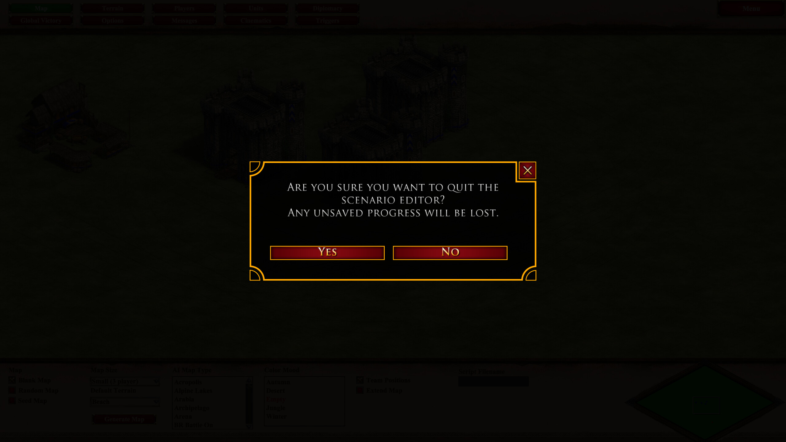
And this disgusting popup confirmation (after you click “quit game”). Just… why? The original one already aligns well with the in-game menu and is smooth. Now some stupid UI designer brings style inconsistency and squeezes unnecessary animation everywhere.
8 Likes
Is it possible to edit the main post so that this vote gets more visible?
Maybe even mention vote in the title.
Not sure why a bug report about performance issues in the new UI is also merged into this thread. Both thread had the new UI as subject. Posting a bug report is something different then sharing you opinion about the topic.
2 Likes
Dislike the fact that Random map is called Skirmish. That’s practically the big speedbump for me.
Don’t care for AOE3 all that much and really don’t care to reference it in my installation of choice.
And yes, I’ve bought AOE 3 DE. Which means I’m still supporting your ventures and I’d ask you respect the playerbase that’s kept this boat afloat for the last decade by not relegating our terms to the less effective and less beloved predecessor.
2 Likes
My poll was broken by thread merging. I’ll see if can remake it.
1 Like
If they have some extra time they should invest it into making something actually useful such as new unit or building graphics or things like that. this new update gave us only one new unit graphics, some grass:
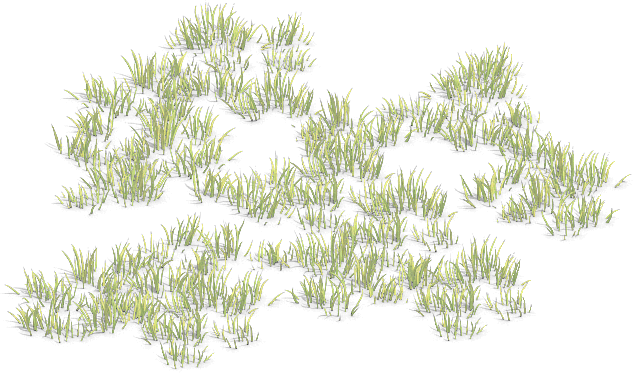
really the biggest update contains only one new unit graphics?? that too one frame of grass??
no-one needed those unnecessary UI changes.
they are investing time in wrong direction. We need actual new content.
imagine they could have made regional monk graphics for asians, regional king graphics for europeans, added harbor-krepost-feitoria architectural variants or added some more hero graphics or some new civ or new campaign. that would have been so much more better.
this new UI is making it harder to access mod manager and editor by hiding them while making the quick play multiplayer easier to access. feels like they care nothing for singleplayer fans. those fancy event icons get on my nerves. don’t we have enough unit icons for profile now?
12 Likes
I get that it is annoying, when resigning, but well tbh: you have the second that the animation takes if you are about to resign. But you also get this new “improved” message box when you want to delete a castle (for example in CBA, to prevent enemy to get a vill) or a monastery (Forrest Nothing thing to delete those, to get buildings for imp, and quickly get space back for farms). This really costs a lot of time, and if your enemy is huns in cba you really have to start deleting that castle when it is half way down, else you will not make it in time…
For now only thing to do is disable the confirmation box, because it is unusable… dont think this should be called intended behaviour
1 Like
What? Which unit is it? ![]()
maybe some embellishment unit added to scenario editor and some map.
I guess you misunderstood. I’m not complaining about any in-game seconds lost. It’s just the UI transition not smooth anymore. This, and civ pick screen, recommended settings popup when switching game mode, etc.
I never used it. It’s very situational. And considering that you need to delete lots of walls in Arena games anyway, or quick wall foundations, this box should really get out of the way.
1 Like
older updates used to give us some useful graphics such as (bayinnaung, envoy, musketeer, golden bombard, slav ship sails, broadswordsman, aoe1 legionary, aoe1 scout) all of them came to aoe2 de with some update but now we get nothing…
2 Likes