It would be good to reduce the animation length for the overlays from currently ~1sec to 100/150ms max,…
1 Like
There is a FPS limit on human eyes as well.
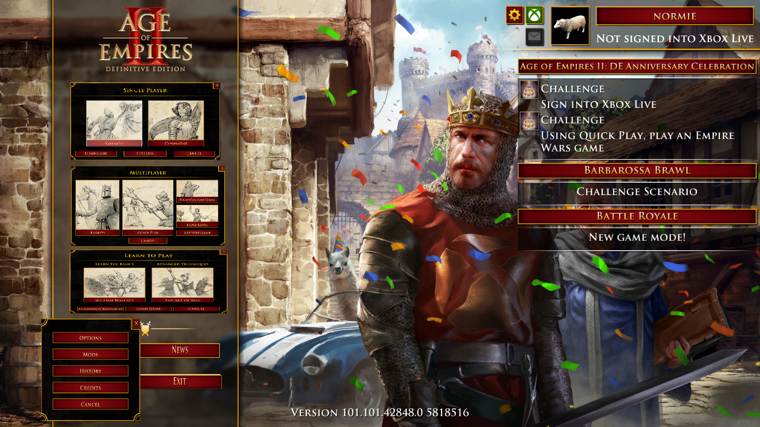
It’s a great patch don’t get me wrong. I was a graphic designer for 8 years so I know what I’m talking about. I’m saying the quick play menu distracts me from being able to read the text in the menu, do to its transparent background. They should make the quick play have a solid background.
8 Likes
The UI should generally be more consistent. Some menus have an oldschool style with solid background while some others have this modern menu with semi transparent background.
4 Likes
Very much agree with the UI being inconsistent, it feels like there are two design teams and they are not working together on this.
It also feels like the general sentiment is that we’re moving away from the UI with the parchment background and toward the solid black with gold borders, which I personally dislike entirely.
2 Likes
I will make a detailed post about this later this day or tomorrow. I also disagree with this new style as it doesn’t really fit the historic setting of AoE2 and it’s also less readable.
1 Like
Although, I don’t have a high end PC, lag in the main menu is a new concept to me. Whoever did the programming for the diagonal fade in animation of menus. Makes you wonder if they ever tested it on a typical PC.
9 Likes
My computer is quite strong and after 2 games the UI in the menu and other stuff gets laggy, so it is not your end it has a bad desing, on top of that my VRAM utilization has increased even when just browsing the menu.
1 Like
Or search in game for the mod ‘[Anne_HK] Old Main Menu’.
You can get the old main menu back. Only drawback is that quick play is hidden. You need to click on the battle royale button to access quick play.
I havent used this mod for too long to know if the mod makes the game less laggy. At least you get rid of the extra clicks in the new UI.
Maybe add this mod to the first post @BomberGriffin
I must admit i like the outcome of the poll. 67 votes, no one want to keep the new menu 
5 Likes
Done. Is a good helpful link.
Obscuring options and adding animation delays makes the UI unpleasant to use and wastes time.
Do something like this or give us back the old menu please.
Made with love in MSPaint
12 Likes
Why people keeps asking about the Harbor-Feitoria-Kepost architecture style for more civs?
Those are unique buildings as unique as any UU in the game
Are you gonna “demand” Eagles skins for Europeans too? Or Berserkers skins for African civs?
It weird tho
because the new update now allows you to change architecture of civs:

No
Please stay on topic. If you would like to continue the discussion on the scenario editor please start a new topic.
2 Likes
I think with design aspects they should be getting players to be beta testers for these things. I mean we’re the ones playing the game. We should have some input with the functionality of the UX and UI, otherwise they’re just as bad as facebook implementing new design changes that affect the experience and fluidity of the game. As mentioned above, the fade in’s and transitions are so bad and makes my laptop feel so sluggish each time one of those pop up’s appear. At least giving people the option to change back to the old style for those of us who just want simplicity and ease of use. I don’t get why they have to add something that just makes it overall worse for a majority of the population. Give us options.
2 Likes
We have our first ‘Keep the new UI’ vote in the poll! The devs made at least one player happy with the changes to the UI!
They must be trolling really if they voted for that.
I found it hard to find “secondary” stuff on the new UI such as the “history” page and such things. basically anything that isn’t “play singleplayer” “play multiplayer”. personally I believe the the UI need some slight changes and it could be ok. but at the current state I would give a thumbs down. not saying you have to bring back the old one but at least make the new one easier to navigate.
Ideas:
“Editors” should not be under single player. I would enter single player to play. not to create.
“History” should not be under options(makes no sense). that’s literally the last place someone would look for that in the settings menu.
This one is trivial but in the single player menu you probably should place campaigns on the right and skirmish on the left.
Maybe add another tab?
also I always wanted a separate technology tree page without having to go to skirmish to click tech tree to see it.
that being said if you make me choose between the old menu and this menu with no improvements then 100% I would go with the old one. and it’s not aversion to change or nostalgia but the old one was more easy to navigate.
5 Likes
I don’t really like the new menu. I neither like the images concept nor the way things are organize I loved the old menu, with the shields
2 Likes
Too many clicks to get around. Also it’s annoying that when picking my Civ I have to “confirm” it. I already clicked it lol. Just move on.