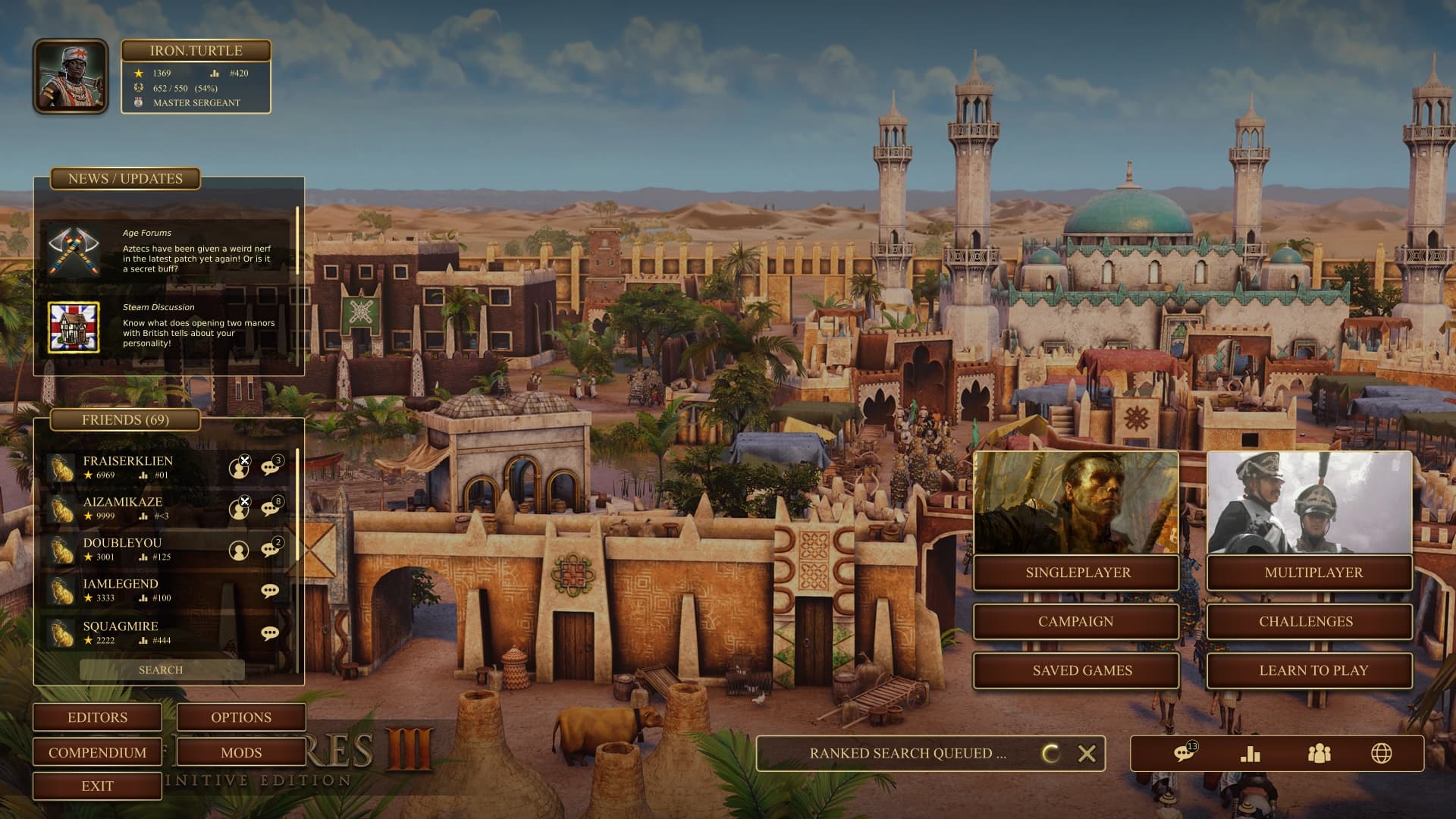
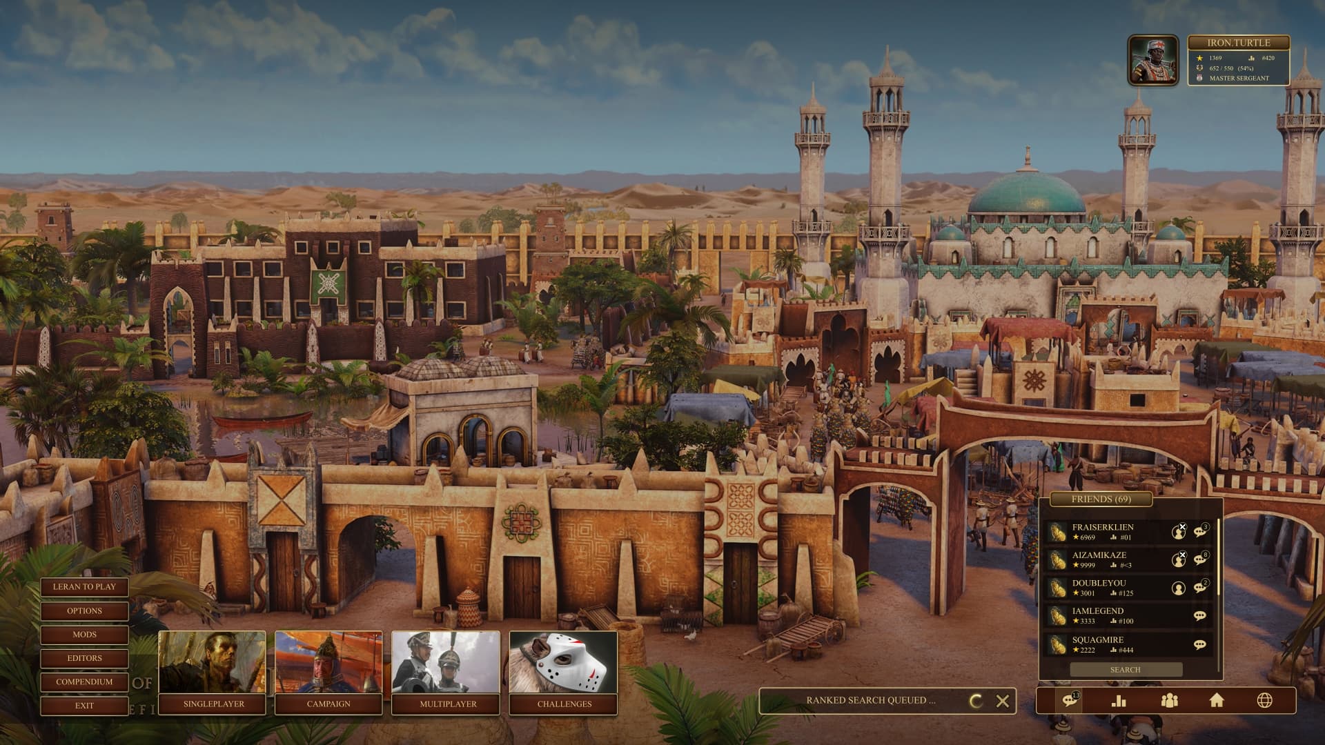
DE UI is really lacking in some features which were present in the legacy game. So I decided to create mockups of what DE with all the features of legacy would look like. I also added new features which I would like to see in the game. I’ll keep updating with new mockups.
features:
- friends list
- global chat, leaderboard etc menu
- match history
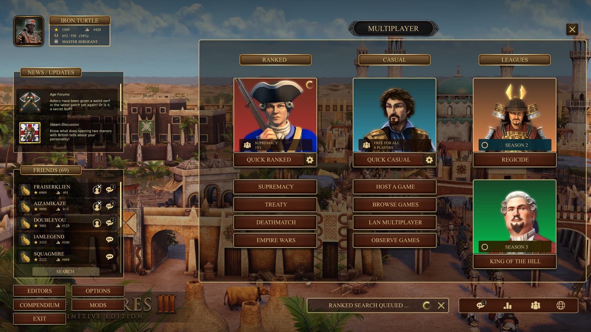
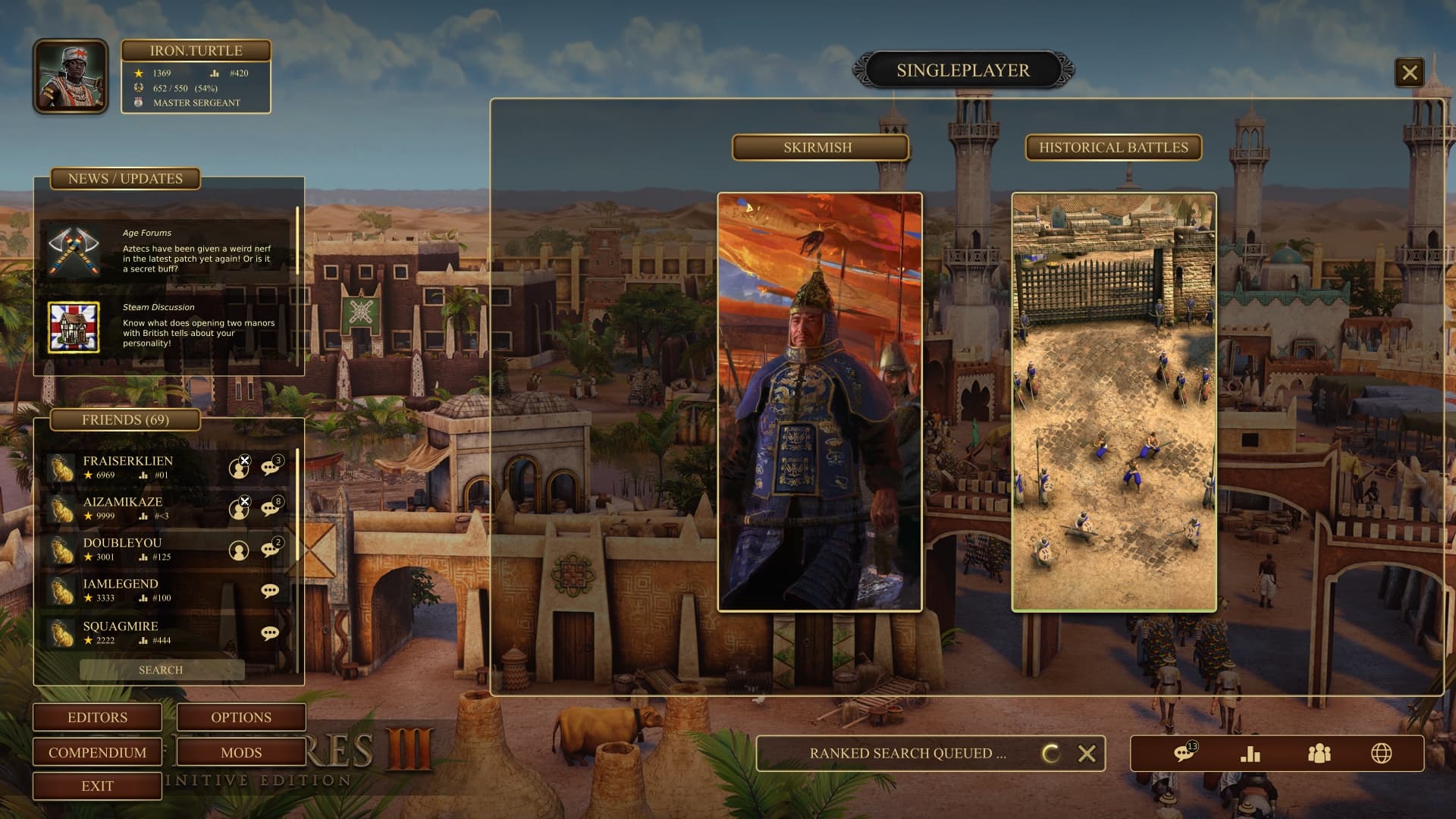
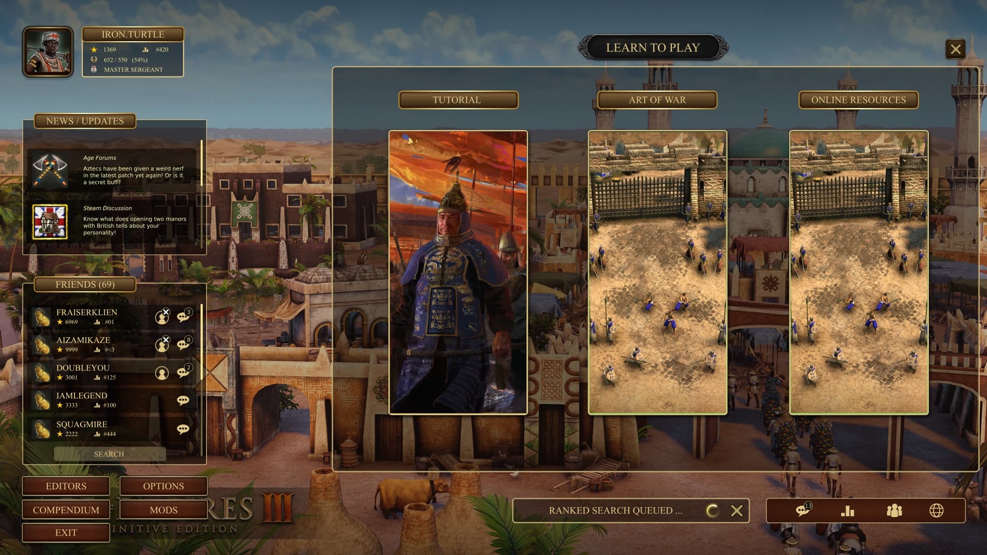
- new game types, modes
- set a preferred game mode for quick games
- status bar indicating game queues, lobby queue etc.
- opening any tab without cancelling queue
MAIN MENUS
37 Likes
I like how the menu is set up now. I can’t stand the menu in AoEIIDE.
Nice work but it just doesn’t appeal to me personally.
9 Likes
Looks good! I like most of the elements. I’d just rearrange some parts: the the single player, multiplayer and the rest of the options on the bottom right I’d put them on the upper left and the player profile on the upper right. Also, something I’d like in the main menus is an option to go directly to your homecity, as that option seems to be missing.
3 Likes
Yeah, I forgot about the homecity! That’s an important one. Maybe it can be included on the bottom bar, so hc can be accessed globally.
2 Likes
The work here is nice, but the HC gets shadowed, and part of the fun for me when entering is looking my main civ upgraded HC.
8 Likes
These look pretty dope! I’d much more prefer them to the current UI.
This looks spectacular! Would love to see this in game.
That looks nice especially. It looks to have a lot more soul than the current UI.
I especially like how friends list is always showing. Current Aoe3 DE feels very solitary atm.
It’s a great draft mock-up, it’s not perfect but I think you get what is missing in aoe3 de and its definatly in the right direction.
Hope the devs take notice
4 Likes
I think the general idea is not that it looks the way he proposes it. The idea is to give more life to the menu. For example, being able to see friends online, show conceptual art from campaigns and other things.
SoullessHeathen It’s just an unrefined idea and concept.
1 Like
For me the menu doesn’t need any life because that is what the home cities are for. As someone previously said it obscures the home city too much. No point in customizing home cities if you can barely see them when launching the game. What about those that don’t care about multiplayer having all that clutter up the screen? I think it is perfect the way it is. Everything is easily accessible and clear. The home cities are the center of attention as they should be.
If given the option to switch between menus fine but if AoEIIDE is any indicator it won’t be given. I don’t know if people are still complaining about it but I know most hated it when it first appeared.
3 Likes
Maybe not for the main menu, but for the submenus it seems like a good idea. That is, those interfaces would only appear when you click on a button on the main menu with the metropolis in the background.
2 Likes
Yeah, thats why I tried keeping less Ui elements in the default screen. I did it in just few hours so it is definitely not the polished version. I tried making it so the Ui only takes as much space as the current one does.
Seeing friends list, chats and other options which could be seen from any screen was my main idea. Also, I am a online player, so I am also biased about more easily and quickly accessible online game. 
1 Like
Yep, thats the idea. The big popup will only come up once you press the singleplayer or multiplayer button.
2 Likes
incrivel wdddddddddddddddddw
I think current main menu is better than Op but others can be thought 
It could be customizable for those who like it one way or another.
2 Likes
Just realized Aoe4 also has a bottom bar for chat, friends online etc. Coincidentally, aoe4 devs also came to a similar solution for UI.
And it also has a game status indicator!
Great work but I also would like to have the option of viewing the home city. 11
Less UI, more homecity!
Homecity button
Match History: contains all matches, saved games, etc.
13 Likes
I like it,it is super minimalist,out there a UI similar to that of the aoe 4 could be viable too…
1 Like